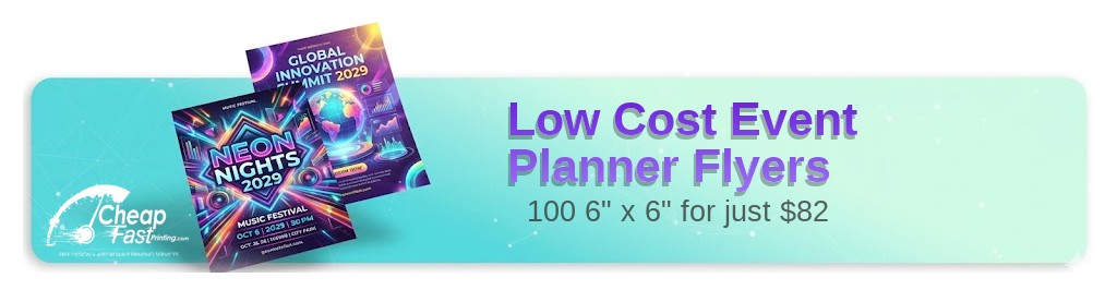
Professionally designed for 6" x 6" flyers. Fully editable & free!
Preparing Templates…
Event planning is a visual and trust-based business. A professional flyer showcases your style, your portfolio, and your ability to execute flawless events.
Whether you specialize in weddings, corporate galas, or private parties, the right flyer puts your brand in the hands of potential clients at bridal shows, networking events, and local venues.
Effective event marketing combines stunning imagery with a clear list of services to inspire confidence.
When your flyer looks polished, your events feel premium.
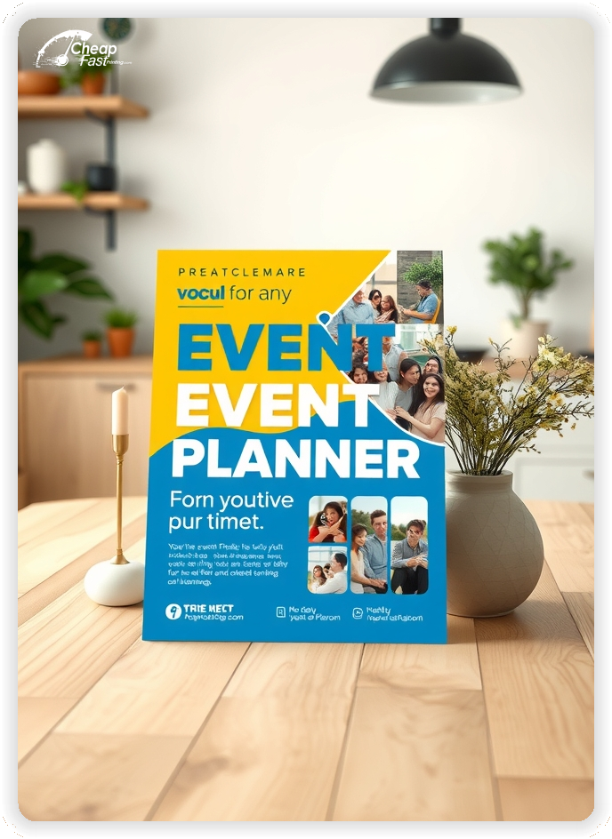
Lead with your strongest visual. A single breathtaking photo of a past event speaks louder than a bulleted list.
Keep your service list concise: 'Weddings | Corporate | Private Parties'.
Use a clean, elegant layout that reflects your organizational skills.
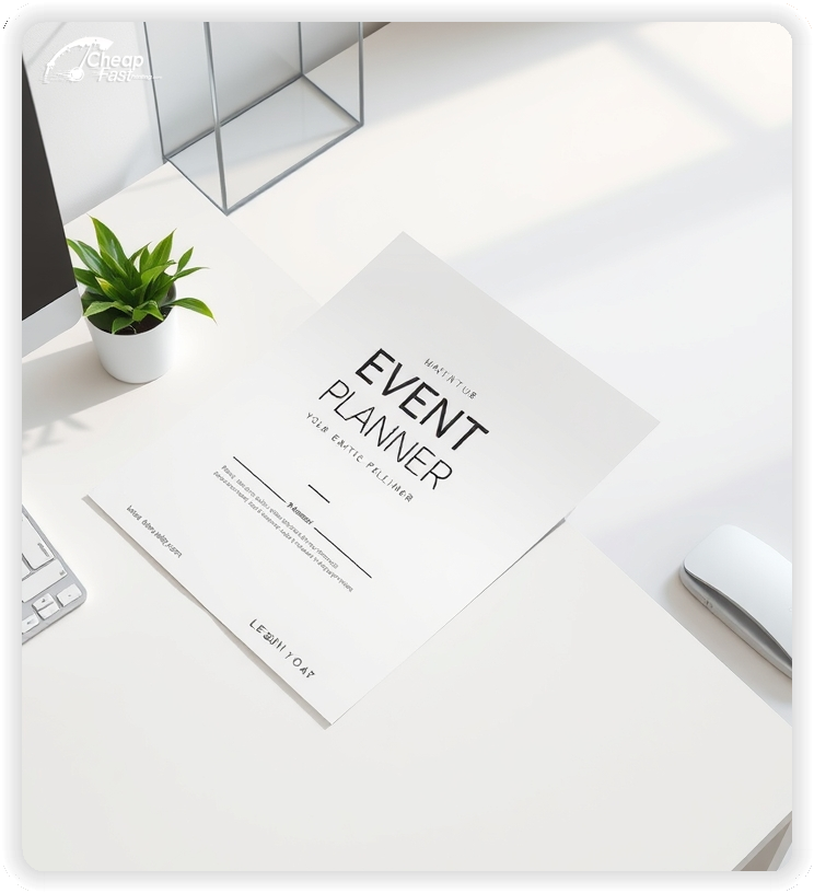
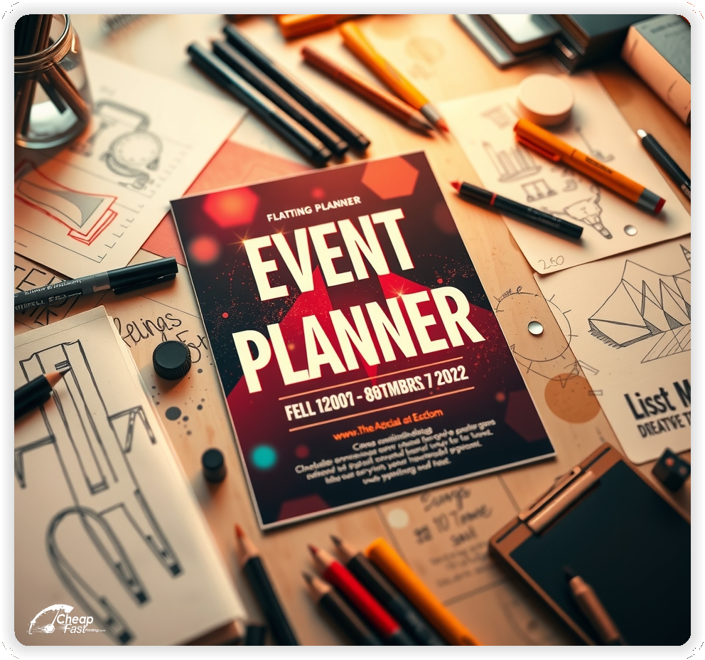
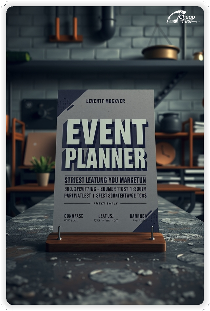
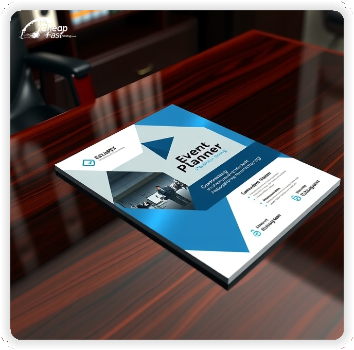
Your flyer is a mini-portfolio. It must convey style, competence, and reliability.
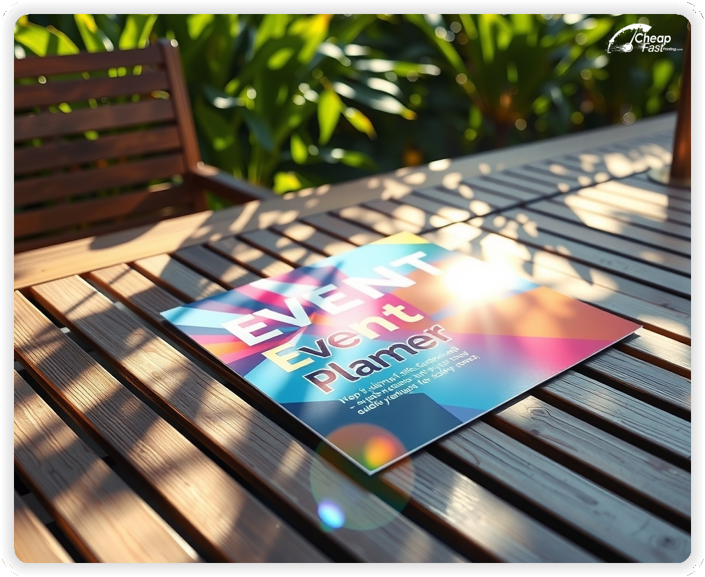
Square formats like 6x6 event planner flyers stand out in a stack of standard mail. They feel modern and chic, perfect for social events and weddings.
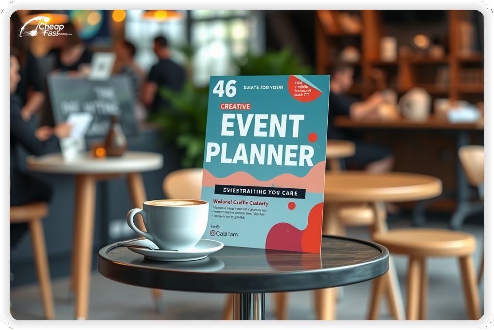
Larger formats like 6x9 allow for a collage of images to show versatility without cluttering the design.
Unique shapes signal creativity, a core trait clients look for in a planner.
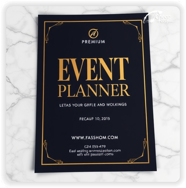
For wedding and social planners, 16pt matte cover offers a sophisticated, soft-touch feel that screams luxury.
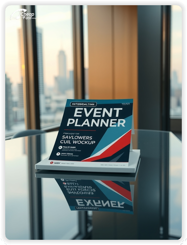
For corporate event planners, 100lb gloss cover provides sharp, vibrant colors that make event photos pop.
The tactile experience of the flyer is the first sample of your attention to detail.
Don't try to be everything to everyone on one flyer. Create specific handouts for different target audiences.
Have a 'Wedding' flyer with romantic imagery and a 'Corporate' flyer with clean, professional lines.
Targeted messaging improves conversion rates at niche-specific expos.
Event planning is high-stakes. A quote like 'Best day of my life, zero stress!' creates instant trust.
Keep testimonials short—one or two sentences max.
Social proof is critical for converting cold leads into consultations.
The goal of the flyer isn't to sell a package instantly, but to get a meeting. Use a low-friction CTA like 'Free Style Consultation' or 'Coffee & Concepts Chat'.
Direct them to a calendar link or a portfolio page to take the next step.
Leave your flyers with florists, caterers, and venues. A professional card stock flyer stands up in display racks and doesn't flop over.
Vendor referrals are a top source of leads; make it easy for them to recommend you with a high-quality handout.
Plan campaigns around the calendar: Engagement season (Dec-Feb) for weddings, and Q3/Q4 for corporate holiday parties.
Use bulk flyer printing to prep for bridal show seasons in advance.
Timely messaging shows you are proactive and market-aware.
Print cannot show your whole portfolio. Use a QR code linked directly to your 'Real Weddings' or 'Past Events' gallery.
This bridges the gap between the physical impression and digital proof of work.
Hand out flyers at bridal expos, chamber of commerce meetings, and community festivals.
Partner with dress shops, jewelry stores, and corporate co-working spaces.
Being visible where your clients are planning their lives is key.
On the back of your flyer, include a 'Sample 12-Month Wedding Checklist' or 'Corporate Event Countdown'. This turns your flyer into a useful tool that they will keep on their fridge or bulletin board, keeping your brand top-of-mind until they are ready to book.
Upload your portfolio photos and create custom event planner flyers that sell your style.
Add a QR code to instantly transport clients to your online gallery or booking calendar.
We know details matter to planners. Our proofing process checks resolution, bleed, and color mode.
Download our setup guides to ensure your artwork is print-ready. Available for Photoshop, Illustrator, and PDF.
Loading Free Editable Designs...
Please wait while we prepare the template library.
Compare our cheap flyer printing rates against giants like 48HourPrint, Mixam, Office Depot / OfficeMax.
Use one clear headline, one offer, and one primary CTA (call, scan, or order). Add the essentials: phone, website/QR, service area, hours (if relevant), and a trust signal like years in business or a short review snippet.
Keep the layout scannable: one hero image or icon, short bullets, and high-contrast CTA text that’s readable at arm’s length.
Yes. 6" x 6" balances visibility and readability without feeling cramped. It gives enough space for a strong headline, a benefits list, and a CTA while staying easy to hand out or place on counters and boards.
Prioritize spacing and hierarchy over extra copy so the main message lands in 3–5 seconds.
18 pt. Ultra Premium Smooth White with Gloss affects how the flyer feels and how colors read. Gloss tends to boost color and photos, matte reduces glare and feels more premium for text-heavy layouts, and uncoated is great for writing on.
If your design uses lots of fine text, choose clarity and contrast first; paper upgrades won’t fix a crowded layout.
100 works well when you want consistent visibility across multiple placements (counters, boards, partner locations, events) over a few weeks. Bulk also lowers unit cost so you can test a message and keep the winner running.
Track performance, then reprint the best offer instead of changing everything at once.
If price is your main hook, feature one simple offer (“ off” or “Starting at ) and keep the fine print minimal. If you have variable pricing, use a short value statement and send details to a landing page.
A clean offer + simple CTA typically outperforms a long price list.
Use a QR code to a dedicated landing page and add UTM tags for each route or partner. Track scans, form fills, and calls to identify the placements that actually convert.
For non-QR audiences, include a short, memorable URL or a trackable phone extension.
Start where your customers already are: complementary businesses, community boards, local events, and targeted neighborhoods. Ask partners for the most visible spot and refresh before your flyer gets buried.
Use a consistent route and restock winners; small, repeated placements usually beat one big drop.
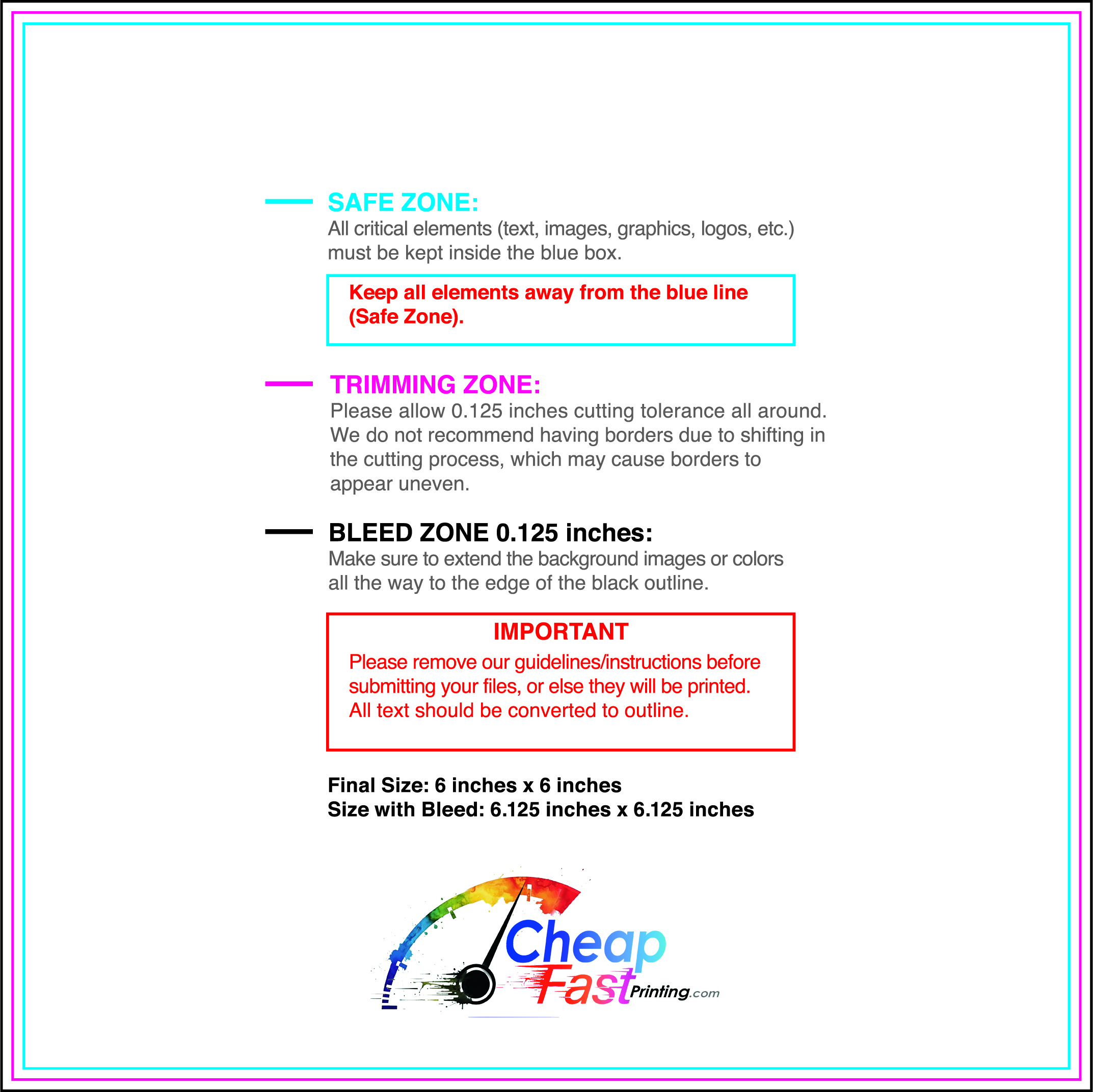
Submit a print-ready PDF (CMYK) at 300 DPI with 0.125" bleed and safe margins around important text. Keep thin lines above 0.5 pt and make QR codes at least ~0.8" square for reliable scanning.
Use vector logos when possible and limit your fonts to maintain a clean, professional look.
Request a proof so you can confirm spelling, margins, and QR/URL accuracy before production. Proofing is the easiest way to prevent expensive reprints.
Double-check phone numbers and offer terms first—those are the most common issues.
Match your flyer headline and offer to the landing page headline so visitors feel they’re in the right place. Keep the CTA consistent and make the page fast to load and easy to complete on mobile.
If you run ads, retarget QR visitors with the same offer to improve conversions.

