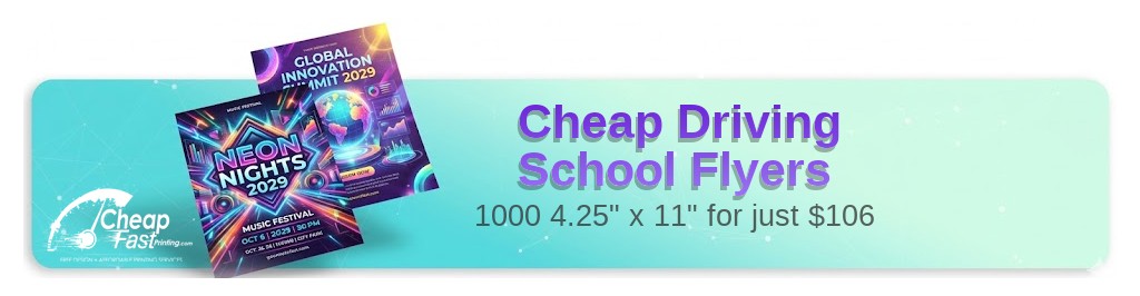
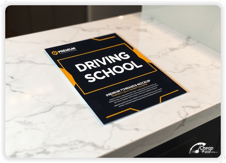
Professionally designed for 4.25" x 11" flyers. Fully editable & free!
Preparing Templates…
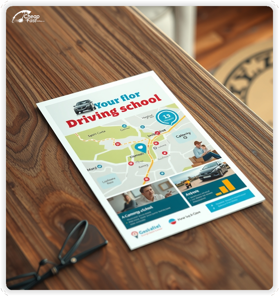
Parents and new drivers choose programs that feel safe, organized, and easy to book. A clean print piece should show the package, the schedule cue, and the next step in seconds.
Use a tall 4.25x11 layout to keep pricing and dates readable without tiny type. Give the QR area breathing room so it scans quickly.
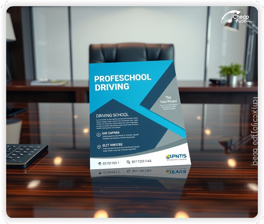
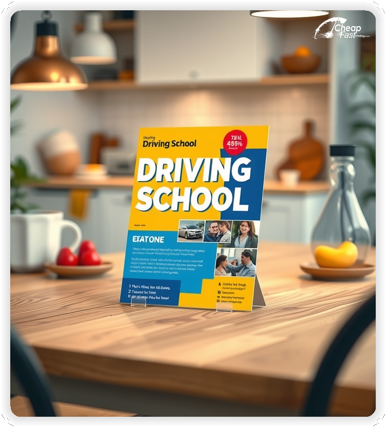
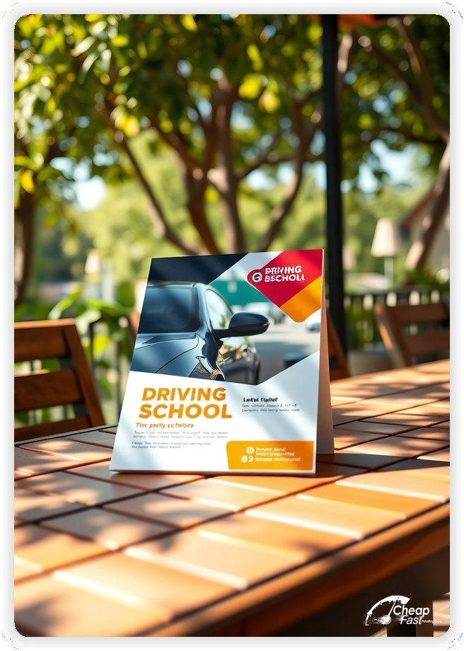
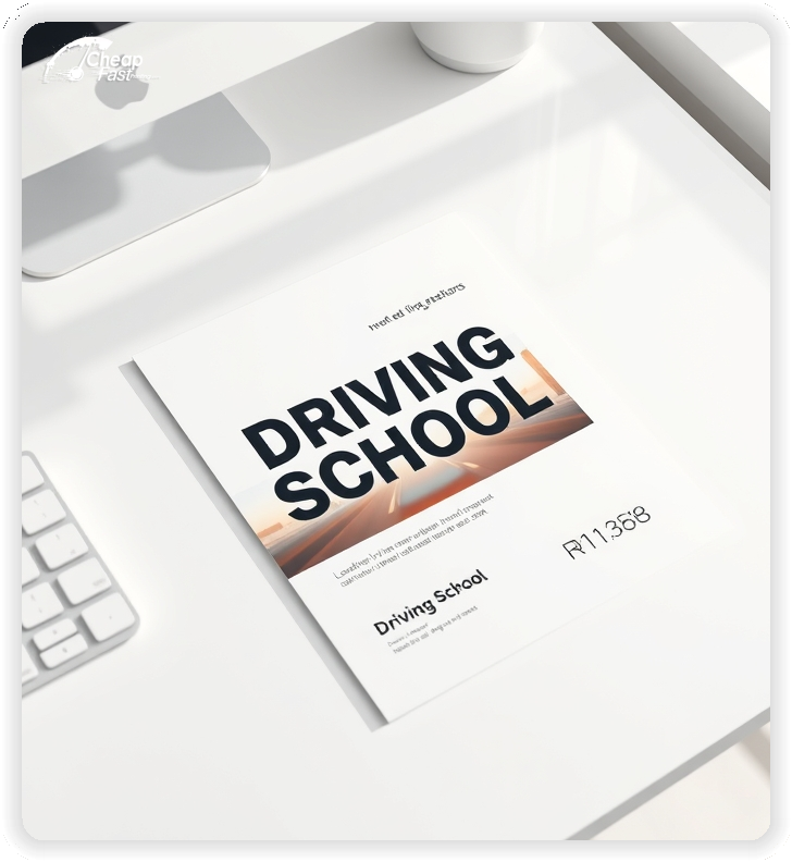
4.25x11 driving school flyers are easy to hand out at events, simple to stack on partner counters, and readable on bulletin boards.
A gloss book finish keeps photos bright and colors clean under indoor lighting. Keep the design calm so the offer reads clearly from a few feet away.
If you want a branded look, match the logo, color system, and tone to your website so the message feels consistent across channels.
Driving lessons sell when the decision feels simple. Use one primary offer and one primary action, then remove everything that competes with those lines.
Parents want clarity, not hype. A clean schedule block, a credible trust cue, and a booking QR do more than a long paragraph of claims.
If you run multiple programs, rotate the headline each season but keep the layout consistent so recognition builds.
The goal is not to explain everything. The goal is to make the next step feel easy and safe.
Keep the structure consistent so readers can scan it quickly in a hallway, on a counter, or at an event table.
Tall layouts are built for fast reading. Use the top third for the promise, the middle for pricing or package blocks, and the bottom for the QR and contact.
This format also supports a clear date line without squeezing it into tiny text. It reduces clutter and helps parents compare options quickly.
When the design is calm, the flyer reads like a professional service instead of a generic ad.
Photos matter for trust. Many programs choose glossy paper flyers when they want a clean look that makes images feel sharp and professional.
Gloss book paper keeps contrast strong and makes dark text remain readable. It also supports bright accent colors that guide the eye to the offer.
Use high-resolution images and avoid busy backgrounds behind small text.
Great offers make the decision simple. Choose one primary package to lead with and one secondary option for flexibility.
Examples that work well include a bundled lesson package, a teen starter plan, or a defensive driving discount. Keep the fine print on your website, not on the flyer.
Use the same language across your site and driving school marketing materials so readers see a consistent offer from print to booking.
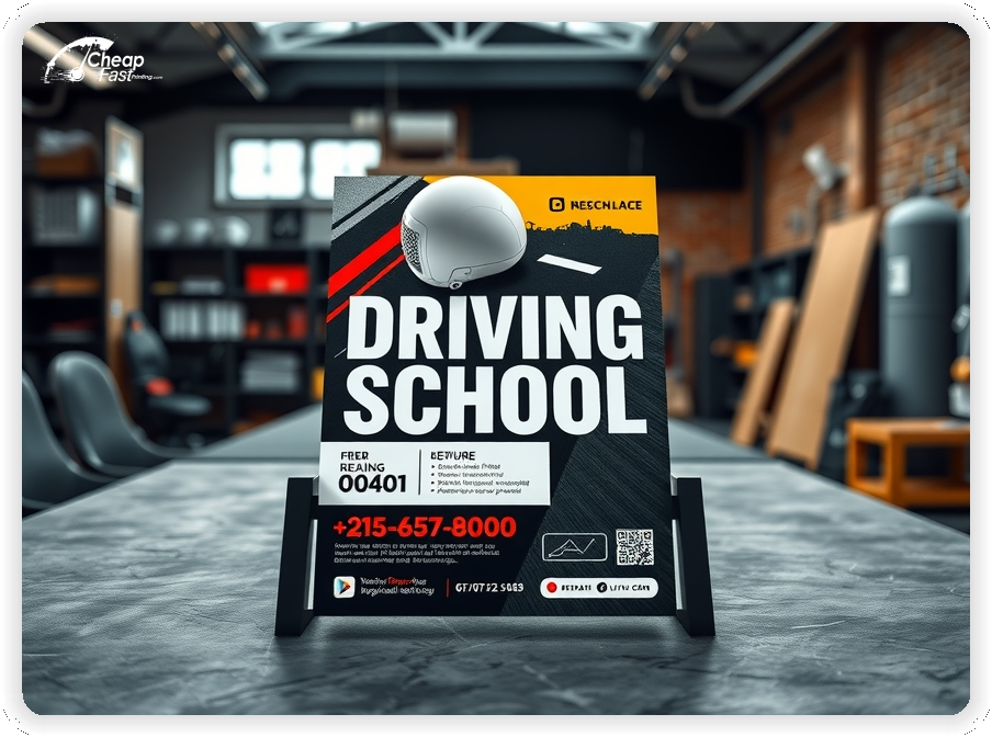
Every flyer should guide the reader to one action. A QR code that opens a short booking page reduces friction and improves follow-through.
Place the QR near a clear instruction line, such as “Scan to see dates and reserve a seat.” Keep the destination page focused and mobile-friendly.
If you track results, use different QR destinations for different placements so you can scale what works.
Most people do not enroll on first touch. They notice the message, remember it, and act later when timing becomes urgent.
Pick two to four reliable placement channels and restock them on a schedule. Consistency beats one massive drop with no follow-up.
For many programs, 1000 driving school flyers supports a steady restock loop without overprinting.
Parents want proof. Add one short line that signals legitimacy, then move details to the website.
Good trust cues include years in business, licensed instructors, DMV approval when applicable, or a simple rating line. Keep it short so it supports the offer instead of competing with it.
Use testimonials sparingly. One short quote can work, but multiple quotes usually create clutter.
Teens respond to energy and simplicity. Parents respond to structure, safety, and a clear plan.
Use one strong photo, a clean pricing block, and a calm safety note. Avoid slang and avoid overly aggressive urgency lines.
A balanced tone helps the flyer feel credible while still feeling modern.
Most flyers fail because pricing becomes a dense spreadsheet. Keep the list short, and highlight one recommended option.
Use simple labels like “Starter,” “Standard,” and “Complete.” If you need add-ons, list them as a short line beneath the packages, not as a separate table.
Make sure the call button and QR instruction remain visible even when the flyer is skimmed quickly.
Small layout errors can cut conversion. Avoid these common problems:
Fixing these usually increases response more than adding extra copy.
Use the front for the offer and CTA. Use the back for details that support decision confidence.
Good back-side content includes what to bring, how scheduling works, and what happens after enrollment. Keep each answer short and use bullets so it stays readable.
When the back supports the same offer, the piece feels cohesive and more trustworthy.
Most delays come from file issues. For driving school flyers printing, export a press-ready PDF, keep images at print resolution, and include proper bleed.
Leave safe margins around the QR and contact lines so trimming never cuts critical elements. If you use a dark photo, confirm text contrast so it stays readable.
Proofing is the final check that protects clarity and saves time.
Enrollment interest follows predictable rhythms. Build your print plan around the months when families are already thinking about schedules.
Keep one core layout and update only the date line and offer line so the flyer stays consistent and easy to recognize.
A placement loop works when it is simple and repeatable. Pick a short list of locations you can restock without friction.
When placements are consistent, bulk driving school flyers become a predictable channel instead of a one-off promotion.
Discounts work best when they feel limited and specific. Avoid vague lines like “cheap” or “lowest price” on the flyer itself.
Use a clean offer such as “New student intro package” or “Winter session special,” then keep terms on the landing page. That keeps the flyer readable while still creating urgency.
If you offer multiple discounts, rotate them across reorders instead of stacking them on one piece.
If you offer defensive driving, CDL prep, or adult lessons, add a short callout block. Keep it to one or two lines so it supports the main offer.
Use a consistent structure: program name, one benefit, then the same CTA. Readers should never wonder which action to take.
When programs are clear, you get fewer unqualified calls and more enrollments that match your schedule.
One good proof line can increase response. Use a short testimonial, a rating line, or a simple outcome statement if it is accurate.
Keep proof specific and brief. A long quote usually becomes a wall of text that nobody reads.
If you include statistics, keep them easy to understand and avoid tiny footnotes. The website can provide details for readers who want more context.
Flyers often fail because text is technically present but not readable in real settings. Use this quick checklist before ordering.
When these pass, distribution becomes easier because the piece works in busy environments.
Reorders are simplest when the design stays stable. Keep the same layout, change only the offer line, and update the schedule cue.
Use reorders to test one variable at a time, such as headline angle or package emphasis. Track QR scans or calls and keep a small log of what changed.
This approach builds a predictable system instead of a one-time campaign.
Mismatch creates drop-off. If the flyer says “Teen starter package,” the landing page should use the same name and show the same offer.
Keep the page short, mobile-friendly, and focused on booking. Add a short FAQ, show availability, and keep contact options clear.
When print and digital match, the flyer feels more trustworthy and enrollments come faster.
Different audiences react to different triggers, but the structure can stay the same. Teens respond to convenience and confidence. Parents respond to safety, structure, and a clear plan. Adult learners respond to flexibility and respectful messaging.
Keep one headline and one CTA, then adjust the supporting lines. For example, a teen-focused piece can highlight “after-school lessons” while a parent-focused version can highlight “licensed instructors” and “clear schedules.” For adult learners, mention evening slots and a simple booking flow.
When you keep the layout consistent and only adjust one or two lines, it is easier to test what performs without redesigning the entire flyer.
A flyer that feels structured earns trust faster. Use two fonts at most, keep headline weight bold, and keep body text readable. Avoid decorative fonts for pricing and date lines.
Use a simple hierarchy: headline, offer, trust cue, then CTA. Keep the offer block in a single colored panel so it is easy to locate. Use one accent color for the CTA and one neutral background for readability.
When you order custom driving school flyers, keep the brand elements consistent with the booking page so the experience feels seamless from print to signup.
Spacing is part of design. White space around the QR, contact line, and pricing block makes the piece look professional and reduces scanning errors.
If you can legitimately claim DMV approval, state licensing, or instructor certification, add one short line and stop there. The flyer is not the place for full legal wording.
Use clear, honest language such as “Licensed instructors” or “State-approved curriculum” only when accurate. If you need disclaimers, keep them on the landing page in a readable FAQ section.
Trust rises when claims are specific and modest. Overstated promises can reduce response because parents become skeptical.
Driving students and parents pass through predictable places. Partner stacks work best when the location matches the decision moment.
Ask for permission and restock consistently. Keep a small stack of driving school handouts at each partner so the message stays visible between events.
Measure the actions that lead to enrollments, not just impressions. Use a unique QR destination for each placement group, and use a short form that captures the first touch channel.
Track three numbers: scans or calls, booked lessons, and completed enrollments. If your conversion rate is stable, you can estimate how many pieces you need for the next session.
When ROI tracking is simple, it becomes easier to reorder confidently and stop spending on placements that do not produce real bookings.
Most campaigns improve with small, controlled changes. If response drops, start by refreshing the offer line, the date line, and the CTA label before changing everything.
Keep the same image, the same layout, and the same hierarchy. This preserves recognition while still giving you a new reason for families to act.
Use redesigns only when the layout is hard to read, the offer is unclear, or the brand has changed. Otherwise, a simple refresh run is usually faster and more effective.
Your flyer has about three seconds to earn attention. Make sure the promise and the CTA are visible at arm’s length.
Use one headline, one offer, and one action. Everything else is support.
If a reader cannot explain your offer after one quick glance, the layout is doing too much.
Results improve when distribution is measurable. Assign a unique QR destination or code to each channel so you can see which placements produce enrollments.
Scale the channels that produce bookings and stop restocking the ones that do not.
This creates a repeatable loop that makes printing decisions simple.
Upload artwork and keep the piece focused on one package, one schedule cue, and one clear QR action.
Proofing checks the details that affect response. It helps keep the flyer clean, readable, and error-free.
Consistent proofing supports smooth reorders and reduces last-minute corrections.
Use templates to keep margins, bleed, and safe zones consistent. A stable grid also makes it easier to update dates and offers without redesigning the full piece.
Templates help protect the QR area, pricing block, and contact lines so the final piece prints cleanly and remains easy to scan.

Loading Free Editable Designs...
Please wait while we prepare the template library.
The cheapest price is not always the best outcome. A clear design with crisp print quality often produces higher response because readers trust the piece.
Compare vendors by proofing support, color consistency, and turnaround reliability. When those stay stable, campaigns are easier to repeat and improve.
Use one clear headline, one offer, and one primary CTA (call, scan, or order). Add the essentials: phone, website/QR, service area, hours (if relevant), and a trust signal like years in business or a short review snippet.
Keep the layout scannable: one hero image or icon, short bullets, and high-contrast CTA text that’s readable at arm’s length.
Yes. 4.25" x 11" balances visibility and readability without feeling cramped. It gives enough space for a strong headline, a benefits list, and a CTA while staying easy to hand out or place on counters and boards.
Prioritize spacing and hierarchy over extra copy so the main message lands in 3–5 seconds.
100 lb. Gloss Book with Gloss affects how the flyer feels and how colors read. Gloss tends to boost color and photos, matte reduces glare and feels more premium for text-heavy layouts, and uncoated is great for writing on.
If your design uses lots of fine text, choose clarity and contrast first; paper upgrades won’t fix a crowded layout.
1000 works well when you want consistent visibility across multiple placements (counters, boards, partner locations, events) over a few weeks. Bulk also lowers unit cost so you can test a message and keep the winner running.
Track performance, then reprint the best offer instead of changing everything at once.
If price is your main hook, feature one simple offer (“ off” or “Starting at ) and keep the fine print minimal. If you have variable pricing, use a short value statement and send details to a landing page.
A clean offer + simple CTA typically outperforms a long price list.
Use a QR code to a dedicated landing page and add UTM tags for each route or partner. Track scans, form fills, and calls to identify the placements that actually convert.
For non-QR audiences, include a short, memorable URL or a trackable phone extension.
Start where your customers already are: complementary businesses, community boards, local events, and targeted neighborhoods. Ask partners for the most visible spot and refresh before your flyer gets buried.
Use a consistent route and restock winners; small, repeated placements usually beat one big drop.
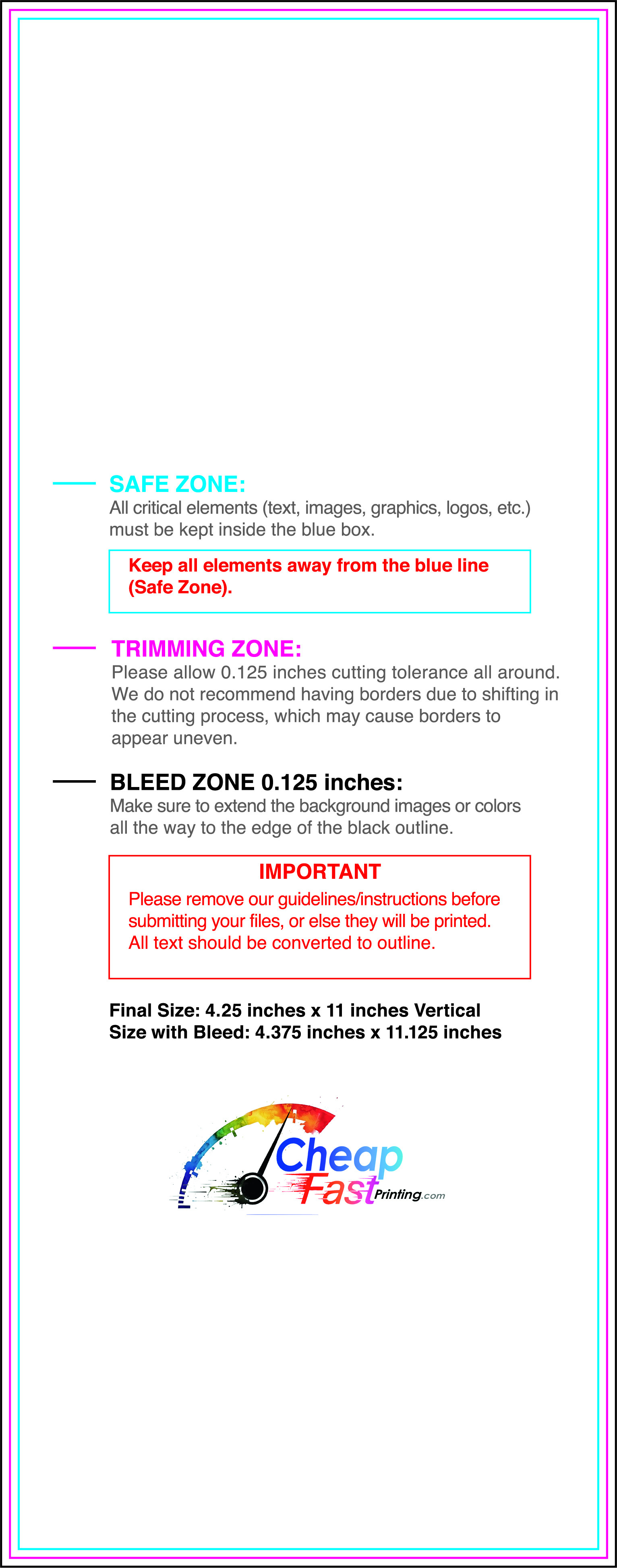
Submit a print-ready PDF (CMYK) at 300 DPI with 0.125" bleed and safe margins around important text. Keep thin lines above 0.5 pt and make QR codes at least ~0.8" square for reliable scanning.
Use vector logos when possible and limit your fonts to maintain a clean, professional look.
Request a proof so you can confirm spelling, margins, and QR/URL accuracy before production. Proofing is the easiest way to prevent expensive reprints.
Double-check phone numbers and offer terms first—those are the most common issues.
Match your flyer headline and offer to the landing page headline so visitors feel they’re in the right place. Keep the CTA consistent and make the page fast to load and easy to complete on mobile.
If you run ads, retarget QR visitors with the same offer to improve conversions.
Bulk runs work best when distribution is planned. Start with a route you can repeat weekly, then scale only after you see stable bookings.
Keep one base layout for reorders and rotate only the offer line when needed. This preserves recognition and makes tracking easier.

