
Professionally designed for 4.25" x 11" flyers. Fully editable & free!
Preparing Templates…
Carpenter Flyers win jobs when they make the next step easy: what you build, where you work, and how to get a fast estimate. This format is built for door-to-door drops, counter stacks, and contractor packets where clarity beats long copy.
Use a simple headline, 3 to 6 core services, and one CTA such as “Call for an estimate” or “Scan to request a quote.” Then use the QR destination to show project photos, reviews, and scheduling.
For repeat routes, keep the design consistent and rotate only the seasonal hook, offer, and service focus so recognition builds.
Lead with the work people hire you for: trim, cabinets, decks, framing, repairs, or finish carpentry. Then add one trust cue like “licensed and insured” or “free estimates.”
Keep the offer specific and simple: “spring deck refresh,” “kitchen cabinet upgrades,” or “same-week repair slots.”
Do not overcrowd the layout. A short list of services and a bold contact block converts better than a paragraph.

Great trade marketing is specific, scannable, and local. The goal is an estimate request, not a long read.
This structure keeps carpenter marketing materials clean and conversion-focused.
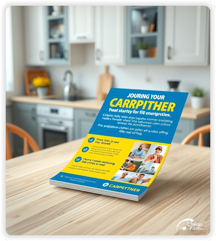
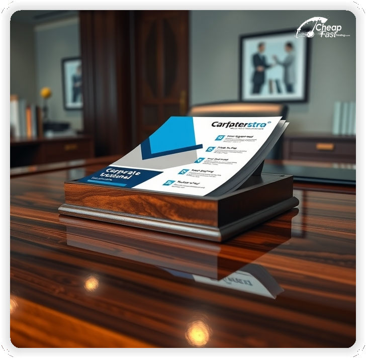
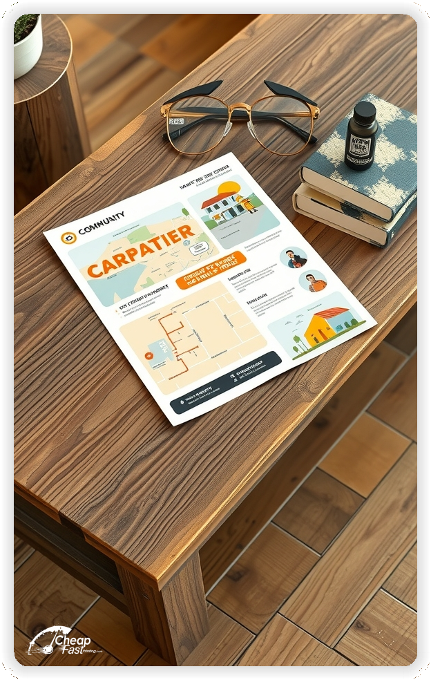
4.25x11 carpenter flyers give you room for a clear service list and a strong contact block without looking cluttered. The tall layout also stands out in door hang packets, clipboards, and counter stacks.
Use the top third for the headline and offer, the middle for services and proof, and the bottom for phone plus QR estimate request.
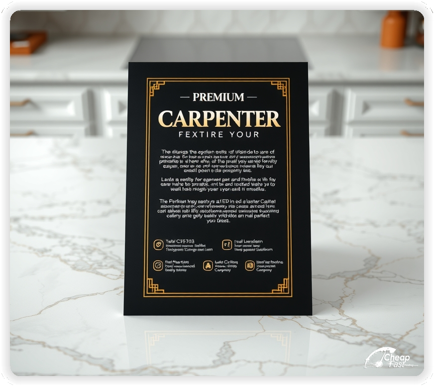
Trade flyers should feel durable. Kraft paper flyers look natural and job-site friendly, and the heavier 18pt stock holds up in tool bags, glove boxes, and counter stacks.
The kraft tone also pairs well with wood textures and clean black ink, making the piece feel premium even when the run is economical.
Make the offer specific to a common need: small repairs, trim refresh, cabinet upgrades, or a seasonal deck check. One clear hook makes response easier.
Keep terms short on the flyer and place details on the landing page so the piece stays clean.
Lead with the most in-demand work, then support with smaller items. Homeowners scan for relevance, so put the top service first.
Use bullets, not paragraphs. A short list reads faster on a porch or at a counter.
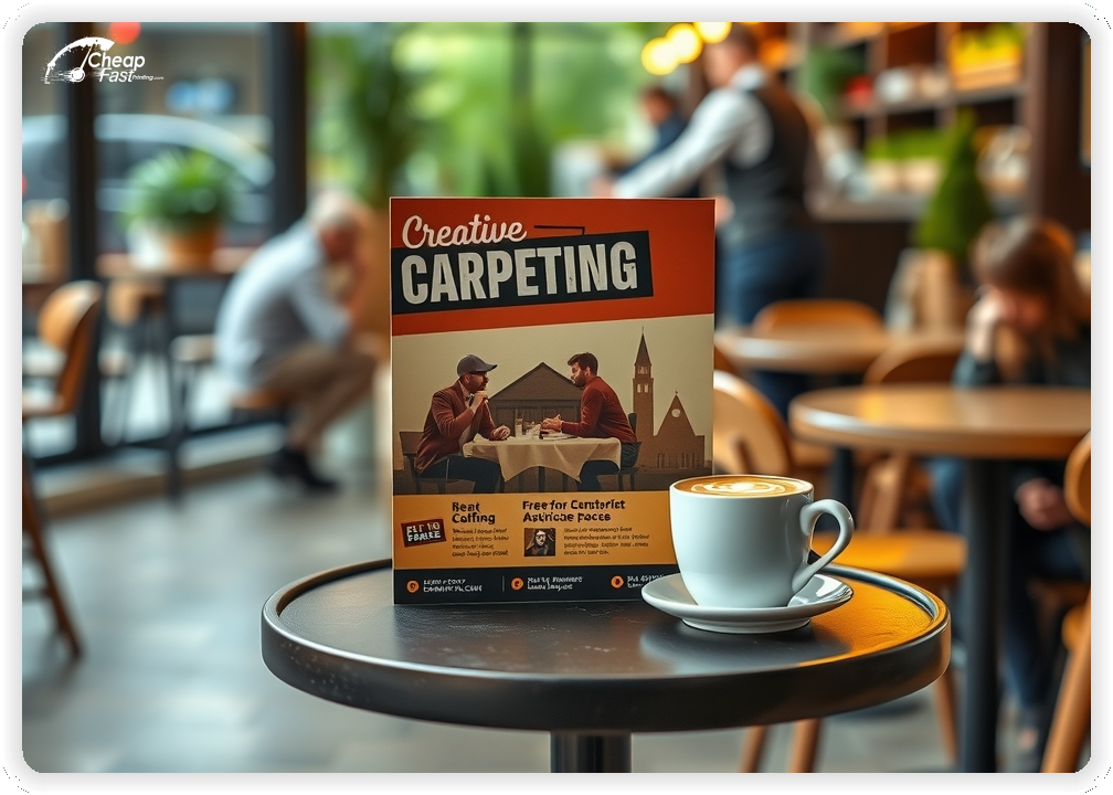
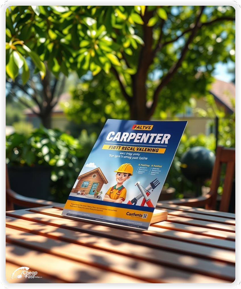
One strong before-and-after or finished detail photo can do more than a paragraph. If you can only show one image, choose a crisp, well-lit project that matches your headline.
Use the QR destination for the full gallery and reviews.
Use one short trust cue near the CTA: licensed and insured, warranty offered, or a review count. Keep it factual and readable.
These cues help carpenter flyers feel credible without adding heavy copy.
Be clear about where you work. List key neighborhoods, towns, or a radius so homeowners know you are a fit.
Local clarity reduces price shoppers and improves response quality.
Design does most of the work. Big type, strong spacing, and one clear image reads premium even on economical carpenter flyers.
Kraft stock supports that premium feel while keeping the piece practical for field distribution.
Place flyers where homeowners already think about projects: lumber yards, hardware stores, paint counters, flooring showrooms, and local suppliers.
This is where carpenter handouts get picked up with real intent.
Pick routes that match your best projects: older neighborhoods for trim and repair work, newer areas for decks and fences, and high-turnover areas for rental repairs.
Consistency beats one-off drops. Repeat the same route so recognition builds.
Use a QR code that leads to a short quote form with service type, address, and photo upload. That reduces back-and-forth and improves lead quality.
This is especially effective for carpenter flyers printing campaigns because the next step stays simple.
Spring and summer are strong for decks, fences, and exterior repairs. Fall is strong for interior trim and remodel planning. Winter is strong for indoor upgrades and repair work.
Keep one template and rotate the headline hook for each season.
Match the flyer headline and offer to your website and social post so people recognize you after the first touch.
Consistent branding across carpenter marketing materials improves follow-through from flyer to estimate.
Test two offers with the same design. Change only the offer line and track calls, texts, or QR scans by route.
Once you know what works, keep the design stable and scale distribution.
Bulk campaigns work best when you restock the same routes and partner placements. A larger run keeps your cost per piece stable while you refine the message.
For route-based drops, 1000 carpenter flyers is a practical starting point that is easy to measure and repeat.
Keep the message simple: what you do, where you work, and how to get an estimate. Avoid jargon and long paragraphs.
Save detailed process explanations for the landing page.
Use confident, straightforward language. Avoid hype. A clean layout and specific services signal professionalism.
That tone supports better leads and fewer price-only calls.
If you want repeat business, add one small line like “seasonal maintenance available” or “repeat-client priority scheduling.” Keep it short.
The flyer should still lead with the primary offer and CTA.
If you offer a workmanship warranty, mention it in one short line. Avoid long policy text.
Short, factual notes support trust without crowding the layout.
One line about local roots can improve trust, like “family owned” or “serving the area since 2012.” Keep it brief.
Use the landing page for the full story and portfolio.
Trade buyers judge quality quickly. A clean piece signals careful work and professional process. Kraft stock supports that handcrafted feel.
When the flyer looks intentional, more homeowners keep it long enough to call.
Print reaches people who are not actively searching today. Repeated exposure in the same neighborhoods creates familiarity before the project decision.
Pair the flyer with a fast estimate page so discovery turns into inquiries.
Use a direct CTA like “Call for a free estimate,” “Text photos for a quote,” or “Scan to request a bid.” Place the CTA next to the QR code.
One action, one destination, one outcome.
Use spacing to create hierarchy. Tall layouts can feel crowded if everything is the same size.
Keep copy short and let the headline and contact block do the heavy lifting.
If you serve both residential and commercial clients, mention it in one short line. Avoid listing every project type.
Use the landing page to qualify and route leads.
If you take subcontract work, add one line like “available for builder and GC partnerships.” Place it under your core services.
This supports B2B leads without diluting the homeowner message.
If you include photos on the flyer, limit it to one hero image and keep text off the photo. Use the QR destination for full galleries.
Clean visuals plus clear copy reads as premium.
Tell people what happens next: “call or text,” “same-week estimates,” or “2-day response.” Keep it realistic and short.
Clear expectations reduce no-shows and improve conversion.
Keep one template for repairs and one for remodel upgrades. Swap the offer line and service list as needed.
Repeatable templates keep your marketing consistent and easy to measure.
Refresh your headline by season instead of redesigning everything. Keep the contact block and branding stable.
Recognition improves response over time.
One short line helps: “Have measurements and photos ready” or “show the space and desired finish.” Keep it brief.
Use the landing page for a full prep checklist.
Use plain words and avoid heavy abbreviations. People should understand what you do in one quick read.
Clear language improves response for both homeowners and contractor partners.
Carpentry outreach works best when it creates one clear path from interest to estimate. Keep the headline bold, keep details short, and put the QR code where it is easy to find.
This is how bulk carpenter flyers stay effective without feeling spammy.
Your flyer has about 3 seconds to make an impression before it's tossed or kept. Don't bury the lead. Ensure your main headline and primary offer are visible from arm's length. Use high-contrast colors and bold typography to guide the eye exactly where you want it.
Target the Right Neighborhoods: Success isn't just about design; it's about distribution. Focus your efforts on neighborhoods that match your ideal customer profile. For local businesses, a tight radius around your location often yields the highest ROI.
Most people do not decide the moment they touch a flyer. They notice it, keep it, and act later when a project becomes urgent. Plan distribution like a routine: pick two to four tight neighborhoods and repeat the same loop so recognition builds.
Pair one primary route with two supporting placements like hardware counters, supplier stacks, and neighborhood boards. Use the same offer across placements and track each channel with a distinct QR destination.
Your flyer has about 3 seconds to make an impression before it's tossed or kept. Don't bury the lead. Ensure your main headline and primary offer are visible from arm's length. Use high-contrast colors and bold typography to guide the eye exactly where you want it.
Target the Right Neighborhoods: Success isn't just about design; it's about distribution. Focus your efforts on neighborhoods that match your ideal customer profile. For local businesses, a tight radius around your location often yields the highest ROI.
Upload artwork for custom carpenter flyers and keep the message focused on one offer and one clear estimate CTA.
Proofing checks trimming, contrast, and spacing so your offer and contact block stay readable. The most common mistakes are small, but expensive.
Confirm the QR destination loads fast on mobile and matches the flyer headline.
Use a consistent template so the headline, service list, and contact block stay in the same spot every run.
Templates speed up seasonal swaps and reduce proofing errors.
A stable grid keeps the QR and CTA aligned even when offers change.

Loading Free Editable Designs...
Please wait while we prepare the template library.
Simple pieces outperform crowded pieces because the service and contact block are obvious. Track response by calls, quote requests, and booked jobs from each route.
When the headline stays consistent, recognition improves and response becomes more predictable.
Use one clear headline, one offer, and one primary CTA (call, scan, or order). Add the essentials: phone, website/QR, service area, hours (if relevant), and a trust signal like years in business or a short review snippet.
Keep the layout scannable: one hero image or icon, short bullets, and high-contrast CTA text that’s readable at arm’s length.
Yes. 4.25" x 11" balances visibility and readability without feeling cramped. It gives enough space for a strong headline, a benefits list, and a CTA while staying easy to hand out or place on counters and boards.
Prioritize spacing and hierarchy over extra copy so the main message lands in 3–5 seconds.
18 pt. Premium Kraft with Gloss affects how the flyer feels and how colors read. Gloss tends to boost color and photos, matte reduces glare and feels more premium for text-heavy layouts, and uncoated is great for writing on.
If your design uses lots of fine text, choose clarity and contrast first; paper upgrades won’t fix a crowded layout.
1000 works well when you want consistent visibility across multiple placements (counters, boards, partner locations, events) over a few weeks. Bulk also lowers unit cost so you can test a message and keep the winner running.
Track performance, then reprint the best offer instead of changing everything at once.
If price is your main hook, feature one simple offer (“ off” or “Starting at ) and keep the fine print minimal. If you have variable pricing, use a short value statement and send details to a landing page.
A clean offer + simple CTA typically outperforms a long price list.
Use a QR code to a dedicated landing page and add UTM tags for each route or partner. Track scans, form fills, and calls to identify the placements that actually convert.
For non-QR audiences, include a short, memorable URL or a trackable phone extension.
Start where your customers already are: complementary businesses, community boards, local events, and targeted neighborhoods. Ask partners for the most visible spot and refresh before your flyer gets buried.
Use a consistent route and restock winners; small, repeated placements usually beat one big drop.
Submit a print-ready PDF (CMYK) at 300 DPI with 0.125" bleed and safe margins around important text. Keep thin lines above 0.5 pt and make QR codes at least ~0.8" square for reliable scanning.
Use vector logos when possible and limit your fonts to maintain a clean, professional look.
Request a proof so you can confirm spelling, margins, and QR/URL accuracy before production. Proofing is the easiest way to prevent expensive reprints.
Double-check phone numbers and offer terms first—those are the most common issues.
Match your flyer headline and offer to the landing page headline so visitors feel they’re in the right place. Keep the CTA consistent and make the page fast to load and easy to complete on mobile.
If you run ads, retarget QR visitors with the same offer to improve conversions.
Bulk works best when distribution is scheduled. Start with one repeatable loop, then expand after you know what converts.
Use bulk carpenter flyers for neighborhood routes, counter stacks, and partner placements so you do not run out mid-campaign.
Keep one base design, rotate the offer seasonally, and track QR scans or calls by channel.

