Professionally designed for 8.5" x 11" flyers. Fully editable & free!
Preparing Templates…
Real estate agents and lenders partner with title companies they trust to get the deal done. A professional flyer demonstrates your reliability, showcases your technology, and keeps your brand top-of-mind for the next contract.
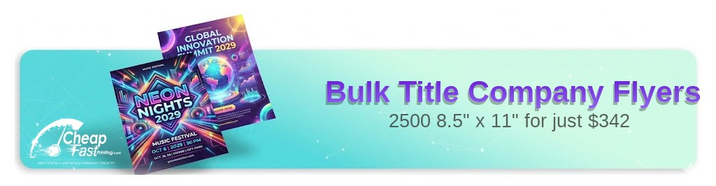
Ordering 2500 title company flyers in the standard 8.5x11 format provides ample space for fee comparisons, team photos, and digital tools. This size fits perfectly in closing folders and presentation packets.
Effective title company marketing materials do more than list services; they solve problems for agents. Your flyer should highlight speed, communication, and problem-solving capabilities.
When the print quality matches your service standards, you build the authority needed to win more escrows.
Lead with convenience. 'Closings Anytime, Anywhere' or 'Instant Net Sheets' are powerful hooks.
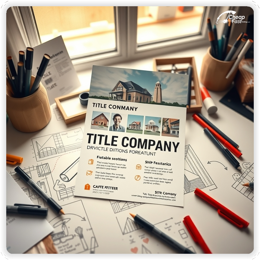
Showcase your team. Real estate is a relationship business; put faces to the names.
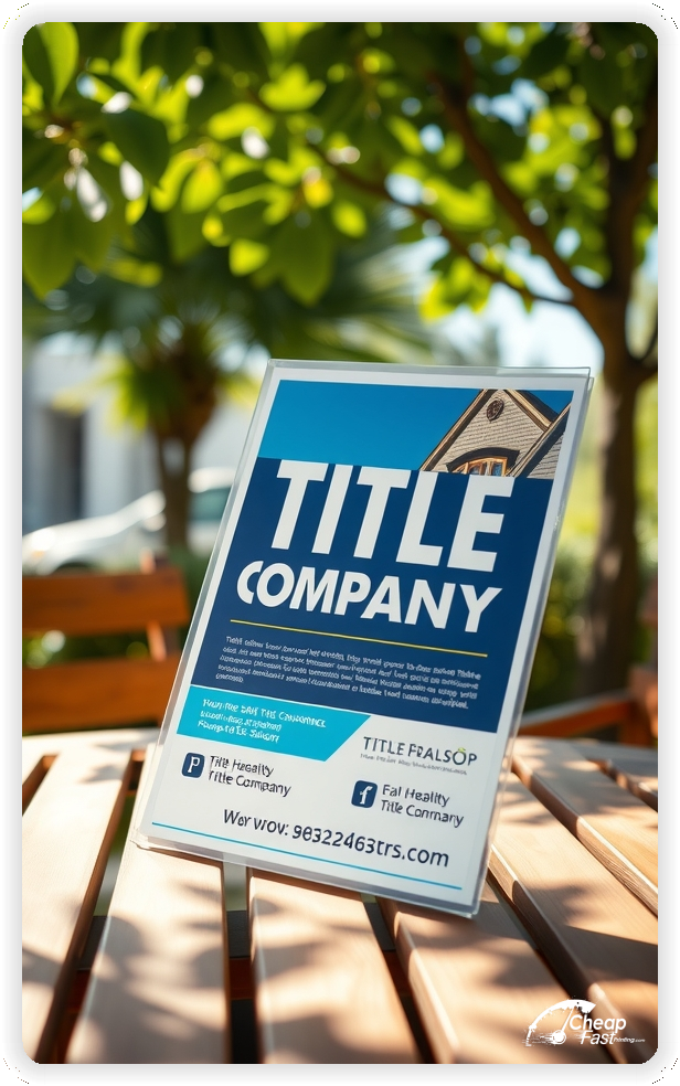
Use a clean, corporate layout that suggests precision and security, as you are handling significant funds.


These pieces must prove utility to the agent. They are looking for partners who make them look good to their clients.
This structure builds confidence and encourages the switch.
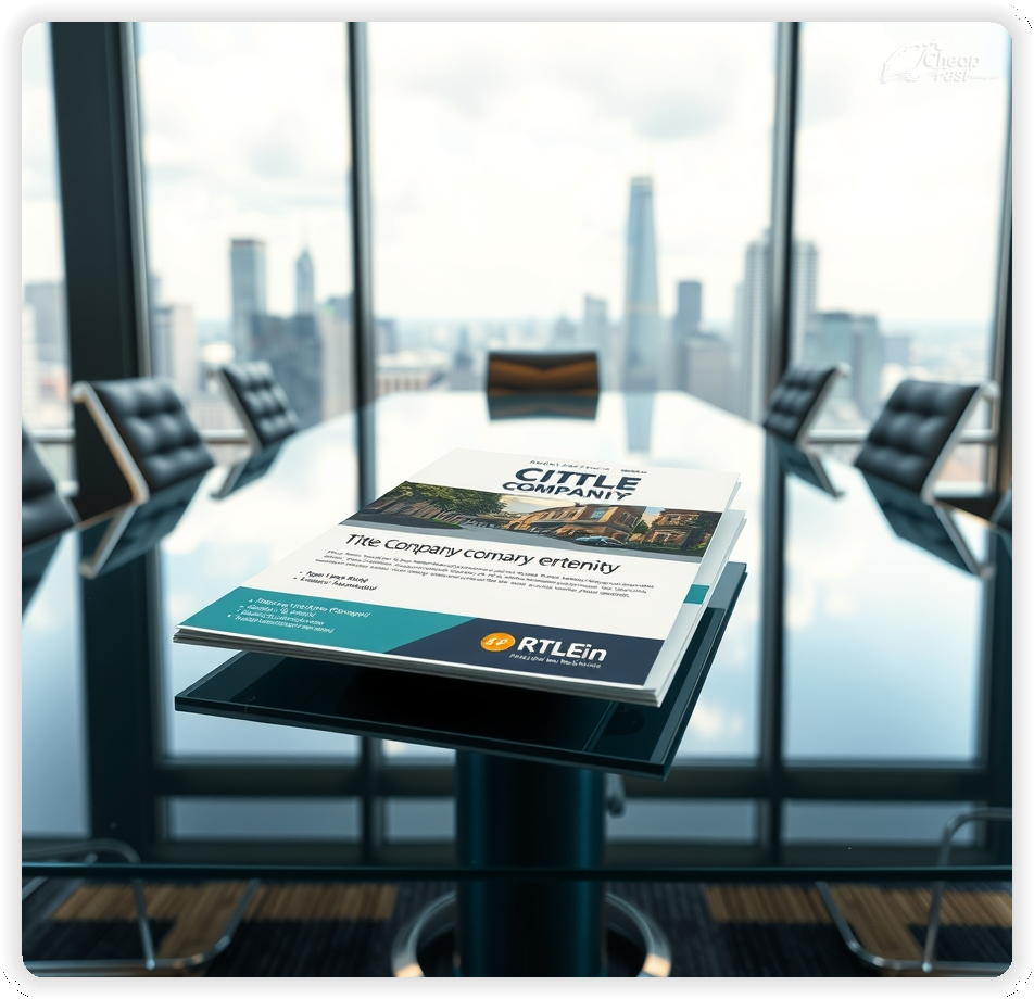
The 8.5x11 title company flyers format is the industry standard for rate sheets and new client packets. It allows for detailed information, such as fee schedules or fraud prevention tips, without clutter.
This size files easily into standard manila folders used by agents and transaction coordinators.
It also provides enough real estate for substantial before-and-after graphics or app screenshots.
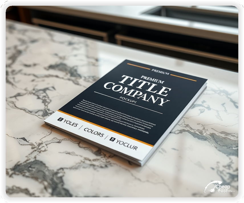
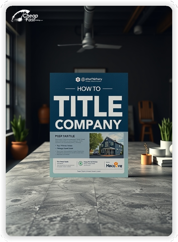
In the legal and financial world, image is everything. Glossy paper flyers offer a polished, high-end feel that distinguishes your brand from cut-rate competitors.
The gloss finish sharpens the details of your logo and team headshots.
Using 100lb cover stock ensures the flyer feels substantial, like a permanent resource rather than a disposable ad.
Agents love speed. Highlight your 'Seller Net Sheet App' or 'Mobile Deposit' features.
Use screenshots to show ease of use.
Tech-forward marketing positions you as a modern, efficient partner.
Transparency wins trust. Use the back of custom title company flyers to list your settlement fees clearly.
Include a comparison column if your rates are highly competitive.
This turns your flyer into a desktop reference tool for agents writing offers.
Convenience is king. Highlight 'Mobile Notaries' or 'Digital Closings'.
Show a map of your service area.
This addresses the agent's pain point of scheduling conflicts.
Safety is a major concern. Dedicate a section to your 'Wire Fraud Protection' guarantees.
List your certifications (SOC 2, ALTA Best Practices).
This reassures both the agent and the consumer.
Sales reps should drop title company handouts at real estate offices during sales meetings catering.
Leave stacks in mortgage lender lobbies.
Consistency in physical presence reinforces your commitment to the relationship.
Reduce friction. 'Scan to Open a New Order' links directly to your portal.
Keep the form simple.
This captures the business at the moment of decision.
Highlight experience. 'Meet Your Closing Team' with years of experience listed.
Personal connections drive title business.
Add value. 'The Title Process Explained' or 'Common Title Issues'.
This helps agents educate their first-time homebuyers.
Show accessibility. A clear map of your closing branches helps agents choose the most convenient spot.
List parking details if relevant.
Social proof matters. 'Why Top Agents Choose Us'.
Use quotes from recognizable local realtors.
Support the community. Use flyers to promote charity events or broker opens you are sponsoring.
This shows you are invested in the industry.
Ordering cheap title company flyers allows for broad distribution without breaking the marketing budget.
For aggressive market share growth, bulk title company flyers ensure every rep has ample supply.
Consistent monthly drops keep you top-of-mind.
Partner up. Co-branded flyers with mortgage loan officers can double your reach.
Ensure you stay RESPA compliant.
Financial stability. Mention your major underwriters (Fidelity, First American, etc.).
This signals that you have the backing to handle complex deals.
Expand your market. 'Se Habla Español' is a huge differentiator in many markets.
List the languages your team speaks.
Target the pros. 'Wholesale Rates for Investors' or 'Double Closing Specialists'.
Investors provide high-volume repeat business.
Readability acts as a trust signal. Use clean, serif or sans-serif fonts that look like legal documents.
Avoid overly decorative scripts.
Your flyer represents a secure legal transaction. High-quality title company flyers printing suggests attention to detail.
Flimsy paper can subconsciously suggest a lack of substance.
Invest in materials that match the gravity of the service.
Capture direct business. Create a 'FSBO Guide' flyer.
Help them understand why they need title insurance.
Use a direct CTA such as 'Get a Quote Today' or 'Download Our App'.
Make the phone number prominent.
Clear instruction leads to action.
Organize content. Use columns and bullet points for lists.
Keep white space to prevent the 'wall of text' effect.
A structured flyer suggests a structured closing process.
Go big. Highlight 'Commercial Division' capabilities.
This attracts higher-value transactions.
Specialized knowledge. Mention '1031 Exchange Intermediary' services.
This targets sophisticated investors.
Flyers work best when they solve a problem for the agent. Speed, accuracy, and communication are the pillars.
When the design communicates competence, the flyer can drive new order counts.
Pair print with email blasts for a cohesive campaign.
Your flyer has about 3 seconds to convey value to a busy agent. Don't use generic stock photos of keys. Ensure your main headline ('Closings in 15 Days') and primary offer are visible instantly. Use corporate colors (Blue/Grey/Green) to evoke financial stability.
Target the Right Offices: Success isn't just about design; it's about relationships. Hand deliver flyers to the top-producing offices in your county. Face-to-face drop-offs yield the highest ROI.
Upload your logo and fee sheet to create custom title company flyers that win agents.
Proofing checks contrast, trimming, and font sharpness so your fees are readable.
Proof review also confirms the QR destination and phone numbers so the flyer works without errors.
Confirm that the app download link loads fast.
Verify that office addresses are correct.
Check that the layout aligns evenly after trimming.
Confirm that legal disclaimers are present.
Use the 8.5x11 template to keep margins consistent and reserve space for fee tables.
Templates also protect the layout so regulatory updates do not break alignment.
Consistent spacing keeps contact details visible after trimming.
A stable grid helps marketing teams update rates without redesigns.
Consistent templates also support multi-branch updates with minimal editing.
They also preserve alignment for QR placement and headshot sizing.
It also keeps headers aligned across residential and commercial campaigns.
Loading Free Editable Designs...
Please wait while we prepare the template library.
Focused layouts outperform crowded pieces because the value prop is clearer.
Consistent templates reduce design time and keep the corporate identity strong.
Compare response by new orders opened and agent feedback rather than only print cost.
When the brand stays consistent, agents trust the escrow officers and refer with confidence.
Tracking orders by sales rep helps refine the next quarter's spend.
Review app downloads to understand which tools generate the best engagement.
Use one clear headline, one offer, and one primary CTA (call, scan, or order). Add the essentials: phone, website/QR, service area, hours (if relevant), and a trust signal like years in business or a short review snippet.
Keep the layout scannable: one hero image or icon, short bullets, and high-contrast CTA text that’s readable at arm’s length.
Yes. 8.5" x 11" balances visibility and readability without feeling cramped. It gives enough space for a strong headline, a benefits list, and a CTA while staying easy to hand out or place on counters and boards.
Prioritize spacing and hierarchy over extra copy so the main message lands in 3–5 seconds.
100 lb. Gloss Cover with Gloss affects how the flyer feels and how colors read. Gloss tends to boost color and photos, matte reduces glare and feels more premium for text-heavy layouts, and uncoated is great for writing on.
If your design uses lots of fine text, choose clarity and contrast first; paper upgrades won’t fix a crowded layout.
2500 works well when you want consistent visibility across multiple placements (counters, boards, partner locations, events) over a few weeks. Bulk also lowers unit cost so you can test a message and keep the winner running.
Track performance, then reprint the best offer instead of changing everything at once.
If price is your main hook, feature one simple offer (“ off” or “Starting at ) and keep the fine print minimal. If you have variable pricing, use a short value statement and send details to a landing page.
A clean offer + simple CTA typically outperforms a long price list.
Use a QR code to a dedicated landing page and add UTM tags for each route or partner. Track scans, form fills, and calls to identify the placements that actually convert.
For non-QR audiences, include a short, memorable URL or a trackable phone extension.
Start where your customers already are: complementary businesses, community boards, local events, and targeted neighborhoods. Ask partners for the most visible spot and refresh before your flyer gets buried.
Use a consistent route and restock winners; small, repeated placements usually beat one big drop.
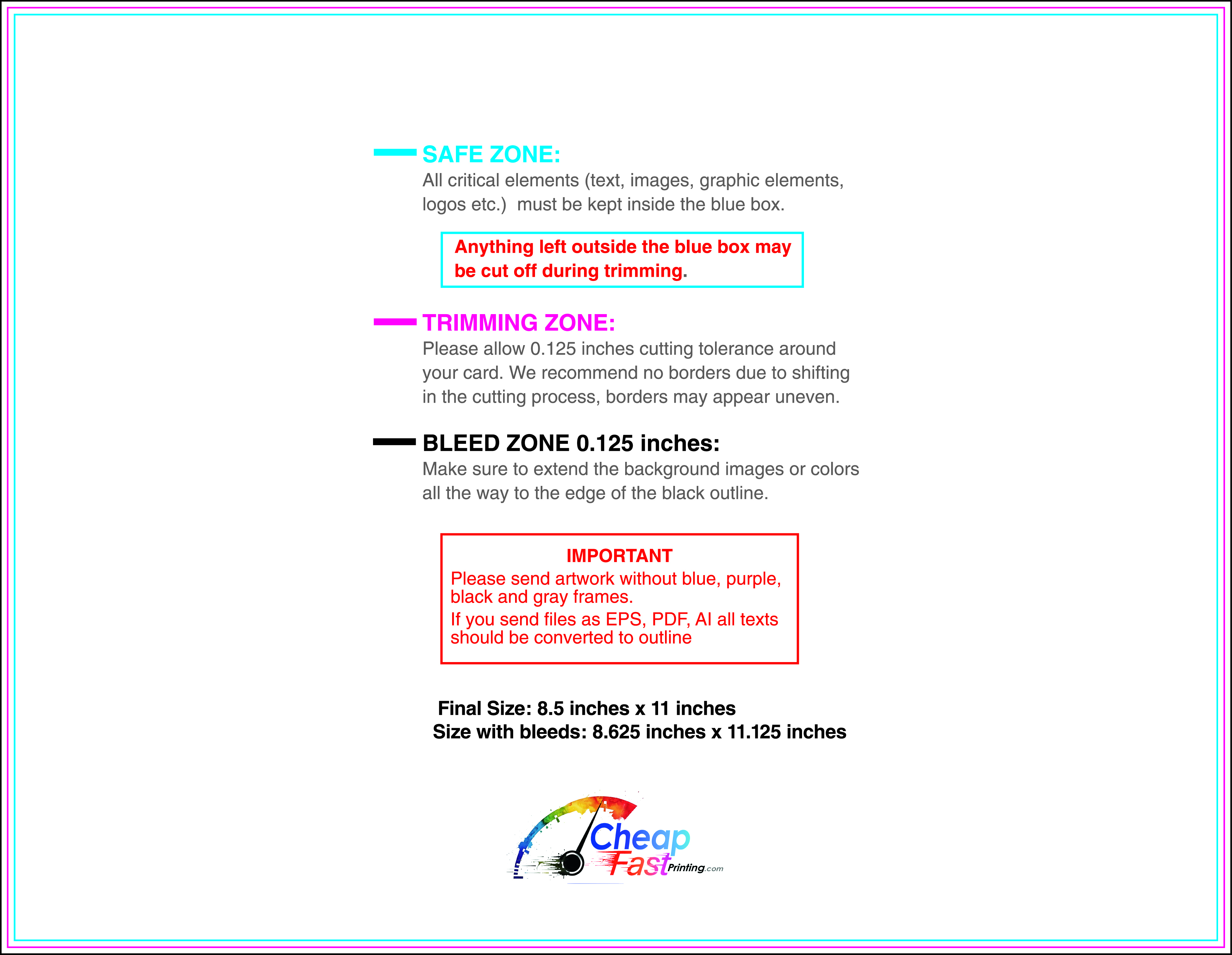
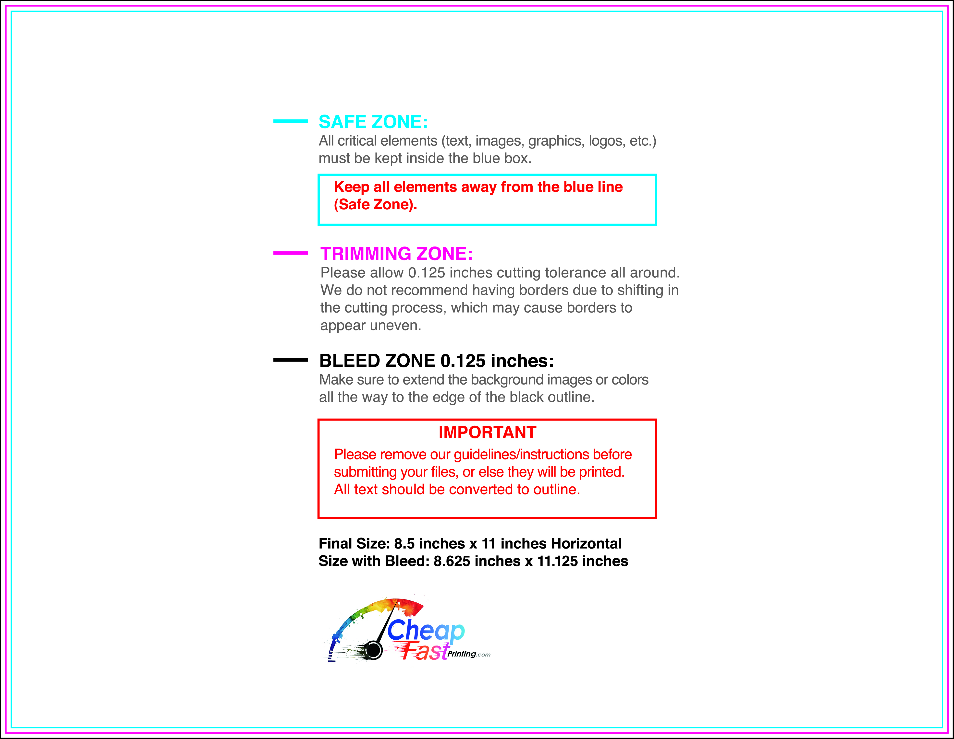
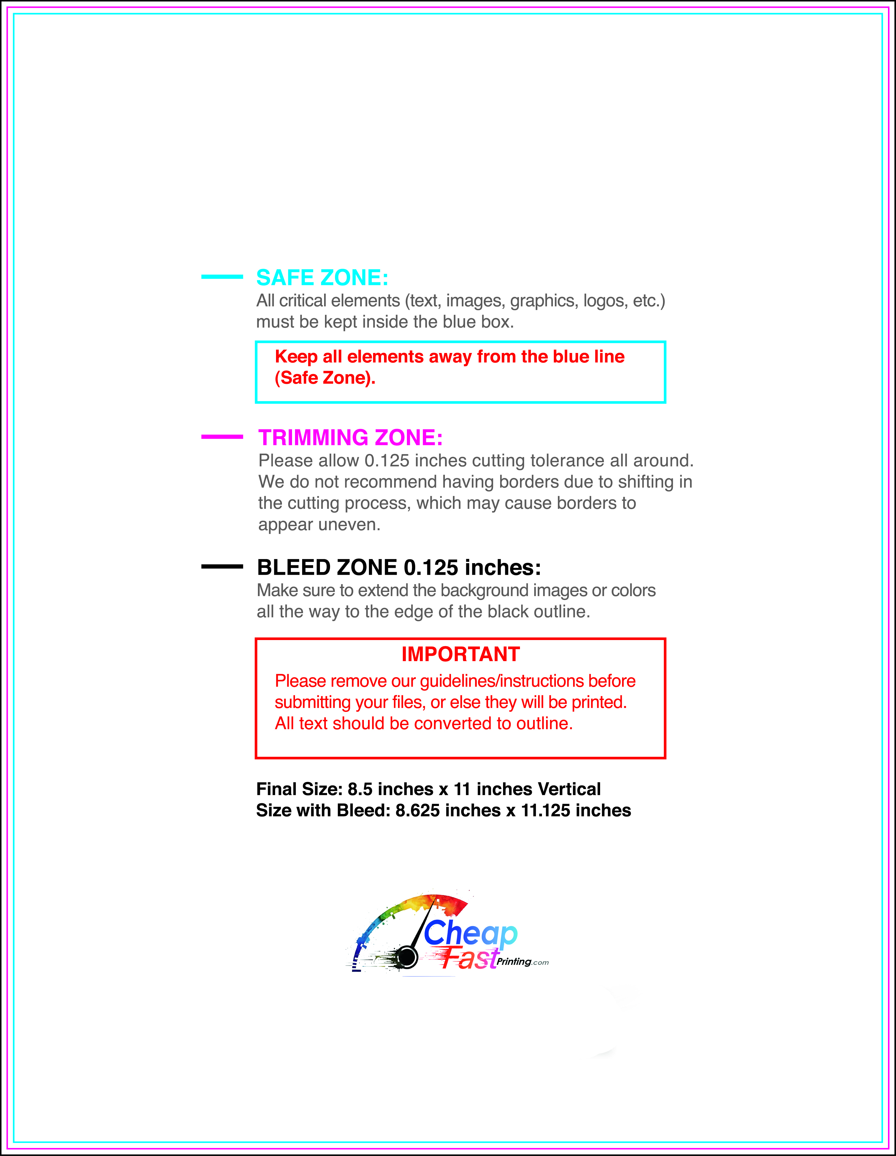
Submit a print-ready PDF (CMYK) at 300 DPI with 0.125" bleed and safe margins around important text. Keep thin lines above 0.5 pt and make QR codes at least ~0.8" square for reliable scanning.
Use vector logos when possible and limit your fonts to maintain a clean, professional look.
Request a proof so you can confirm spelling, margins, and QR/URL accuracy before production. Proofing is the easiest way to prevent expensive reprints.
Double-check phone numbers and offer terms first—those are the most common issues.
Match your flyer headline and offer to the landing page headline so visitors feel they’re in the right place. Keep the CTA consistent and make the page fast to load and easy to complete on mobile.
If you run ads, retarget QR visitors with the same offer to improve conversions.
Plan a steady supply for sales rep routes and office lobbies. Short runs allow rate updates without waste.
Predictable inventory supports stronger sales team confidence.
Track which reps drive the most flyer-based orders and replenish their stock.
Use title company flyers printing services to keep your team equipped.
Balance monthly newsletters and rate sheet distributions to keep the pipeline full.
Use new agent packets for recruiting.
For annual conferences, bulk title company flyers provide the volume needed to saturate the event.

