
Professionally designed for 3.5" x 8.5" flyers. Fully editable & free!
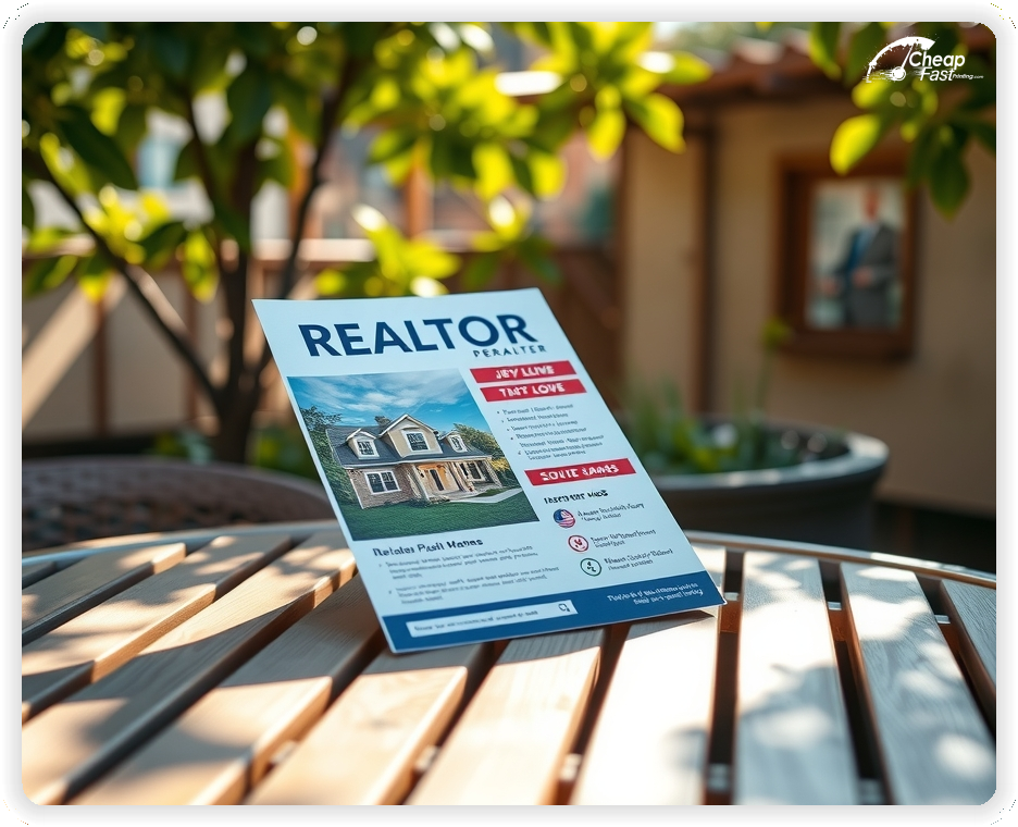
Buyers and sellers want quick clarity. A focused flyer highlights the property, the price range, and the next step to schedule a showing.
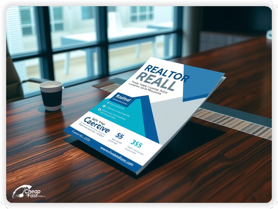
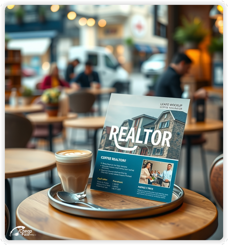
The 3.5x8.5 format keeps the message concise while leaving space for a hero photo, key specs, and a clean QR to the listing.
Great realtor marketing materials pair print visibility with a fast mobile landing page so prospects act quickly.
When the layout feels polished and simple, the listing looks more professional and trustworthy.
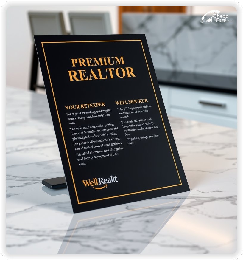
Securing a run of 2500 3.5" x 8.5" flyers provides an excellent foundation for your property marketing campaigns. Whether you are announcing a new listing or farming a neighborhood, having a substantial supply of high-quality handouts ensures you never miss an opportunity to connect with potential clients.
This package utilizes our premium 100 lb. Gloss Cover printing process. This stock is specifically chosen for its ability to render vibrant property photos while maintaining a professional feel in hand. It offers the perfect balance of durability and cost-effectiveness, making it a staple for successful agents.
For agents focused on listing flyer printing, consistency is key. A steady stream of branded materials builds recognition in your farm area. Every interaction counts, and having a professional card to leave behind ensures your name stays top-of-mind with homeowners.
When looking for cheap bulk flyers that don't compromise on quality, volume is your ally. Ordering 2500 qty allows you to saturate a target market effectively. Our pricing model is designed to support high-volume distribution strategies, ensuring you get the best possible return on your marketing investment.
To truly succeed in your farm area, real estate flyer printing strategies must rely on frequency and reach. By maintaining a consistent presence in your target neighborhoods, you establish authority and trust. These compact cards are perfect for regular updates, market stats, or simply introducing yourself to new residents.
These handouts serve as powerful takeaways for open house flyers, giving visitors a tangible reminder of the property details long after they have left the viewing. The gloss finish helps highlight architectural details and curb appeal, ensuring the property looks its best in print.
As essential realtor marketing materials, these cards are designed for versatility. Use them for door knocking, direct mail inserts, or local business partnerships. Their compact size makes them easy to distribute and easy for recipients to keep.
If you are on a tight schedule, our fast shipping flyers 3.5" x 8.5" options ensure you have your materials ready exactly when your campaign launches. We prioritize speed without sacrificing the quality your brand relies on, so you can meet your market deadlines with confidence.
Lead with one listing or one neighborhood focus. A single property or price tier converts better than a long list.
Keep the call to action short and place it near the listing details so the path is obvious.
Use strong contrast and a readable font so the key specs stay clear at a glance.


These flyers must make the property feel easy to understand and easy to tour. Buyers and sellers respond best to a clear headline and a direct next step.
This structure keeps the message clear and action ready.
3.5x8.5 realtor flyers keep the listing message tight and easy to scan.
This size gives enough room for a hero photo, a short property summary, and a QR that leads to the full listing.
Use the top third for the headline, the middle for specs, and the bottom for the CTA and contact line.
As compact realtor handouts, this format works well for open houses and counter stacks.
Sharp imagery and clean typography perform best for listings. Glossy paper flyers protect photo detail and keep colors accurate.
100lb gloss cover stock adds durability for open house tables and listing packets.
Use high contrast panels to keep the price and contact line readable.
A clean finish elevates the presentation without adding extra copy.
A focused offer removes hesitation. Examples include a weekend open house, a virtual tour, or a same-day showing window.
Keep the offer line short and move details to the listing page so the flyer remains clean.
Clear offers improve response because buyers understand the next step.
Details must be easy to scan. Use a clean line for beds, baths, and square footage.
Keep the price range visible and add one standout feature, such as a renovated kitchen or large yard.
Readable listing details increase calls because the basics are clear at a glance.
Choose one primary focus for each flyer, such as a starter home, luxury listing, or investor property.
This keeps the message specific and helps buyers self-select quickly.
Focused positioning improves inquiries and supports stronger showing conversion.
Buyers and sellers want confidence fast. A short line about experience, neighborhoods served, or sales volume builds trust.
Keep credentials brief and avoid a long bio. The landing page can provide full agent details.
A short trust line near the CTA supports decision confidence without clutter.
Location clarity improves response. Add a short line about commute routes, school zones, or nearby amenities.
Keep the note brief so the listing details remain the main focus.
Clear access notes reduce questions and support higher showing rates.
Financing options can be summarized in one line, such as “pre-qualification welcome.”
Keep detailed terms on the listing page so the flyer remains easy to scan.
This approach keeps the message clear while still signaling accessibility.
Open houses are strong for seasonal demand. Use a short callout for date and time.
Keep dates short and direct readers to the listing page for full details.
Event callouts add urgency while keeping the listing message visible.
Place flyers at coffee shops, local businesses, and neighborhood boards with permission.
Ask front desks for the most visible spots and refresh placements when boards rotate.
Consistent placement supports awareness and brings steady inquiries for showings.
Each flyer should lead to one action. A QR code to a mobile listing page reduces friction.
Keep the landing page focused on photos, key specs, and a simple showing request form.
This flow converts better than long pages because it keeps the decision path clear.
Interest rises during spring listings, summer relocations, and fall school transitions.
Plan a primary run for each peak season and a smaller follow-up run to keep momentum.
When inventory changes quickly, fast shipping supports a timely campaign refresh.
Match the flyer headline and price range to the listing page to reduce confusion.
Use the same feature highlights so the experience feels aligned.
Consistent messaging across print and digital improves conversion because buyers see one clear story.
Test two CTAs with the same layout to identify the best response.
Change only the offer line and track QR scans or calls by placement.
Once a winner is clear, scale with cost-efficient runs to keep expenses controlled.
For high-demand months, larger batches keep the offer consistent across all locations.
Teams with multiple agents benefit from consistent templates and localized listing details.
Use shared print specs to keep branding aligned across offices while adjusting local listings.
For large campaigns, 2500 realtor flyers support consistent reach without production delays.
Consistent visuals help neighbors recognize the team quickly.
First-time buyers need clear guidance. Use one line that explains how to book a showing or request info.
Keep the text short, and link to a full FAQ on the listing page.
This reduces hesitation and supports smoother showings.
Use language that reflects the listing, such as modern, family friendly, or luxury.
Keep tone consistent across the headline and CTA so the piece feels cohesive.
Aligned tone helps the flyer feel authentic and builds a stronger brand impression.
Use a short reminder line such as “curious about your home value?” or “thinking about selling soon?”
Do not add a full list of services. The goal is to encourage a quick reply.
Follow-up messaging supports steady referrals without overshadowing the listing offer.
Safety and clarity remain important for many buyers. A short line about appointment-only showings improves confidence.
Keep the note brief and place it near the trust line.
Short safety notes support decisions without requiring a long policy list.
Realtors often stand out through local knowledge. A short line about neighborhood expertise builds connection.
Keep it to one line and allow the listing page to tell the deeper story.
This creates a sense of trust without heavy copy.
Listings rely on crisp visuals. Realtor flyers printing should keep lines sharp and colors accurate for photos.
When the piece looks polished, the listing feels more professional and trustworthy.
High-quality print also helps a simple design look intentional rather than sparse.
Many buyers discover listings through neighborhood boards or partner businesses. A clear flyer supports discovery when digital ads miss local foot traffic.
For local outreach, steady print runs keep distribution consistent across weeks.
This supports awareness while the listing page captures the action.
Use a friendly CTA such as “Schedule a showing” or “View the listing.”
Keep the CTA short and place it near the property details so the next step is visible.
Clear CTAs help readers decide quickly and support higher response rates.
Spacing matters in listing marketing. Use generous margins around the photo and specs block.
Keep text blocks short and separate them with simple dividers.
A balanced layout keeps attention on the listing and makes the piece feel refined.
Private showings attract buyers who want flexibility. A short line such as “private showings available” adds value without overwhelming the main offer.
Keep details on the listing page so the flyer remains focused on the property.
This message supports premium listings while keeping the CTA clear.
Investor and relocation buyers can be a growth channel. A short line about rental potential or commute access signals flexibility.
Use a brief callout and direct inquiries to a dedicated contact form.
This adds a business-friendly option without crowding the primary listing message.
Agents can include a short line about certifications or years in market.
Keep the details on a separate landing page and let the flyer serve as an introduction.
This adds depth to the agent profile and builds credibility with serious buyers.
If slots fill quickly, mention limited capacity and recommend booking ahead.
Use a short line such as “appointment suggested for peak times.”
This sets expectations and helps reduce scheduling friction.
Some listings benefit from a short amenities line, such as “updated kitchen” or “private yard.”
Keep the focus on the main specs and use the amenities note as a secondary detail.
This supports interest without shifting the primary message away from the listing.
Short status updates can refresh attention. Use a short line such as “new price” or “back on market.”
Keep dates and details on the listing page to preserve flyer clarity.
Status messaging can improve repeat visits and long-term interest.
Buyers often want to know what to expect. A short line about arrival time or check-in can reduce anxiety.
Keep guidance brief and place it near the CTA so it reads as part of the visit flow.
This small detail supports higher showing attendance and fewer last-minute cancellations.
Inclusive language makes a listing feel welcoming to a wider audience. A short note about accessibility features helps buyers feel comfortable.
Keep the note short and avoid long explanations on the flyer.
Clear inclusivity messaging supports broader interest and encourages showings.
Flyers work best when they create one clear path from interest to contact. A bold headline, visible specs, and a short CTA are enough.
When the layout stays focused, the flyer supports realtor marketing materials without heavy copy.
Pair print with a short listing page and keep the message aligned for a consistent experience.
Your flyer has about 3 seconds to make an impression before it's tossed or kept. Ensure your main headline and hero photo are visible from arm's length.
Target the Right Neighborhoods: Success isn't just about design; it's about distribution. Focus on neighborhoods that match your ideal buyer profile for higher ROI.
Most prospects do not decide the moment they touch a flyer. They notice, they remember, and they act later when the timing is right. For listing marketing, plan distribution like a routine instead of a single drop. Pick two to four tight neighborhoods, repeat every two to three weeks, and keep the headline consistent so recognition builds.
Pair one primary route with two supporting placements. A counter stack at a related business, a community board, or a partner location creates extra touches. Use the same offer across all placements and track the channel with a distinct QR destination. When you know where leads come from, you can scale the winning route and stop printing flyers that are not producing calls.
Your flyer has about 3 seconds to make an impression before it's tossed or kept. Ensure your main photo, price line, and CTA are visible from arm's length.
Target the Right Neighborhoods: Focus on neighborhoods that match your ideal buyer profile for higher response.
Upload artwork and keep the focus on one property and one CTA for custom realtor flyers.
Proofing checks contrast, trimming, and spacing so the photo and CTA remain clear.
Proof review also confirms the QR destination and contact lines so the flyer works without errors.
Confirm that the listing page loads quickly on mobile so buyers can request a showing.
Verify that the address and price line remain clear at arm’s length.
Check that the photo crop aligns evenly after trimming.
Confirm that contact lines remain aligned and do not wrap on narrow displays.
Use the 3.5x8.5 template to keep margins consistent and reserve space for photo and CTA blocks.
Templates also protect the photo crop so updates do not break alignment.
Consistent spacing keeps contact details visible after trimming and supports quick approvals.
A stable grid helps agents update listings without redesigns.
Consistent templates also support multi-listing updates with minimal editing.
They also preserve alignment for QR placement and phone lines across every run.
It also keeps headers aligned across new listing updates cleanly.

Loading Free Editable Designs...
Please wait while we prepare the template library.
Focused layouts outperform crowded pieces because the property details stay visible.
Consistent templates reduce design time and keep the message aligned across listings.
Compare response by calls, showing requests, and offers rather than only print cost.
When the message stays consistent, buyers recognize the listing faster and act with less hesitation.
Tracking scans by placement helps refine the next print cycle.
Review scan-to-showing ratios to understand which placements generate the best conversions.
Affordable realtor flyers can still look premium when the layout stays clean and photo-first.
Use one clear headline, one offer, and one primary CTA (call, scan, or order). Add the essentials: phone, website/QR, service area, hours (if relevant), and a trust signal like years in business or a short review snippet.
Keep the layout scannable: one hero image or icon, short bullets, and high-contrast CTA text that’s readable at arm’s length.
Yes. 3.5" x 8.5" balances visibility and readability without feeling cramped. It gives enough space for a strong headline, a benefits list, and a CTA while staying easy to hand out or place on counters and boards.
Prioritize spacing and hierarchy over extra copy so the main message lands in 3–5 seconds.
100 lb. Gloss Cover with Gloss affects how the flyer feels and how colors read. Gloss tends to boost color and photos, matte reduces glare and feels more premium for text-heavy layouts, and uncoated is great for writing on.
If your design uses lots of fine text, choose clarity and contrast first; paper upgrades won’t fix a crowded layout.
2500 works well when you want consistent visibility across multiple placements (counters, boards, partner locations, events) over a few weeks. Bulk also lowers unit cost so you can test a message and keep the winner running.
Track performance, then reprint the best offer instead of changing everything at once.
If price is your main hook, feature one simple offer (“ off” or “Starting at ) and keep the fine print minimal. If you have variable pricing, use a short value statement and send details to a landing page.
A clean offer + simple CTA typically outperforms a long price list.
Use a QR code to a dedicated landing page and add UTM tags for each route or partner. Track scans, form fills, and calls to identify the placements that actually convert.
For non-QR audiences, include a short, memorable URL or a trackable phone extension.
Start where your customers already are: complementary businesses, community boards, local events, and targeted neighborhoods. Ask partners for the most visible spot and refresh before your flyer gets buried.
Use a consistent route and restock winners; small, repeated placements usually beat one big drop.
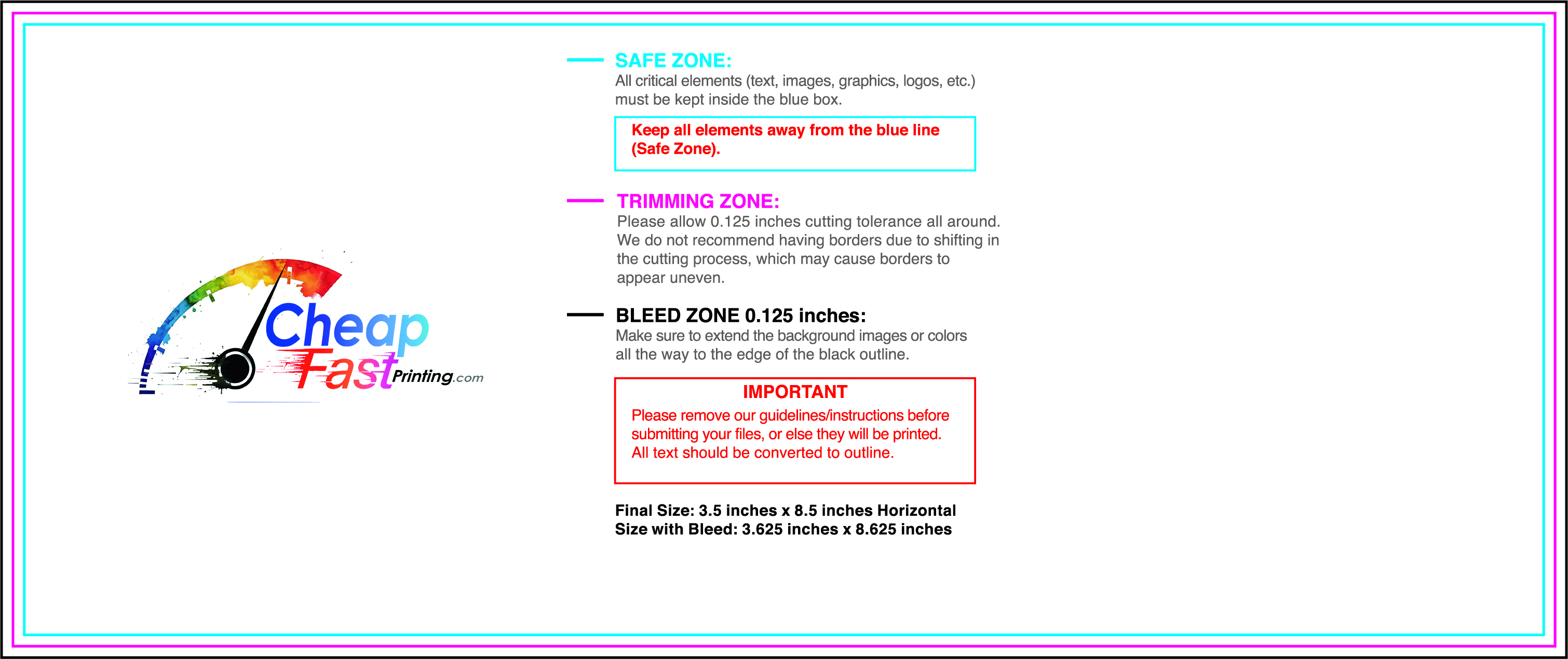
Submit a print-ready PDF (CMYK) at 300 DPI with 0.125" bleed and safe margins around important text. Keep thin lines above 0.5 pt and make QR codes at least ~0.8" square for reliable scanning.
Use vector logos when possible and limit your fonts to maintain a clean, professional look.
Request a proof so you can confirm spelling, margins, and QR/URL accuracy before production. Proofing is the easiest way to prevent expensive reprints.
Double-check phone numbers and offer terms first—those are the most common issues.
Match your flyer headline and offer to the landing page headline so visitors feel they’re in the right place. Keep the CTA consistent and make the page fast to load and easy to complete on mobile.
If you run ads, retarget QR visitors with the same offer to improve conversions.
Plan a steady supply for open houses and partner locations. Short runs allow listing updates without waste.
Predictable timing supports stronger inquiry response and keeps the message current.
Track which locations drive the most QR scans and prioritize restocks there.
Use smaller top-up runs to match inventory changes without redesigning the layout.
Balance weekly and monthly distributions to keep coverage consistent.
Use distribution logs to identify boards that perform well and retire low-response locations.
For seasonal pushes, bulk realtor flyers keep inventory ready while you scale.

