Professionally designed for 8" x 8" flyers. Fully editable & free!
Preparing Templates…
In the competitive field of optometry, visibility is everything. With a massive campaign of 10000 professional prints, you can saturate your local market, ensuring that when residents need an exam or new glasses, your practice is the first one they call.
These quick turnaround handouts are printed on professional 80lb matte text paper, offering a glare-free, easy-to-read finish that is perfect for conveying medical information and premium offers. The unique 8x8 square format stands out in the mail and on bulletin boards, commanding attention.
Whether you are promoting a back-to-school special or a senior vision seminar, our bulk printing service provides the reach and quality you need to grow your patient base.
Trust is the currency of healthcare. Your eye care marketing materials should reflect professionalism and care. The matte finish of these pieces feels sophisticated and clinical (in a good way), avoiding the 'junk mail' shine of cheaper alternatives.
Use the 8x8 space to balance educational content (like '5 Signs You Need an Exam') with a strong offer. This 'give and get' approach builds authority while driving appointments.
To maximize conversion, your custom eye care flyers should follow a proven structure:
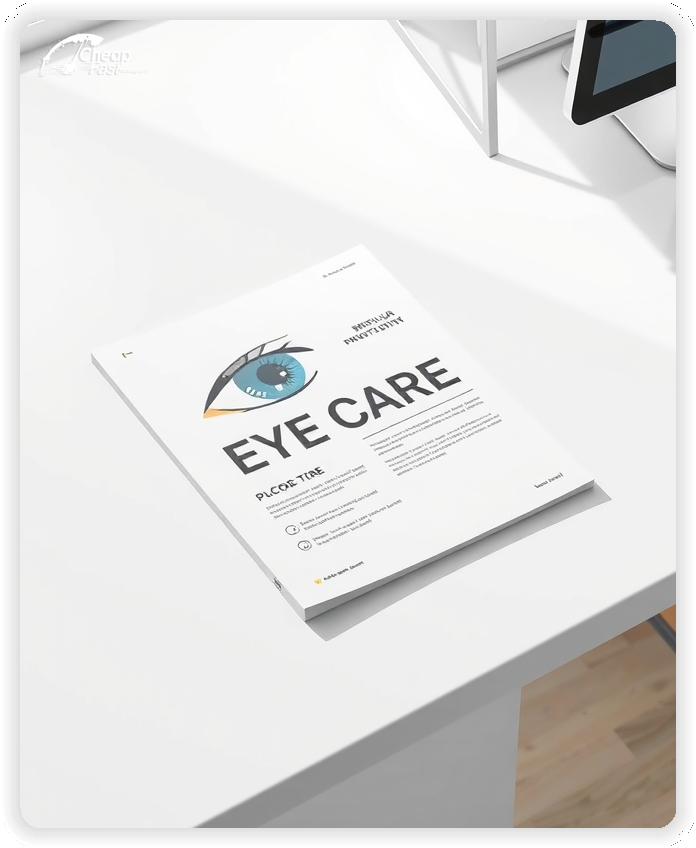
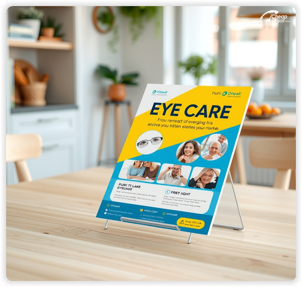
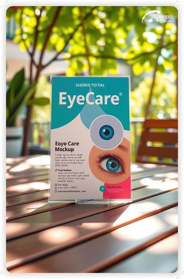
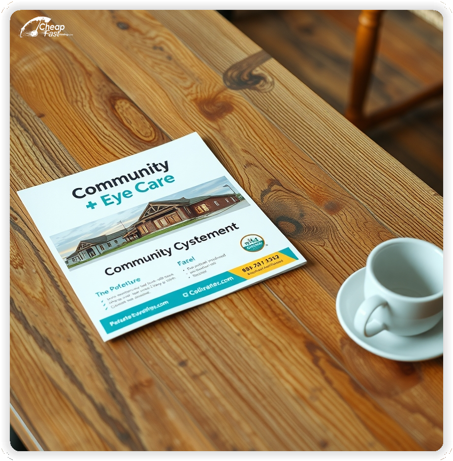
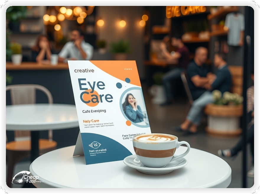
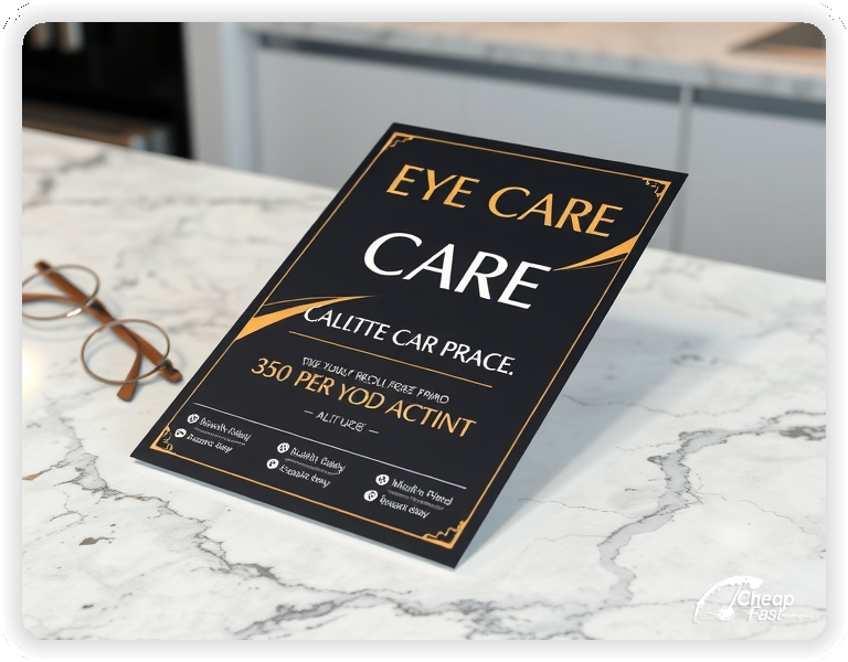
The 8x8 eye care flyers size is distinctive. It breaks the visual pattern of standard letter-sized mail, making it more likely to be picked up. It provides a perfect canvas for a central image (like frames or a happy patient) surrounded by key details, utilizing the square symmetry for a balanced, calm design.
For medical practices, matte paper flyers are often superior to gloss. The 80lb matte text stock is substantial but non-reflective, making text highly legible under any lighting—a crucial detail for a vision-focused business.
It feels modern, clean, and high-quality, aligning perfectly with medical branding.
Ordering 10000 eye care flyers allows you to execute a true saturation strategy. You can blanket every home within a 5-mile radius of your clinic. Consistency is key; seeing your brand multiple times establishes familiarity and trust.
Use your eye care handouts in multiple ways:
When you have gaps in your schedule, you need to act fast. Our quick eye care flyers production ensures you can launch a campaign in days, filling those empty slots with new patients.
Tailor your eye care flyers printing design to your target. Use larger fonts and high contrast for senior demographics. Use trendy frame photos for younger audiences. The matte paper handles color beautifully, allowing for versatile branding.
People who move to a new area need new doctors. Target your eye care handouts specifically to new homeowner listings. Offer a 'Welcome to the Neighborhood' free vision screening. This establishes loyalty early, often securing a patient for years.
Recall Strategy: Don't just target strangers. Send mailers to your inactive patient list with a 'We Miss You' offer to reactivate dormant files.
Upload your design now and order your bulk eye care flyers. High-volume printing saves you money while expanding your reach.
We review every file to ensure it meets professional standards.
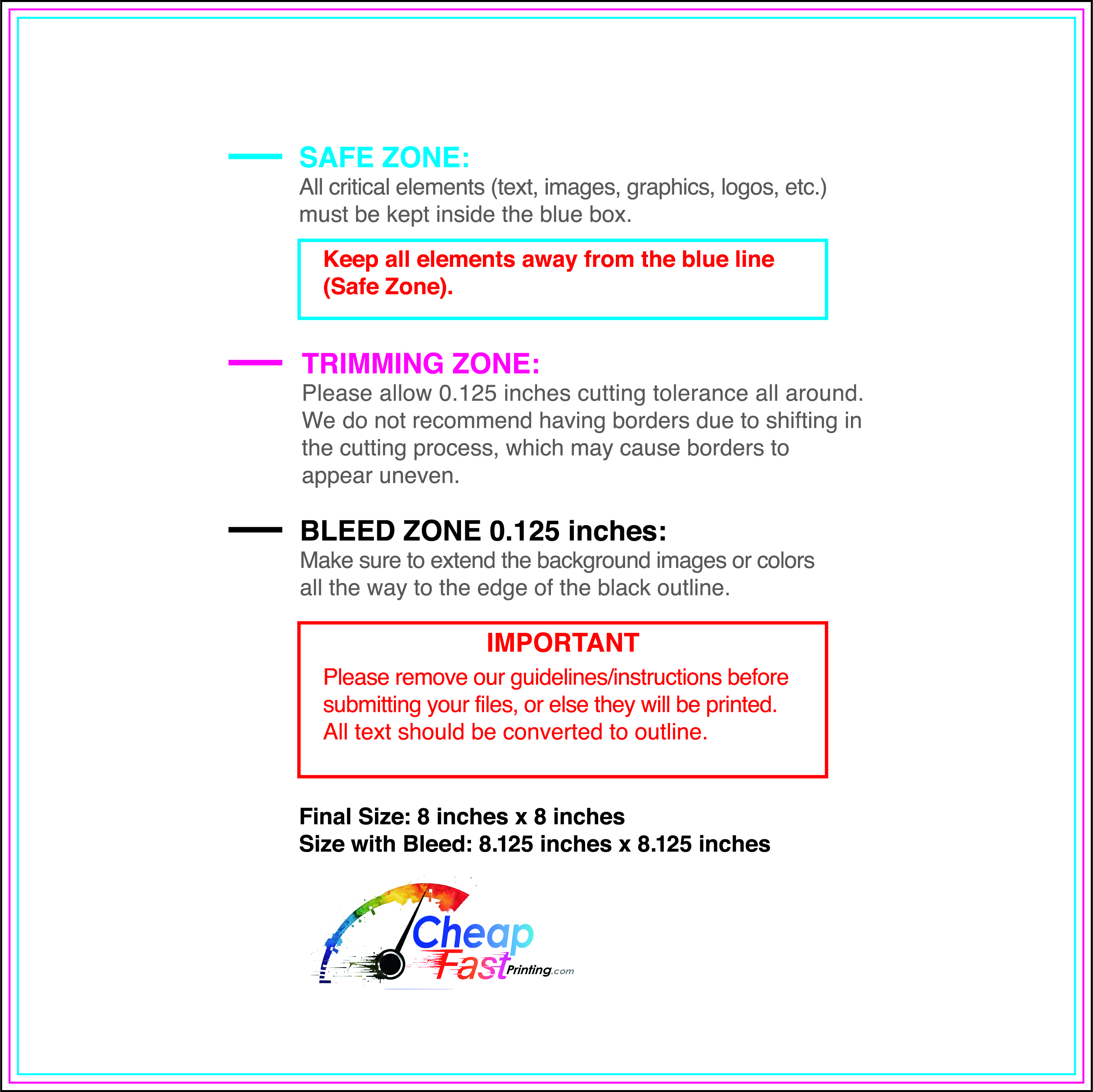
Download our 8x8 templates to set up your artwork correctly.
Designed for matte stock prints, these guides ensure your margins and bleed are perfect for a clean, professional result.
Loading Free Editable Designs...
Please wait while we prepare the template library.
Compared to digital ads which disappear instantly, print marketing has staying power. A bulk run of 10,000 units drives down the cost per piece, making it one of the most efficient ways to acquire new patients.
Use one clear headline, one offer, and one primary CTA (call, scan, or order). Add the essentials: phone, website/QR, service area, hours (if relevant), and a trust signal like years in business or a short review snippet.
Keep the layout scannable: one hero image or icon, short bullets, and high-contrast CTA text that’s readable at arm’s length.
Yes. 8" x 8" balances visibility and readability without feeling cramped. It gives enough space for a strong headline, a benefits list, and a CTA while staying easy to hand out or place on counters and boards.
Prioritize spacing and hierarchy over extra copy so the main message lands in 3–5 seconds.
80 lb. Matte Text with Matte affects how the flyer feels and how colors read. Gloss tends to boost color and photos, matte reduces glare and feels more premium for text-heavy layouts, and uncoated is great for writing on.
If your design uses lots of fine text, choose clarity and contrast first; paper upgrades won’t fix a crowded layout.
10000 works well when you want consistent visibility across multiple placements (counters, boards, partner locations, events) over a few weeks. Bulk also lowers unit cost so you can test a message and keep the winner running.
Track performance, then reprint the best offer instead of changing everything at once.
If price is your main hook, feature one simple offer (“ off” or “Starting at ) and keep the fine print minimal. If you have variable pricing, use a short value statement and send details to a landing page.
A clean offer + simple CTA typically outperforms a long price list.
Use a QR code to a dedicated landing page and add UTM tags for each route or partner. Track scans, form fills, and calls to identify the placements that actually convert.
For non-QR audiences, include a short, memorable URL or a trackable phone extension.
Start where your customers already are: complementary businesses, community boards, local events, and targeted neighborhoods. Ask partners for the most visible spot and refresh before your flyer gets buried.
Use a consistent route and restock winners; small, repeated placements usually beat one big drop.
Submit a print-ready PDF (CMYK) at 300 DPI with 0.125" bleed and safe margins around important text. Keep thin lines above 0.5 pt and make QR codes at least ~0.8" square for reliable scanning.
Use vector logos when possible and limit your fonts to maintain a clean, professional look.
Request a proof so you can confirm spelling, margins, and QR/URL accuracy before production. Proofing is the easiest way to prevent expensive reprints.
Double-check phone numbers and offer terms first—those are the most common issues.
Match your flyer headline and offer to the landing page headline so visitors feel they’re in the right place. Keep the CTA consistent and make the page fast to load and easy to complete on mobile.
If you run ads, retarget QR visitors with the same offer to improve conversions.
Maximizing your budget is easy with wholesale printing. The more you print, the less you pay per piece, allowing you to increase frequency without breaking the bank.

