


★
★
★
★
★
Submitted 2026-01-22
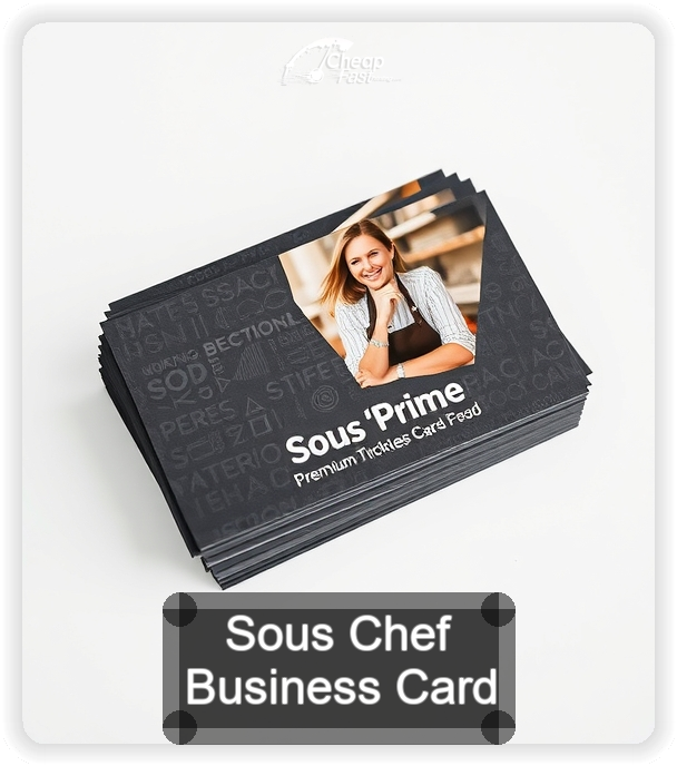
Used these for a catering season and the square size got noticed fast. Matte stock feels premium and the corners stayed clean even after living in my apron pocket. Proof process was simple.
Ramon D.