


★
★
★
★
★
Submitted 2026-01-09
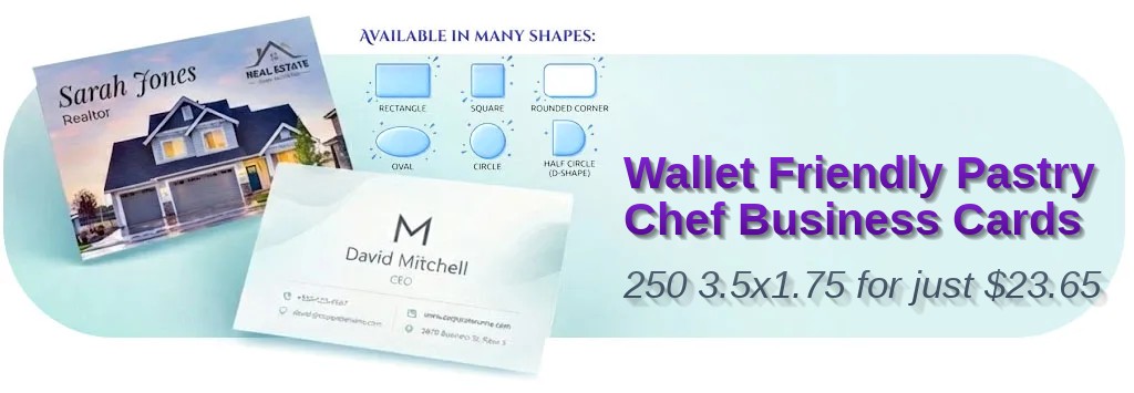
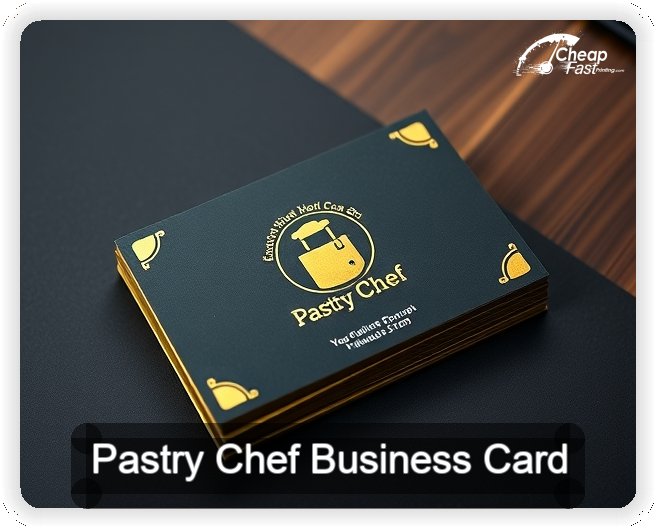
The half circle shape is making people stop and touch the card, which is exactly what I wanted for my dessert table brand. The gloss finish looks premium and the print is sharp. Free proof saved me from a typo.
Nina P.