


★
★
★
★
★
Submitted 2026-01-11
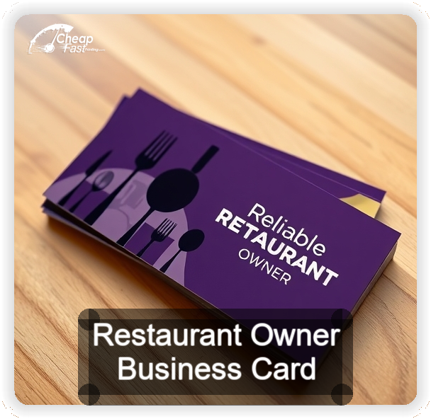
We used the cards for catering leads and vendor meetings. Stock feels premium, and the gloss finish keeps it looking clean after a week in my jacket pocket. Proof process was fast and simple.
Anthony R.