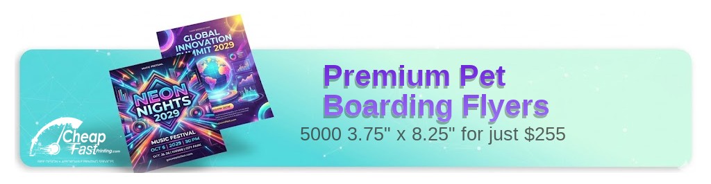
Professionally designed for 3.75" x 8.25" flyers. Fully editable & free!
Preparing Templates…
Boarding decisions are trust‑driven and schedule‑dependent. A focused flyer explains services, hours, and the next step to reserve a stay.
The 3.75x8.25 format keeps CTAs visible on counters and in folders while preserving legibility.
Effective outreach pairs print for local discovery with a short reservation page. Use a clear CTA and keep copy concise.
When the message is clean and structured, the kennel feels professional and reliable.
Lead with cleanliness, staff care, and capacity. Prospects respond to credibility and a simple next step.
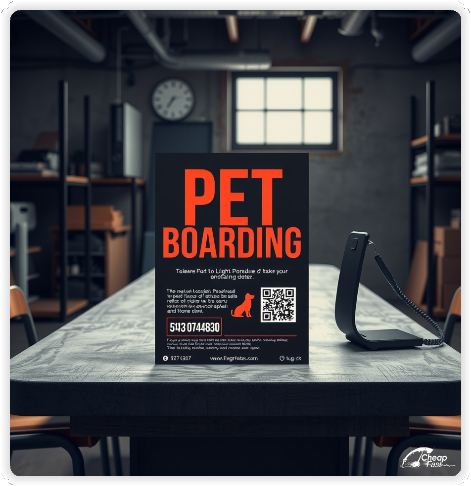
Keep the CTA near contact details so reservation flow is obvious. Use high contrast so phone, URL, and QR remain readable at a glance.
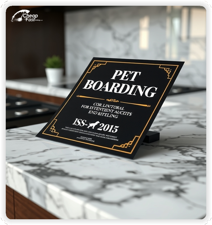
Place policy notes where required, but keep them short to preserve clarity.
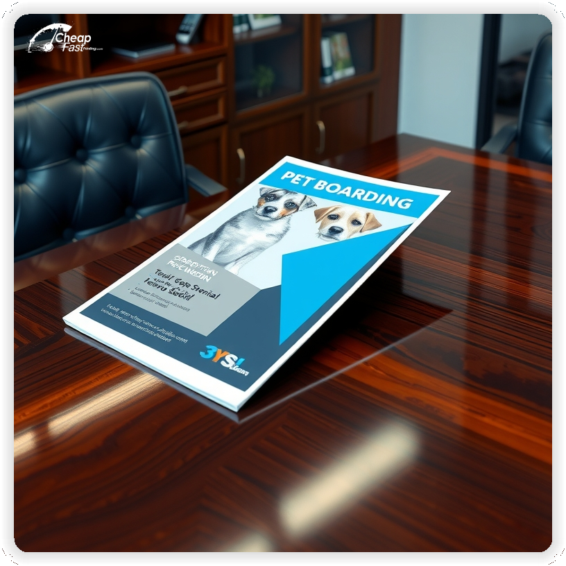
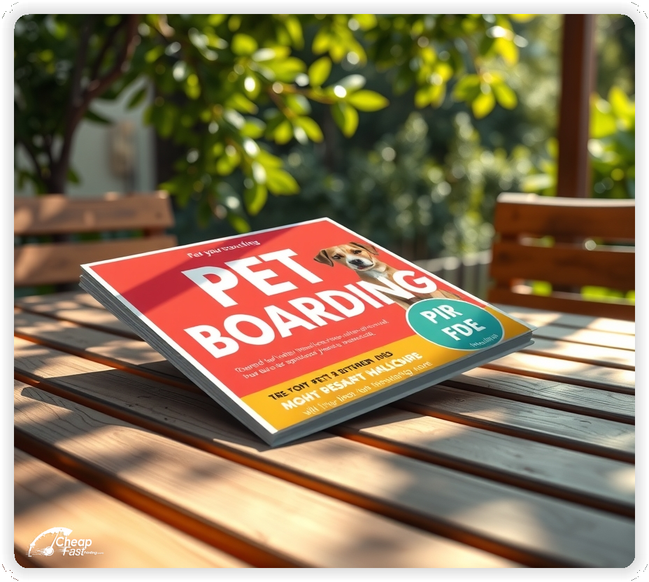
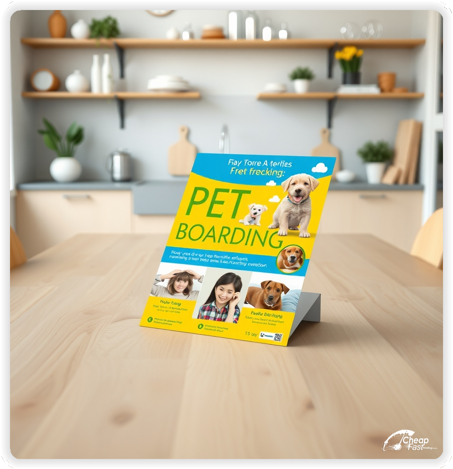
These flyers must make the service feel trustworthy and easy to reserve. Pet owners respond to cleanliness, staff care, and a low‑friction reservation CTA.
This structure keeps the message clear while supporting fast decisions.
3.75x8.25 kennel flyers keep hours and CTAs visible on counters and in folders.
The size preserves legibility for services and pickup windows without tiny text.
Use the top panel for the care headline and trust line, the middle for services, and the bottom for contact and CTA.
Clean imagery and legible type perform well. Matte paper flyers reduce glare and keep fine type crisp and professional.
Use high contrast panels to protect readability.
For counters and folders, thicker stocks hold up and stay crisp.
A focused intro offer removes hesitation. Examples include a first-class discount or a short trial package.
Keep the offer line short and move terms to the booking page so the flyer remains clean.
Clear offers improve studio conversion because new students understand the next step.
Schedules must be easy to scan. Use a simple grid with two to four time blocks per day.
Use abbreviations for class types and add a legend that fits within one line.
Readable scheduling is essential for yoga studio marketing because time is the top decision factor.
Choose one primary style for each flyer, such as vinyasa flow, restorative, or hot yoga.
This keeps the message specific and helps students self-select more quickly.
Focused positioning improves inquiries and supports higher trial-to-membership conversion.
Students want confidence in instruction quality. A short line about certification, experience, or continuing education builds trust.
Keep credentials brief and avoid a long bio. The landing page can provide full instructor details.
A short trust line near the CTA supports decision confidence without adding clutter.
Accessibility improves attendance. Add a short line about parking availability, bike racks, or transit proximity.
Keep the note brief so the schedule remains the main focus.
Clear access notes reduce last-minute questions and support higher first-visit show rates.
Membership options can be summarized in one line, such as “monthly memberships available.”
Keep detailed pricing on the booking page so the flyer remains easy to scan.
This approach keeps the studio message welcoming while still signaling value.
Workshops are strong for seasonal demand. Use a short callout for a weekend workshop or a beginner series.
Keep dates short and direct readers to a registration page for full details.
Event callouts add urgency while keeping the core class offer visible.
Place flyers at juice bars, wellness clinics, boutiques, and local markets with permission.
Ask front desks for the most visible spots and refresh placements when boards rotate.
Consistent placement supports awareness and brings steady inquiries for class trials.
Each flyer should lead to one action. A QR code to a short reservation page reduces friction.
Keep the landing page focused on services, hours, and a simple reservation form.
This flow converts better than long pages because it keeps the decision path clear.
Interest rises during new year resets, pre-summer wellness goals, and fall routine shifts.
Plan a primary run for each peak season and a smaller follow-up run to keep momentum.
When changes happen quickly, fast shipping flyers support a timely campaign refresh.
Match the flyer headline and offer to the booking page to reduce confusion.
Use the same class names and time blocks so the experience feels consistent.
Alignment across marketing materials online and print improves conversion because the message stays consistent.
Test two offers with the same layout to identify the best response.
Change only the offer line and track QR scans or calls by placement.
Once a winner is clear, scale with custom kennel flyers to keep cost controlled.
For high‑demand months, bulk pet boarding flyers help keep the offer consistent across locations.
Kennels with multiple locations benefit from consistent templates and localized hours.
Use wholesale printing services to keep branding aligned while adjusting local details.
For large campaigns, 5000 pet boarding flyers support consistent reach without production delays.
Consistent visuals help neighbors recognize the brand quickly.
New students need clear guidance. Use one line that explains what to bring and how early to arrive.
Keep the text short, and link to a full FAQ on the booking page.
This reduces anxiety and supports smoother first visits.
Use language that reflects the studio vibe, such as calm, energizing, or balanced.
Keep tone consistent across the schedule and offer blocks so the piece feels cohesive.
Aligned tone helps the flyer feel authentic and builds a stronger brand impression.
Use a short reminder line such as “class packs available” or “returning student discounts.”
Do not add a full list of pricing tiers. The goal is to encourage ongoing visits.
Retention messaging supports steady attendance without overshadowing the intro offer.
Cleanliness and safety remain important for many students. A short line about clean props and fresh air improves confidence.
Keep the note brief and place it near the trust line.
Short safety notes support enrollment decisions without requiring a long policy list.
Studios often stand out through community. A short line about local roots or community classes builds connection.
Keep it to one line and allow the instructor page to tell the deeper story.
This creates a sense of belonging without adding heavy copy to the flyer.
Studios rely on calm, premium visuals. Premium quality prints reinforce that perception by keeping lines crisp and colors clean.
When the piece looks polished, the studio feels more professional and trustworthy.
High-quality print also helps a simple design look intentional rather than sparse.
Many pet owners discover kennels through community boards, partner businesses, and mailers. A clear, professional flyer supports discovery when digital ads miss local foot traffic.
For local outreach, bulk flyer printing keeps distribution consistent across weeks.
This supports awareness while the reservation page captures the action.
Use a direct CTA such as “Reserve a stay” or “Request a call.”
Keep the CTA short and place it near phone, URL, and QR so the next step is visible.
Clear CTAs help readers decide quickly and support higher reservation rates.
Spacing matters in wellness branding. Use generous margins around the schedule and offer block.
Keep text blocks short and separate them with simple dividers.
A balanced layout keeps attention on the offer and makes the piece feel refined.
Private sessions attract students who want personalized guidance. A short line such as “private sessions available” adds value without overwhelming the main offer.
Keep details on the booking page so the flyer remains focused on the core schedule.
This message supports premium offerings while keeping the introduction offer clear.
Corporate and community classes can be a growth channel. A short line about workplace wellness sessions or community partnerships signals flexibility.
Use a brief callout and direct inquiries to a dedicated contact form.
This adds a business-friendly option without crowding the primary schedule.
Studios that offer teacher training can include a short line about upcoming cohorts or training modules.
Keep the training details on a separate landing page and let the flyer serve as an introduction.
This adds depth to the studio profile and builds credibility among serious practitioners.
If classes fill quickly, mention limited capacity and recommend booking ahead.
Use a short line such as “reservation suggested for peak classes.”
This sets expectations and helps reduce waitlist frustration.
Offer simple add‑ons like grooming or toy bundles. Keep the focus on boarding and use add‑ons as secondary details.
Use a short callout and place full details on the website.
Short challenges and multi-week series build attendance habits. Use a short line such as “4-week beginner series” or “30-day challenge.”
Keep dates and details on the booking page to preserve flyer clarity.
Series messaging can improve repeat visits and long-term membership interest.
New students often want to know what to expect. A short line about arrival time, footwear, or quiet zones can reduce anxiety.
Keep guidance brief and place it near the schedule or CTA so it reads as part of the visit flow.
This small detail supports higher first-class attendance and fewer last-minute cancellations.
Inclusive language makes a studio feel welcoming to a wider audience. A short note such as “all levels welcome” or “modifications offered” helps students feel comfortable.
Keep the note short and avoid long explanations on the flyer.
Clear inclusivity messaging supports community growth and encourages first-time bookings.
Flyers work best when they create one clear path from interest to booking. A calm headline, a visible schedule, and a short offer line are enough.
When the layout stays focused, the flyer can promote yoga studio business without heavy copy.
Pair print with a short booking page and keep the message aligned for a consistent experience.
Your flyer has about 3 seconds to make an impression before it's tossed or kept. Don't bury the lead. Ensure your main headline and primary offer are visible from arm's length. Use high-contrast colors and bold typography to guide the eye exactly where you want it.
Target the Right Neighborhoods: Success isn't just about design; it's about distribution. Focus your efforts on neighborhoods that match your ideal customer profile. For local businesses, a tight radius around your location often yields the highest ROI.
Prospects rarely decide the moment they see a flyer. They notice, remember, and act later when the need becomes urgent. Plan distribution like a routine instead of a single drop. Pick two to four tight neighborhoods, repeat every two to three weeks, and keep the headline consistent so recognition builds.
Pair one primary route with two supporting placements. Use distinct QR destinations per channel so results are measurable. Scale the winning route and stop printing to placements that underperform.
Your flyer has about 3 seconds to make an impression before it's tossed or kept. Don't bury the lead. Ensure your main headline and primary offer are visible from arm's length. Use high-contrast colors and bold typography to guide the eye exactly where you want it.
Target the Right Neighborhoods: Success isn't just about design; it's about distribution. Focus your efforts on neighborhoods that match your ideal customer profile. For local businesses, a tight radius around your location often yields the highest ROI.
Upload artwork and keep the message focused with custom kennel flyers that highlight services and a clear reservation CTA.
Proofing checks contrast, trimming, and spacing so services, hours, and CTA remain clear.
Proof review also confirms the QR destination and contact lines so the flyer works without errors.
Verify mobile load speed on the reservation page and keep fields minimal to reduce friction.
Confirm file settings align with pet boarding flyers printing standards for crisp type.
Use the template for 3.75x8.25 pet boarding flyers to keep margins consistent and reserve space for services, hours, CTA, and policy notes.
Templates protect alignment so updates do not break spacing.
Consistent spacing keeps contact details visible after trimming and supports quick approvals.
Loading Free Editable Designs...
Please wait while we prepare the template library.
Focused layouts outperform crowded pieces because services and CTA stay visible.
Consistent templates reduce design time and keep the message aligned across campaigns.
Compare response by reservations, qualified inquiries, and repeat stays rather than only print cost.
When the message stays consistent, pet owners recognize the brand faster and book with less hesitation.
Tracking inquiries by placement helps refine the next print cycle and route coverage.
Use one clear headline, one offer, and one primary CTA (call, scan, or order). Add the essentials: phone, website/QR, service area, hours (if relevant), and a trust signal like years in business or a short review snippet.
Keep the layout scannable: one hero image or icon, short bullets, and high-contrast CTA text that’s readable at arm’s length.
Yes. 3.75" x 8.25" balances visibility and readability without feeling cramped. It gives enough space for a strong headline, a benefits list, and a CTA while staying easy to hand out or place on counters and boards.
Prioritize spacing and hierarchy over extra copy so the main message lands in 3–5 seconds.
100 lb. Matte Cover with Matte affects how the flyer feels and how colors read. Gloss tends to boost color and photos, matte reduces glare and feels more premium for text-heavy layouts, and uncoated is great for writing on.
If your design uses lots of fine text, choose clarity and contrast first; paper upgrades won’t fix a crowded layout.
5000 works well when you want consistent visibility across multiple placements (counters, boards, partner locations, events) over a few weeks. Bulk also lowers unit cost so you can test a message and keep the winner running.
Track performance, then reprint the best offer instead of changing everything at once.
If price is your main hook, feature one simple offer (“ off” or “Starting at ) and keep the fine print minimal. If you have variable pricing, use a short value statement and send details to a landing page.
A clean offer + simple CTA typically outperforms a long price list.
Use a QR code to a dedicated landing page and add UTM tags for each route or partner. Track scans, form fills, and calls to identify the placements that actually convert.
For non-QR audiences, include a short, memorable URL or a trackable phone extension.
Start where your customers already are: complementary businesses, community boards, local events, and targeted neighborhoods. Ask partners for the most visible spot and refresh before your flyer gets buried.
Use a consistent route and restock winners; small, repeated placements usually beat one big drop.
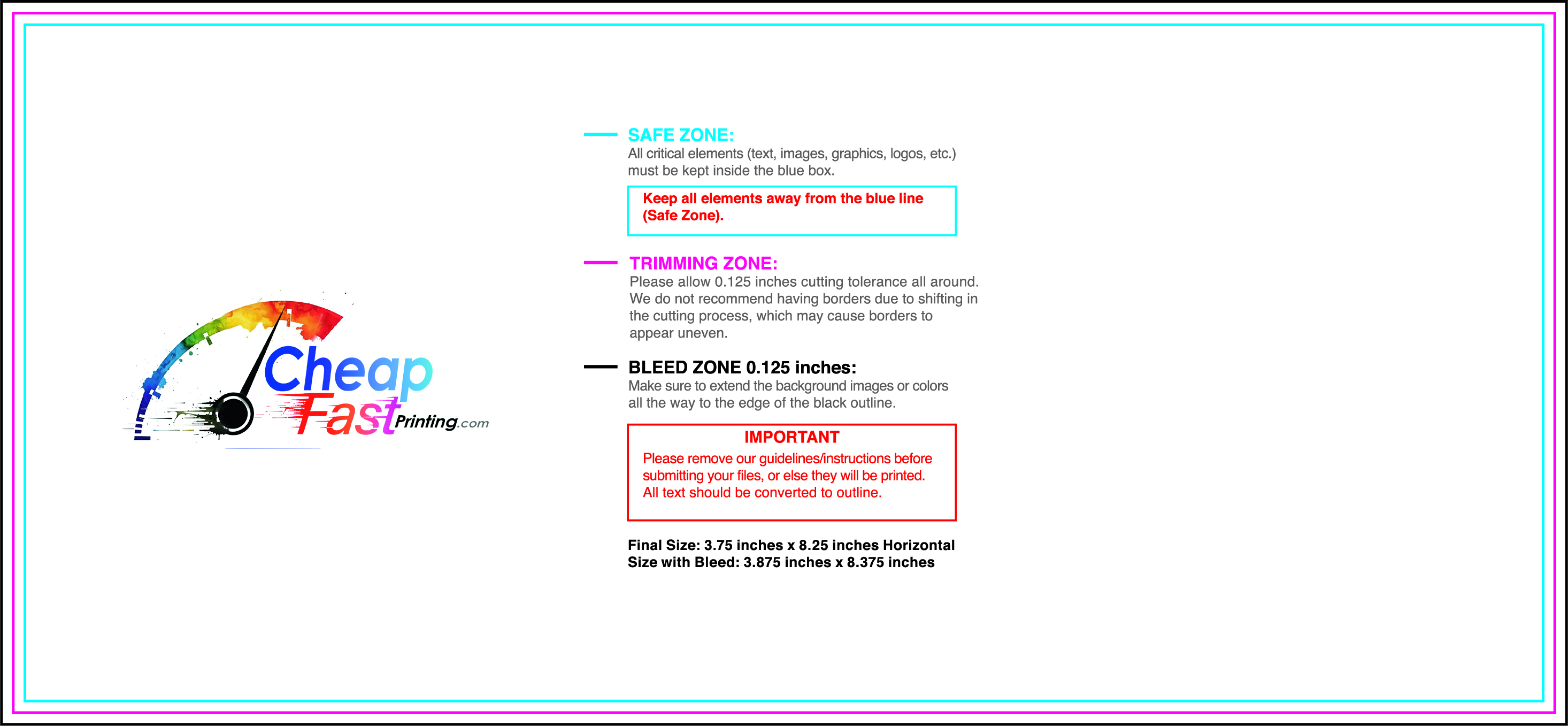
Submit a print-ready PDF (CMYK) at 300 DPI with 0.125" bleed and safe margins around important text. Keep thin lines above 0.5 pt and make QR codes at least ~0.8" square for reliable scanning.
Use vector logos when possible and limit your fonts to maintain a clean, professional look.
Request a proof so you can confirm spelling, margins, and QR/URL accuracy before production. Proofing is the easiest way to prevent expensive reprints.
Double-check phone numbers and offer terms first—those are the most common issues.
Match your flyer headline and offer to the landing page headline so visitors feel they’re in the right place. Keep the CTA consistent and make the page fast to load and easy to complete on mobile.
If you run ads, retarget QR visitors with the same offer to improve conversions.
Plan a steady supply for partner offices and community boards. Short runs allow message updates without waste.
Predictable timing supports stronger reservation response and keeps the message current.
Track which locations drive the most QR scans and prioritize restocks there.
Use smaller top‑up runs to match seasonal changes without redesigning the layout.
Balance weekly and monthly distributions to keep coverage consistent.
Use distribution logs to identify boards that perform well and retire low‑response locations.
For seasonal pushes, bulk pet boarding flyers keep budgets stable while you scale.

