Professionally designed for 3.75" x 8.25" flyers. Fully editable & free!
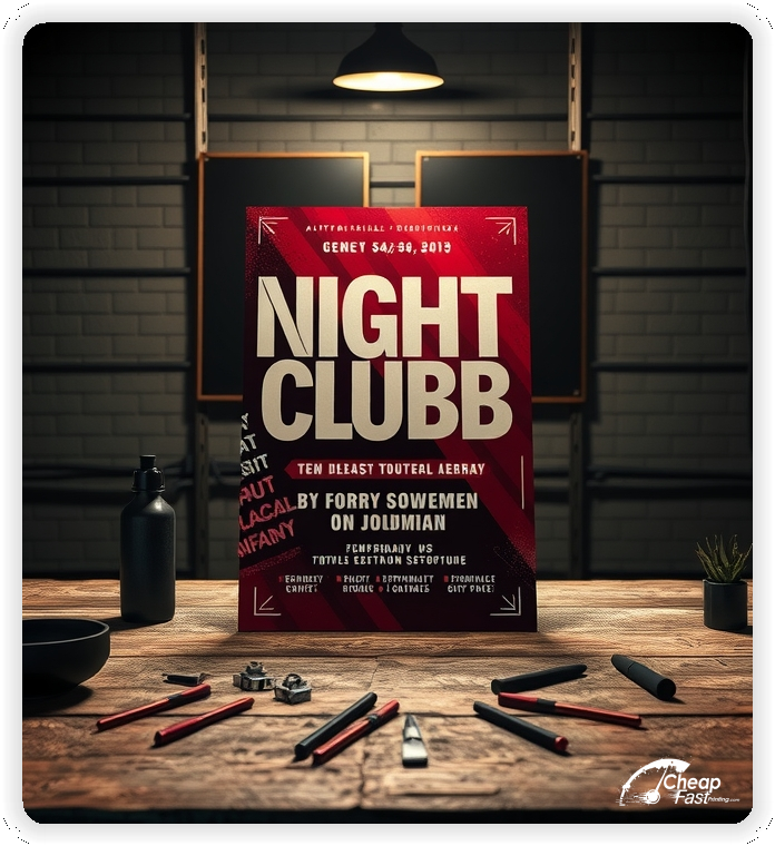
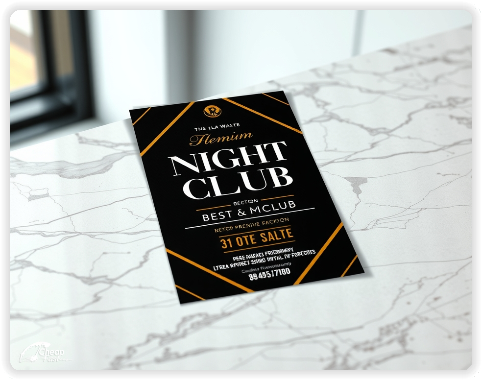
Nightclub Flyers work when the message is fast: the night, the DJ, the door time, and one clear way to get in. This small format is built for quick reads under streetlights, at bar tops, and in line.
Use a bold headline, a single featured act, and a tight CTA like “RSVP” or “Join the guest list.” Keep details to the essentials, then let a QR code carry the rest.
For recurring promotions, an economical layout that stays consistent week to week builds recognition while letting you swap the date, lineup, and offer.
Do not bury the headline. Put the event name and date first, then the featured act, then the CTA. Most people decide in seconds.
Use high-contrast type, keep the copy tight, and leave negative space so the piece looks premium even on an economical run.
One offer per flyer wins: free before 11, reduced cover, bottle service code, or a guest list perk.
Great nightclub promotions are simple and specific. The goal is fast comprehension and one action.
This structure keeps nightclub flyers readable and conversion-focused.
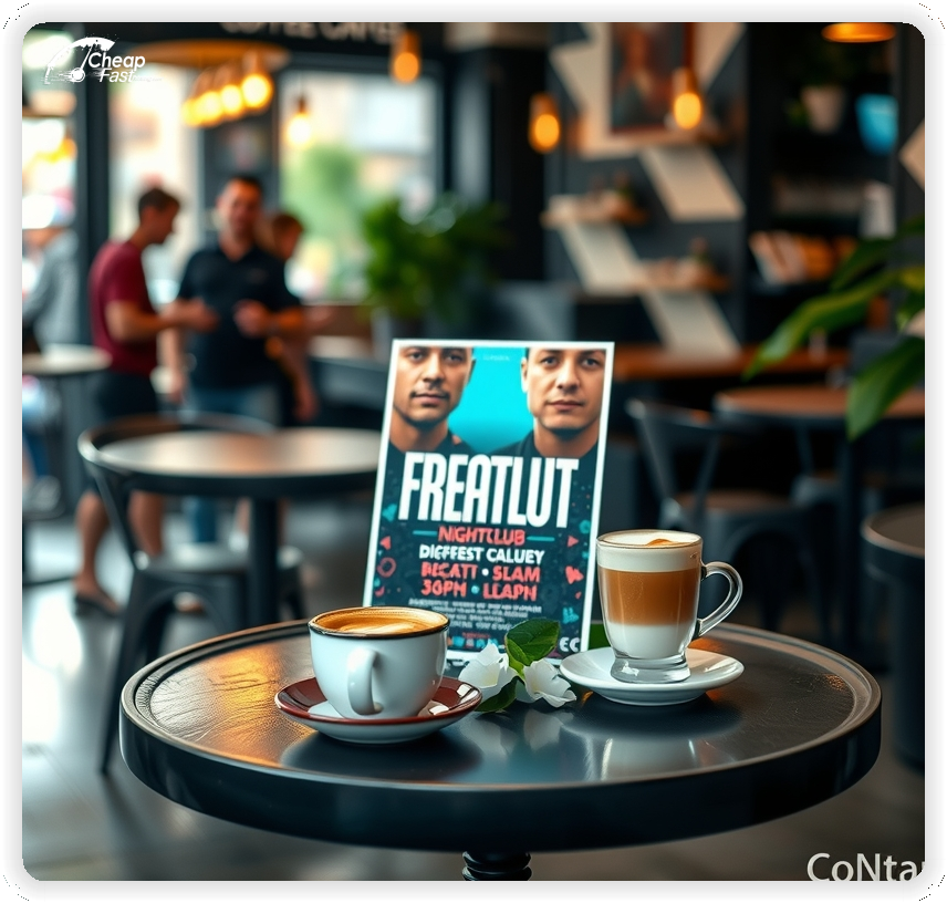
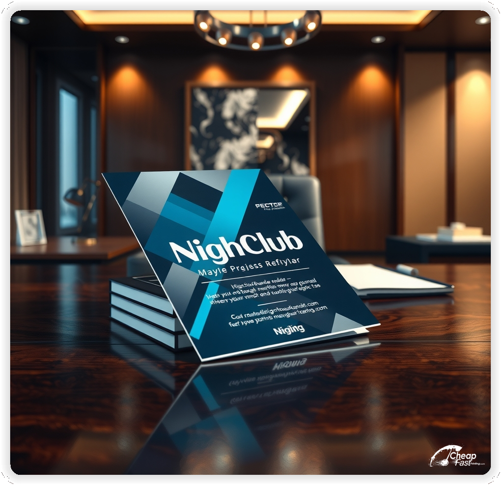
3.75x8.25 nightclub flyers are easy to carry, easy to stack, and fast to read. They fit jacket pockets, bar tops, check presenters, and street-team clipboards.
Use the top third for the night and headliner, the middle for the date and doors, and the bottom for the QR code plus a short CTA.
This layout keeps your message legible during fast handoffs.
Nightlife design relies on contrast and clean type. Matte paper flyers reduce glare under bright venue lighting while keeping dark backgrounds and neon accents looking sharp.
The 100lb matte cover feel also helps the piece survive pockets, bags, and night-of distribution without looking beat up.
One offer per piece keeps the decision simple. Choose the highest-leverage hook for the night: reduced cover before a time, a free drink ticket, or a bottle service code.
Keep the fine print off the flyer and on the RSVP page so the piece stays clean.
Lead with one featured name. Support with two to four smaller names if needed. If you list a full lineup, use clear hierarchy and spacing so the headliner still dominates.
Keep genre descriptors short, like “house” or “latin night,” to help people self-select quickly.
Recurring themes make marketing easier. Keep one template for a residency, then swap the date and headliner. Consistency improves recognition across weeks.
This approach helps when you need nightclub marketing materials that scale without constant redesign.
Most people will not decide at the moment they receive the flyer. A QR code gives them a way to act later without searching.
Use a short RSVP page with date, doors, address, and one button. Track scans by placement so you know what is working.
Plan distribution like a routine. Pair one street-team route with a handful of partner stacks at bars, eateries, campus spots, and record shops.
When you restock consistently, nightclub handouts stay visible and response compounds over time.
Design does most of the work. Use big type, strong contrast, and intentional spacing. Minimal copy plus a strong image reads premium even on economical nightclub flyers.
Keep one base template for the venue, then swap the details for each event.
Use the same event name, colors, and headline on the flyer and the social post. That consistency reduces confusion and improves follow-through from scan to RSVP.
It also makes custom nightclub flyers easier to produce because the brand system stays stable.
If needed, include “21+” (or the correct age) and any door policy in a short line. Keep it readable and do not crowd the layout.
Put full terms on the RSVP page.
Double-check the basics: date, doors, address, and the QR destination. Then check contrast so small details remain readable in low light.
This matters for nightclub flyers printing because one typo can waste an entire run.
Start distribution early enough for plans to form, then add a reminder wave 48 to 72 hours before the event. The second wave is often where conversions spike.
Keep the same headline both waves to build recognition.
VIP promos work best with a single code and one clear benefit. Keep the code short and repeat it once near the QR so it is easy to remember.
Use the landing page to capture contact details and confirm the offer.
Test two offers with the same layout. Change only the offer line and track QR scans by placement.
Once you know the winner, scale distribution and keep the design stable.
If you promote weekly or monthly, build around repeatable templates and simple swaps. Large runs lower cost per piece and keep stacks ready.
For venue-wide pushes, 5000 nightclub flyers make it easier to cover multiple routes without running out mid-campaign.
Use one consistent layout and rotate the lineup details.
Keep it easy: where it is, when doors open, and how to get on the list. One clear CTA beats a paragraph of details.
Save the rest for the RSVP page.
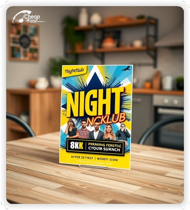
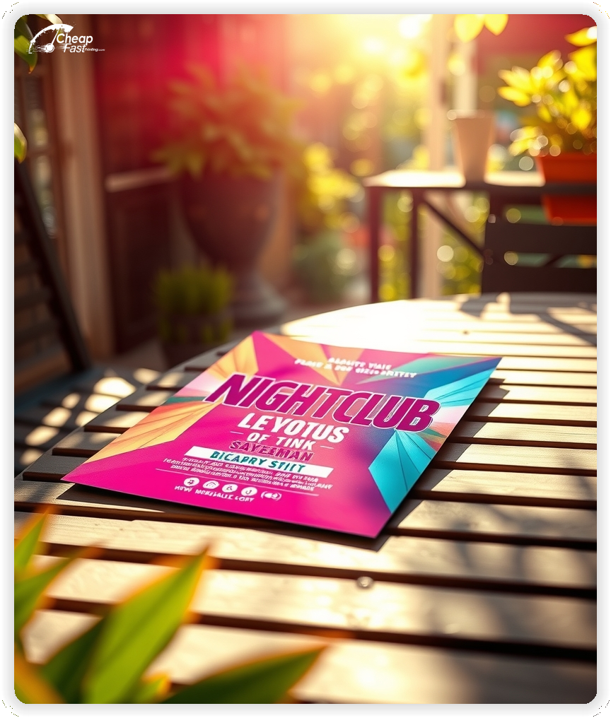
Match the flyer style to the music and crowd. Minimal black-and-white works for underground nights, while bold color blocks work for pop, latin, or open-format events.
Keep typography consistent so the piece reads cleanly in low light.
For regulars, add one small line like “VIP list available” or “monthly member perks.” Avoid long benefit lists.
The flyer should still lead with the event and the CTA.
Use high-resolution images and avoid tiny text over busy photos. If you have to choose, prioritize legibility over decoration.
Strong hierarchy makes the night feel organized and worth showing up for.
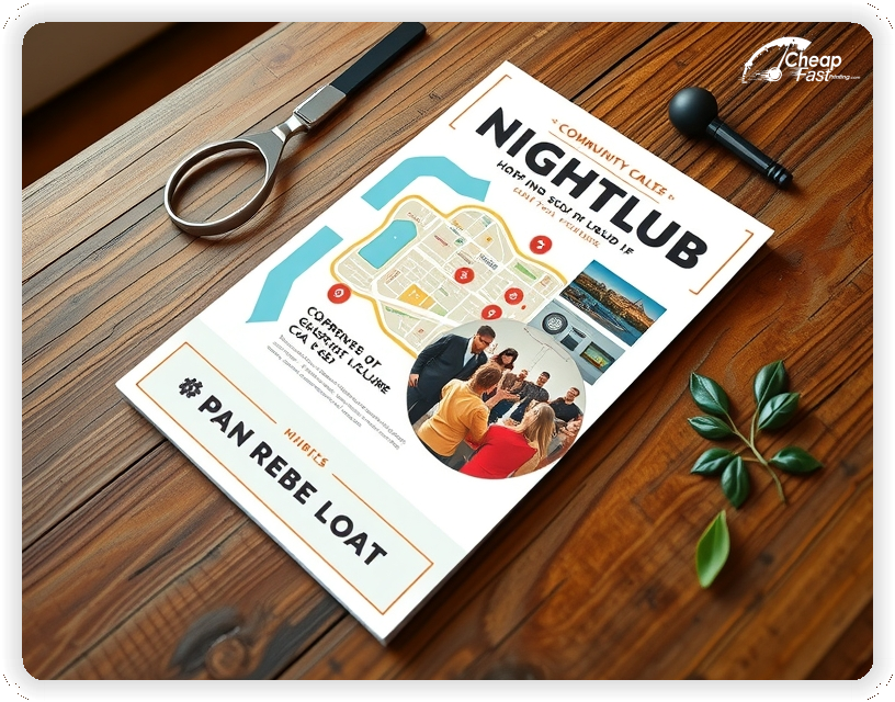
Call out the neighborhood or landmark so people immediately place the venue. Then distribute where your crowd already goes: late-night food spots, bars, and local events.
That context makes the flyer feel relevant instead of generic.
Nightlife is a brand game. A clean piece signals the room is curated and worth the cover. Matte cover stock supports that premium impression without adding visual glare.
When the piece looks intentional, more people keep it long enough to scan the QR.
Digital reaches fast, but print creates repeated touchpoints in real neighborhoods. Use consistent drops so the night becomes familiar before the decision.
Pair the flyer with a simple RSVP page to convert awareness into attendance.
Use a short CTA like “Scan to RSVP” or “Join the guest list.” Put the QR code next to the CTA and keep the destination fast on mobile.
One action, one page, one outcome.
Keep lines short and use spacing to create hierarchy. Small formats can feel crowded quickly, so avoid long paragraphs.
One strong image plus clean type usually outperforms a dense layout.
If a night can sell out, say so. A short line like “limited capacity” creates urgency without feeling pushy.
Use the RSVP page to control capacity and confirm entry details.
Group promos work best when the benefit is simple and the entry path is clear. Keep the offer visible and the QR destination short.
Use a second QR destination if you need to separate a student list from general RSVP.
One strong photo that matches the crowd is enough. If you add a review or quote, keep it short and place it near the CTA.
Social proof helps the night feel established.
Put doors time and address in a consistent spot on every design. Make it easy for someone to confirm details with one glance.
That small clarity step reduces “where is it?” friction.
Build one template, then create a repeatable checklist: swap the date, update the lineup, confirm the QR destination, export, and go.
That repeatability makes bulk campaigns easier to manage.
Holiday weekends and seasonal peaks work best with earlier drops and a stronger reminder wave. Keep the headline consistent and swap only the date.
Consistency is what makes the night feel established.
Keep safety messaging short and clear. If needed, include a ride-share reminder or “drink responsibly” line near the footer.
Use the RSVP page for full policy details.
If you have a dress code or entry expectations, keep it short and readable. Avoid long blocks of rules.
Clarity prevents surprises and supports better reviews.
Nightclub promos work best when they create one clear path from interest to RSVP. Keep the headline bold, keep details short, and put the QR code where it is easy to find.
When the layout stays focused, bulk distribution becomes predictable and measurable.
Your flyer has about 3 seconds to make an impression before it's tossed or kept. Don't bury the lead. Ensure your main headline and primary offer are visible from arm's length. Use high-contrast colors and bold typography to guide the eye exactly where you want it.
Target the Right Neighborhoods: Success isn't just about design; it's about distribution. Focus your efforts on neighborhoods that match your ideal customer profile. For local businesses, a tight radius around your location often yields the highest ROI.
Most people do not decide the moment they touch a flyer. They notice the night, remember the venue, and act later when plans form. Treat distribution like a routine instead of a single drop: pick two to four tight zones, repeat weekly, and keep the headline consistent so recognition builds.
Pair one primary street-team route with two supporting placements: partner bars, late-night food counters, campus hotspots, and record shops. Use the same offer across placements and track the channel with a distinct QR destination.
Your flyer has about 3 seconds to make an impression before it's tossed or kept. Don't bury the lead. Ensure your main headline and primary offer are visible from arm's length. Use high-contrast colors and bold typography to guide the eye exactly where you want it.
Target the Right Neighborhoods: Success isn't just about design; it's about distribution. Focus your efforts on neighborhoods that match your ideal customer profile. For local businesses, a tight radius around your location often yields the highest ROI.
Upload artwork for custom nightclub flyers and keep the message focused on the night, the headliner, and one RSVP CTA.
Proofing checks trimming, contrast, and QR clarity so key details stay readable. For nightclub promotions, mistakes usually happen in the small stuff.
Confirm the RSVP link loads fast on mobile and matches the flyer headline.
Use a consistent template so the headline, doors time, and QR placement stay in the same spot every run.
Templates speed up weekly swaps and reduce proofing errors.
A stable grid makes it easy to update the date and lineup without redesigning.
Loading Free Editable Designs...
Please wait while we prepare the template library.
Simple pieces beat crowded pieces because the event details are obvious. Track response by QR scans, guest list signups, and door conversions.
When the headline stays consistent, recognition improves and response becomes more predictable.
Use one clear headline, one offer, and one primary CTA (call, scan, or order). Add the essentials: phone, website/QR, service area, hours (if relevant), and a trust signal like years in business or a short review snippet.
Keep the layout scannable: one hero image or icon, short bullets, and high-contrast CTA text that’s readable at arm’s length.
Yes. 3.75" x 8.25" balances visibility and readability without feeling cramped. It gives enough space for a strong headline, a benefits list, and a CTA while staying easy to hand out or place on counters and boards.
Prioritize spacing and hierarchy over extra copy so the main message lands in 3–5 seconds.
100 lb. Matte Cover with Matte affects how the flyer feels and how colors read. Gloss tends to boost color and photos, matte reduces glare and feels more premium for text-heavy layouts, and uncoated is great for writing on.
If your design uses lots of fine text, choose clarity and contrast first; paper upgrades won’t fix a crowded layout.
5000 works well when you want consistent visibility across multiple placements (counters, boards, partner locations, events) over a few weeks. Bulk also lowers unit cost so you can test a message and keep the winner running.
Track performance, then reprint the best offer instead of changing everything at once.
If price is your main hook, feature one simple offer (“ off” or “Starting at ) and keep the fine print minimal. If you have variable pricing, use a short value statement and send details to a landing page.
A clean offer + simple CTA typically outperforms a long price list.
Use a QR code to a dedicated landing page and add UTM tags for each route or partner. Track scans, form fills, and calls to identify the placements that actually convert.
For non-QR audiences, include a short, memorable URL or a trackable phone extension.
Start where your customers already are: complementary businesses, community boards, local events, and targeted neighborhoods. Ask partners for the most visible spot and refresh before your flyer gets buried.
Use a consistent route and restock winners; small, repeated placements usually beat one big drop.
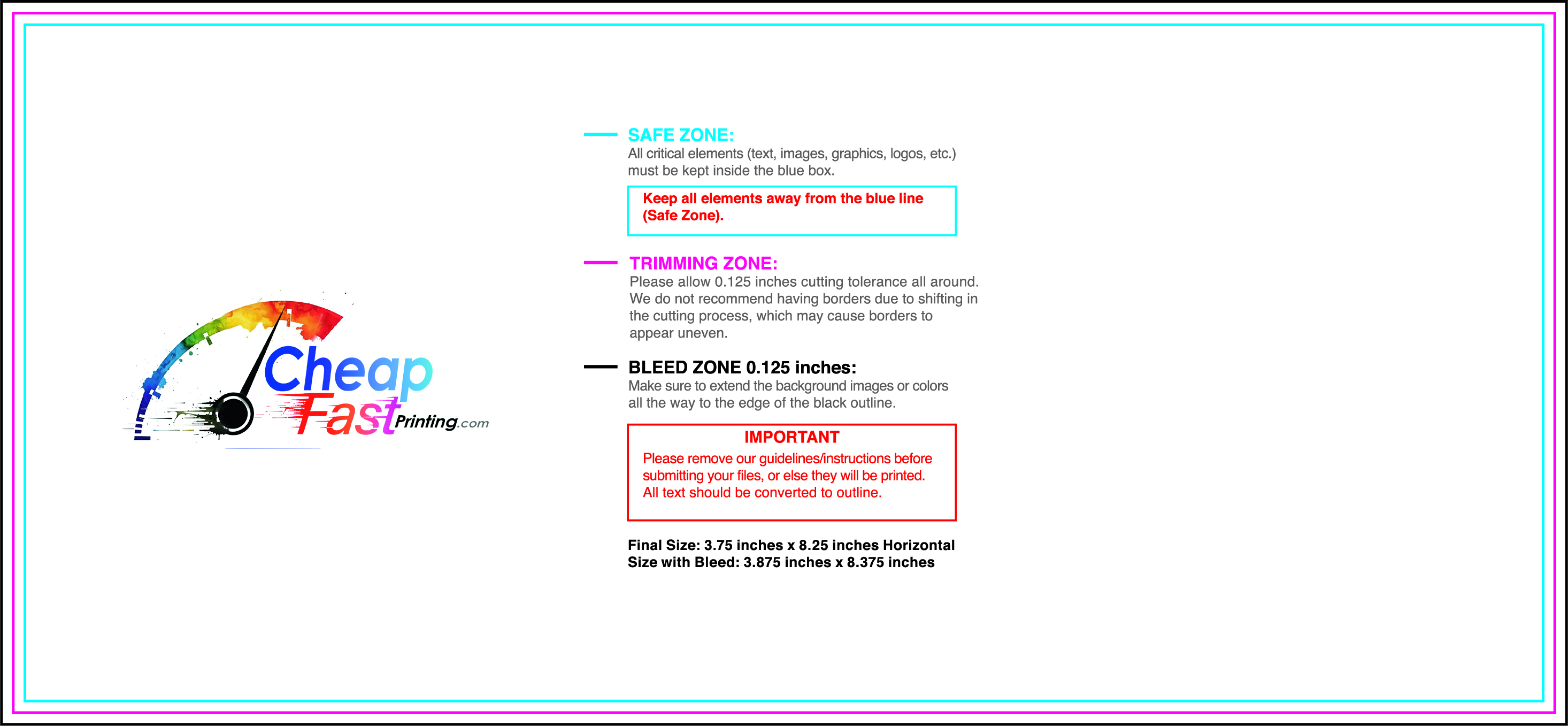
Submit a print-ready PDF (CMYK) at 300 DPI with 0.125" bleed and safe margins around important text. Keep thin lines above 0.5 pt and make QR codes at least ~0.8" square for reliable scanning.
Use vector logos when possible and limit your fonts to maintain a clean, professional look.
Request a proof so you can confirm spelling, margins, and QR/URL accuracy before production. Proofing is the easiest way to prevent expensive reprints.
Double-check phone numbers and offer terms first—those are the most common issues.
Match your flyer headline and offer to the landing page headline so visitors feel they’re in the right place. Keep the CTA consistent and make the page fast to load and easy to complete on mobile.
If you run ads, retarget QR visitors with the same offer to improve conversions.
Bulk works best when distribution is scheduled. Start with one repeatable route, then expand after you know what converts.
Use bulk nightclub flyers for weekly stacks and partner placements so you do not run out mid-push.
Keep one base design, rotate the date and headliner, and track QR scans by channel.
For venue-wide promotions, 5000 nightclub flyers keep promoters stocked while maintaining a consistent look.

