Professionally designed for 4" x 9" flyers. Fully editable & free!
Preparing Templates…
Assisted living decisions are personal and require clear communication. A focused flyer explains services, schedules, and events, guiding families to take the next step.
The 4x9 format provides room for essential details and a clear CTA without overwhelming the reader.
Effective marketing materials use print to reach local families and digital to capture inquiries. The flyer should guide readers to a contact page or phone number for more information.
When the message is clear and professional, trust and interest grow.
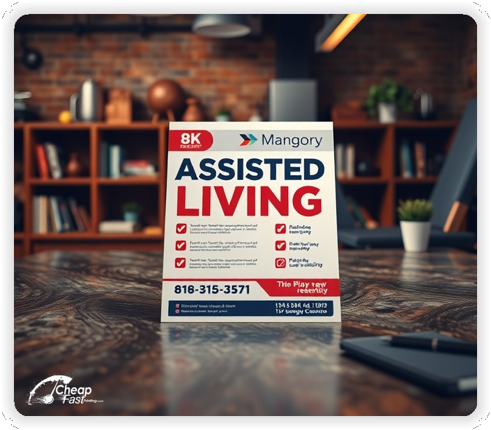
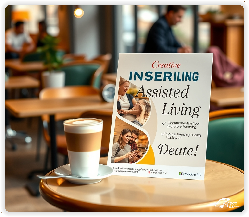
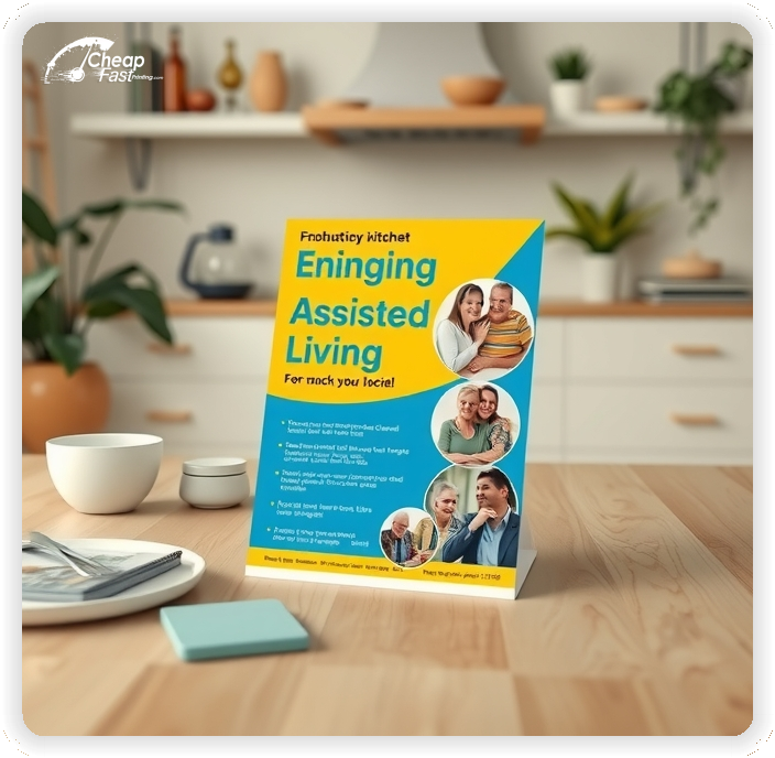
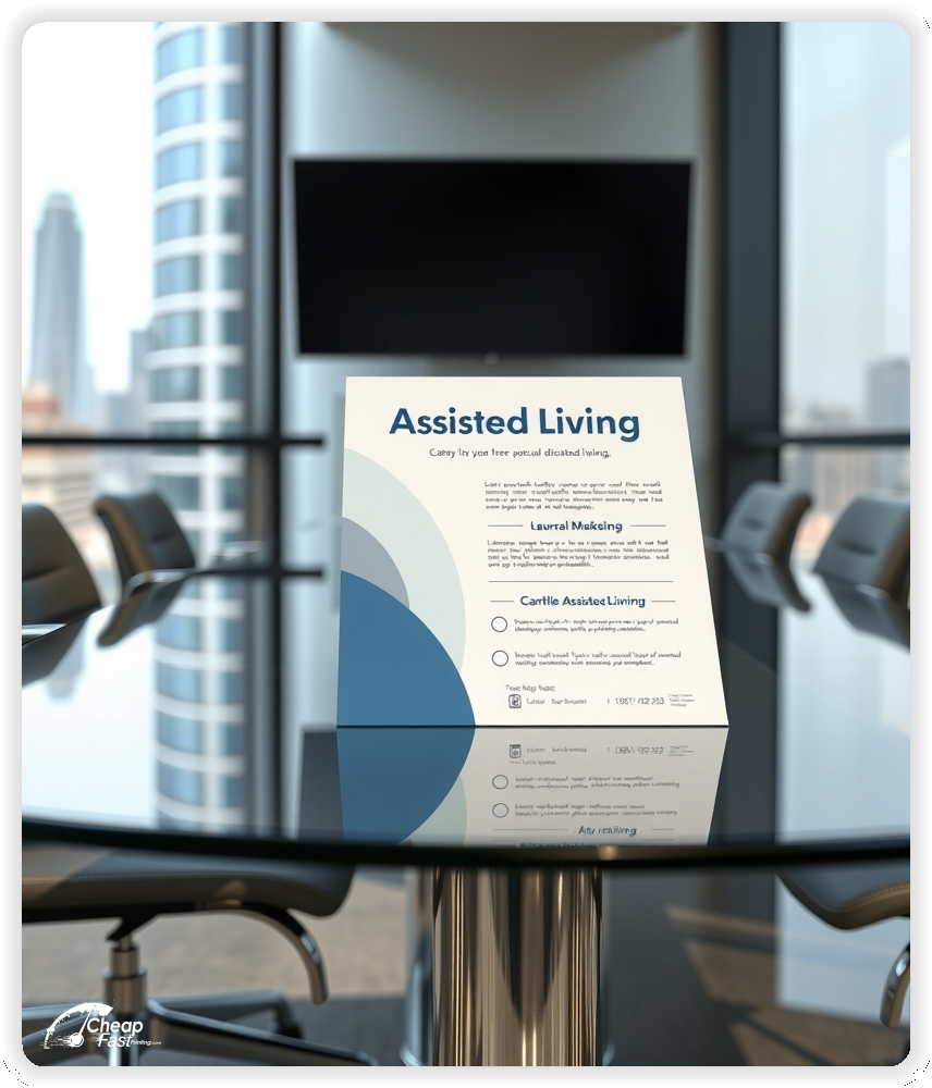
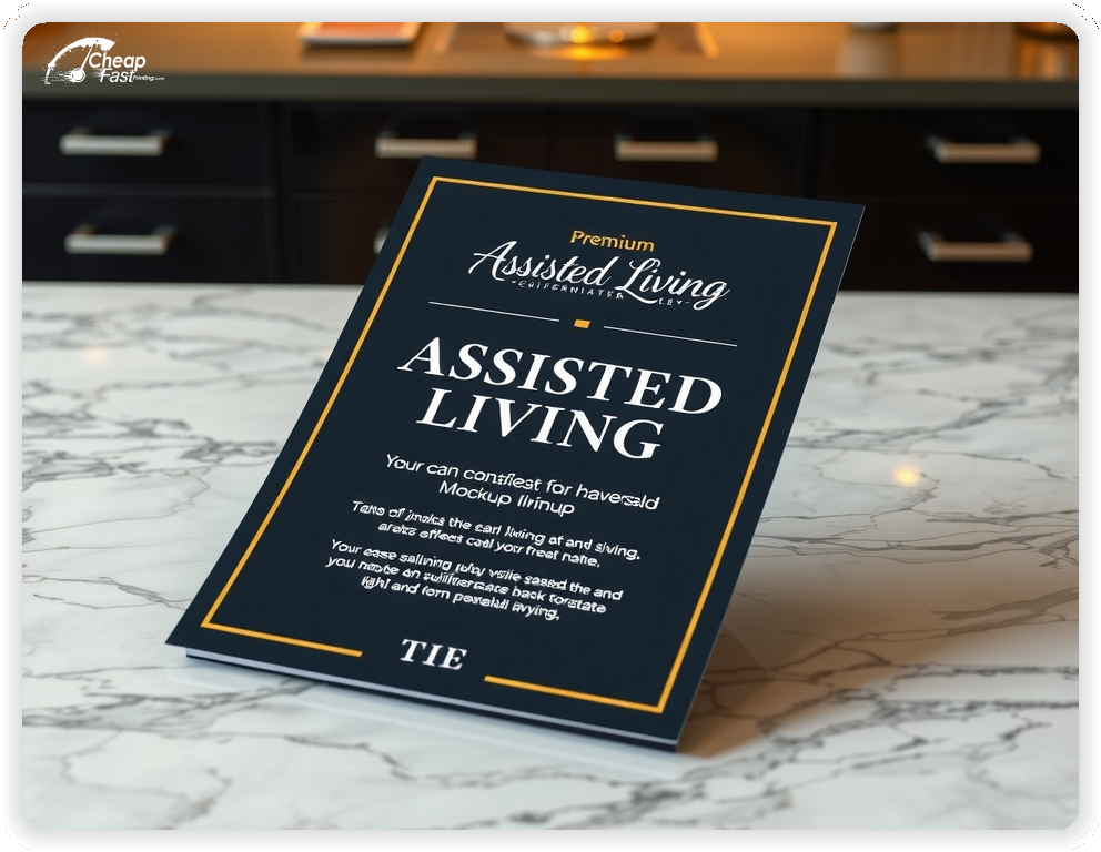
These flyers must communicate trust and clarity. Families respond best to a clear list of services, contact details, and a welcoming message.
This structure ensures the flyer is informative and engaging.
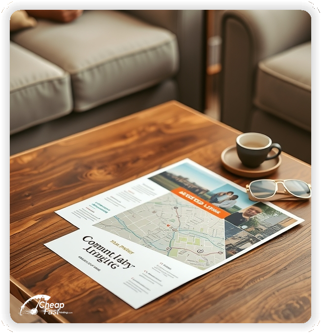
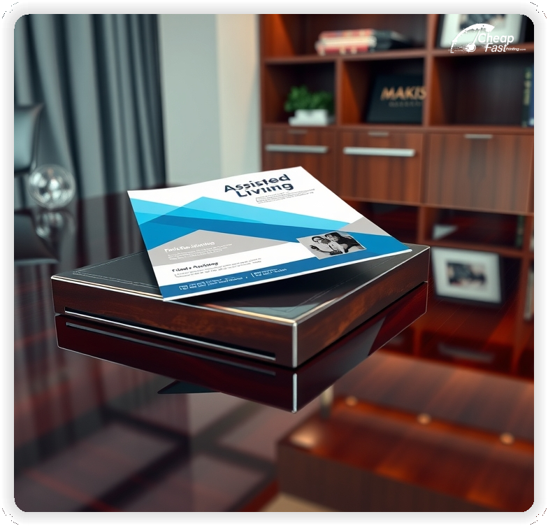
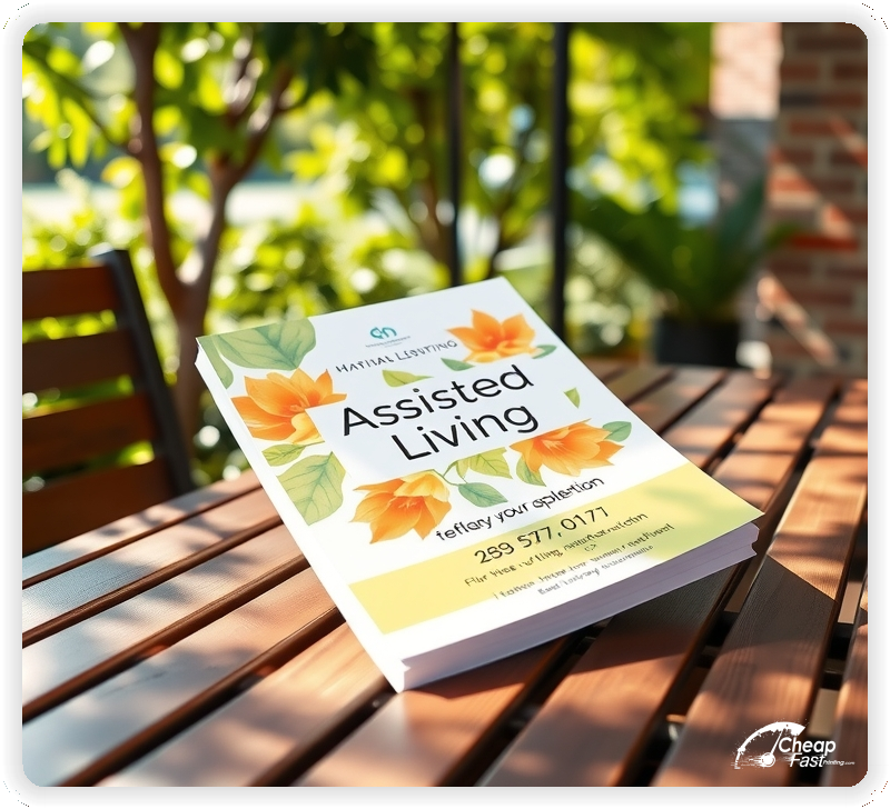
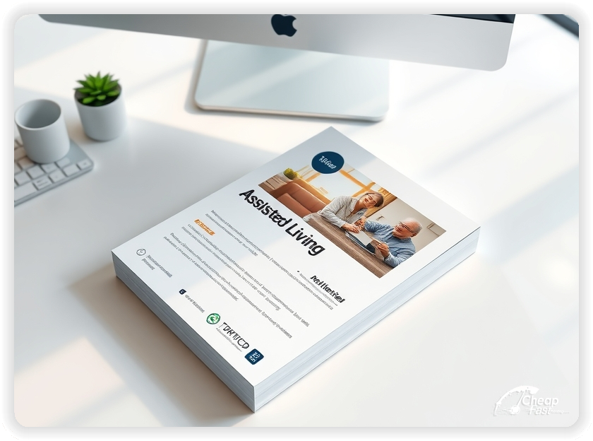
4x9 custom flyers are compact yet spacious enough for essential details. This size is ideal for distribution at community centers, clinics, and events.
Use the top section for a welcoming headline, the middle for services or schedules, and the bottom for the CTA and contact details.
As glossy paper flyers, they maintain a professional appearance and are easy to handle.
Soft colors and clear typography work best. Custom assisted living flyers should use high-quality prints to ensure readability and a professional look.
Glossy finishes enhance images and make the flyer stand out.
Keep the layout clean and focused to guide readers to the next step.
Your flyer has about 3 seconds to make an impression before it's tossed or kept. Don't bury the lead. Ensure your main headline and primary offer are visible from arm's length. Use high-contrast colors and bold typography to guide the eye exactly where you want it.
Target the Right Neighborhoods: Success isn't just about design; it's about distribution. Focus your efforts on neighborhoods that match your ideal customer profile. For local businesses, a tight radius around your location often yields the highest ROI.
Upload your artwork and create custom assisted living flyers that highlight your services and events.
Proofing checks contrast, trimming, and spacing so the schedule and CTA remain clear.
Proof review also confirms the QR destination and contact lines so the flyer works without errors.
Confirm that the booking page loads quickly on mobile so first-time students can reserve a spot.
Verify that schedule times and dates remain clear at arm’s length.
Check that the schedule grid aligns evenly after trimming so time blocks remain consistent.
Confirm that offer lines remain aligned and do not wrap on narrow displays.
Use the 4x9 template to keep margins consistent and reserve space for schedule and CTA blocks.
Templates also protect the schedule grid so updates do not break alignment.
Consistent spacing keeps contact details visible after trimming and supports quick approvals.
A stable grid helps staff update offers without redesigns.
Consistent templates also support multi-location updates with minimal editing.
They also preserve alignment for QR placement and phone lines across every run.
It also keeps headers aligned across seasonal updates cleanly.
Loading Free Editable Designs...
Please wait while we prepare the template library.
Focused layouts outperform crowded pieces because the class plan stays visible.
Consistent templates reduce design time and keep the message aligned across seasons.
Compare response by bookings, attendance, and repeat visits rather than only print cost.
When the offer stays consistent, students recognize the studio faster and book with less hesitation.
Tracking attendance by offer type helps refine the next print cycle.
Review scan-to-book ratios to understand which placements generate the best conversions.
Use one clear headline, one offer, and one primary CTA (call, scan, or order). Add the essentials: phone, website/QR, service area, hours (if relevant), and a trust signal like years in business or a short review snippet.
Keep the layout scannable: one hero image or icon, short bullets, and high-contrast CTA text that’s readable at arm’s length.
Yes. 4" x 9" balances visibility and readability without feeling cramped. It gives enough space for a strong headline, a benefits list, and a CTA while staying easy to hand out or place on counters and boards.
Prioritize spacing and hierarchy over extra copy so the main message lands in 3–5 seconds.
80 lb. Gloss Book with Gloss affects how the flyer feels and how colors read. Gloss tends to boost color and photos, matte reduces glare and feels more premium for text-heavy layouts, and uncoated is great for writing on.
If your design uses lots of fine text, choose clarity and contrast first; paper upgrades won’t fix a crowded layout.
500 works well when you want consistent visibility across multiple placements (counters, boards, partner locations, events) over a few weeks. Bulk also lowers unit cost so you can test a message and keep the winner running.
Track performance, then reprint the best offer instead of changing everything at once.
If price is your main hook, feature one simple offer (“ off” or “Starting at ) and keep the fine print minimal. If you have variable pricing, use a short value statement and send details to a landing page.
A clean offer + simple CTA typically outperforms a long price list.
Use a QR code to a dedicated landing page and add UTM tags for each route or partner. Track scans, form fills, and calls to identify the placements that actually convert.
For non-QR audiences, include a short, memorable URL or a trackable phone extension.
Start where your customers already are: complementary businesses, community boards, local events, and targeted neighborhoods. Ask partners for the most visible spot and refresh before your flyer gets buried.
Use a consistent route and restock winners; small, repeated placements usually beat one big drop.
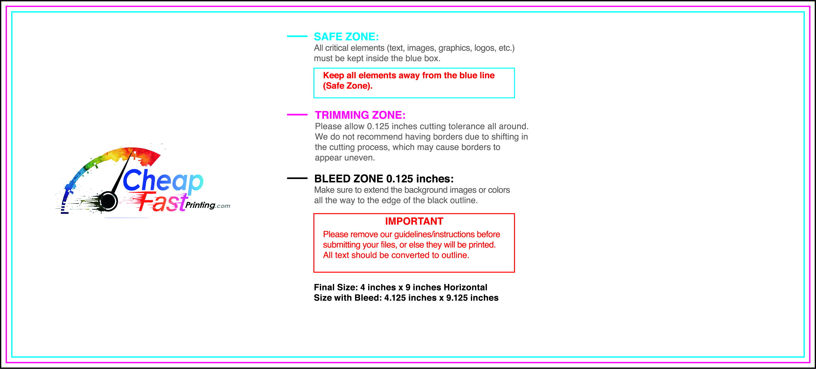
Submit a print-ready PDF (CMYK) at 300 DPI with 0.125" bleed and safe margins around important text. Keep thin lines above 0.5 pt and make QR codes at least ~0.8" square for reliable scanning.
Use vector logos when possible and limit your fonts to maintain a clean, professional look.
Request a proof so you can confirm spelling, margins, and QR/URL accuracy before production. Proofing is the easiest way to prevent expensive reprints.
Double-check phone numbers and offer terms first—those are the most common issues.
Match your flyer headline and offer to the landing page headline so visitors feel they’re in the right place. Keep the CTA consistent and make the page fast to load and easy to complete on mobile.
If you run ads, retarget QR visitors with the same offer to improve conversions.
Plan a steady supply for community boards and partner locations. Short runs allow schedule updates without waste.
Predictable timing supports stronger booking response and keeps the message current.
Track which locations drive the most QR scans and prioritize restocks there.
Use smaller top-up runs to match seasonal changes without redesigning the layout.
Balance weekly and monthly distributions to keep coverage consistent.
Use distribution logs to identify boards that perform well and retire low-response locations.
For seasonal pushes, cheap yoga studio flyers can keep budgets stable while you scale.

