
Professionally designed for 4" x 9" flyers. Fully editable & free!
Preparing Templates…
In the competitive world of retail pharmacy, staying top-of-mind is essential. Patients have choices, from big box chains to mail-order services. A professional bag stuffer reminds them why your local, personalized care is superior.
Ordering 500 pharmacy flyers in the slim 4x9 pharmacy flyers format gives you the perfect tool for prescription bags. Every refill that leaves your counter is an opportunity to cross-sell a service.
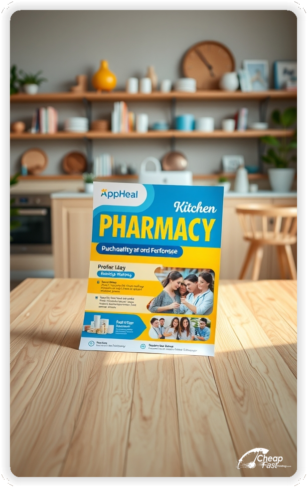
Effective pharmacy marketing materials highlight convenience: delivery, immunizations, and medication synchronization. The handout should educate patients on services they didn't know you offered.
When the print quality is crisp and the paper is glossy, it reflects the cleanliness and professionalism of your drugstore.
Focus on convenience. 'Free Delivery' or '15-Minute Wait Times' are huge selling points.
Highlight seasonal needs. Flu shots in Fall, allergy meds in Spring, vitamins in Winter.
Use the 4x9 rack card size to create a 'Health Checklist' that patients will want to keep on their fridge.
These pieces must build trust and awareness. Many patients travel to you just for a refill, unaware of your other clinical services.
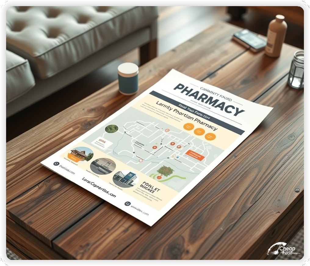
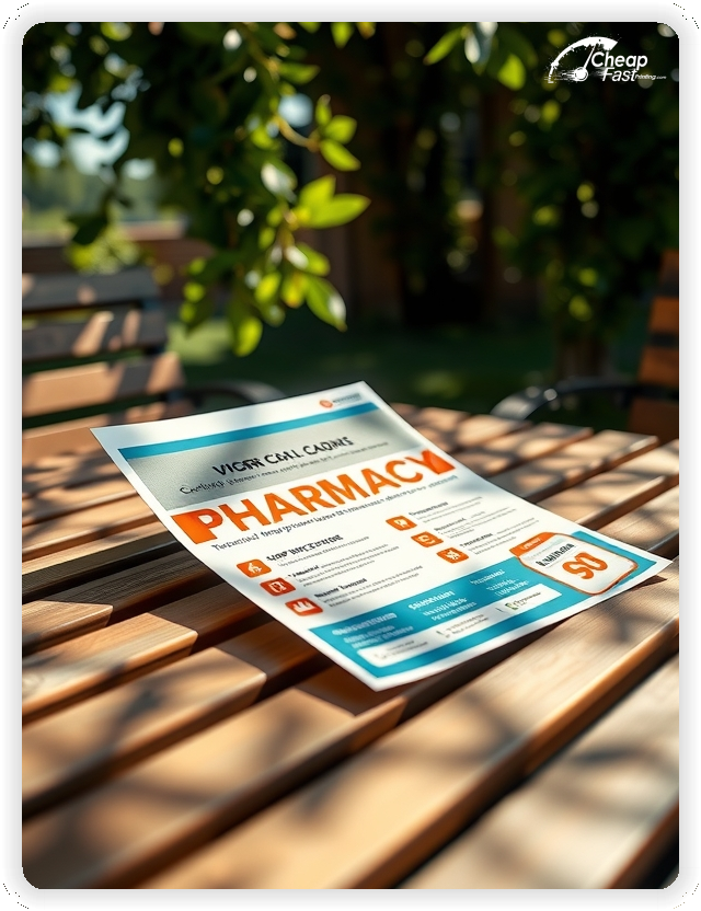
The 4x9 size is the industry standard for prescription bag stuffers. It slides easily into a #5 or #6 bag without getting crumpled.
For pharmacies requesting custom pharmacy flyers, this size doubles as a counter brochure or rack card.
It provides a vertical layout perfect for bulleted lists of services or 'Steps to Transfer Your Script'.
14pt Gloss Cover provides a sterile, clean look that signals hygiene and safety. Colors pop, making pill images and logos look sharp.
The glossy finish wipes clean and is durable enough to survive being carried in a purse.
Standard paper feels flimsy; glossy paper flyers generally have a higher retention rate.
Be timely. 'Flu Shots Available Now - No Appointment Needed'.
Use these as bag stuffers starting in late August.
This is a high-margin service that needs constant promotion.
Steal market share. 'Tired of Long Lines? Switch to Us'.
Explain how easy the process is; fear of hassle is the #1 barrier to switching.
Compete with mail order. 'Free Same-Day Delivery'.
This is a killer benefit for seniors and busy parents.
Improve adherence. 'Pick Up All Your Meds on One Day'.
Use the brochure to explain the 'Med Sync' program.
This increases your efficiency and patient satisfaction.
Highlight your niche. 'Custom Medication for You and Your Pets'.
Many doctors don't know who to refer to; drop these rack cards at veterinary and pediatric clinics.
Place pharmacy handouts in every outgoing bag.
Partner with local urgent cares to have your materials in their lobby.
Mail to new homeowners in your zip code to capture them before they choose a chain.
Modernize your image. 'Scan to Refill from Your Phone'.
Link to your mobile app or refill website.
Boost front-end sales. 'Pharmacist Recommended Immunity Pack'.
Use the leaflet to educate on the difference between high-quality pharmacy grade vitamins and grocery store brands.
Target chronic conditions. 'Free Glucose Meter Training'.
Position yourself as a partner in their disease management.
Ordering cheap pharmacy flyers keeps your marketing ROI high.
A run is perfect for testing a seasonal promo like 'Sun Care' or 'Back to School'.
Consistent bag stuffers are cheaper than acquiring new customers.
Target the caregivers. 'We Bubble Pack for Easy Dosing'.
Drop materials at assisted living facilities to win large accounts.
Be a resource. 'Free Medicare Plan Review'.
This service builds immense loyalty among seniors.
You handle health. Your marketing must look professional. High-quality pharmacy flyers printing assures patients you don't cut corners.
Smudged ink suggests a lack of attention to detail.
Keep them coming back. 'Earn Points on Every Purchase'.
Use the insert to explain the rewards tiers.
Use a direct CTA such as 'Transfer Today' or 'Ask Your Pharmacist'.
Include an expiry date on coupons to drive immediate action.
Use clean, sans-serif fonts for readability. White space is critical.
Use icons (truck for delivery, needle for shots) to make it skimmable.
Flyers work best when they solve a problem. 'Don't wait in line' solves a problem. 'We have open appointments' solves a problem.
When the design communicates care and speed, the marketing works.
Pair print with text message reminders for a full patient engagement strategy.
Your bag stuffer has about 3 seconds to catch a patient's eye before they throw the bag away. Don't use generic shield logos. Ensure your main headline ('We Deliver') offers a clear benefit. Use trusted medical colors (Blue/White/Green) to evoke health.
Target the Right Bags: Success isn't just about design; it's about timing. Put flu shot info in antibiotic pick-up bags. Put vitamin offers in antibiotic bags. Cross-sell based on the immediate need.
Upload your logo and service list to create custom inserts that drive transfers.
Proofing checks contrast, trimming, and font size so your seniors can read the offer.
Proof review also confirms the QR destination and phone numbers so the printed piece works without errors.
Confirm that the address is correct.
Verify that store hours are accurate.
Check that the layout aligns evenly after trimming.
Use the 4x9 template to keep margins consistent and reserve space for rack display visibility.
Templates also protect the layout so coupon updates do not break alignment.
Consistent spacing keeps contact details visible after trimming.
A stable grid helps marketing teams update seasonal shots without redesigns.
Consistent templates also support multi-location updates with minimal editing.
They also preserve alignment for QR placement and logo sizing.
It also keeps headers aligned across flu and allergy campaigns.
Loading Free Editable Designs...
Please wait while we prepare the template library.
Focused layouts outperform crowded pieces because the offer is clearer.
Consistent templates reduce design time and keep the pharmacy brand strong.
Compare response by transfer volume rather than only print cost.
When the brand stays consistent, patients trust the pharmacist easier.
Tracking coupon redemption helps refine the next bag stuffer.
Review OTC sales lift to understand which inserts perform best.
Use one clear headline, one offer, and one primary CTA (call, scan, or order). Add the essentials: phone, website/QR, service area, hours (if relevant), and a trust signal like years in business or a short review snippet.
Keep the layout scannable: one hero image or icon, short bullets, and high-contrast CTA text that’s readable at arm’s length.
Yes. 4" x 9" balances visibility and readability without feeling cramped. It gives enough space for a strong headline, a benefits list, and a CTA while staying easy to hand out or place on counters and boards.
Prioritize spacing and hierarchy over extra copy so the main message lands in 3–5 seconds.
14 pt. Gloss with Gloss affects how the flyer feels and how colors read. Gloss tends to boost color and photos, matte reduces glare and feels more premium for text-heavy layouts, and uncoated is great for writing on.
If your design uses lots of fine text, choose clarity and contrast first; paper upgrades won’t fix a crowded layout.
500 works well when you want consistent visibility across multiple placements (counters, boards, partner locations, events) over a few weeks. Bulk also lowers unit cost so you can test a message and keep the winner running.
Track performance, then reprint the best offer instead of changing everything at once.
If price is your main hook, feature one simple offer (“ off” or “Starting at ) and keep the fine print minimal. If you have variable pricing, use a short value statement and send details to a landing page.
A clean offer + simple CTA typically outperforms a long price list.
Use a QR code to a dedicated landing page and add UTM tags for each route or partner. Track scans, form fills, and calls to identify the placements that actually convert.
For non-QR audiences, include a short, memorable URL or a trackable phone extension.
Start where your customers already are: complementary businesses, community boards, local events, and targeted neighborhoods. Ask partners for the most visible spot and refresh before your flyer gets buried.
Use a consistent route and restock winners; small, repeated placements usually beat one big drop.
Submit a print-ready PDF (CMYK) at 300 DPI with 0.125" bleed and safe margins around important text. Keep thin lines above 0.5 pt and make QR codes at least ~0.8" square for reliable scanning.
Use vector logos when possible and limit your fonts to maintain a clean, professional look.
Request a proof so you can confirm spelling, margins, and QR/URL accuracy before production. Proofing is the easiest way to prevent expensive reprints.
Double-check phone numbers and offer terms first—those are the most common issues.
Match your flyer headline and offer to the landing page headline so visitors feel they’re in the right place. Keep the CTA consistent and make the page fast to load and easy to complete on mobile.
If you run ads, retarget QR visitors with the same offer to improve conversions.
Plan a steady supply for every prescription bag. Short runs allow seasonal updates without waste.
Predictable inventory supports consistent cross-selling.
Track which seasons drive the most traffic and stock up early.
Use bulk pharmacy flyers to ensure you never hand out a plain bag.
Balance broad awareness and targeted disease-state distributions.
For grand openings, large runs provide the volume needed to blanket the neighborhood.

