Professionally designed for 3.5" x 8.5" flyers. Fully editable & free!
Preparing Templates…
If you need Brewery Flyers that turn a passerby into a taproom guest, lead with one featured release, one offer, and one simple next step to visit or order.
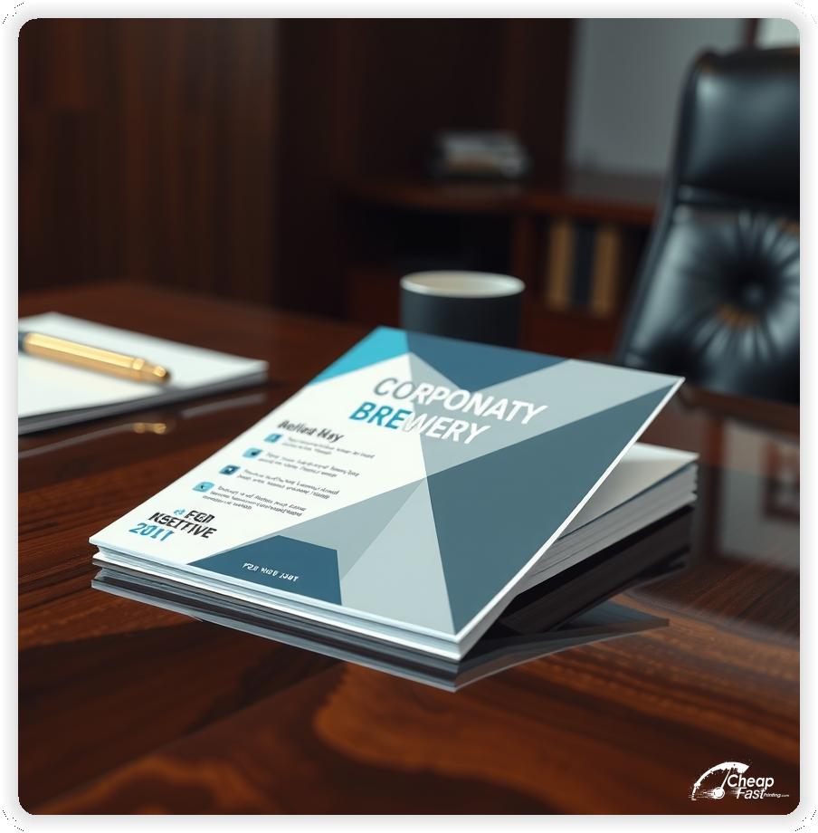
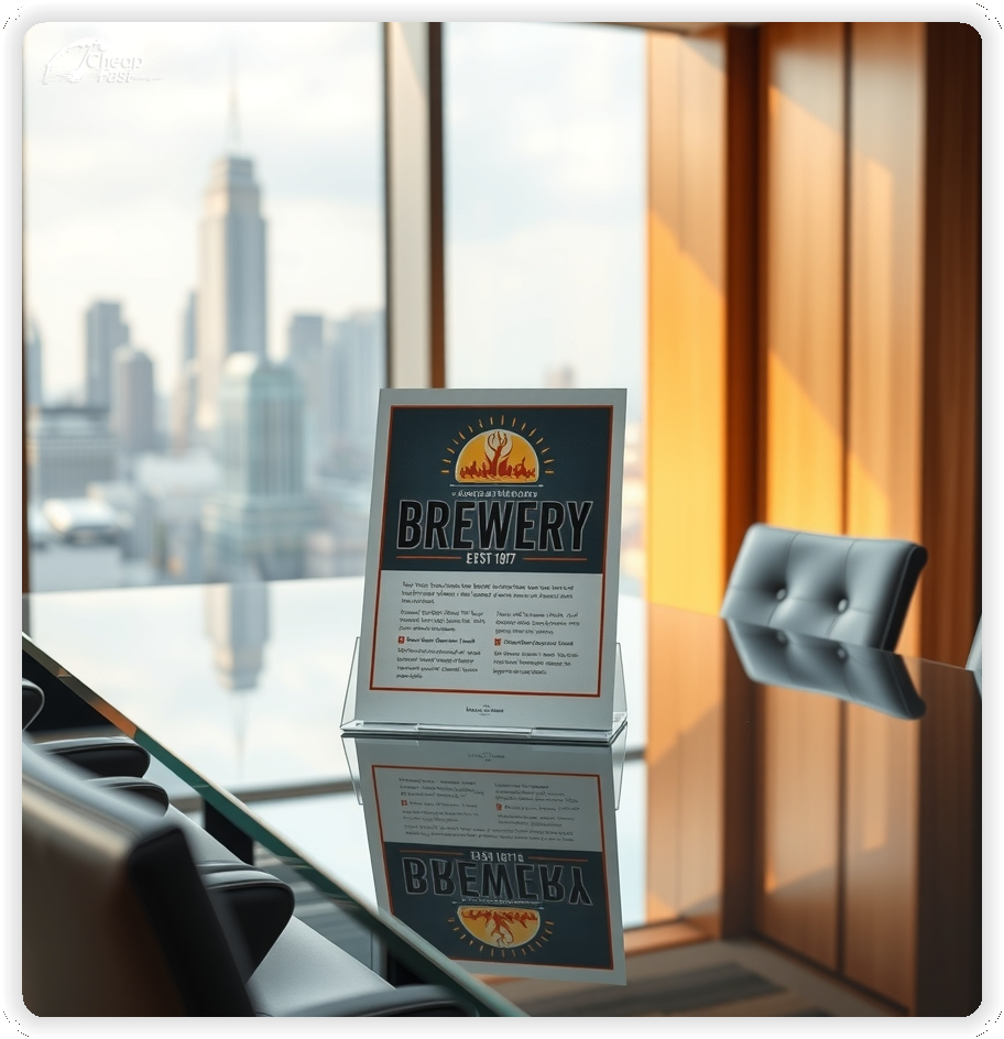
Use the 3.5x8.5 format for bar tops, takeaway bags, and partner stacks without taking over the counter.
For weekend pushes and neighborhood coverage, run a consistent message across multiple placements and refresh the offer as releases change.
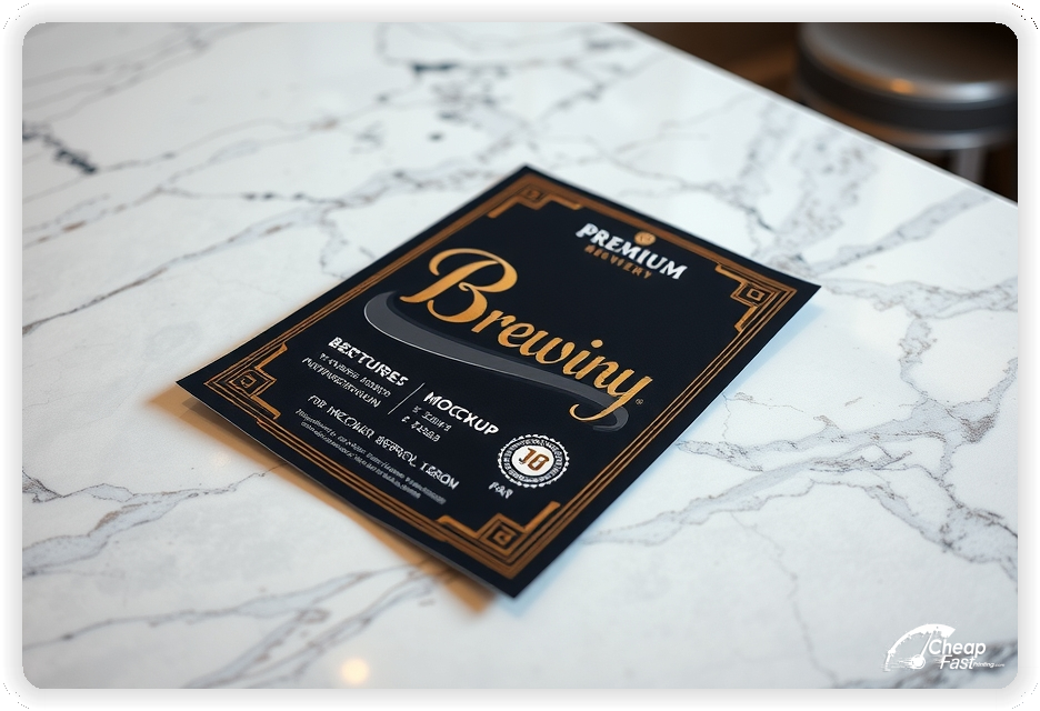
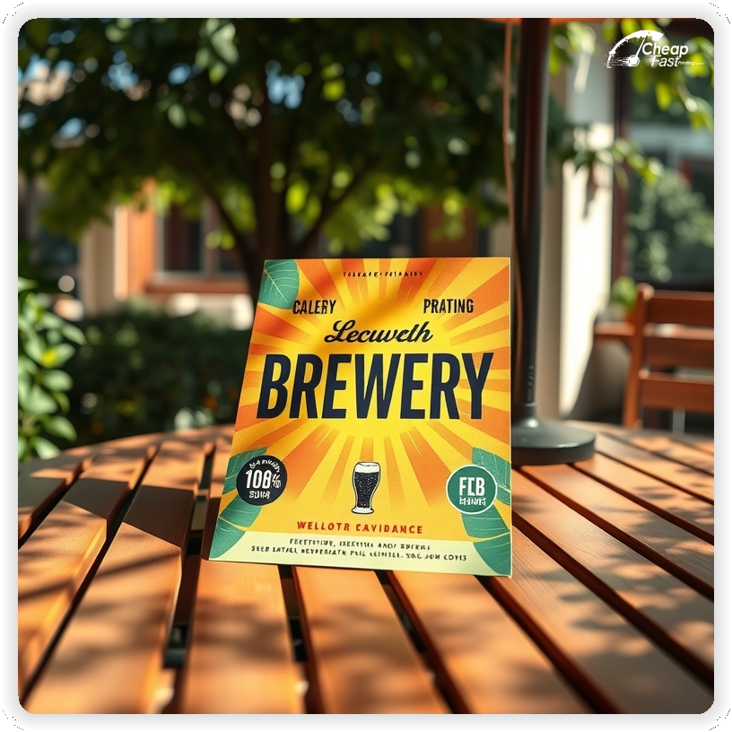
100lb gloss cover creates high-impact glossy paper flyers that make can art, tasting notes, and event dates look crisp.
Lead with one featured beer or event and one clear offer, such as a release weekend, trivia night, or limited pour.
Keep the CTA direct and include one fast action option, such as scan to view the tap list, RSVP, or order.
Use high contrast so dates, hours, and the QR or short URL stay readable at a glance.
These pieces must communicate the hook fast. Prospects respond best to one offer, one proof point, and one clear CTA.
This structure keeps brewery marketing materials focused and action-ready.
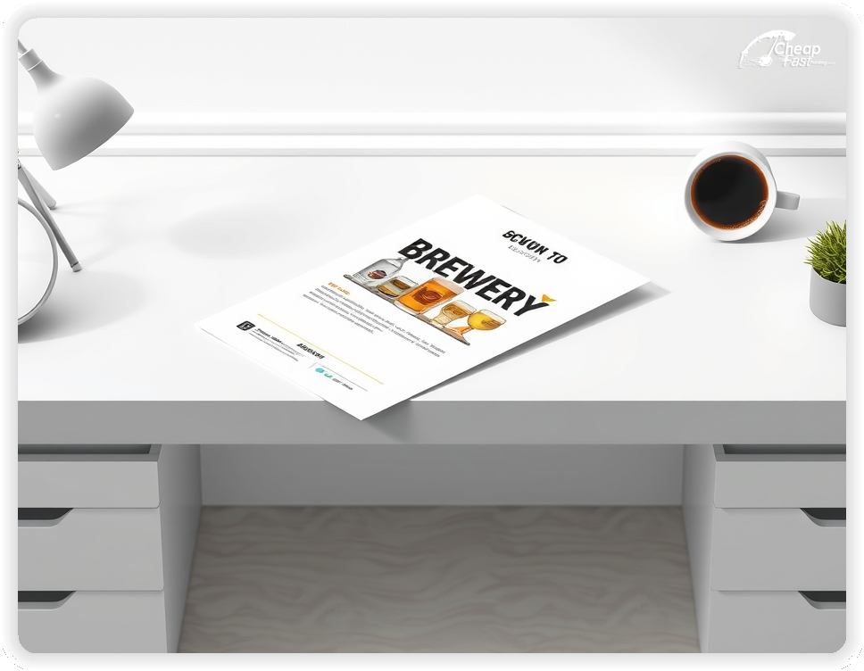
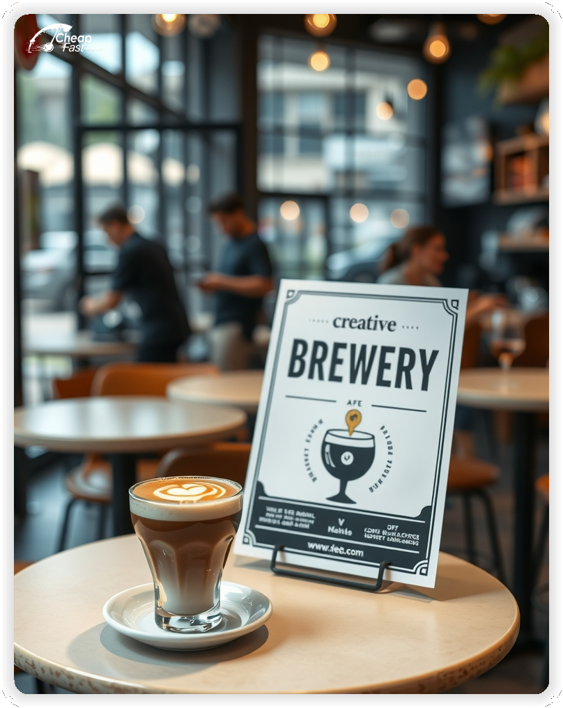
3.5x8.5 brewery flyers are easy to hand out and easy to keep. The slim format fits in bags, under a pint glass, and in counter stacks.
Use the top third for the featured release, the middle for two to three key details, and the bottom for the CTA and QR.
For compact, high-impact brewery handouts, this size stays readable without crowding the bar.
Beer labels and can art depend on color. Glossy paper flyers keep photos, gradients, and fine text crisp so releases look premium.
Use strong contrast and short lines so dates, hours, and the QR instruction stay readable.
With 100lb gloss cover stock, custom brewery flyers hold up in stacks and frequent handling.
A focused offer removes hesitation. Examples include a flight special, a limited release, or a timed happy-hour deal.
Keep the offer line short and move full terms to the tap list or event page so the flyer stays clean.
Clear offers improve response because guests understand the next step.
Prospects scan first. Keep the event date, time, and location in one tight block.
Use a short tasting-note line and avoid long paragraphs.
Readable formatting matters for brewery flyers printing because clarity drives visits.
Choose one guest focus per flyer, such as lager fans, IPA releases, barrel-aged drops, or food-truck nights.
This keeps messaging specific and improves turnout quality.
Focused positioning reduces wasted placements and increases response.
Guests want confidence in quality. Add one short trust line such as awards, ratings, or “fresh batch this week.”
Keep it brief and let your website or tap list show full details.
A trust line near the QR improves response without clutter.
Reduce friction with one short line about hours, parking, and how to find the taproom.
Keep it brief so the featured release remains the focus.
Clear access notes reduce questions and increase turnout.
Memberships can be summarized in one line, such as “mug club available” or “release club signups open.”
Keep detailed terms on the signup page so the flyer stays easy to scan.
This supports repeat visits without crowding the main offer.
Events create urgency. Use a short callout for a release weekend, trivia night, or live music.
Keep dates short and direct readers to an RSVP or tap list page for full details.
Event callouts add urgency while keeping the featured offer visible.
Place flyers at bottle shops, restaurants, local markets, and event boards with permission.
Ask for the most visible spot and refresh stacks regularly.
Consistent placement supports awareness and brings steady taproom visits.
Each flyer should lead to one action. A QR code to your tap list or event page reduces friction.
Keep the landing page focused on the featured release, hours, and a simple RSVP or order path.
This flow converts better than long pages because the decision path stays clear.
Demand rises around release weekends, festivals, and seasonal launches.
Plan one primary run before the drop and a smaller follow-up run to stay top of mind.
For tight timelines, rapid brewery flyers support fast updates without redesigning everything.
Match the flyer headline and offer to your tap list or event page to reduce confusion.
Use the same beer names and the same CTA across channels.
Alignment across brewery marketing materials online and print improves conversion because the message stays consistent.
Test two offers with the same layout to learn what drives more taproom visits.
Change only the offer line and track QR scans by placement.
Once a winner is clear, scale with bulk brewery flyers to keep outreach consistent.
Multi-location placements benefit from consistent templates and localized details.
Keep branding aligned while adjusting partner mentions, neighborhoods, and QR destinations.
For steady coverage, ordering a 2,500-piece run supports consistent reach without delays.
Consistent visuals help guests recognize your brewery quickly.
New guests need clear guidance. Use one line that explains what’s featured and how to get the full tap list.
Keep the text short and link to a simple page with hours and directions.
This reduces friction and improves turnout.
Use language that fits your taproom style, such as crisp and clean, hop-forward, or barrel-aged and bold.
Keep tone consistent across the offer and CTA so the piece feels cohesive.
Aligned tone makes your brewery feel memorable.
Use a short reminder line such as “new releases every week” or “seasonal flights available.”
Do not add a long list of everything. The goal is to encourage repeat visits.
Retention messaging supports steady traffic without overshadowing the main offer.
One short quality line can improve confidence, such as “fresh on tap” or “small-batch brewed.”
Keep it brief and place it near the featured release.
Short quality notes support decisions without clutter.
Local roots matter. One short line about being locally brewed or community-focused builds credibility.
Keep it to one line and let your website tell the deeper story.
This builds trust without heavy copy.
Guests judge brands quickly. Crisp printing and clean stock make your release feel premium.
High-quality glossy paper flyers keep photos and fine text sharp.
A polished finish helps simple designs look intentional.
Many guests discover breweries through partner businesses and local boards. A clear flyer supports discovery when digital ads miss local foot traffic.
For consistent coverage, distribute bulk brewery flyers across weeks.
This supports awareness while your tap list page captures action.
Use a direct CTA such as “Scan for today’s tap list,” “RSVP for the release,” or “Order pickup.”
Keep the CTA short and place it near the QR code so the next step is obvious.
Clear CTAs help prospects decide quickly and support higher turnout.
Spacing matters for bar-top pieces. Use generous margins around the featured release and QR CTA.
Keep text blocks short and separate them with simple dividers.
A balanced layout keeps attention on the offer and makes the piece feel professional.
Flyers work best when they create one clear path from interest to a visit. A clear headline, one offer, and one CTA are enough.
When the layout stays focused, brewery flyers printing supports real turnout without heavy copy.
Pair print with a tap list or event page and keep the message aligned for a consistent experience.
Your flyer has about 3 seconds to earn attention before it’s tossed or kept. Lead with one release and one offer, then make the CTA obvious.
Target the Right Accounts: Focus on bottle shops, restaurants, local markets, and event boards where craft drinkers already visit.
Most prospects do not visit the moment they touch a flyer. They notice it, they remember it, and they act later when a weekend opens up or a friend wants to go out. Plan distribution like a routine instead of a single drop. Pick two to four routes, repeat every two to three weeks, and keep the headline consistent so recognition builds.
Pair one primary route with two supporting placements. A counter stack at a bottle shop, restaurant, or local market adds extra touches. Use the same offer across all placements and track results with distinct QR destinations. When you know what works, you can scale and stop printing brewery handouts that are not producing visits.
When budgets are tight, start with one focused message and scale after you identify the best placement.
Use your winning layout and expand coverage with bulk brewery flyers for consistent outreach.
Keep the design clean so the message still feels premium.
Plain language helps people decide quickly. Use short lines like “fresh pours,” “limited release,” or “live music this weekend.”
Keep benefits short and avoid jargon-heavy paragraphs.
Clear messaging supports higher response rates.
Your flyer has about 3 seconds to make an impression before it’s tossed or kept. Don’t bury the lead. Ensure your featured release and primary offer are visible from arm’s length.
Target the Right Accounts: Focus on bottle shops, restaurants, and local markets where craft drinkers already visit, then repeat routes so recognition builds.
Upload artwork and keep the focus on one offer and one CTA for custom brewery flyers.
Proofing checks contrast, trimming, and spacing so your offer and CTA stay clear.
Proof review also confirms the QR destination and contact lines so the flyer works without errors.
Confirm that the tap list or event page loads quickly on mobile.
Verify that your key offer reads well at arm’s length.
Check that the QR code scans reliably from a typical phone distance.
Confirm that dates and hours do not wrap on narrow layouts.
Use the 3.5x8.5 template to keep margins consistent and reserve space for the featured release, offer, and CTA blocks.
Templates protect spacing so updates do not break alignment.
Consistent grids keep contact details visible after trimming and support quick approvals.
A stable layout helps you refresh offers without redesigning.
Templates also support partner-specific versions with minimal edits.
They preserve alignment for QR placement and short URLs across every run.
They also keep headers aligned across seasonal promos cleanly.

Loading Free Editable Designs...
Please wait while we prepare the template library.
Focused layouts outperform crowded pieces because the offer and CTA stay visible.
Consistent templates reduce design time and keep the message aligned across seasons.
Compare response by taproom visits, event RSVPs, and repeat customers rather than only print cost.
When the offer stays consistent, guests recognize your brewery faster and respond with less hesitation.
Tracking results by placement helps refine the next print cycle.
Review scan-to-tap-list ratios to understand which locations convert best.
Use one clear headline, one offer, and one primary CTA (call, scan, or order). Add the essentials: phone, website/QR, service area, hours (if relevant), and a trust signal like years in business or a short review snippet.
Keep the layout scannable: one hero image or icon, short bullets, and high-contrast CTA text that’s readable at arm’s length.
Yes. 3.5" x 8.5" balances visibility and readability without feeling cramped. It gives enough space for a strong headline, a benefits list, and a CTA while staying easy to hand out or place on counters and boards.
Prioritize spacing and hierarchy over extra copy so the main message lands in 3–5 seconds.
100 lb. Gloss Cover with Gloss affects how the flyer feels and how colors read. Gloss tends to boost color and photos, matte reduces glare and feels more premium for text-heavy layouts, and uncoated is great for writing on.
If your design uses lots of fine text, choose clarity and contrast first; paper upgrades won’t fix a crowded layout.
2500 works well when you want consistent visibility across multiple placements (counters, boards, partner locations, events) over a few weeks. Bulk also lowers unit cost so you can test a message and keep the winner running.
Track performance, then reprint the best offer instead of changing everything at once.
If price is your main hook, feature one simple offer (“ off” or “Starting at ) and keep the fine print minimal. If you have variable pricing, use a short value statement and send details to a landing page.
A clean offer + simple CTA typically outperforms a long price list.
Use a QR code to a dedicated landing page and add UTM tags for each route or partner. Track scans, form fills, and calls to identify the placements that actually convert.
For non-QR audiences, include a short, memorable URL or a trackable phone extension.
Start where your customers already are: complementary businesses, community boards, local events, and targeted neighborhoods. Ask partners for the most visible spot and refresh before your flyer gets buried.
Use a consistent route and restock winners; small, repeated placements usually beat one big drop.
Submit a print-ready PDF (CMYK) at 300 DPI with 0.125" bleed and safe margins around important text. Keep thin lines above 0.5 pt and make QR codes at least ~0.8" square for reliable scanning.
Use vector logos when possible and limit your fonts to maintain a clean, professional look.
Request a proof so you can confirm spelling, margins, and QR/URL accuracy before production. Proofing is the easiest way to prevent expensive reprints.
Double-check phone numbers and offer terms first—those are the most common issues.
Match your flyer headline and offer to the landing page headline so visitors feel they’re in the right place. Keep the CTA consistent and make the page fast to load and easy to complete on mobile.
If you run ads, retarget QR visitors with the same offer to improve conversions.
Plan a steady supply for partner counters and route drops. Short runs let you refresh releases without waste.
Predictable timing supports stronger response and keeps the message current.
Track which locations drive the most QR scans and prioritize restocks there.
Use smaller top-up runs to match seasonal launches without redesigning the layout.
Balance weekly and monthly distribution to keep coverage consistent.
Use distribution logs to identify placements that perform well and retire low-response locations.
Start with 2500 brewery flyers to test placement, then scale once a route proves performance.

