Professionally designed for 8.5" x 11" flyers. Fully editable & free!
Preparing Templates…
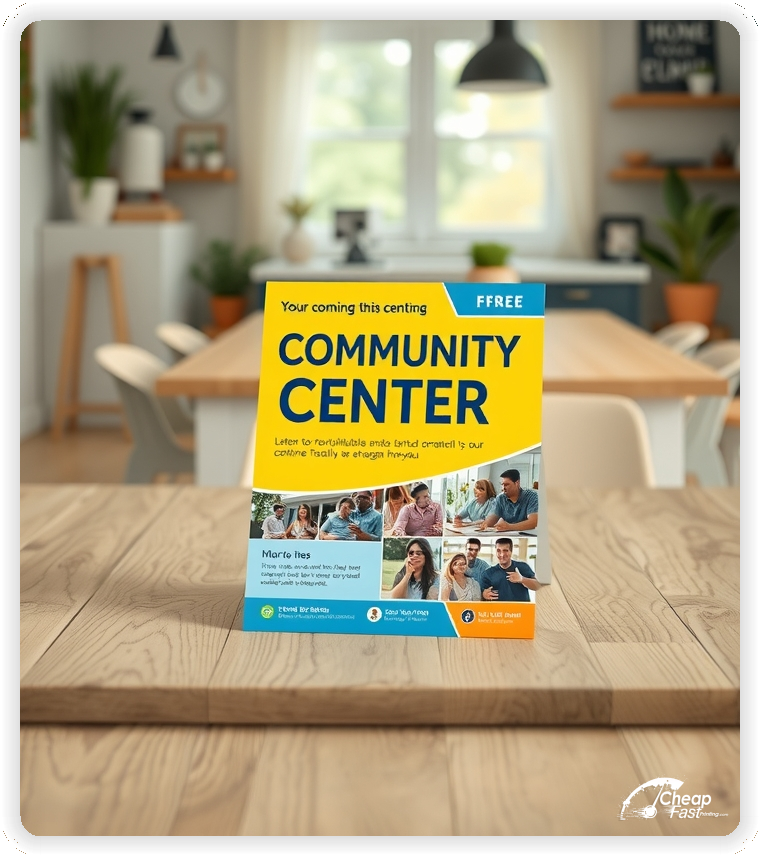
Community centers are the heart of the neighborhood, but participation starts with awareness. Use these professional handouts to announce upcoming classes, seasonal festivals, and local resource programs in a format that stands out on any bulletin board.
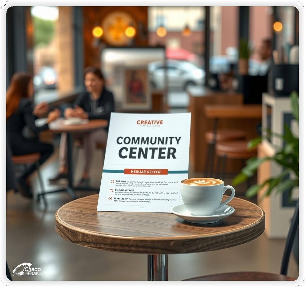
For high-traffic areas like library entrances and local cafes, 8.5x11 community center flyers provide the perfect canvas for detailed event schedules and registration forms. This ensures the message is both informative and visually engaging.
Use these community center handouts to promote everything from senior fitness to youth sports. Add a QR code to the registration page to turn print materials into trackable sign-ups for the next session.
When needing to reach every doorstep, 2500 community center flyers provide the coverage needed at a sustainable cost. Distributing these bulk promotional materials across the service area keeps programs full and residents connected.
Print on glossy paper flyers for a professional, vibrant finish that makes event photos pop and text easy to read. With these custom community center materials and reliable community center flyers printing, the center will stand out as a trusted local hub.
Lead with the most popular program—such as a seasonal festival or summer camp—to grab attention more effectively than a generic list of services.
Keep the registration deadline visible and place the contact details or website link near the bottom so residents know exactly how to sign up.
Use a balanced layout with high-quality photos of diverse community activities to build immediate trust and interest with local families.


Effective flyers make programs feel inclusive and well-organized. Residents respond best to clear benefits and a simple way to participate.
This structure keeps the handouts focused on driving community participation.
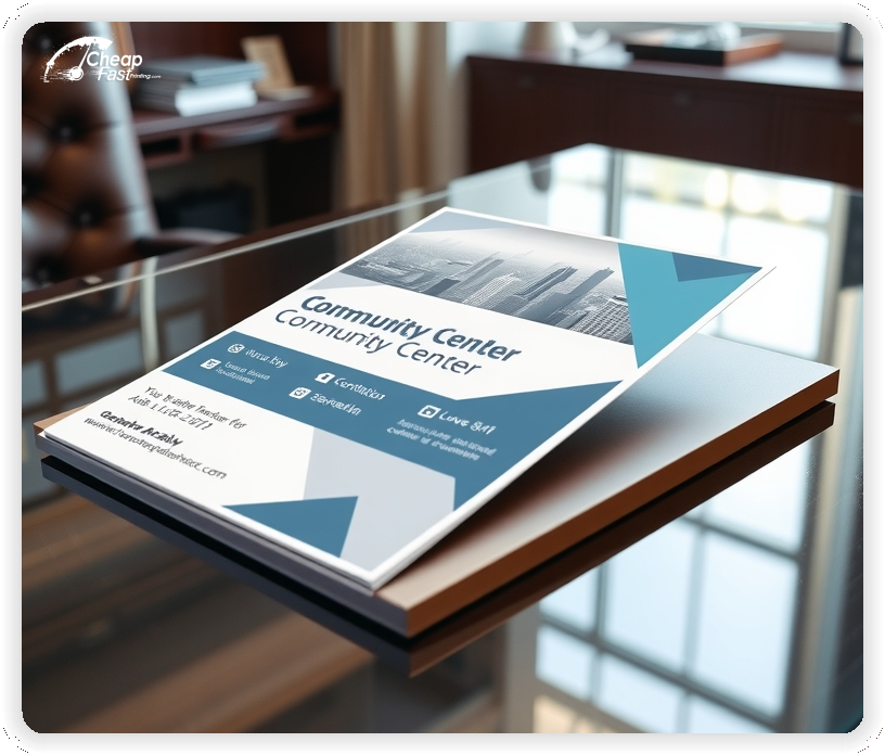
The 8.5x11 size creates enough room for a monthly calendar or a detailed registration form without feeling cluttered.
For centers requesting custom community center flyers, this standard size is ideal for slipping into neighborhood welcome packets or mailing with utility bills.
Use the top for the primary event, the middle for the program schedule, and the bottom for the CTA and center address.
As community center marketing materials, the standard size stays readable on crowded community boards and shop windows.
A glossy paper flyers finish provides a professional, high-impact look that makes event photos and colorful graphics stand out. This ensures the promotional pieces attract attention even from a distance.
The 100lb gloss cover paper provides a premium feel that holds up well in outdoor kiosks and high-traffic distribution racks.
For bulk community center flyers, the gloss finish keeps the brand looking professional while remaining cost-effective for large neighborhood runs.
A clear registration deadline removes the procrastination residents often feel when signing up for classes. Examples include early bird discounts or limited spot warnings.
Keep the deadline clear and direct readers to a registration portal for full details. This improves the conversion rates for seasonal campaigns.
Schedules must be easy to scan. Use a simple list with dates and times for the next three major events or program starts.
Use bold headers for different age groups (Youth, Adult, Senior) to help residents find relevant programs quickly.
Clear scheduling is essential for community marketing because timing is often the deciding factor for busy families.
Choose one primary program to feature for each run of flyers, such as youth basketball, senior ceramics, or an aquatic center opening.
This keeps the message specific and helps residents identify with the opportunity more quickly.
Focused positioning improves sign-up quality and supports higher attendance for the featured programs.
Residents want confidence in the quality and safety of center programs. A short line about city affiliation or certified instructors builds immediate credibility.
Keep credentials brief and move the full department bio to the website. A short trust line near the CTA supports faster registration decisions.
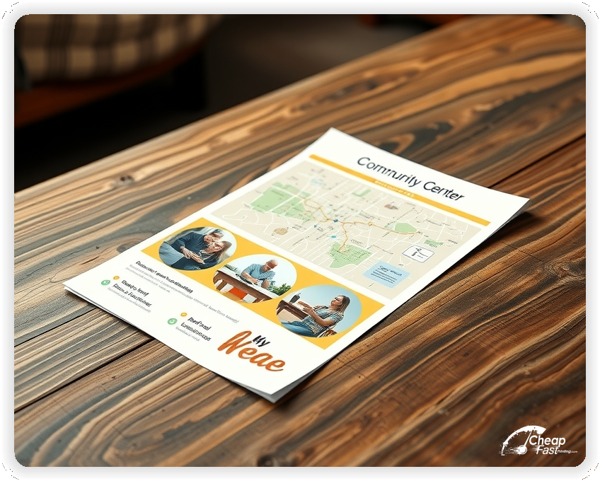
Clearly state the center address and if parking or transit access is available. Add a short line about the neighborhoods served or resident residency requirements.
Clear access notes reduce irrelevant inquiries and help target the right local residents with 2500 community center flyers.
Summarize fees in one line, such as “Programs start at $25 or are free for residents.”
Keep detailed pricing on the registration page to keep the flyer easy to scan. This keeps community center flyers printing costs focused on generating interest, not just listing prices.
One-time events like town halls or seasonal festivals are strong for building general awareness. Use a short callout for an upcoming event to drive traffic to the site.
Event callouts add urgency to campaigns while keeping the core services visible.
Place flyers at libraries, local schools, and park kiosks where families gather.
Ask partner organizations for display space and refresh the handouts regularly to keep the community informed.
Each flyer should lead to one action. A QR code leading to a registration form or program portal reduces the friction of calling or visiting in person.
This flow converts better for modern residents who prefer to sign up or inquire online.
Interest in programs rises before summer break, the start of the school year, and during new year resolution periods.
When programs are filling fast, cheap community center flyers support a timely campaign refresh for the next session start date.
Match the flyer headline and program dates to the municipal website to create a cohesive resident experience.
Alignment across marketing materials online and print improves trust because the message stays consistent across all official channels.
Test two different headlines—like focusing on 'Health' vs. 'Fun'—to see which generates more QR scans for a specific class.
Once a winner is found, scale with affordable custom printing to maximize the community impact.
Municipalities with multiple centers benefit from consistent templates that can be localized for different neighborhood facilities.
Use wholesale printing services to keep branding aligned while scaling outreach across the city.
New residents need guidance on how to join. Use one line that explains the membership process (e.g., “Resident ID required for enrollment”).
This positions the center as a helpful resource for new community members and builds a relationship early on.
Use language that reflects the center's mission, such as “All are welcome,” “Family-friendly,” or “Accessible to all.”
Aligned tone helps the flyer feel authentic and attracts the residents who are the best fit for the community programs.
Use a short line such as “Advanced skills training and volunteer opportunities available” to encourage ongoing engagement from current members.
This supports long-term community growth without overshadowing the primary program offer.
Safety is a top priority for families. A short line about sanitized equipment or safe environment policies builds confidence.
Short safety notes support enrollment decisions without requiring a long list of policies.
Centers often stand out through local non-profit partnerships. A short line about local food bank support or community garden work builds strong connections.
This creates a sense of trust and community belonging for local residents.
Public institutions rely on trust and professionalism. Premium quality prints on gloss cover reinforce that trust by keeping text sharp and colors vibrant.
When the materials look polished, the center feels more established and reliable as a public resource.
Many residents discover center programs through neighborhood boards or library racks. A clear, professional flyer supports discovery when digital ads miss local foot traffic.
For local outreach, bulk flyer printing keeps distribution consistent across the neighborhood.
Use an action-oriented CTA such as “Register for summer camp” or “Join the senior club.”
Clear CTAs help residents decide quickly and support higher participation rates for the programs.
Spacing matters in professional branding. Use generous margins around the program list and contact block.
A balanced layout keeps the focus on the events and makes the center's communication feel refined.
Facility rentals for birthdays or meetings attract residents with specific needs. A short line about “Room rentals available for private events” adds value to the center's offerings.
This supports revenue generation while keeping the primary program offers clear.
Specialized services like tax prep or job fairs can be a growth channel. A short line about community workshops signals the center's expertise as a resource hub.
This adds a professional-grade option without crowding the primary program schedule.
Centers that offer holiday events can include a short line about tree lightings, craft fairs, or seasonal celebrations.
This adds depth to the community profile and builds credibility for the standard year-round classes.
If the center keeps classes small, mention it. Use a line like “Small class sizes for personalized instruction.”
This sets expectations and highlights the value of the center's approach to community learning.
Some centers recommend local resources, health clinics, or social services. A short line about “Community resource guides available” can add value to the resident's visit.
This supports the role as an expert hub for local community information.
Summer camp and after-school programs build attendance. Use a short line about “Safe and engaging after-school care” to drive seasonal interest.
Seasonal messaging improves repeat visits and keeps the center relevant year-round.
New residents want to know what to bring. A short line about registration forms or membership cards can reduce first-day stress.
This small detail supports smoother program starts and more confident residents.
A short note such as “Programs for all ages and abilities welcome” helps residents feel comfortable regardless of their background.
Clear inclusivity messaging supports community growth and encourages first-time sign-ups.
Flyers work best when they create one clear path from a resident's need to a community solution. A strong headline and a visible CTA are enough.
When the layout stays focused, the center can be promoted without overwhelming residents with copy.
A flyer has about 3 seconds to make an impression before it's tossed or kept. Don't bury the lead. Ensure the main headline and primary offer are visible from arm's length. Use high-contrast colors and bold typography to guide the eye exactly where wanted.
Target the Right Neighborhoods: Success isn't just about design; it's about distribution. Focus efforts on neighborhoods that match the ideal customer profile. For local businesses, a tight radius around the location often yields the highest ROI.
Most residents do not decide the moment they see a flyer. They notice, they remember, and they act when a program or event becomes relevant. For community center marketing, plan distribution like a routine. Pick four tight neighborhoods with high resident density, repeat every few weeks, and keep the headline consistent.
Pair the primary route with library and school placements. A counter stack at a local cafe or grocery store creates extra touches. Use the same offer across all placements and track results with a unique QR code destination.
A flyer has about 3 seconds to make an impression before it's tossed or kept. Don't bury the lead. Ensure the main headline and primary offer are visible from arm's length. Use high-contrast colors and bold typography to guide the eye exactly where wanted.
Target the Right Neighborhoods: Success isn't just about design; it's about distribution. Focus efforts on neighborhoods that match the ideal customer profile. For local businesses, a tight radius around the location often yields the highest ROI.
Upload the logo and event schedule for professional materials that convert.
Proofing checks contact details, program lists, and city logos so the flyer remains error-free.
Proof review also confirms the registration links so print pieces work without technical issues.
Use the 8.5x11 template to keep margins consistent and reserve space for the center's contact block.
Templates protect the program grid so updates do not break the layout. Consistent spacing keeps affiliations visible after trimming.
Loading Free Editable Designs...
Please wait while we prepare the template library.
Focused designs outperform cluttered pieces because solutions stay visible. Consistent templates reduce design time and keep the center's brand aligned across seasons.
Compare results by the number of enrollments and long-term resident engagement rather than only the cost of community center flyers printing.
Use one clear headline, one offer, and one primary CTA (call, scan, or order). Add the essentials: phone, website/QR, service area, hours (if relevant), and a trust signal like years in business or a short review snippet.
Keep the layout scannable: one hero image or icon, short bullets, and high-contrast CTA text that’s readable at arm’s length.
Yes. 8.5" x 11" balances visibility and readability without feeling cramped. It gives enough space for a strong headline, a benefits list, and a CTA while staying easy to hand out or place on counters and boards.
Prioritize spacing and hierarchy over extra copy so the main message lands in 3–5 seconds.
100 lb. Gloss Cover with Gloss affects how the flyer feels and how colors read. Gloss tends to boost color and photos, matte reduces glare and feels more premium for text-heavy layouts, and uncoated is great for writing on.
If your design uses lots of fine text, choose clarity and contrast first; paper upgrades won’t fix a crowded layout.
2500 works well when you want consistent visibility across multiple placements (counters, boards, partner locations, events) over a few weeks. Bulk also lowers unit cost so you can test a message and keep the winner running.
Track performance, then reprint the best offer instead of changing everything at once.
If price is your main hook, feature one simple offer (“ off” or “Starting at ) and keep the fine print minimal. If you have variable pricing, use a short value statement and send details to a landing page.
A clean offer + simple CTA typically outperforms a long price list.
Use a QR code to a dedicated landing page and add UTM tags for each route or partner. Track scans, form fills, and calls to identify the placements that actually convert.
For non-QR audiences, include a short, memorable URL or a trackable phone extension.
Start where your customers already are: complementary businesses, community boards, local events, and targeted neighborhoods. Ask partners for the most visible spot and refresh before your flyer gets buried.
Use a consistent route and restock winners; small, repeated placements usually beat one big drop.
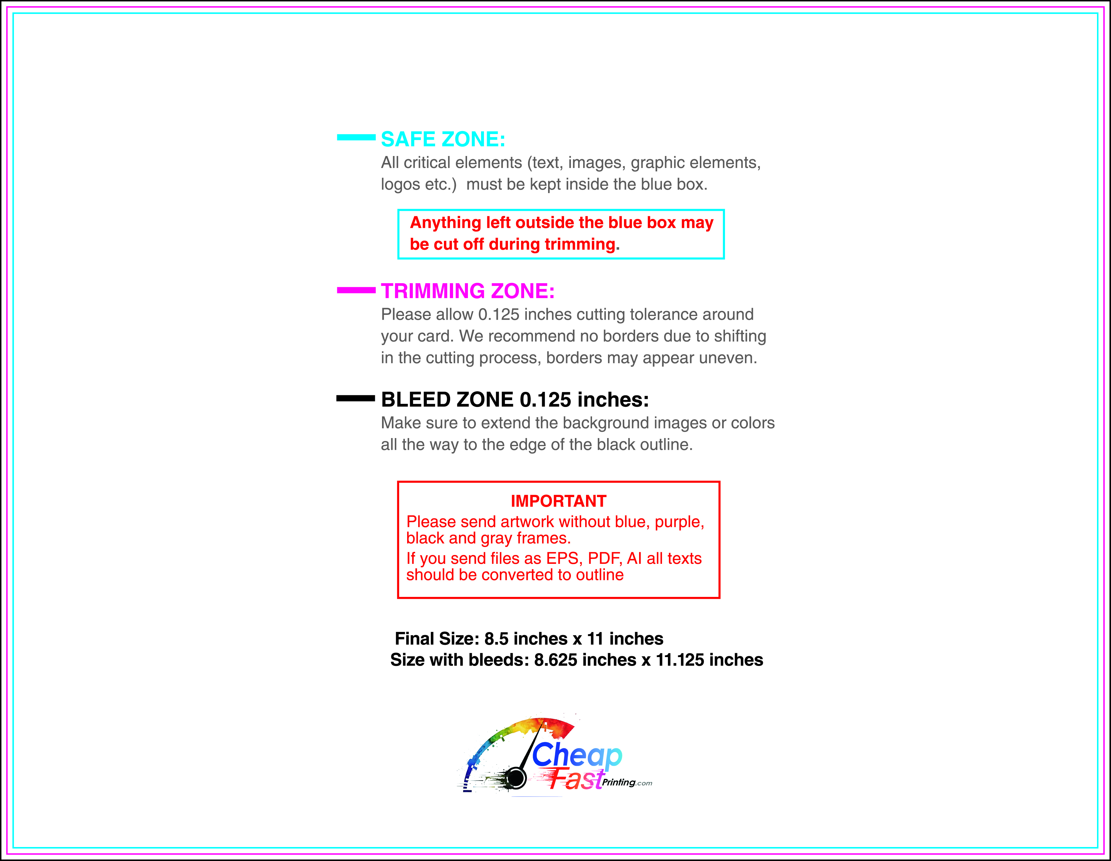
Submit a print-ready PDF (CMYK) at 300 DPI with 0.125" bleed and safe margins around important text. Keep thin lines above 0.5 pt and make QR codes at least ~0.8" square for reliable scanning.
Use vector logos when possible and limit your fonts to maintain a clean, professional look.
Request a proof so you can confirm spelling, margins, and QR/URL accuracy before production. Proofing is the easiest way to prevent expensive reprints.
Double-check phone numbers and offer terms first—those are the most common issues.
Match your flyer headline and offer to the landing page headline so visitors feel they’re in the right place. Keep the CTA consistent and make the page fast to load and easy to complete on mobile.
If you run ads, retarget QR visitors with the same offer to improve conversions.
Plan a steady supply for libraries and cafes. Smaller runs allow for monthly updates, while bulk runs keep neighborhood outreach affordable.
Track which locations drive the most QR scans and prioritize those for restocks. Use cheap community center flyers for seasonal pushes to keep the budget stable while scaling reach.

