Professionally designed for 12" x 12" flyers. Fully editable & free!
Preparing Templates…
Strong clinic outreach leads with one problem, one outcome, and a simple next step to book a consult.
Square 12x12 gives you room for a short program overview, a trust block, and a QR that routes prospects to the right intake form.
Premium 18pt stock creates durable kraft paper flyers that look professional on counters, boards, and lobby stacks.
Use these as weight loss clinic handouts for partner locations, local drops, and front-desk distribution.
Lead with one primary offer and one clear CTA, such as a free consultation, an introductory assessment, or a program overview.
Keep the promise specific and avoid medical claims. Use credibility signals like practitioner credentials, years in business, or review volume.
Place the QR and phone number together so the next step is obvious at a glance.
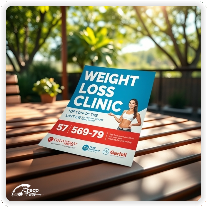
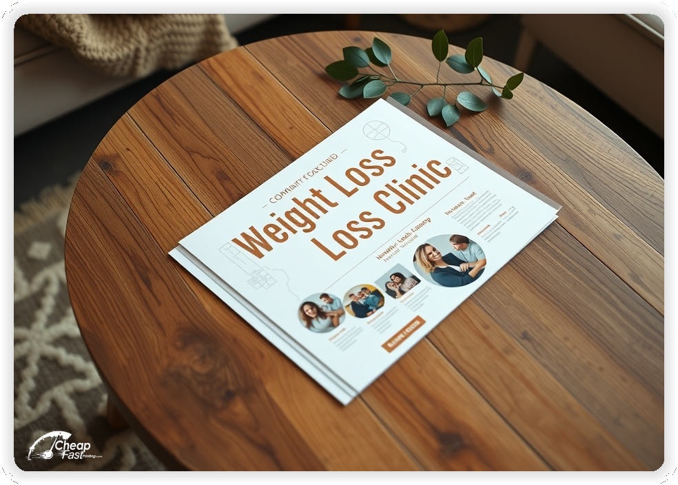

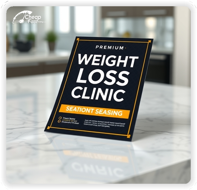

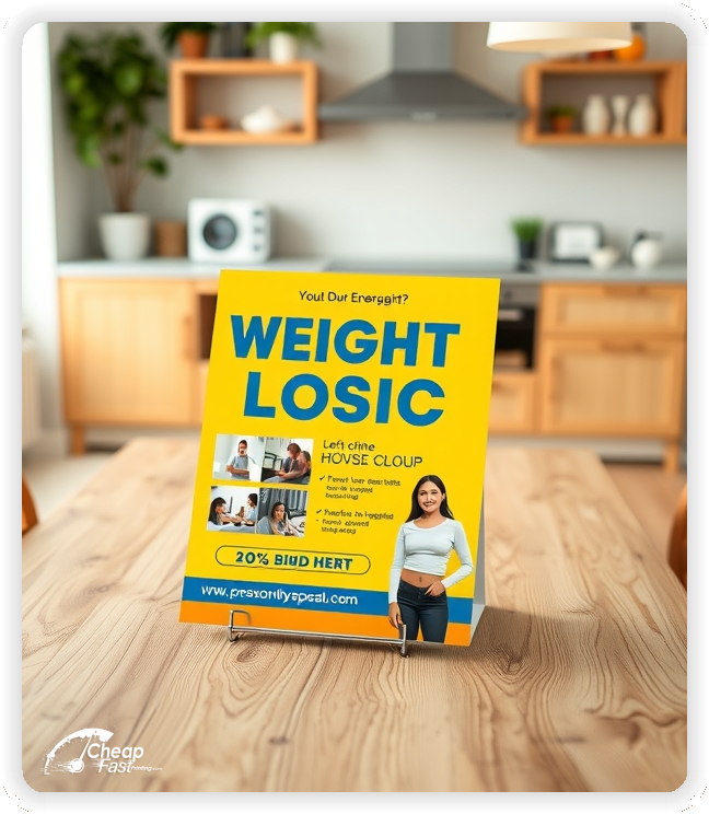


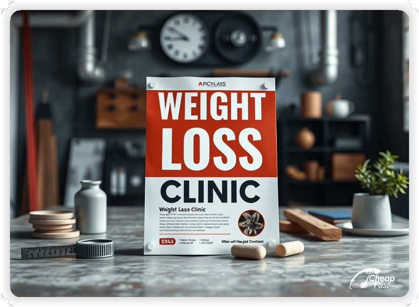
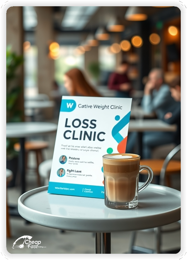
These flyers must build trust quickly and make booking easy. Prospects respond best to a simple offer, proof, and a fast way to request a consult.
Keep it specific, compliant, and easy to act on.
12x12 gives you room for a clean program snapshot without crowding the layout.
Use the top third for the problem and offer, the middle for a short “how it works” block and proof, and the bottom for the QR and contact details.
This format reads well on counters, boards, and partner stacks where prospects decide quickly.
Clinic outreach performs best when the piece feels credible and easy to keep. 18pt kraft stock is sturdy, clean, and professional.
Use high-contrast type and short lines so the offer, phone number, and QR instructions stay readable at a glance.
This choice supports durable kraft paper flyers that hold up in lobby stacks and partner counters.
A focused offer removes hesitation. Examples include a consultation, an assessment, or a new-patient special.
Keep the offer line short and move detailed terms to the intake page so the flyer stays clean.
Clear offers improve response because prospects understand the next step.
Prospects want clarity, but health claims can create risk. Keep promises grounded and focus on process, support, and what happens next.
Use short lines like “personalized plan,” “nutrition coaching,” or “accountability check-ins,” and let your website handle full details.
This improves trust and reduces low-quality inquiries.
Choose one patient focus per flyer, such as busy professionals, postpartum support, metabolic health, or lifestyle-based coaching.
This keeps messaging specific and helps prospects self-select faster.
Focused positioning improves consult requests and lead quality.
Health decisions are risk-based. Add one short trust line such as practitioner credentials, years in practice, or review volume.
Keep it brief and let your intake page provide full details.
A trust line near the QR increases response without clutter.
Reduce friction with one short line about location and how to start, such as “appointments available” or “scan to request a consult.”
If you mention insurance or financing, keep it high level and route details to the intake page.
Clear access notes reduce back-and-forth and improve booked consult rates.
Program options can be summarized in one line, such as “weekly coaching available” or “monthly program options.”
Keep pricing details on the intake page so the flyer stays easy to scan.
This keeps attention on booking the first step.
Interest rises around new-year goals, pre-summer planning, and post-holiday resets.
Plan one primary run before peak periods and a smaller follow-up run to stay top of mind.
Fast turnaround supports quick updates when offers change.
Place flyers at gyms, wellness partners, pharmacies, salons, and local business counters with permission.
Ask for the most visible spot and refresh stacks regularly.
Consistent placement supports awareness and brings steady consult inquiries.
Each flyer should lead to one action. A QR code to a short intake form reduces friction.
Keep the landing page focused on the offer, eligibility basics, and a simple request form.
This flow converts better than long pages because the decision path stays clear.
Match the flyer headline and offer to your intake page to reduce confusion.
Use the same program names and the same CTA across channels.
Consistency improves conversion because the message stays aligned.
Test two offers with the same layout to learn what drives more booked consults.
Change only the offer line and track QR scans or calls by placement.
Once a winner is clear, scale the same design for consistent outreach.
Multi-route outreach benefits from consistent templates and localized details.
Keep branding aligned while adjusting referral partners, service areas, and QR destinations.
For steady coverage, a 10,000-count run supports consistent reach without delays.
Consistent visuals help prospects recognize your clinic quickly.
New prospects need clear guidance. Use one line that explains how to request a consult and what info to provide.
Keep the text short and link to a short intake form.
This reduces friction and improves lead quality.
Use language that fits your clinic style, such as supportive, evidence-based, or results-focused.
Keep tone consistent across the offer, proof, and CTA so the piece feels cohesive.
Aligned tone makes your clinic feel trustworthy.
Use a short reminder line such as “check-ins available” or “program renewals open.”
Do not add a long list of services. The goal is to encourage follow-up.
Retention messaging supports continuity without overshadowing the main offer.
Prospects often value privacy. A short line about respectful, confidential service can improve comfort.
Keep it brief and place it near the trust line.
Short discretion notes support inquiries without heavy policy copy.
Prospects judge providers quickly. Clean typography, sturdy stock, and crisp printing make your clinic feel reliable.
A polished finish helps simple layouts look intentional and professional.
Print quality supports higher trust at first touch.
Many prospects find providers through partner businesses and local boards. A clear flyer supports discovery when digital ads miss local foot traffic.
For consistent coverage, distribute these clinic flyers across weeks.
This supports awareness while your intake form captures leads.
Use a direct CTA such as “Book a consultation,” “Request an assessment,” or “Scan to start.”
Keep the CTA short and place it near the QR code so the next step is obvious.
Clear CTAs help prospects decide quickly and support higher lead volume.
Spacing matters in healthcare marketing. Use generous margins around the offer and trust block.
Keep text blocks short and separate them with simple dividers.
A balanced layout keeps attention on the offer and makes the piece feel professional.
Flyers work best when they create one clear path from interest to a request. A clear headline, one offer, and one CTA are enough.
When the layout stays focused, your message drives consults without heavy copy.
Pair print with a short intake form and keep the message aligned for a consistent experience.
Your flyer has about 3 seconds to earn attention before it’s tossed or kept. Lead with one problem, one offer, and one obvious CTA.
Target the Right Routes: Prioritize locations that match your ideal patient profile and repeat distribution so recognition builds.
Most prospects do not book the moment they touch a flyer. They notice it, they remember it, and they act later when motivation spikes or a deadline hits. Plan distribution like a routine instead of a single drop. Pick two to four routes, repeat every two to three weeks, and keep the headline consistent so recognition builds.
Pair one primary route with two supporting placements. A counter stack at a gym, wellness partner, or local business association adds extra touches. Use the same offer across all placements and track results with distinct QR destinations. When you know what works, you can scale and stop printing weight loss clinic handouts that are not producing requests.
Make the first step easy. Use one QR destination with a short form, and keep the phone number visible for people who prefer to call.
When the intake flow is simple, you get more qualified requests and fewer time-wasters.
Sturdy stock and clean printing matter in healthcare marketing because credibility is part of conversion.
Premium kraft holds its shape in stacks and feels worth keeping, which can extend shelf life at partner locations.
Short, readable lines protect clarity and improve response.
Track response by placement so you can scale what works. Use one QR per route or partner.
Keep the offer stable while you test placement and headline changes.
Measurement improves results without constant redesign.
For front-desk use, add a short prompt like “Scan to request a consult” so staff can hand it off in one sentence.
Keep the offer and the CTA close together so the message is easy to repeat.
This increases consistency and response.
Prospects want confidence. Add a short line about respectful service, documented processes, and clear expectations.
Keep it brief and place it near the trust line.
Short credibility notes support inquiries without turning the flyer into a policy list.
Local trust matters. One short line about serving the community builds credibility.
Keep it to one line and let your website show stories and reviews.
This builds trust without heavy copy.
Plain language helps people understand the next step quickly. Use short lines like “supportive coaching” or “personalized plan” instead of jargon-heavy paragraphs.
Keep the tone welcoming and avoid shame-based phrasing.
Clear messaging supports higher response rates and better-fit leads.
Your flyer has about 3 seconds to make an impression before it’s tossed or kept. Don’t bury the lead. Ensure your main headline and primary offer are visible from arm’s length.
Target the Right Locations: Success isn’t just about design; it’s about distribution. Focus on routes and partners that match your ideal prospect profile and repeat them consistently.
Upload artwork and keep the focus on one offer and one CTA for your clinic.
Proofing checks contrast, trimming, and spacing so your offer and CTA stay clear.
Proof review also confirms the QR destination and contact lines so the flyer works without errors.
Confirm that the intake page loads quickly on mobile.
Verify that the offer reads well at arm’s length.
Check that the QR code scans reliably from typical phone distance.
Confirm that phone numbers and short URLs do not wrap on narrow layouts.
Use the 12x12 template to keep margins consistent and reserve space for your offer, proof, and CTA blocks.
Templates protect spacing so updates do not break alignment.
Consistent grids keep contact details visible after trimming and support quick approvals.
A stable layout helps you refresh offers without redesigning.
Templates also support referral-partner versions with minimal edits.
They preserve alignment for QR placement and phone lines across every run.
They also keep headers aligned across seasonal promos cleanly.
Loading Free Editable Designs...
Please wait while we prepare the template library.
Focused layouts outperform crowded pieces because the offer and CTA stay visible.
Consistent templates reduce design time and keep the message aligned across seasons.
Compare response by consult quality, booked assessments, and retention rather than only print cost.
When the offer stays consistent, prospects recognize your clinic faster and respond with less hesitation.
Tracking results by placement helps refine the next print cycle.
Review scan-to-form ratios to understand which routes convert best.
Use one clear headline, one offer, and one primary CTA (call, scan, or order). Add the essentials: phone, website/QR, service area, hours (if relevant), and a trust signal like years in business or a short review snippet.
Keep the layout scannable: one hero image or icon, short bullets, and high-contrast CTA text that’s readable at arm’s length.
Yes. 12" x 12" balances visibility and readability without feeling cramped. It gives enough space for a strong headline, a benefits list, and a CTA while staying easy to hand out or place on counters and boards.
Prioritize spacing and hierarchy over extra copy so the main message lands in 3–5 seconds.
18 pt. Premium Kraft with Gloss affects how the flyer feels and how colors read. Gloss tends to boost color and photos, matte reduces glare and feels more premium for text-heavy layouts, and uncoated is great for writing on.
If your design uses lots of fine text, choose clarity and contrast first; paper upgrades won’t fix a crowded layout.
10000 works well when you want consistent visibility across multiple placements (counters, boards, partner locations, events) over a few weeks. Bulk also lowers unit cost so you can test a message and keep the winner running.
Track performance, then reprint the best offer instead of changing everything at once.
If price is your main hook, feature one simple offer (“ off” or “Starting at ) and keep the fine print minimal. If you have variable pricing, use a short value statement and send details to a landing page.
A clean offer + simple CTA typically outperforms a long price list.
Use a QR code to a dedicated landing page and add UTM tags for each route or partner. Track scans, form fills, and calls to identify the placements that actually convert.
For non-QR audiences, include a short, memorable URL or a trackable phone extension.
Start where your customers already are: complementary businesses, community boards, local events, and targeted neighborhoods. Ask partners for the most visible spot and refresh before your flyer gets buried.
Use a consistent route and restock winners; small, repeated placements usually beat one big drop.
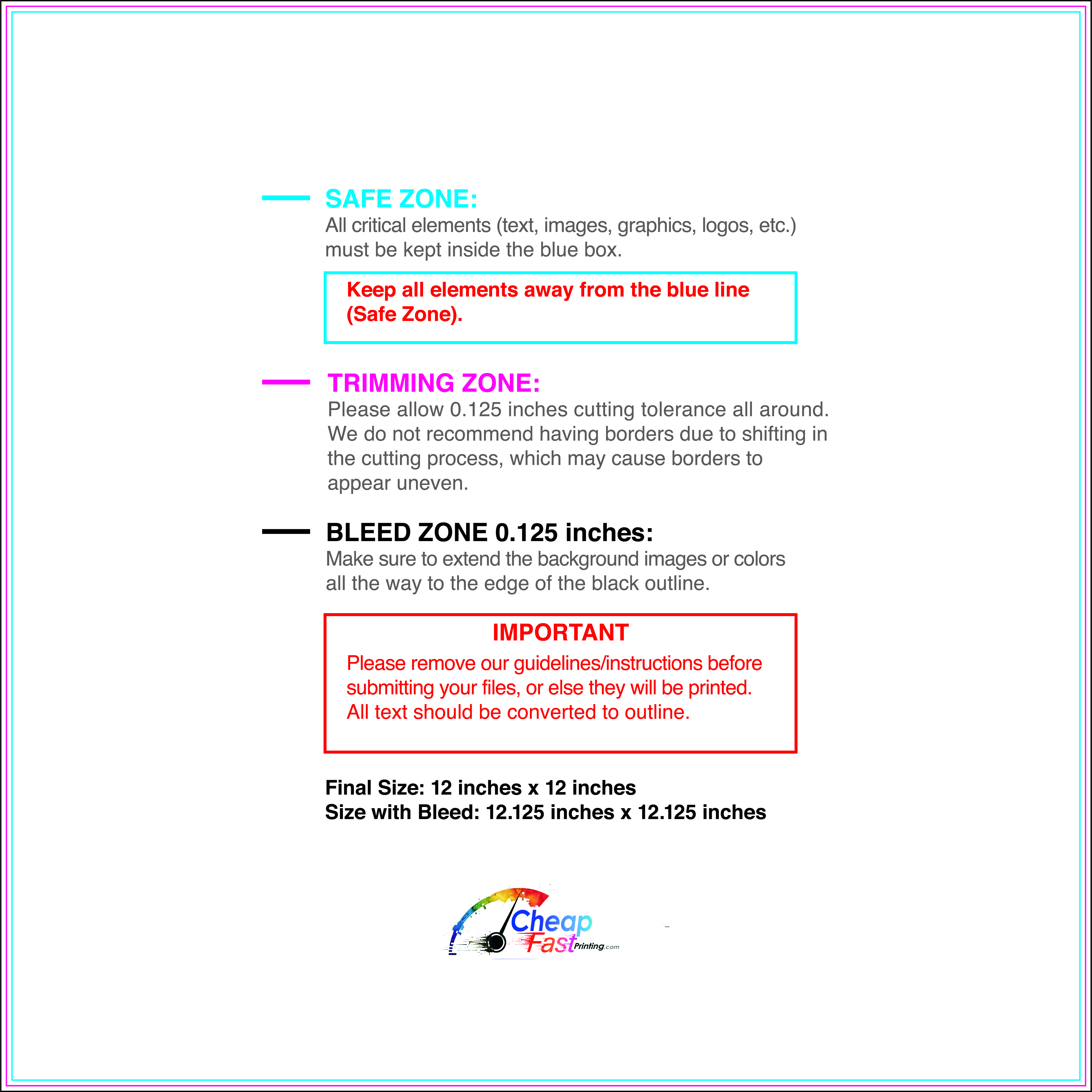
Submit a print-ready PDF (CMYK) at 300 DPI with 0.125" bleed and safe margins around important text. Keep thin lines above 0.5 pt and make QR codes at least ~0.8" square for reliable scanning.
Use vector logos when possible and limit your fonts to maintain a clean, professional look.
Request a proof so you can confirm spelling, margins, and QR/URL accuracy before production. Proofing is the easiest way to prevent expensive reprints.
Double-check phone numbers and offer terms first—those are the most common issues.
Match your flyer headline and offer to the landing page headline so visitors feel they’re in the right place. Keep the CTA consistent and make the page fast to load and easy to complete on mobile.
If you run ads, retarget QR visitors with the same offer to improve conversions.
Plan a steady supply for partner counters and route drops. Short runs let you refresh offers without waste.
Predictable timing supports stronger response and keeps messaging current.
Track which locations drive the most QR scans and prioritize restocks there.
Use smaller top-up runs to match seasonal changes without redesigning the layout.
Balance weekly and monthly distribution to keep coverage consistent.
Use distribution logs to identify placements that perform well and retire low-response locations.
For tight budgets, order smaller runs first and scale once a placement proves performance.

