Professionally designed for 4.25" x 11" flyers. Fully editable & free!
Preparing Templates…
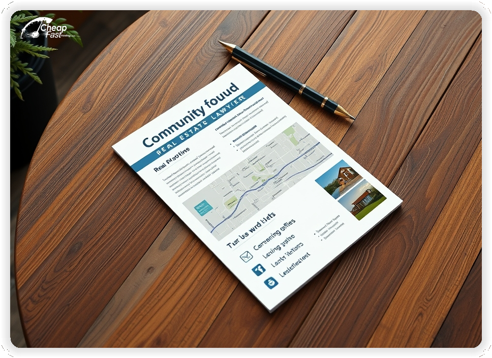
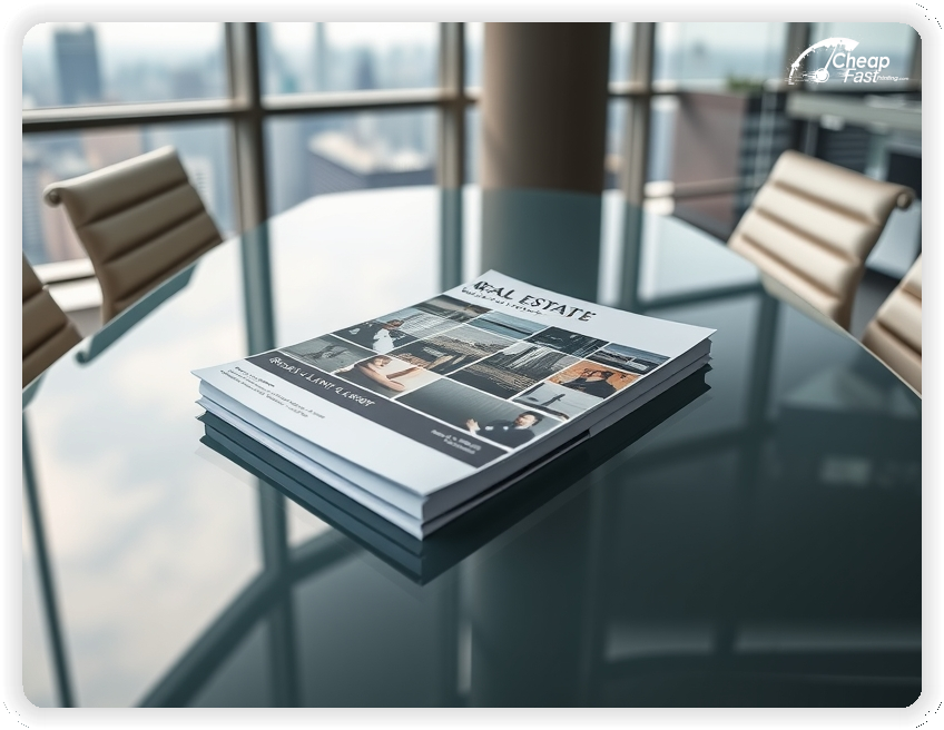
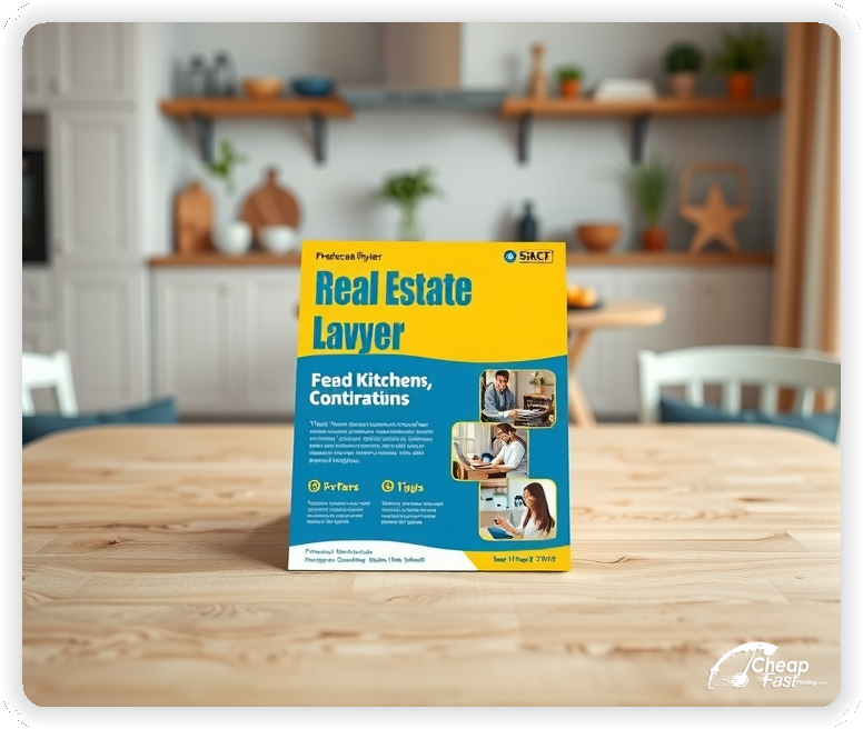
In the competitive world of property law, first impressions are everything. High-quality **real estate lawyer flyers** provide a tangible way to showcase legal expertise, recent successful closings, and specialized services to potential clients and partners.
Premium printing options, including distinctive **kraft paper flyers**, help the firm stand out from the generic competition. Whether promoting title services, escrow expertise, or property litigation, the right marketing piece makes a lasting impression.
Strategic outreach with these professional handouts ensures that contact information and key value propositions are always within reach of realtors and home buyers alike.
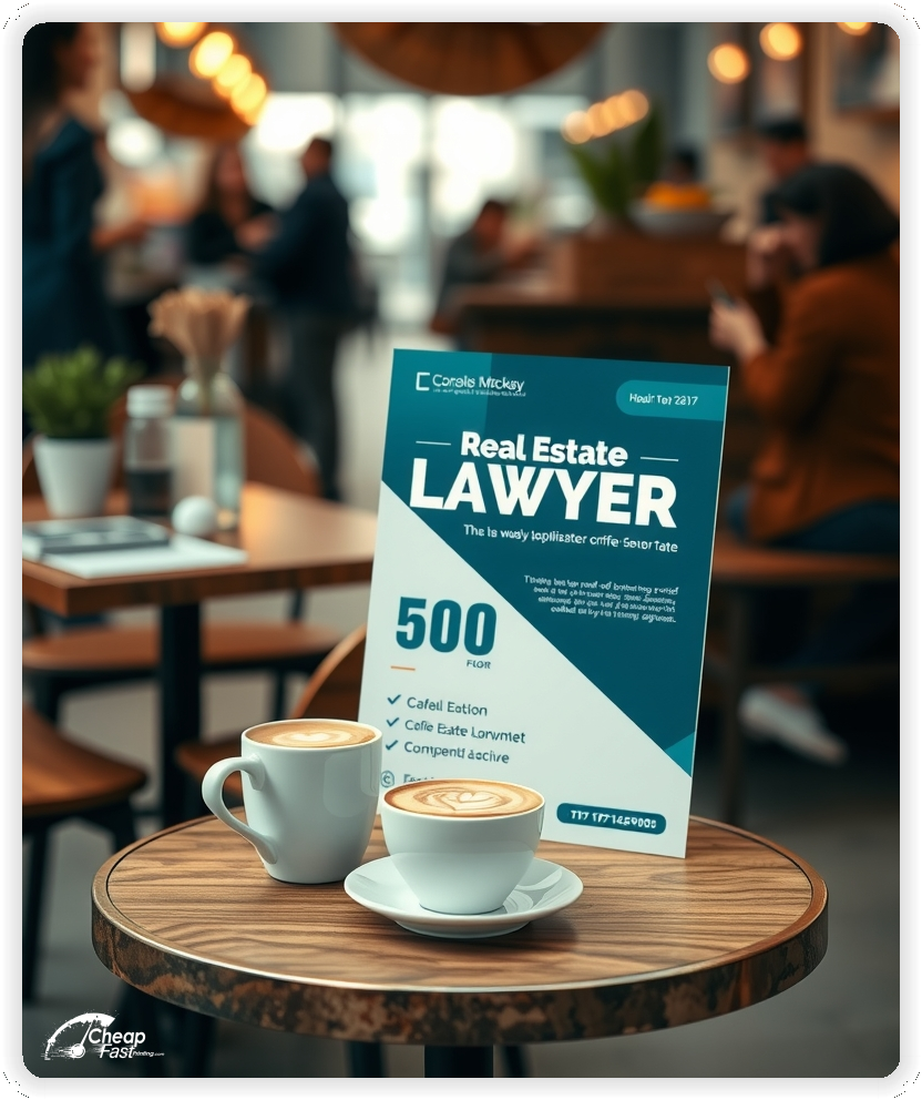
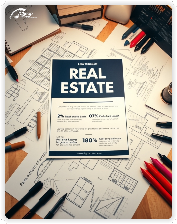
Focus on one primary service area per flyer to avoid overwhelming the reader. A dedicated focus on title insurance, closing services, or contract review converts better than a broad list of legal capabilities.
Keep the call to action direct and professional. Positioning the firm as a partner in the closing process builds trust with both realtors and clients.
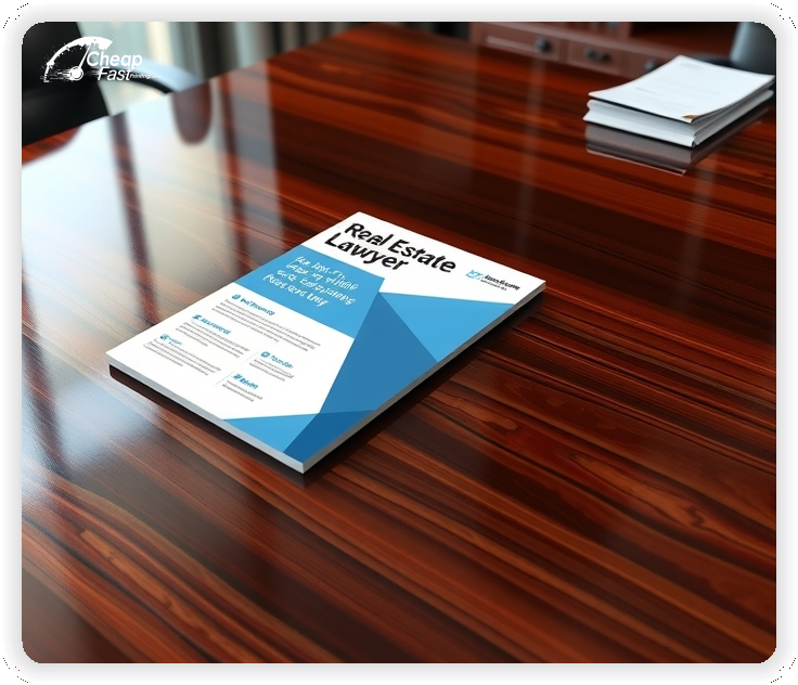
Use high-contrast designs on premium stock to ensure that legal credentials and contact details remain sharp and legible during high-stakes negotiations.
Effective legal marketing requires projecting professionalism and clarity. Clients and real estate partners respond best to a clear value proposition and a low-friction way to contact the firm.
This structure keeps the message authoritative while supporting fast decision-making for busy realtors.
High-quality print stock signals that the firm values attention to detail. This is critical in legal transactions where precision is paramount.
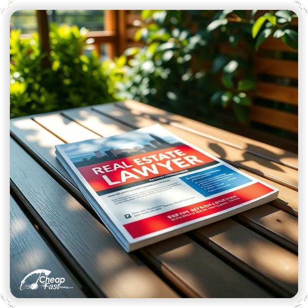
For firms seeking a more natural or rustic aesthetic, **kraft paper flyers** provide a unique texture that stands out in a stack of standard white paper.
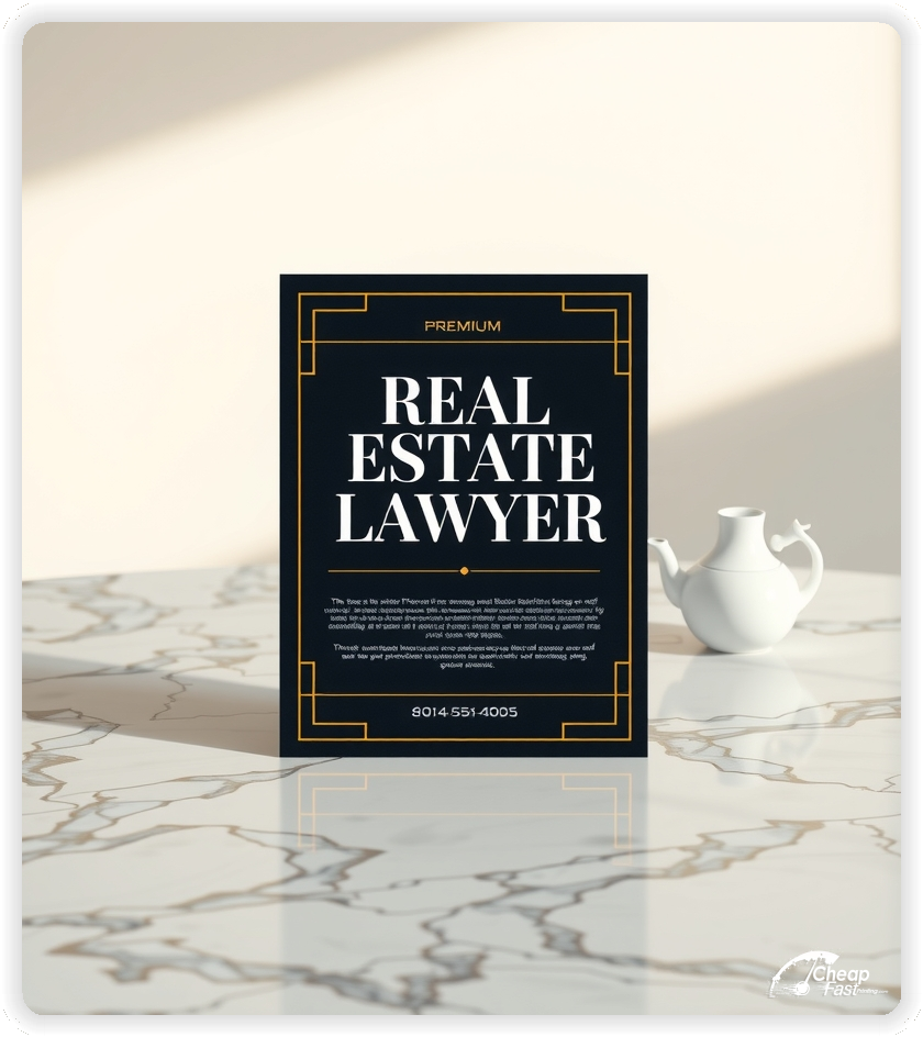
Use matte finishes for a sophisticated, understated look, or gloss when high-resolution photography of luxury properties is central to branding.
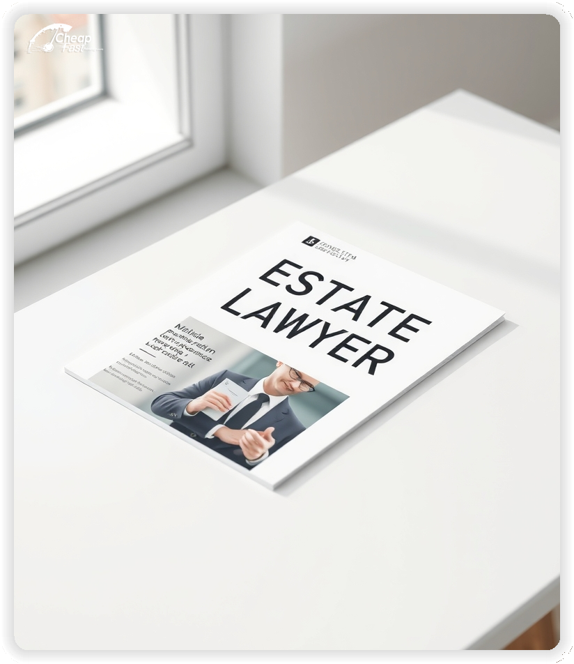
As professional **real estate lawyer handouts**, the physical weight of the paper reinforces the stability and permanence of legal counsel.
A focused presentation of your closing services removes hesitation for home buyers and sellers. Clearly list your expertise in title search, escrow management, and contract preparation.
Keep your service descriptions concise and professional. Move detailed legal disclaimers to your firm's website so the flyer remains easy to navigate.
Clear service lists improve conversion because clients immediately understand how your firm can protect their investment.
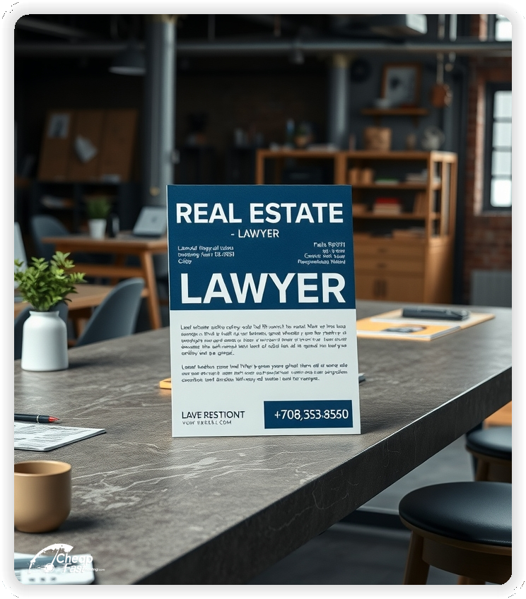
Real estate agents are your primary referral source. Providing them with high-quality **real estate lawyer flyers** that they can display at open houses builds a mutually beneficial partnership.
Use a clean, modern layout that complements the agent's marketing materials while maintaining your firm's distinct legal identity.
Consistent visibility in local real estate offices supports firm awareness and brings in steady inquiries for closing services.
Clients want confidence in their legal representation. A short line about your firm's history, local community involvement, or specific bar certifications builds immediate trust.
Keep credentials brief and focused on results. Your digital presence can provide full attorney bios and case studies.
A short trust line near your contact information supports decision confidence without adding visual clutter.
Upload the firm's logo and artwork to create professional **custom real estate lawyer flyers** that command respect.
The proofing process ensures that contact information, legal credentials, and branding are perfectly aligned and sharp.
Each proof review confirms that the message is professional and error-free before the final print run.
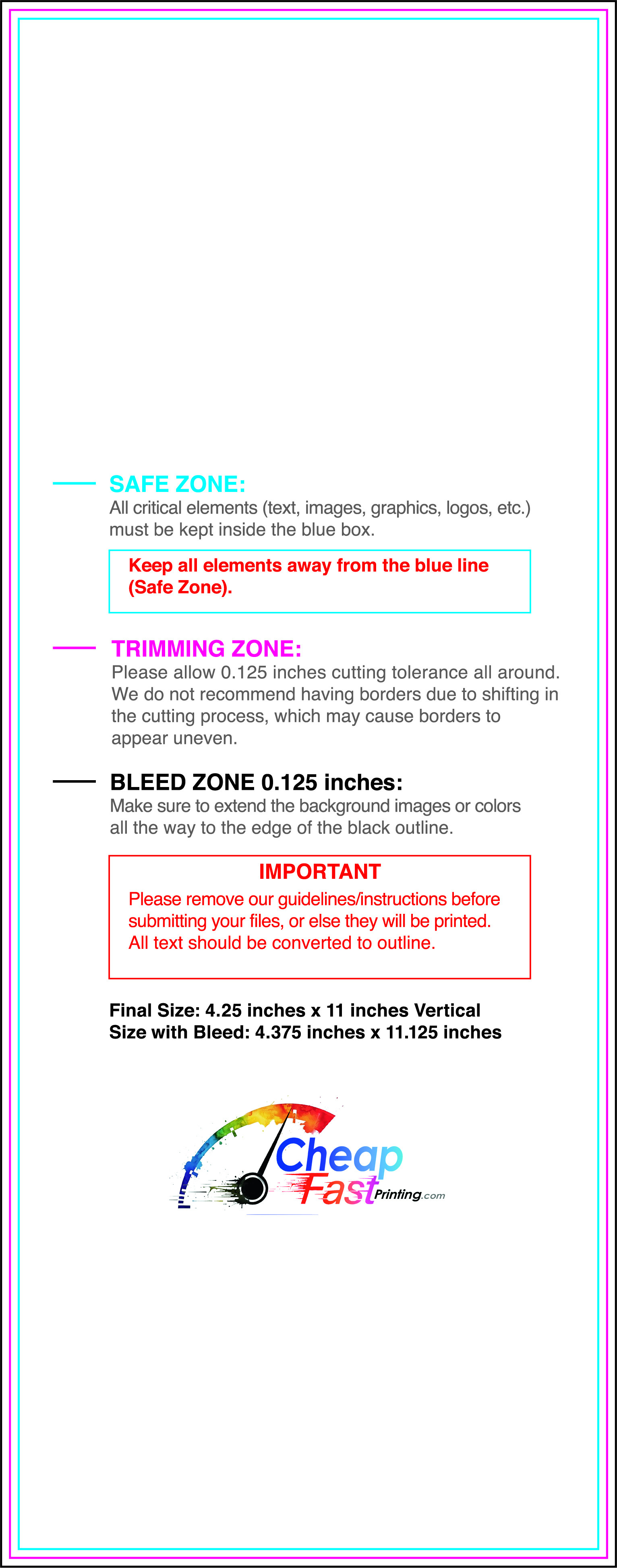
Ensure your files are print-ready with our correct bleed, safety, and trim lines.

Loading Free Editable Designs...
Please wait while we prepare the template library.
Compare our cheap flyer printing rates against giants like Vistaprint, PrintRunner, Walmart Business Print.
Use one clear headline, one offer, and one primary CTA (call, scan, or order). Add the essentials: phone, website/QR, service area, hours (if relevant), and a trust signal like years in business or a short review snippet.
Keep the layout scannable: one hero image or icon, short bullets, and high-contrast CTA text that’s readable at arm’s length.
Yes. 4.25" x 11" balances visibility and readability without feeling cramped. It gives enough space for a strong headline, a benefits list, and a CTA while staying easy to hand out or place on counters and boards.
Prioritize spacing and hierarchy over extra copy so the main message lands in 3–5 seconds.
18 pt. Premium Kraft with Gloss affects how the flyer feels and how colors read. Gloss tends to boost color and photos, matte reduces glare and feels more premium for text-heavy layouts, and uncoated is great for writing on.
If your design uses lots of fine text, choose clarity and contrast first; paper upgrades won’t fix a crowded layout.
1000 works well when you want consistent visibility across multiple placements (counters, boards, partner locations, events) over a few weeks. Bulk also lowers unit cost so you can test a message and keep the winner running.
Track performance, then reprint the best offer instead of changing everything at once.
If price is your main hook, feature one simple offer (“ off” or “Starting at ) and keep the fine print minimal. If you have variable pricing, use a short value statement and send details to a landing page.
A clean offer + simple CTA typically outperforms a long price list.
Use a QR code to a dedicated landing page and add UTM tags for each route or partner. Track scans, form fills, and calls to identify the placements that actually convert.
For non-QR audiences, include a short, memorable URL or a trackable phone extension.
Start where your customers already are: complementary businesses, community boards, local events, and targeted neighborhoods. Ask partners for the most visible spot and refresh before your flyer gets buried.
Use a consistent route and restock winners; small, repeated placements usually beat one big drop.
Submit a print-ready PDF (CMYK) at 300 DPI with 0.125" bleed and safe margins around important text. Keep thin lines above 0.5 pt and make QR codes at least ~0.8" square for reliable scanning.
Use vector logos when possible and limit your fonts to maintain a clean, professional look.
Request a proof so you can confirm spelling, margins, and QR/URL accuracy before production. Proofing is the easiest way to prevent expensive reprints.
Double-check phone numbers and offer terms first—those are the most common issues.
Match your flyer headline and offer to the landing page headline so visitors feel they’re in the right place. Keep the CTA consistent and make the page fast to load and easy to complete on mobile.
If you run ads, retarget QR visitors with the same offer to improve conversions.

