
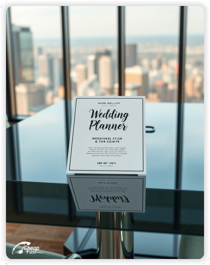
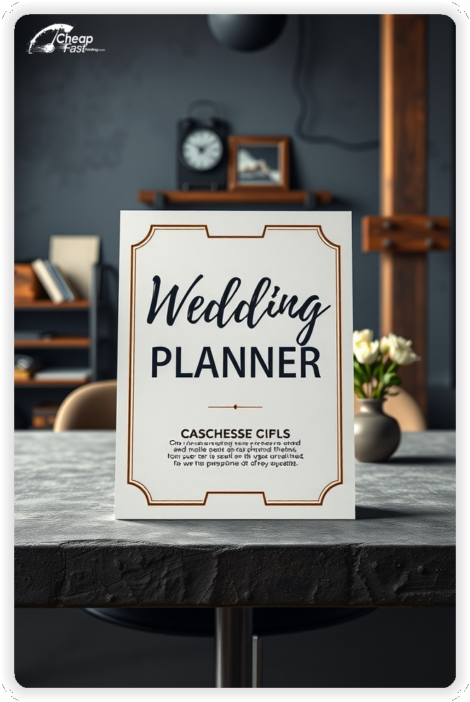
Professionally designed for 8" x 10" flyers. Fully editable & free!
Preparing Templates…
wedding planner flyers work best when they show style fast, build trust, and make it easy to book a consultation.
The 8x10 size gives you room for one signature package, a short gallery preview, and a bold QR code without clutter.
For bridal shows, venues, and referral partners, express wedding planner flyers printed as bulk wedding planner flyers keep your brand consistent everywhere.
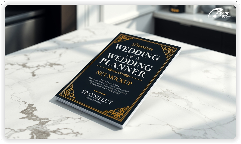
Premium kraft stock adds a warm, upscale feel that fits wedding brands and makes your wedding planner handouts look intentional.
Lead with one style and one promise, such as modern, classic, or luxury planning. One focused message converts better than a long list.
When ordering 1000 wedding planner flyers, keep the layout stable so you can re-run the same design for each season with only small updates.
On kraft paper flyers, use strong contrast and short lines so the offer and contact details stay readable at a glance.
These pieces must communicate style and reliability quickly. Couples respond best to a signature look, a clear package, and an easy booking step.
This structure keeps wedding planner marketing materials focused while supporting fast decisions.
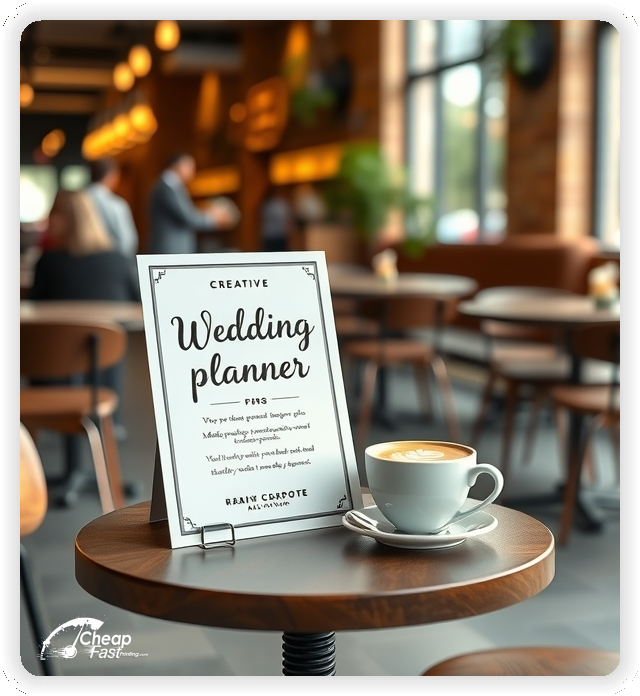
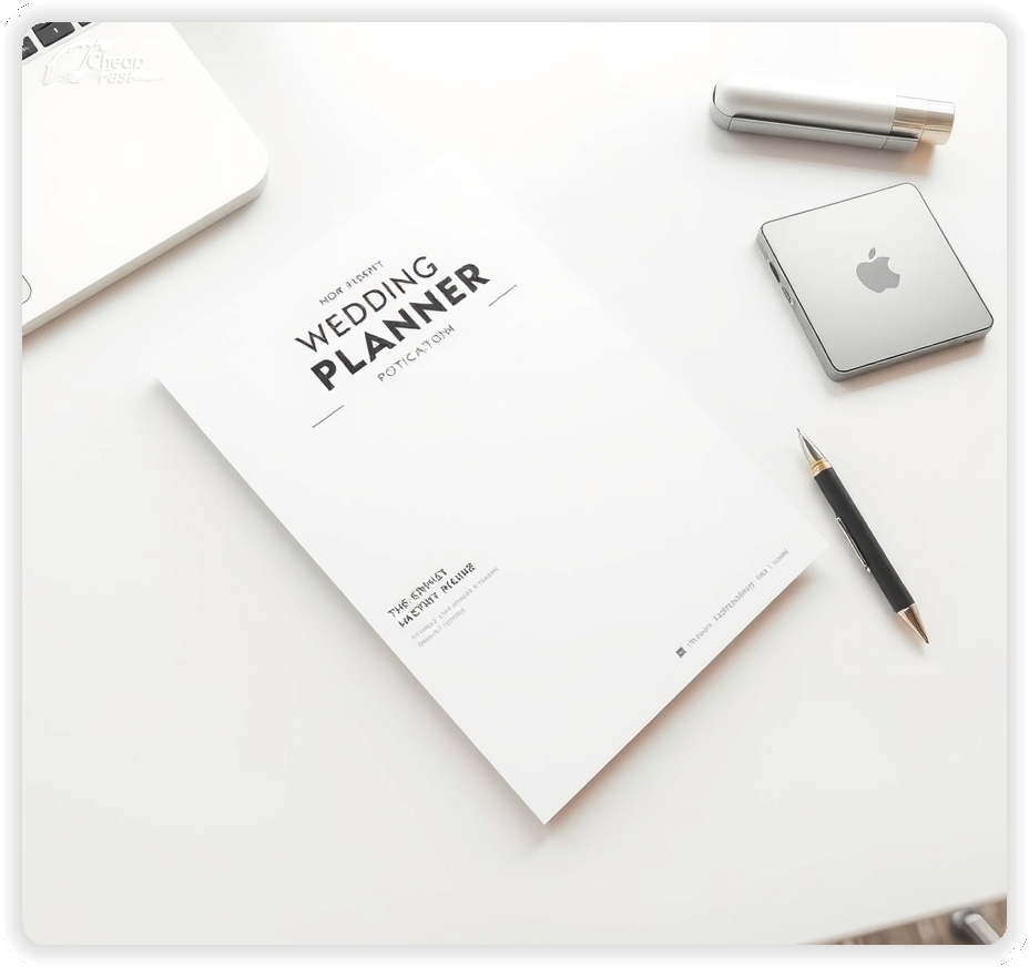
8x10 wedding planner flyers give you room for a portfolio preview and a clear package offer while staying easy to post and hand out.
Use the top third for style positioning, the middle for proof and a short package list, and the bottom for the CTA and contact details.
For planners who need premium-looking wedding planner handouts, this size stays readable at venues, bridal shops, and community boards.
Wedding marketing performs best when it feels intentional and high-end. Premium kraft stock has a warm tone that pairs well with modern and rustic aesthetics.
For kraft paper flyers, keep palettes simple and use strong contrast so dates, packages, and phone numbers remain readable.
Thicker stock also holds up better in bridal show totes, venue racks, and partner stacks.
A focused offer removes hesitation. Examples include a free planning checklist, a venue walkthrough consult, or a 15-minute intro call.
Keep the offer line short and move details to the landing page so the flyer stays clean.
Clear offers improve booking response because couples understand the next step.
Couples scan first. Limit packages to three options and keep each line short.
Use simple names like day-of coordination, partial planning, and full planning.
Readable structure matters for wedding planner flyers printing because clarity drives inquiries.
Choose one client focus per flyer, such as luxury, modern minimal, destination, or budget-friendly planning.
This keeps the message specific and helps couples self-select quickly.
Focused positioning improves lead quality and reduces price shopping.
Couples want confidence the day will run smoothly. Add one short trust line such as weddings planned, featured venues, or review count.
Keep it brief and avoid long bios. The landing page can show full testimonials and galleries.
A clear trust line near the CTA increases bookings without clutter.
For local planners, include one simple service area line, such as city plus nearby regions.
Keep it brief so the package offer remains the focus.
Clear service area notes reduce friction and improve inquiry quality.
You can summarize pricing with one line, such as “packages start at” or “custom quotes available.”
Keep details on the landing page so your custom wedding planner flyers stay easy to scan.
This approach signals value without turning the flyer into fine print.
Events are strong for lead capture. Use a short callout for a bridal show booth, venue open house, or seasonal consult promo.
Keep details short and direct couples to an RSVP or booking page.
Event callouts add urgency while keeping your signature package visible.
Place flyers at venues, bridal boutiques, photographers, florists, bakeries, and dress shops with permission.
Ask staff for the most visible spot and refresh placements when racks rotate.
Consistent placement supports awareness and brings steady inquiries.
Each flyer should lead to one action. A QR code to a short consultation booking page reduces friction.
Keep the landing page focused on style, packages, and a simple form.
This flow converts better than long pages because the decision path stays clear.
Demand rises after engagements, during bridal show seasons, and ahead of peak wedding months.
Plan a primary run before show weekends and a smaller follow-up run to stay top of mind.
Express production helps you respond when dates open up or schedules change quickly.
Match your flyer headline to your website and Instagram highlights to reduce confusion.
Use the same package names and the same CTA across channels.
Alignment across wedding planner marketing materials online and print improves conversion because the message stays consistent.
Test two offers with the same layout to identify what generates more consult requests.
Change only the offer line and track QR scans or booked calls by placement.
Once a winner is clear, scale with bulk wedding planner flyers to keep marketing consistent.
For bridal show weekends, express wedding planner flyers help you stay ready for last-minute events.
Planner teams and venue partners benefit from consistent templates and localized details.
Keep branding aligned while adjusting service areas, venue names, and QR destinations.
For steady coverage, ordering 1000 wedding planner flyers per channel supports consistent reach without delays.
Consistent visuals help couples recognize your brand quickly.
New couples need clear guidance. Use one line that explains what happens on the first call and what details to prepare.
Keep text short and link to a planning checklist.
This reduces anxiety and improves show rates.
Use language that reflects your planning style, such as calm, luxury, fun, or detail-driven.
Keep tone consistent across the package list and CTA so the piece feels cohesive.
Aligned tone helps your brand feel premium and trustworthy.
Use a short line such as “preferred vendor relationships welcome” or “venue partner packet available.”
Do not add long details. The goal is to encourage ongoing referrals.
Retention messaging supports steady leads without overshadowing the main offer.
Confidence matters. Add one short line about timelines, vendor coordination, or day-of execution.
Keep it brief and place it near the trust line.
Short assurance notes support booking decisions without turning the flyer into a full process guide.
Local reputation matters. One short line about venues served or vendor relationships builds credibility.
Keep it to one line and let your website show the full gallery.
This builds trust without adding heavy copy.
Couples judge brand quality fast. Crisp printing and sturdy stock make your services feel established and high-end.
Premium kraft also supports a boutique look even with simple designs.
A polished finish helps your wedding planner flyers feel intentional, not disposable.
Many couples discover planners through venues and partner vendors. A clear flyer supports discovery when digital ads miss in-person referrals.
For consistent local coverage, distribute bulk wedding planner flyers across weeks.
This supports awareness while your booking page captures leads.
Use a direct CTA such as “Book a consult,” “Get a quote,” or “Scan for the planning checklist.”
Keep the CTA short and place it near the QR code so the next step is obvious.
Clear CTAs help couples decide quickly and support higher inquiry rates.
Spacing matters in wedding branding. Use generous margins around the portfolio preview and CTA.
Keep text blocks short and separate sections with simple dividers.
A balanced layout keeps attention on the package and makes your wedding planner marketing materials feel refined.
If you offer extras, mention only one secondary option such as timeline creation, vendor sourcing, or rehearsal coordination.
Keep details on the landing page so the flyer stays focused on the primary package.
This adds value without crowding the main message.
Partnerships drive referrals. Add a short line about working with venues and vendors for seamless timelines.
Use a brief callout and direct partners to a vendor info page.
This adds a referral pathway without crowding the main offer.
Include a short line about what couples need to get started, such as budget, venue, and date range.
Keep full details on a checklist landing page and let the flyer stay clean.
This improves follow-through and reduces back-and-forth.
If dates fill quickly, mention limited availability and encourage booking ahead.
Use a short line such as “dates book fast” or “limited weekends available.”
This sets expectations and increases early inquiries.
Many planners provide a checklist or planning timeline. Mention one take-home item and direct couples to the QR link for the full packet.
Keep the focus on the primary package and CTA.
This supports higher-quality leads without crowding the flyer.
Mini-services can increase bookings. Use a short line such as “elopement planning available” or “day-of coordination packages.”
Keep details on the landing page to preserve flyer clarity.
Simple package messaging can improve conversion.
New couples want to know what happens next. Add one short line about a quick discovery call and timeline goals.
Keep guidance brief and place it near the CTA so it reads as part of the booking flow.
This reduces uncertainty and increases follow-through.
Inclusive language helps more couples feel welcome. A short note such as “all love is welcome” can reduce barriers.
Keep the note short and avoid long explanations on the flyer.
Clear inclusivity messaging supports higher inquiry rates.
Flyers work best when they create one clear path from interest to consultation. A clear headline, one benefit line, and one offer are enough.
When the layout stays focused, wedding planner flyers printing supports real bookings without heavy copy.
Pair print with a short landing page and keep messaging aligned for a consistent experience.
Your flyer has about 3 seconds to earn attention. Lead with your style focus and make the CTA obvious. Use one strong image, simple typography, and high contrast for key details.
Target the Right Partners: Distribution matters. Focus on venues and vendors that align with your ideal couples, then repeat placements so recognition builds.
Most couples do not book the moment they pick up a flyer. They notice, they remember, and they act later when planning becomes urgent. Plan distribution like a routine instead of a single drop. Pick two to four partner routes, repeat every two to three weeks, and keep the headline consistent so recognition builds.
Pair one primary route with two supporting placements. A counter stack at a venue, a bridal boutique, or a partner vendor creates extra touches. Use the same offer across all placements and track results with distinct QR destinations. When you know what works, you can scale and stop printing wedding planner handouts that are not producing consult requests.
Your flyer has about 3 seconds to earn attention. Lead with your style and one offer, then make the CTA and QR code impossible to miss.
Target the Right Partners: Focus distribution on venues and vendors that match your ideal couples, then repeat placements for consistent exposure.
Upload artwork and keep the focus on one package and one CTA for custom wedding planner flyers.
Proofing checks contrast, trimming, and spacing so your style and CTA stay clear.
Proof review also confirms the QR destination and contact lines so the flyer works without errors.
Confirm that the consultation page loads quickly on mobile.
Verify that the package name reads well at arm’s length.
Check that the QR code scans reliably from a typical phone distance.
Confirm that phone numbers and short URLs do not wrap on narrow layouts.
Use the 8x10 template to keep margins consistent and reserve space for the portfolio preview and CTA blocks.
Templates protect spacing so updates do not break alignment.
Consistent grids keep contact details visible after trimming and support quick approvals.
A stable layout helps you refresh seasonal promos without redesigning.
Templates also support venue partner versions with minimal edits.
They preserve alignment for QR placement and phone lines across every run.
They also keep headers aligned across bridal show seasons cleanly.
Loading Free Editable Designs...
Please wait while we prepare the template library.
Focused layouts outperform crowded pieces because the package and CTA stay visible.
Consistent templates reduce design time and keep the message aligned across seasons.
Compare response by consult requests, qualified leads, and booked clients rather than only print cost.
When the offer stays consistent, couples recognize your brand faster and inquire with less hesitation.
Tracking results by placement helps refine the next print cycle.
Review scan-to-book ratios to understand which placements generate the best conversions.
Use one clear headline, one offer, and one primary CTA (call, scan, or order). Add the essentials: phone, website/QR, service area, hours (if relevant), and a trust signal like years in business or a short review snippet.
Keep the layout scannable: one hero image or icon, short bullets, and high-contrast CTA text that’s readable at arm’s length.
Yes. 8" x 10" balances visibility and readability without feeling cramped. It gives enough space for a strong headline, a benefits list, and a CTA while staying easy to hand out or place on counters and boards.
Prioritize spacing and hierarchy over extra copy so the main message lands in 3–5 seconds.
18 pt. Premium Kraft with Gloss affects how the flyer feels and how colors read. Gloss tends to boost color and photos, matte reduces glare and feels more premium for text-heavy layouts, and uncoated is great for writing on.
If your design uses lots of fine text, choose clarity and contrast first; paper upgrades won’t fix a crowded layout.
1000 works well when you want consistent visibility across multiple placements (counters, boards, partner locations, events) over a few weeks. Bulk also lowers unit cost so you can test a message and keep the winner running.
Track performance, then reprint the best offer instead of changing everything at once.
If price is your main hook, feature one simple offer (“ off” or “Starting at ) and keep the fine print minimal. If you have variable pricing, use a short value statement and send details to a landing page.
A clean offer + simple CTA typically outperforms a long price list.
Use a QR code to a dedicated landing page and add UTM tags for each route or partner. Track scans, form fills, and calls to identify the placements that actually convert.
For non-QR audiences, include a short, memorable URL or a trackable phone extension.
Start where your customers already are: complementary businesses, community boards, local events, and targeted neighborhoods. Ask partners for the most visible spot and refresh before your flyer gets buried.
Use a consistent route and restock winners; small, repeated placements usually beat one big drop.
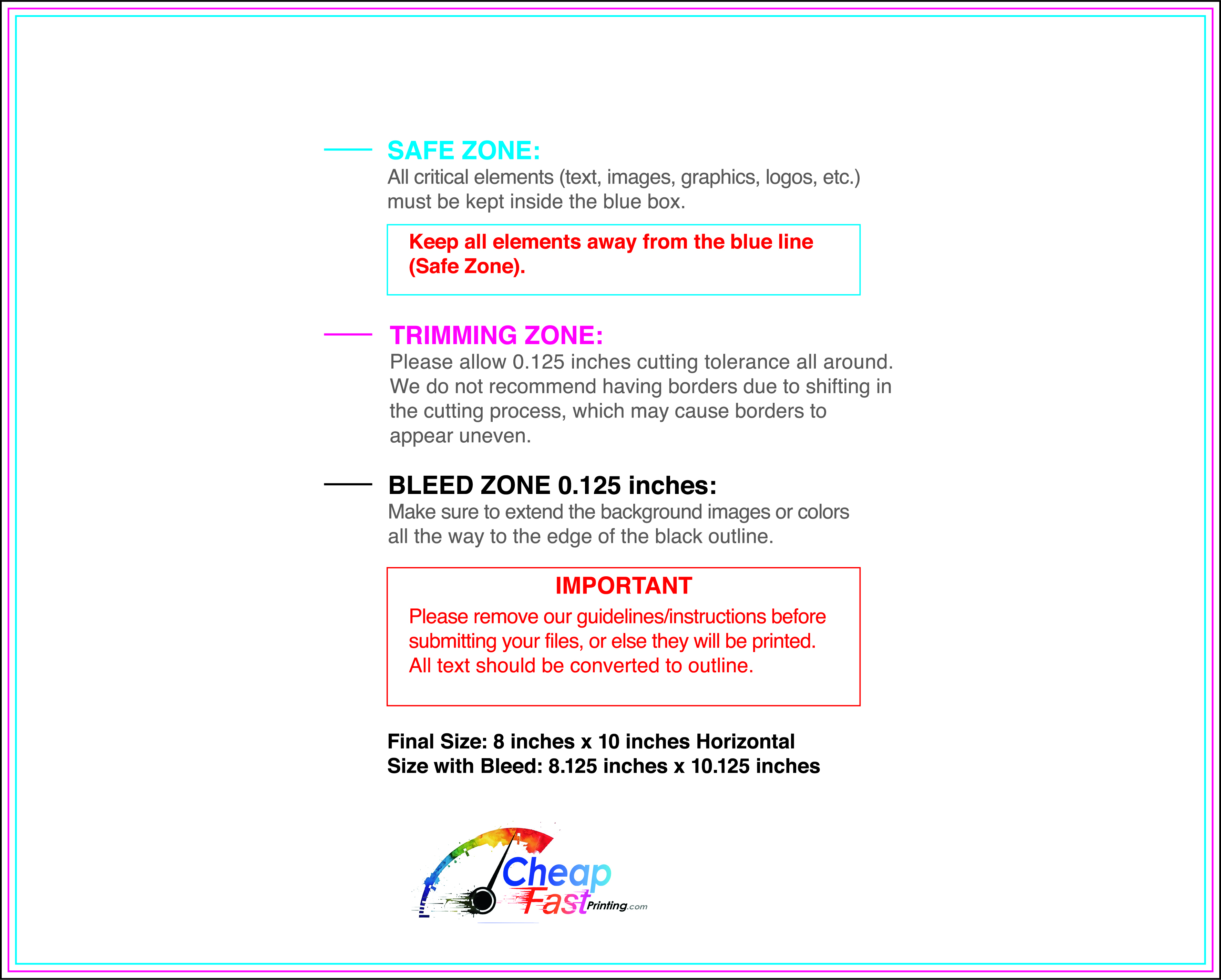
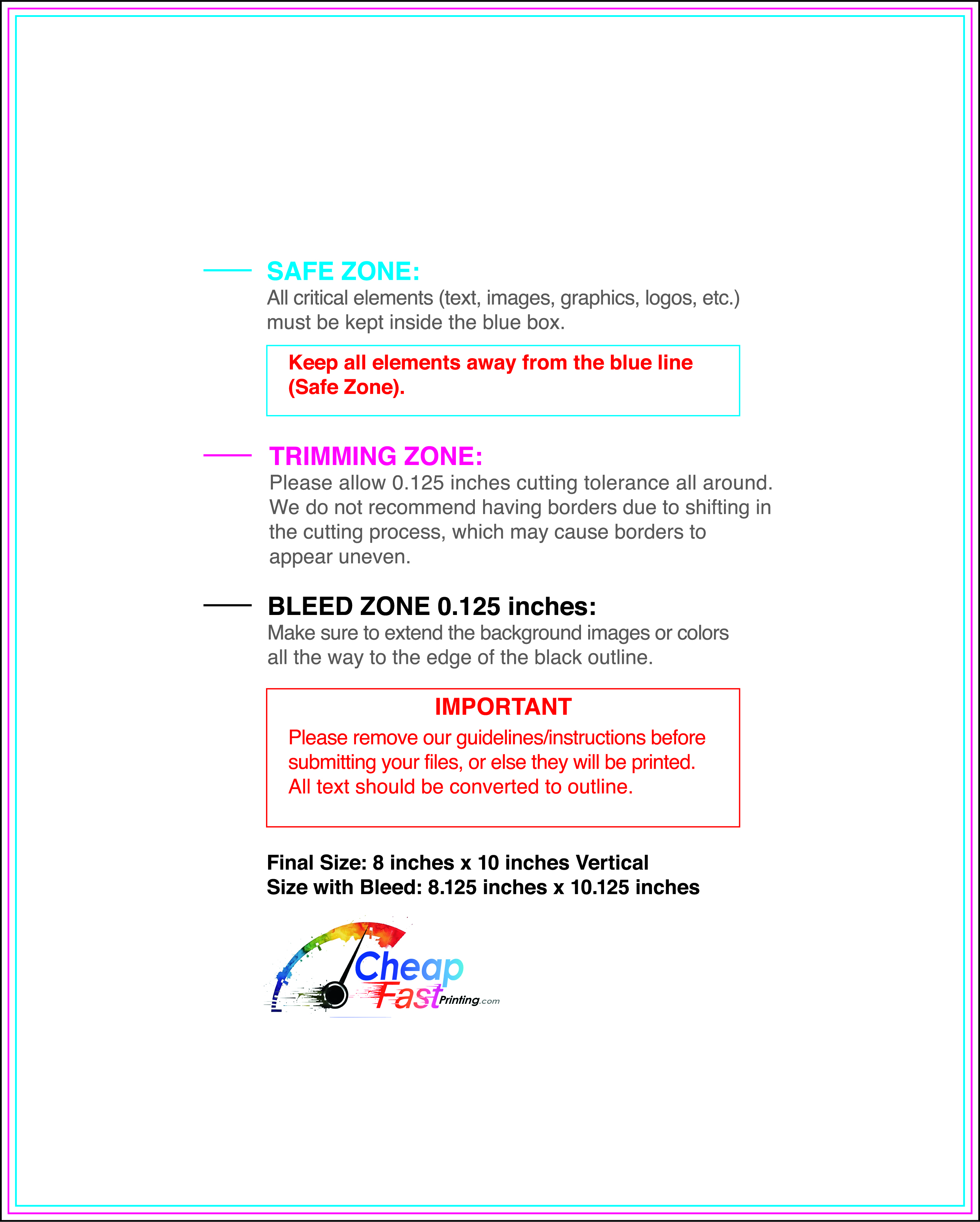
Submit a print-ready PDF (CMYK) at 300 DPI with 0.125" bleed and safe margins around important text. Keep thin lines above 0.5 pt and make QR codes at least ~0.8" square for reliable scanning.
Use vector logos when possible and limit your fonts to maintain a clean, professional look.
Request a proof so you can confirm spelling, margins, and QR/URL accuracy before production. Proofing is the easiest way to prevent expensive reprints.
Double-check phone numbers and offer terms first—those are the most common issues.
Match your flyer headline and offer to the landing page headline so visitors feel they’re in the right place. Keep the CTA consistent and make the page fast to load and easy to complete on mobile.
If you run ads, retarget QR visitors with the same offer to improve conversions.
Plan a steady supply for bridal shows, venue racks, and partner locations. Short runs let you refresh dates and promos without waste.
Predictable timing supports stronger response and keeps your offer current.
Track which placements drive the most QR scans and prioritize restocks there.
Use smaller top-up runs to match seasonal show schedules without redesigning the layout.
Balance weekly and monthly distribution to keep coverage consistent.
Use distribution logs to identify placements that perform well and retire low-response locations.
For fast events, express wedding planner flyers help you stay ready without delays.

