
Professionally designed for 9" x 12" flyers. Fully editable & free!
Preparing Templates…
Patients suffering from seasonal allergies often don't know that long-term relief is possible. A clear, educational flyer explains the benefits of testing and immunotherapy, guiding them from the pharmacy aisle to your clinic.
Trustworthy custom allergy clinic flyers turn confusion into action. The 9x12 format offers expanded space for detailed symptom checklists or treatment diagrams without looking cluttered.
Effective allergy clinic marketing materials combine medical authority with a hopeful message of relief. The flyer should guide patients to schedule an initial consultation or testing appointment.
When the paper has a premium texture and the design is clean, patients feel confident in the quality of care they will receive.
Lead with a 'Is it a Cold or Allergies?' comparison or a symptom checklist. Educational content builds trust faster than a generic ad.
Keep the call to action simple, such as 'Schedule Your Test Today'.
Use a clean, white-space dominant layout so the medical information feels accessible and professional.


These flyers must bridge the gap between suffering and solution. Patients respond best to clear identifiers of their problem and a direct path to relief.
This structure educates the patient and empowers them to seek help.
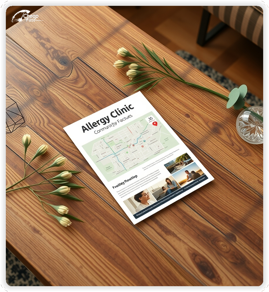
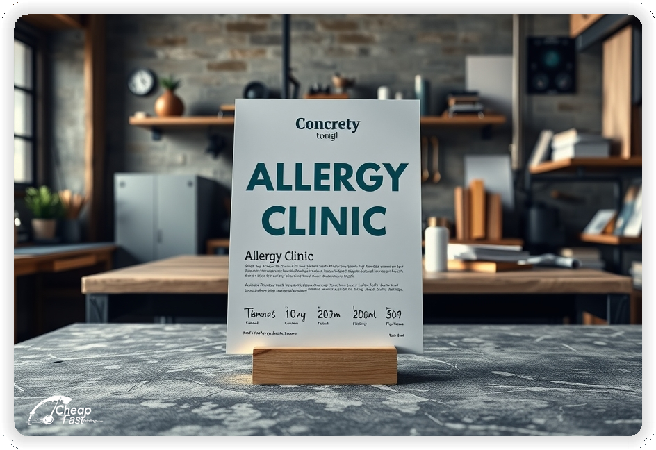
9x12 allergy clinic flyers provide vital extra inches compared to standard letter size.
This allows for a 'pocket folder' feel without the cost. It effectively displays side-by-side comparisons of 'Over-the-Counter vs. Immunotherapy' benefits.
Use the larger canvas to make font sizes larger and more readable for all age groups.
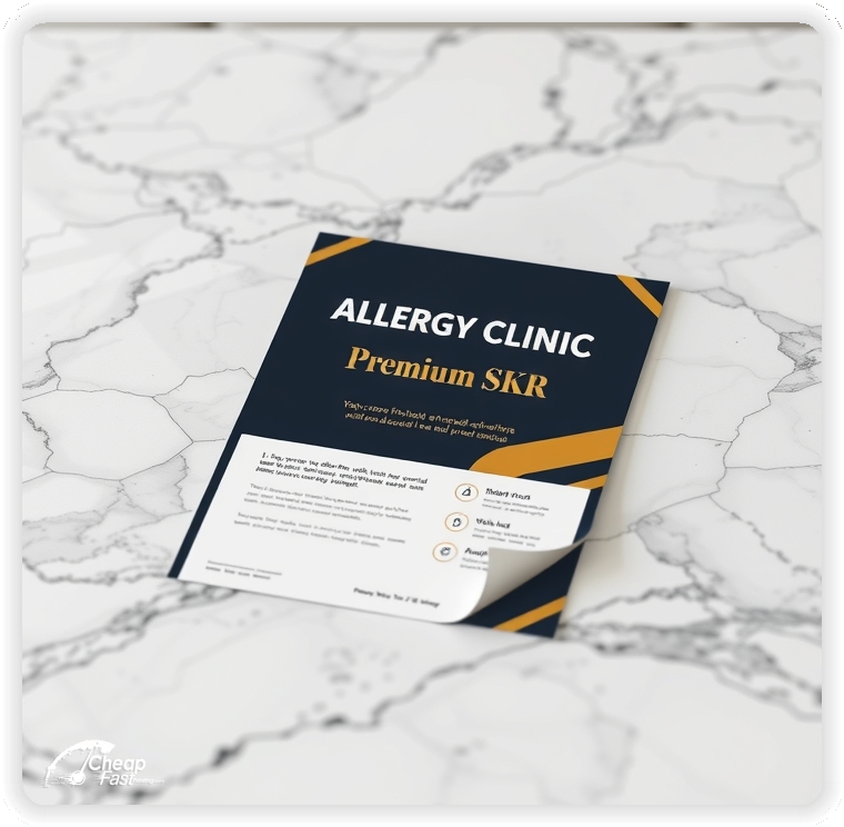
Medical communications require a tactile sense of quality. Linen paper flyers feature a subtle crosshatch texture that feels like high-end stationery or prescription expertise.
The linen finish separates your practice from generic commercial mailers.
Custom allergy clinic flyers printed on linen suggest a boutique, specialized level of patient care.
The texture also improves grip and readability under clinic lighting.
Reduce the barrier to the first appointment. Examples include 'Free Insurance Verification' or 'Same-Week Testing Appointments'.
Keep the focus on access and ease.
Clear access offers improve booking rates because they address the fear of long wait times or unknown costs.
Help patients self-diagnose. A checklist with 'Itchy Eyes,' 'Chronic Cough,' and 'Fatigue' validates their experience.
Use checkmarks visually.
When a patient sees their life described on paper, they trust you understand their problem.
Allergies are seasonal. Use a short callout for 'Spring Pollen Prep' or 'Fall Ragweed Relief'.
This creates natural urgency based on the calendar.
Timely campaigns capture patients exactly when their symptoms are flaring up.
Parents worry about their kids. A section on 'Pediatric Allergy Solutions' or 'Food Allergy Testing' builds strong family connections.
Keep the tone gentle and reassuring.
Addressing pediatric needs often brings the whole family into the practice.
Place allergy clinic handouts at local pharmacies, pediatric offices, and ENT clinics.
These are 'point of suffering' placements where patients are already looking for relief.
Strategic placement creates a referral network with other healthcare providers.
Explain the 'cure' vs. the 'band-aid'. A simple diagram showing how immunotherapy builds tolerance is powerful.
Keep the medical jargon to a minimum.
Educated patients are more likely to commit to long-term treatment plans.
Cost is a barrier. A clear line stating 'We Accept Most Major Insurance' removes hesitation.
Mention referral policies clearly.
Financial clarity supports booking decisions.
Each flyer should lead to action. A QR code to 'New Patient Registration' streamlines the intake process.
Keep the digital form mobile-friendly.
This reduces front-desk paperwork and speeds up the first visit.
Food allergies are high-anxiety. Use a specific section for 'Peanut styling' or 'OIT (Oral Immunotherapy)'.
This signals specialized safety protocols.
Link allergies to asthma. 'Breathe Easier' is a universal benefit.
Mention lung function testing capabilities.
This expands the scope of services in the patient's mind.
Fear of needles is real. Briefly explain 'Skin Prick Testing' as quick and relatively painless.
This manages expectations and reduces appointment anxiety.
Ordering 100 allergy clinic flyers is perfect for stocking your own waiting room or exam rooms.
For community outreach, bulk allergy clinic flyers allow you to mail every home in your zip code.
Even for small runs, cheap allergy clinic flyers provide high ROI by converting just one immunotherapy patient.
Convenience matters. If you offer 'Telehealth Follow-ups', mention it.
This appeals to busy professionals and parents.
showcase the clinic. A photo of a clean, modern waiting area or a smiling nurse builds comfort.
Keep the visuals bright and sterile-clean.
Facility photos reduce the 'medical anxiety' of visiting a new doctor.
Relief stories sell. 'I haven't used nasal spray in 3 years' is a powerful endorsement.
Anonymize appropriately (e.g., '– John D., Patient').
Success stories validate the treatment effectiveness.
Allergy shots require frequent visits. Emphasize 'Convenient Hours' or 'Before/After Work Appointments'.
This addresses the logistical objection to immunotherapy.
Be the expert. 'Your Local Pollen Source' positions you as the community authority.
Link to your daily pollen count web page.
Your marketing reflects your medical standards. Linen paper flyers suggest attention to detail.
Flimsy paper can suggest a 'clinic-in-a-box' rather than a specialist.
High-quality print builds the trust needed for medical decisions.
Primary care doctors need resources. Providing them with professional flyers to hand to patients makes their job easier.
This solidifies your professional referral relationships.
Use a direct CTA such as 'Schedule Your Relief Plan' or 'Book a Testing Consult'.
Keep the CTA compassionate but clear.
Clear CTAs help patients take the first step toward better health.
Use headers to separate 'Symptoms', 'Triggers', and 'Treatments'.
Keep the layout logical.
An organized flyer suggests an organized medical practice.
Pets are family. Mention 'Solutions for Pet Lovers' rather than just 'get rid of the cat'.
This appeals to pet owners who refuse to part with their animals.
Chronic sinusitis is a major pain point. Connect the dots between 'Frequent Sinus Infections' and 'Untreated Allergies'.
This offers a root-cause solution to a recurring problem.
Eczema and Hives are visible. Mention 'Skin Allergy Testing' clearly.
This broadens the appeal beyond just respiratory sufferers.
Safety is key. Mention 'Penicillin & Drug Allergy Testing'.
This is a specific, high-value service that many patients need.
Preparedness saves lives. Mention 'Anaphylaxis Management'.
This signals serious medical competence.
If you offer it, mention 'Lifestyle & Environmental Guidance'.
This appeals to patients looking for more than just a prescription.
Flyers work best when they offer hope. A clear symptom list, a treatment path, and a friendly invitation are enough.
When the design is clean, the flyer can fill your new patient roster.
Pair print with a helpful website and keep the medical branding consistent.
Your flyer has about 3 seconds to catch a patient's interest. Don't use scary needles. Ensure your main headline benefits ('Stop Sneezing') and primary image are relatable. Use calming colors (Blue/Green/White) to evoke health.
Target the Right Season: Success isn't just about design; it's about timing. Focus your distribution 4 weeks before the major pollen season starts. This catches patients during their 'pre-symptom' planning phase.
Most patients suffer for years before seeing a specialist. They browse drugstores. For allergy marketing, plan distribution like an intervention. Pick local pharmacies, hit them before spring/fall, and keep the message educational.
Pair one primary pharmacy strategy with 'pediatric referral' marketing. Drop flyers at pediatrician offices. Use the same offer ('Pediatric Testing Available') and track the channel. When you know where patients come from, you can build better referral loops.
Your flyer has about 3 seconds to catch a patient's interest. Don't use scary needles. Ensure your main headline benefits ('Stop Sneezing') and primary image are relatable. Use calming colors (Blue/Green/White) to evoke health.
Target the Right Season: Success isn't just about design; it's about timing. Focus your distribution 4 weeks before the major pollen season starts. This catches patients during their 'pre-symptom' planning phase.
Upload your logo and educational content to create custom allergy clinic flyers that drive appointments.
Proofing checks contrast, trimming, and spacing so your text looks authoritative.
Proof review also confirms the QR destination and web address so the flyer works without errors.
Confirm that the mobile appointment page loads fast.
Verify that treatment names are spelled correctly.
Check that the layout aligns evenly after trimming.
Confirm that the insurance acceptance text is legible.
Use the 9x12 template to keep margins consistent and reserve space for detailed checklists.
Templates also protect the layout so seasonal updates do not break alignment.
Consistent spacing keeps contact details visible after trimming.
A stable grid helps staff update hours without redesigns.
Consistent templates also support multi-provider updates with minimal editing.
They also preserve alignment for QR placement and logo sizing.
It also keeps headers aligned across spring and fall campaigns.
Loading Free Editable Designs...
Please wait while we prepare the template library.
Focused layouts outperform crowded pieces because the medical advice is clearer.
Consistent templates reduce design time and keep the practice identity strong.
Compare response by new patient starts, retention, and referrals rather than only print cost.
When the brand stays consistent, patients trust the clinic faster and book with less anxiety.
Tracking starts by source helps refine the next season's spend.
Review appointment request ratios to understand which messages generate the best patients.
Use one clear headline, one offer, and one primary CTA (call, scan, or order). Add the essentials: phone, website/QR, service area, hours (if relevant), and a trust signal like years in business or a short review snippet.
Keep the layout scannable: one hero image or icon, short bullets, and high-contrast CTA text that’s readable at arm’s length.
Yes. 9" x 12" balances visibility and readability without feeling cramped. It gives enough space for a strong headline, a benefits list, and a CTA while staying easy to hand out or place on counters and boards.
Prioritize spacing and hierarchy over extra copy so the main message lands in 3–5 seconds.
13 pt. Premium Linen with Uncoated affects how the flyer feels and how colors read. Gloss tends to boost color and photos, matte reduces glare and feels more premium for text-heavy layouts, and uncoated is great for writing on.
If your design uses lots of fine text, choose clarity and contrast first; paper upgrades won’t fix a crowded layout.
100 works well when you want consistent visibility across multiple placements (counters, boards, partner locations, events) over a few weeks. Bulk also lowers unit cost so you can test a message and keep the winner running.
Track performance, then reprint the best offer instead of changing everything at once.
If price is your main hook, feature one simple offer (“ off” or “Starting at ) and keep the fine print minimal. If you have variable pricing, use a short value statement and send details to a landing page.
A clean offer + simple CTA typically outperforms a long price list.
Use a QR code to a dedicated landing page and add UTM tags for each route or partner. Track scans, form fills, and calls to identify the placements that actually convert.
For non-QR audiences, include a short, memorable URL or a trackable phone extension.
Start where your customers already are: complementary businesses, community boards, local events, and targeted neighborhoods. Ask partners for the most visible spot and refresh before your flyer gets buried.
Use a consistent route and restock winners; small, repeated placements usually beat one big drop.
Submit a print-ready PDF (CMYK) at 300 DPI with 0.125" bleed and safe margins around important text. Keep thin lines above 0.5 pt and make QR codes at least ~0.8" square for reliable scanning.
Use vector logos when possible and limit your fonts to maintain a clean, professional look.
Request a proof so you can confirm spelling, margins, and QR/URL accuracy before production. Proofing is the easiest way to prevent expensive reprints.
Double-check phone numbers and offer terms first—those are the most common issues.
Match your flyer headline and offer to the landing page headline so visitors feel they’re in the right place. Keep the CTA consistent and make the page fast to load and easy to complete on mobile.
If you run ads, retarget QR visitors with the same offer to improve conversions.
Plan a steady supply for office handouts and pharmacy partners. Short runs allow seasonal updates without waste.
Predictable inventory supports stronger referral presence.
Track which partners drive the most calls and prioritize materials there.
Use 100 allergy clinic flyers to test a new message in the waiting room.
Balance spring and fall distributions to keep the testing schedule full.
Use mailers for radius marketing around the clinic.
For community-wide awareness, bulk allergy clinic flyers reduce the cost per patient significantly.

