
Professionally designed for 6" x 6" flyers. Fully editable & free!
Preparing Templates…
Pool routes grow when the message is simple: clean water, reliable service, and an easy next step. Use calm visuals, one clear offer, and a short booking path.
These print pieces are built for door drops, partner counters, and seasonal outreach without looking generic or rushed.
Keep the front focused on one promise and one action. Put details, pricing tables, and long lists on a landing page where people can read at their pace.
Repeat coverage wins. A single drop can work, but frequency builds recognition. Keep the design consistent and refresh placement routes on a schedule.
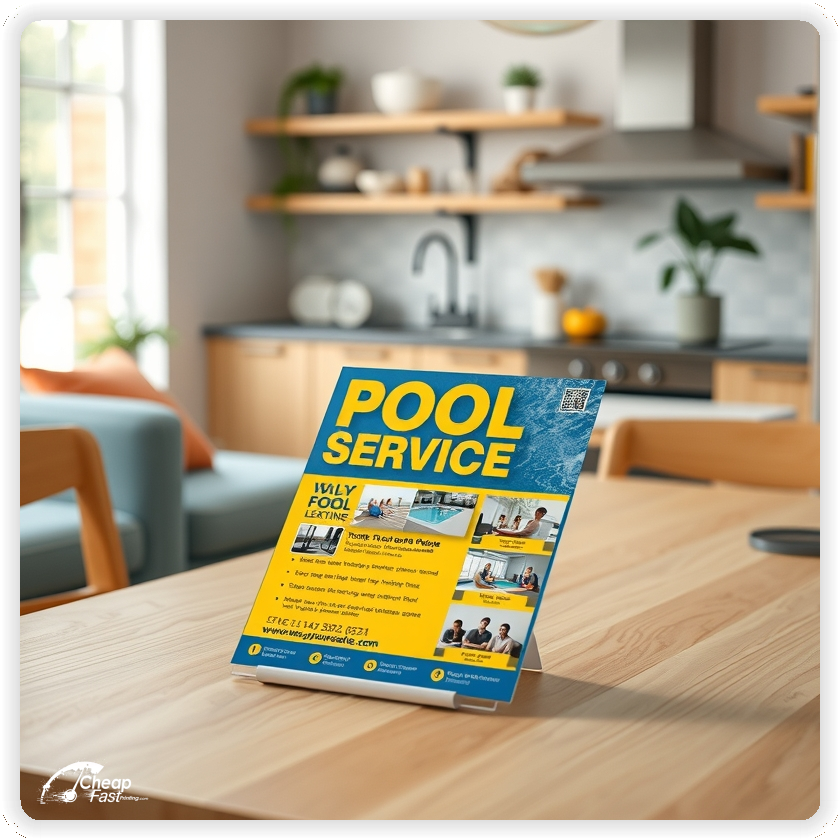

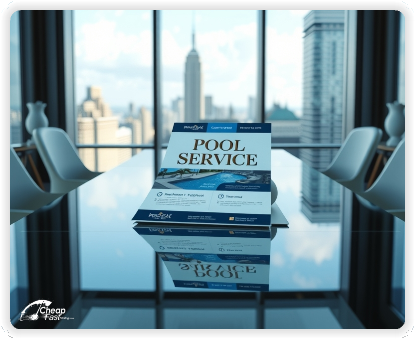

Pearl stock catches light the same way water does. That shimmer creates instant contrast, so your headline reads cleanly even with a calm photo.
It also signals premium service. When the paper feels substantial, the prospect assumes the work will be, too.
Thicker stock holds its shape on a doorstep and looks cleaner on community boards. It resists curling and it feels deliberate in-hand.
That physical confidence supports the message: consistent weekly care, not a one-time discount job.
6x6 pool service flyers look different from the usual 4x6 stack. The square format feels modern and gives your water visuals room to breathe.
Keep typography larger than you think you need. Doorstep reads are quick reads.
Most people decide in seconds. Use a simple structure: one benefit headline, one proof cue, and one next step.
This approach outperforms long lists on paper flyers because it reduces decision friction.
Choose one primary offer: weekly maintenance, opening service, or storm cleanup. Add one action: call, text, or book online.
When you do need a tailored message, custom pool service flyers let you match the headline to each neighborhood’s pain point without changing the entire design system.
Time your drops to decision moments: early spring openings, peak summer weekly care, and post-storm recovery windows.
Matching outreach to those moments keeps response steady without relying on heavy discounts.
One of the fastest ways to build a profitable route is density: multiple clients within a tight radius.
Design your message to support that goal: highlight reliability, fast response, and consistent weekly plans. Think of it as pool maintenance marketing built around recurring routes, not one-off jobs.
Door drops create immediate local visibility, especially in pool-heavy neighborhoods. They are also door to door marketing handouts that can be repeated on a simple route schedule. Direct mail adds consistency when paired with repeat drops.
Use the same headline and offer across channels so every touchpoint reinforces the same decision.
A QR should land on a short page with one CTA. Avoid sending people to a homepage with multiple choices.
Use a unique QR per neighborhood to learn what converts.
If you are testing a new offer, begin with 100 pool service flyers in one neighborhood. Track calls and bookings for two weeks, then adjust.
Small tests prevent expensive guesswork and quickly reveal which headline pulls best.
Talk like a real person. “Clear water every week” reads better than a long service list, and it still communicates value.
Use short service phrases and let your proof cue do the heavy lifting: reviews, years in business, or a simple guarantee.
Pool stores, pressure-washing companies, and real estate agents already speak to your ideal customer. Leave a small stack and refresh it regularly. This kind of local pool service advertising works best when the placement stays tidy and current.
When the message is consistent, your brand becomes the obvious referral.
Use the back for proof and process: “what’s included,” a short checklist, and the booking path.
Keep the same visual style so the piece feels premium from both sides.
Once your test wins, scale in rings around your best neighborhood. Keep the same headline and rotate only the offer line when needed.
When you are ready for consistent coverage, bulk pool service flyers support the frequency required to stay top-of-mind.
If the piece promises weekly care, the landing page should lead with weekly care. Misalignment lowers conversions.
Continuity reduces doubt and increases action.
Add one line that proves competence: licensed and insured, years in business, or a simple satisfaction promise.
Keep it short so the offer stays the main focus.
Use one primary action and make it visually obvious. People should not hunt for the phone number.
For fast responses, pool service handouts work best when the booking path is frictionless.
Think of print as part of your sales system. One design can support door drops, counter placement, and seasonal follow-ups.
Used this way, the same file becomes a core set of pool service marketing materials that build brand familiarity over time.
If you are measuring SEO copy strictly, include the exact phrase once where it reads naturally: pool service flyers.
Then switch to normal language like “door drops,” “handouts,” or “print pieces” so the paragraph still sounds human.
Pool care demand moves in predictable waves. The best outreach is timed to the customer’s mindset instead of random coverage. Use a simple seasonal calendar so your message lands when homeowners are already thinking about the problem.
People are planning spring projects and comparing providers. Lead with an opening service, a fast turnaround promise, and a short booking path. Keep the call-to-action tight and make scheduling feel easy.
This is the rush window. Emphasize consistency, on-time weekly visits, and a clear scope of work. The goal is to win recurring plans, not just one-time cleanups.
Homeowners want stability during peak use. A small “mid-season check” offer can pull in new accounts. Keep the offer simple and make the next step obvious.
Close-out messaging can focus on winterizing, equipment checks, and pre-booking for spring. This is also a great time to lock in early renewals for weekly service routes.
Run the same design framework all year and only rotate the offer line. That consistency builds recognition across neighborhoods.
Marketing only works when the math works. The most profitable pool businesses optimize for route density: multiple homes close together, fewer windshield hours, and predictable weekly revenue.
Design your outreach to support density. Use language that signals “we service your neighborhood” and keep the offer tied to weekly plans rather than one-off discounts.
Think in terms of lifetime value. A single weekly client can be worth thousands over a year, and much more over multiple seasons. That’s why a small test is powerful: validate the message, then scale the same framework to adjacent streets.
When you measure results, track calls and bookings per neighborhood. If one area responds better, concentrate there. Concentration is what turns outreach into a route.
Keep your proof cue short: a rating, a guarantee, or a one-line promise of reliability. Prospects don’t need a long story; they need confidence that you will show up and keep the water clear.
Sell the outcome, not the chemicals. Calm blue imagery, high contrast text, and clean spacing communicate “professional” without extra copy.
Avoid clutter. A crowded layout signals chaos, and chaos is the opposite of what pool owners want. Use one hero image, one offer line, and one primary action.
If you use a photo, prioritize clarity: clean water, a tidy deck, and a clear sky. If you use an icon set, keep it minimal: weekly, repair, opening, closing. Too many icons become visual noise.
Typography matters. Use a readable font, keep the headline large, and make the phone number or booking URL impossible to miss. The piece should work even if someone glances at it for two seconds while walking inside.
Most importantly, keep the message consistent with the landing page. When the headline and offer match, conversions go up because the customer feels guided, not sold.
Repetition is the enemy of trust. Use normal phrasing and rotate headline structures so the copy feels human.
Keep the subhead short. Add one proof cue under it, like “licensed and insured” or “on-time weekly visits.”
If you are running multiple neighborhoods, keep the design identical and only change one line of copy. Consistency protects your brand while still letting you test different angles.
The best headlines are simple, specific, and easy to believe. If it sounds exaggerated, prospects will assume the rest of the message is exaggerated too.
Target areas where pools are common and maintenance decisions are frequent. Look for neighborhoods with visible pools, active HOA communication, and recent home sales.
Plan your walk like a route. Start where you already have jobs, then expand outward. This creates a compounding effect: your brand appears repeatedly in the same corridors, and prospects see your trucks nearby.
Use repeat drops. One exposure can work, but multiple exposures work better because people rarely act the first time. A simple schedule is enough: drop once, follow up two weeks later, then again a month after that.
Keep tracking simple: one QR per neighborhood or one tracking number per route. Data is what tells you where to double down.
Consistency matters more than cleverness. A clean piece, delivered on a repeat schedule, beats a complex message delivered once.
Some of the highest-intent demand happens after storms. People need fast help, and they are ready to choose a provider quickly.
For these campaigns, the best message is “availability + action.” Use a short availability note, a direct booking path, and a promise of quick response. Avoid long descriptions. If the need is urgent, simplicity converts.
Keep a template ready so you can update the offer line and deploy quickly. The rest of the design should stay stable so it still looks like your brand.
If you use a discount, keep it clean and easy to understand. “$50 off first cleanup” is clearer than complex percentages.
After the storm window closes, shift back to weekly plans and maintenance messaging so you are building recurring revenue instead of chasing only emergency work.
Some of your best leads come from partners who already have the homeowner’s trust. Pool builders, realtors, and pool supply stores are natural channels for consistent referrals.
Make the piece useful to the partner. For a builder, the message can focus on “new pool owner weekly care.” For a realtor, it can focus on “move-in ready service and quick scheduling.” For a store, it can focus on “weekly maintenance so you don’t have to test water every weekend.”
Keep the headline aligned with the partner context. The visual design can stay the same, but the top line should match the scenario.
Don’t ask partners to sell for you. Ask them to place the stack. Your copy should do the selling.
When a partner channel works, treat it like a route. Refresh the stack regularly and keep the message consistent so customers recognize your brand across touchpoints.
Every Door Direct Mail can work well for pool care when the targeting is right. The goal is not blanket coverage; it is qualified coverage.
Choose routes with a high concentration of pools and the right home values for your service tier. Then run consistent drops so the message is repeated over time.
Keep the design legible at arm’s length. If the offer cannot be understood quickly, response drops. Use one offer and one CTA, then push details to a landing page.
Mail works best when paired with local presence. If you already service nearby, your message becomes believable because the homeowner sees your truck in the area.
Track mail the same way you track door drops: unique QR codes, unique phone numbers, or unique landing pages. Data tells you if the route is worth repeating.
Measure the few metrics that matter: inquiries, booked jobs, and recurring signups. Everything else is noise.
Use a unique QR per neighborhood or per campaign. If you prefer phone calls, use a tracking number that forwards to your main line. Then review results weekly.
When you see a winner, don’t redesign. Scale the same framework. Most campaigns fail because people change too many variables at once.
Simple iteration wins: adjust the offer line, adjust the headline, or adjust the placement schedule. Keep everything else stable.
Tracking also protects your time. When you know which neighborhoods convert, you stop wasting effort in areas that do not.
Small production mistakes can break response. Use a checklist before you order a run.
This checklist keeps the piece clean and conversion-focused, which is what homeowners respond to.
Modern customers care about waste. The most sustainable approach is efficiency: place outreach where it will be read and acted on.
Choose tighter neighborhoods, use repeat drops in high-performing areas, and avoid blanket coverage that produces zero response.
If you want to mention sustainability, keep it subtle. A short line about recyclable paper is enough, and it can help your brand feel thoughtful without turning the message into a lecture.
The real sustainability win is avoiding waste through targeting, tracking, and route density. When the outreach supports a profitable route, you can afford to keep it consistent and clean.
If your QA tool checks for exact phrases, use them sparingly and spread them out. Include the main terms once each, then use normal language everywhere else.
For example, you can include a single instance of pool service flyers printing in a technical section, and then switch back to phrases like “print pieces” and “door drops.”
The goal is readability first. Homeowners do not hire based on keyword density; they hire based on clarity and trust.
When the piece reads naturally, response goes up. When it reads like a checklist, response goes down. Aim for simple promises, short proof cues, and a clean booking path.
Local service marketing has shifted over time, but one thing stayed constant: homeowners respond to clarity and trust. Decades ago, newspaper classifieds worked because the decision was simple and options were limited. As the market got noisier, visuals and branding started doing more of the work.
Today, digital ads are everywhere, and people are tired of them. That is why physical pieces can feel premium again. They require a real interaction: pick up, glance, and decide. If your message is calm and confident, you stand out immediately.
The winning approach is hybrid. Use print to create attention and local credibility, then use digital pages for details and booking. The paper gets the first look; the landing page finishes the decision.
This is also why consistency matters. When the same brand appears multiple times over a season, your name becomes familiar, and familiar names win the call.
Pearl paper reacts to light. That means very subtle gradients can look better, but tiny low-contrast text can look worse. Design with contrast in mind.
Use one strong focal image. Crop tightly so the water texture reads even at a quick glance. Avoid busy pool-party scenes that turn into visual noise.
Keep text panels clean. A simple white or dark overlay behind your headline can increase readability without ruining the calm look.
If you are printing a QR, give it space and test it on different phones. A small QR or low contrast background is a silent conversion killer.
Most underperforming campaigns fail for simple reasons, not complex ones.
Fixing these basics often improves response more than any clever copywriting trick.
When someone calls, speed and structure matter. Use a simple script so your team converts more inquiries into scheduled service.
Step 1: Confirm the need (weekly care, opening, repair, cleanup).
Step 2: Confirm location and availability window.
Step 3: Offer two appointment options instead of asking “when works?”
Step 4: Confirm the next step by text or email (address, gate code, expectations).
The easier you make the first booking, the more weekly plans you win.
Homeowners make snap judgments. If the piece feels cheap, they assume the service might be cheap. Pearl stock helps you avoid that problem before the prospect reads a single word.
The shimmer is subtle, but it changes perception. It feels closer to a high-end brochure than a basic handout, which supports higher-value weekly plans and reliable add-on services.
That premium signal also creates space for calmer design. You do not need loud colors or aggressive discount language. A clean water image, a confident headline, and a single offer can work because the material already carries weight.
Use that advantage to keep your copy short and direct. When your design is calm and your material feels premium, trust rises and resistance drops.
A strong campaign does not just generate calls; it generates the right calls. One of the easiest ways to do that is to build an offer ladder.
Entry offer: a first-visit incentive or a quick assessment that feels low risk. This is for homeowners who are uncertain or price sensitive.
Core offer: a weekly maintenance plan with a simple scope: skim, brush, balance, and check equipment. This is where recurring revenue comes from.
Premium offer: a higher-tier plan that includes extra attention, priority scheduling, or seasonal add-ons. This is for clients who value reliability more than discounts.
Keep the print message focused on one rung of the ladder, then use the landing page to present the full ladder. This keeps the first read clean while still giving you room to increase average order value once the prospect is engaged.
Most pool businesses lose bookings because pricing is unclear or overwhelming. The fix is not to hide pricing; it is to frame it.
Use simple ranges and attach them to outcomes. Instead of a long list of line items, present a basic weekly plan, a premium weekly plan, and optional add-ons. Make it easy to understand the difference in plain language.
When you present price on a landing page, focus on what is included and what the customer stops worrying about. People are buying time, convenience, and the confidence that their pool will not turn green the week guests arrive.
If you do not want to show prices publicly, offer a quick quote flow with two or three questions. The important part is reducing friction while still qualifying leads.
Upsells work when they are framed as protection, not pressure. The best add-ons solve predictable problems: algae prevention, filter cleaning, equipment checks, and seasonal opening or closing work.
Introduce add-ons as “common next steps” rather than “limited time offers.” Homeowners respond better to calm guidance than aggressive tactics.
Keep your add-on list short. Three options is plenty. More than that creates decision paralysis and reduces conversions.
Use print to win the first contact, then use the follow-up conversation to match add-ons to the customer’s real needs. This is how you raise revenue without hurting trust.
Many neighborhoods have strict rules about solicitation and signage, but community boards and permitted posting areas can still be effective.
If you place pieces on boards, keep the design readable from a few feet away. Larger type, high contrast, and a simple headline matter more than clever copy. Include tear-off contact options only if the board location supports it.
For HOA-friendly outreach, avoid language that feels spammy. Lead with reliability and professionalism. A calm message with clear contact info is more likely to be tolerated and more likely to convert.
Always follow local rules. A campaign that respects the neighborhood builds trust before the first call.
Trust is what converts. Visual proof and social proof do more than extra adjectives ever will.
If you use before/after photos, keep them realistic. Over-edited images can backfire because they look fake. A simple “green-to-clean” transformation is instantly understood.
For reviews, do not paste long quotes. Use one short line and the platform name, like “5-star average on Google.” That is enough to remove doubt.
Combine proof cues with a clear process: what happens when they call, how scheduling works, and what to expect on the first visit. When the customer knows what will happen next, they are more likely to book.
Expanding a service area is easy to do badly. The goal is to expand in a way that strengthens route density instead of diluting it.
Start by mapping your current jobs. Then identify the next ring of neighborhoods that keeps drive time low. Run repeat outreach in that ring until you have enough clients to justify a new mini-route.
As you expand, keep the message consistent. Brand recognition is a multiplier. People do not always call the first time they see your name, but they remember it the third time.
Use tracking to decide where to grow next. This is how you support neighborhood route growth without turning your schedule into constant windshield time.
Repairs are high-value, but the wrong message can attract low-quality leads who only want the cheapest fix. Frame repair work around confidence and outcomes.
Use language like “diagnose and fix fast,” “clear communication,” and “no surprise steps.” Homeowners want to know that you will identify the real issue and keep them informed.
If you promote repairs, keep the list short: pumps, filters, heaters, and leaks. Then direct people to a quote page with a simple intake form. The goal is to capture the inquiry, not to educate someone on equipment brands.
Repairs also support weekly plans. A great strategy is to offer a quick diagnostic appointment and then present a maintenance plan that prevents repeat issues. Done well, a repair lead can become a long-term client.
Commercial pools are not sold the same way as residential service. Decision makers care about reliability, documentation, and response time.
For commercial messaging, emphasize process: scheduled visits, written checklists, and clear communication. Mention that you can coordinate with property managers and handle time-sensitive issues.
Keep the offer professional. Instead of consumer discounts, use “site assessment” or “maintenance proposal” language. This attracts serious inquiries and protects your pricing.
If you want to pursue commercial work, build a dedicated landing page with a short form for pool type, location, and preferred contact. Make it easy for managers to start the conversation without a phone call.
Winning a client is only half the game. Keeping them is where profits compound.
Retention is mostly about expectations and communication. Make it clear what “weekly service” includes, how you handle weather delays, and how you communicate if a visit needs to shift.
Use a simple “what to expect” checklist on your landing page or in your onboarding email. The clearer the process, the fewer complaints and the higher the renewal rate.
You can also run light follow-up outreach in neighborhoods where you already have clients. Familiarity reinforces confidence, and it helps your current clients feel like they chose a well-established provider.
Homeowners are skeptical because they have been burned by vague promises. A short checklist solves that. It shows exactly what you do, without forcing you into a long technical explanation.
Keep the checklist outcome-based and simple:
Use this checklist on the landing page and optionally on the back side of the piece. The goal is to remove uncertainty and make the service feel predictable.
A checklist also protects your team. When expectations are written clearly, you spend less time explaining what is included and more time doing the work.
FAQs reduce hesitation, especially for first-time pool owners and new residents. Keep answers short and practical.
Good questions to cover include: how scheduling works, what happens during rain, what chemicals are used, whether you need gate access, and what a first visit looks like.
Do not turn FAQs into a wall of text. Use 3 to 6 questions and write like you speak. Every answer should point back to the next step: call, text, or book online.
When your FAQ matches the message on the print piece, it creates a smooth experience. Smooth experiences convert because they feel safe.
A small guarantee can increase response, but only if it is realistic. Avoid promises that invite abuse. Instead, guarantee the process.
Good examples include: “On-time weekly visits,” “Clear communication,” or “We fix issues we cause.” These promises feel fair and they are easy to honor.
Pair the guarantee with a simple expectation statement on the landing page. For example, clarify that results depend on access, equipment condition, and basic maintenance. This protects your team while still making the customer feel safe.
Risk reversal also works through transparency. Tell the prospect what a first visit looks like, how you report issues, and how you handle storms or schedule shifts. When people know what will happen next, they feel in control, and they book.
Keep the wording calm. The goal is not to sound like a contract; it is to sound like a professional who has done this hundreds of times.
Small details can raise conversion without changing the offer. If you operate in the neighborhood, say so. If your trucks are branded, mention that homeowners may see you nearby.
Local trust signals work because they reduce perceived risk. A homeowner feels safer hiring a provider that appears established and visible.
Keep these signals short: years in business, service radius, and a simple promise of professional communication. One or two lines is enough.
Trust cues should support the headline, not compete with it. When the piece stays clean, the offer stays clear, and clarity is what gets the call.
Upload your design or customize a template, then place your order. Proofs help lock in readability and CTA clarity before the run.
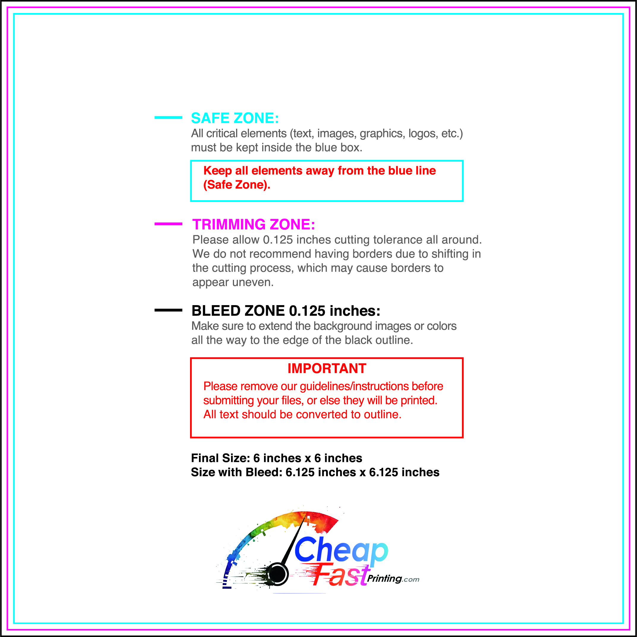
Ensure your files are print-ready with our correct bleed, safety, and trim lines.
Loading Free Editable Designs...
Please wait while we prepare the template library.
Compare our cheap flyer printing rates against giants like GotPrint, RushFlyers, SameDayRushPrinting.com.
Use one clear headline, one offer, and one primary CTA (call, scan, or order). Add the essentials: phone, website/QR, service area, hours (if relevant), and a trust signal like years in business or a short review snippet.
Keep the layout scannable: one hero image or icon, short bullets, and high-contrast CTA text that’s readable at arm’s length.
Yes. 6" x 6" balances visibility and readability without feeling cramped. It gives enough space for a strong headline, a benefits list, and a CTA while staying easy to hand out or place on counters and boards.
Prioritize spacing and hierarchy over extra copy so the main message lands in 3–5 seconds.
18 pt. Ultra Premium Pearl with Gloss affects how the flyer feels and how colors read. Gloss tends to boost color and photos, matte reduces glare and feels more premium for text-heavy layouts, and uncoated is great for writing on.
If your design uses lots of fine text, choose clarity and contrast first; paper upgrades won’t fix a crowded layout.
100 works well when you want consistent visibility across multiple placements (counters, boards, partner locations, events) over a few weeks. Bulk also lowers unit cost so you can test a message and keep the winner running.
Track performance, then reprint the best offer instead of changing everything at once.
If price is your main hook, feature one simple offer (“ off” or “Starting at ) and keep the fine print minimal. If you have variable pricing, use a short value statement and send details to a landing page.
A clean offer + simple CTA typically outperforms a long price list.
Use a QR code to a dedicated landing page and add UTM tags for each route or partner. Track scans, form fills, and calls to identify the placements that actually convert.
For non-QR audiences, include a short, memorable URL or a trackable phone extension.
Start where your customers already are: complementary businesses, community boards, local events, and targeted neighborhoods. Ask partners for the most visible spot and refresh before your flyer gets buried.
Use a consistent route and restock winners; small, repeated placements usually beat one big drop.
Submit a print-ready PDF (CMYK) at 300 DPI with 0.125" bleed and safe margins around important text. Keep thin lines above 0.5 pt and make QR codes at least ~0.8" square for reliable scanning.
Use vector logos when possible and limit your fonts to maintain a clean, professional look.
Request a proof so you can confirm spelling, margins, and QR/URL accuracy before production. Proofing is the easiest way to prevent expensive reprints.
Double-check phone numbers and offer terms first—those are the most common issues.
Match your flyer headline and offer to the landing page headline so visitors feel they’re in the right place. Keep the CTA consistent and make the page fast to load and easy to complete on mobile.
If you run ads, retarget QR visitors with the same offer to improve conversions.

