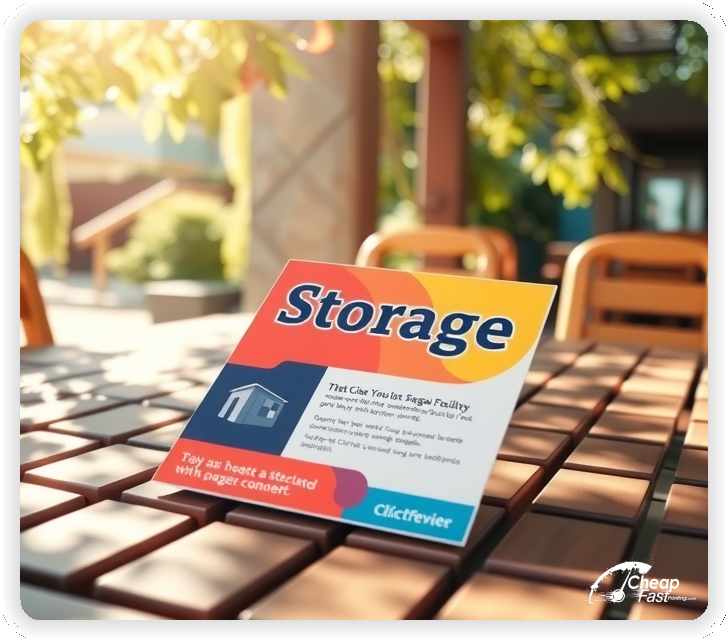
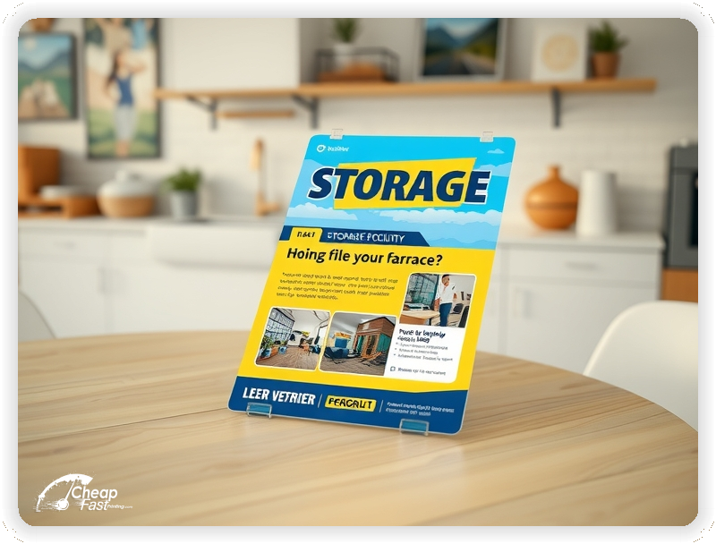
Professionally designed for 4" x 6" flyers. Fully editable & free!
Preparing Templates…
Self-storage decisions happen fast. A renter is moving, renovating, downsizing, or clearing a business backlog, and they want two things right away: a good price and an easy move-in.
Strong storage facility print pieces make the offer obvious, remove confusion about access, and point to one simple next step. Keep the message short: unit sizes, the special, and how to reserve.
Use trust cues that matter in storage: gated access, cameras, bright lighting, clean property, and a real manager on-site or available by phone.
When the piece feels premium in-hand, it also makes the facility feel safer and better maintained, which directly improves conversions for higher-value units.
Discounts are effective, but the best campaigns protect your margins. Use an offer that qualifies renters, not an offer that attracts only bargain hunters.
Good examples include: “First month $1 with 2-month minimum,” “Online reservation bonus,” or “Free lock with move-in.” These feel valuable without forcing you into deep price cuts.
Keep restrictions simple, and move the fine print to the landing page. The print piece should stay clean, readable, and focused on one action.


The best-performing pieces follow a simple structure that matches how renters decide. They scan, compare, and reserve quickly.
This format reduces decision friction and keeps calls higher quality.
4x6 is compact, easy to hand out, and easy to place where renters already go: U-Haul counters, apartment offices, real estate desks, and hardware stores.
Because it’s small, every word must earn space. That’s an advantage. You can’t clutter it with long lists or generic claims.
Use the front for the offer and one trust line. Use the back for a mini checklist: what’s included, how access works, and how to reserve.
Storage is a trust purchase. People worry about theft, pests, water damage, and hidden fees. A thick, premium-feeling piece signals that your facility is well-run.
It also stands up better on community boards and partner counters, so you get more impressions per piece.
Use clean design and strong contrast. When the piece reads instantly, it feels “professional,” which increases the chance they reserve rather than keep shopping.
Storage specials work best when they feel valuable and simple. Avoid complicated discount ladders that require a calculator.
Good offer formats:
One offer per piece keeps your messaging clean and your results easy to measure.
Renters usually start with a guess. If you overwhelm them with a long list, they postpone the decision.
Choose 3 to 5 size anchors and describe them in plain language. Example: “5x10: small apartment,” “10x10: 1-bedroom,” “10x20: 2–3 bedroom.”
Then route them to a page that shows the full inventory and availability by size.
Climate control is easier to sell when you frame it as protection. People care about their stuff, not your HVAC system.
Use plain outcomes: protects wood furniture, electronics, photos, documents, clothing, and seasonal items from extreme heat and humidity.
Keep the climate pitch short and use an icon. One line is enough on print; the landing page can explain the details.
Many renters choose a facility based on convenience. If your access rules are unclear, they keep shopping.
List what matters most: access hours, gate code entry, elevator availability, and whether drive-up units exist.
If you have 24/7 access or extended access hours, say it clearly. If you don’t, don’t pretend. Clarity converts better than vague promises.
Security claims must feel believable. Avoid generic lines like “safe and secure.” Use specific features instead.
These cues reduce anxiety and shorten the decision cycle.
Pick one conversion path and make it obvious. “Reserve Online” works well because it feels low commitment and fast.
If you prefer calls, make the phone number dominant and remove distractions. Don’t ask people to choose between five actions.
Use a short QR destination with your offer pre-selected. If the QR lands on a homepage, conversions drop because renters get lost.
Storage marketing improves fast when you track. Use one QR per channel: one for U-Haul counters, one for apartment offices, one for door drops, one for community boards.
That gives you channel-level performance without needing complicated analytics.
When you see a winner, you scale placements that produce reservations, and you stop wasting pieces that don’t.
Most facilities win within a short radius. Target renters who move through your area, not an entire city.
High-intent local targets include:
This is the fastest path to consistent occupancy growth.
Door drops can work well for storage when they’re timed to local moving patterns. Keep them clean and professional.
Focus on renters, not homeowners. Target apartment-heavy areas, new construction neighborhoods, and zones with frequent turnover.
Avoid spammy language. A simple offer and a clear location anchor converts better than aggressive copy.
Apartment offices see move-ins and move-outs constantly. If your piece is on their counter, you’re in front of renters at the exact moment they need storage.
Make it easy for staff to recommend you. Include a short “how to reserve” line and a quick size guide.
Refresh the stack regularly and keep the design consistent so staff recognizes it and keeps it visible.
Business renters often stay longer and pay more. They care about access, reliability, and convenience.
Use one short line that signals business-friendly storage: “Contractor-friendly access,” “Commercial deliveries accepted,” or “Invoice-ready receipts.”
Partner counters that work well include hardware stores, trade suppliers, and local business associations.
Storage demand spikes during moving season, life transitions, and local events. Plan your print schedule like a calendar, not like a one-time run.
Strong seasons include spring and summer moves, back-to-school, and pre-holiday home clean-outs.
Run a primary campaign before the spike, then a follow-up run two to three weeks later for recognition.
Posting exact prices can create a race to the bottom, but hiding pricing can slow reservations. The middle path is framing.
Use a range or “starting at” price for one size, or focus on the special instead of the base rate.
Then use the landing page to show availability and current pricing by size. Renters want clarity; they don’t need your entire spreadsheet on print.
Risk reversal increases response, but only if it’s realistic. Avoid promises that invite disputes.
Better options include “no hidden fees,” “clean units,” “easy online reservation,” or “manager support during business hours.”
Guarantee the process. When the process feels reliable, renters reserve.
Storage doesn’t have glamor shots, but it does have proof. Use images that signal cleanliness and organization: bright hallways, clean drive-up rows, neat doors, and clear signage.
Pair with one simple proof line: “4.9-star local rating,” “locally owned,” or “trusted by movers.”
Proof cues should support the offer, not compete with it.
The back side is where you remove hesitation. Keep it structured and quick to read.
This checklist reduces phone questions and speeds up conversion.
Storage marketing can feel “cheap” fast if the design screams discount. Keep the offer visible but not aggressive.
Use clean typography, strong spacing, and one highlight color. Avoid shouting with multiple badges and stacked promotions.
A professional look supports higher-value units and longer-term renters.
Rather than comparing yourself to a competitor by name, compare your process and convenience.
Positioning angles that work well include: cleaner property, clearer communication, easier move-in, better access hours, and simpler reservation.
These angles shift the decision away from “who is cheapest” and toward “who is easiest and safest.”
Community boards can still be effective for storage if your design reads from a few feet away. Larger type and a simple offer matter more than clever copy.
Use a short location anchor: “Near (landmark)” or “Off (main road).” Then include a QR and phone number.
Keep the piece clean so it feels like a facility, not a spam ad.
Referral partners can produce consistent reservations. Give them a piece that is easy to hand to a customer and easy to explain in one sentence.
Consider a partner-only tracking QR so you can see which referrals produce move-ins.
When you reward partners and keep messaging consistent, your referrals become predictable.
Storage campaigns win through repetition. People often see your name once, ignore it, then reserve after the third exposure when the need becomes urgent.
Keep one core template for the season and rotate only the offer line. This keeps recognition high and design time low.
Consistency also makes partner stacks look “current,” which improves trust.
Write like you speak to a renter: “clean units,” “easy online reservation,” “close to you,” and “move-in today.”
Short, direct language converts better than repeating the same phrase over and over.
Let the offer and the move-in path do the selling. Your goal is not to explain everything; it’s to get the reservation.
Student storage is a predictable seasonal spike with a different decision pattern. Parents want safety and simple pricing. Students want convenience and quick access.
Keep the message short and practical: “Summer storage near campus,” “month-to-month options,” and “easy online reservation.” Use a location anchor that includes the campus name or a nearby landmark.
For students, add one convenience cue: extended access hours, drive-up loading, or elevator access. For parents, add one trust cue: cameras, gated entry, and a clean, well-lit facility.
Timing matters. Run student-focused outreach two to three weeks before dorm move-out and again before fall move-in. A follow-up run captures late planners who are the highest intent and least price sensitive.
PCS moves create urgent storage needs. The renter is usually managing paperwork, deadlines, and a complicated moving timeline.
Keep the offer calm and predictable: flexible terms, easy reservation, and clear move-in requirements. If you have any military-friendly policy, state it simply without overpromising.
Use language that reduces stress: “reserve today, move in when ready,” “short-term and long-term options,” and “clear communication from a local manager.”
For this audience, the next step should be straightforward. A short landing page with availability by size and a simple contact option converts better than a long page full of general claims.
Vehicle storage customers care about different things than household storage customers. Security, access, and space are the decision drivers.
If you offer vehicle, boat, or RV storage, highlight only the specifics that matter: outdoor vs covered, gate width, access hours, and whether the surface is paved.
Keep the message clean and avoid technical jargon. A single line like “RV parking available” plus a simple “call for availability” can be enough for print.
Vehicle storage also supports cross-sells. A renter storing an RV might also need a small unit for gear. A short “ask about gear storage” line can increase average revenue without cluttering the main offer.
Insurance messaging can increase confidence, but it needs to be handled carefully. Too much detail creates friction. Too little creates doubt.
Use one simple line on print: “Protection plans available” or “Tenant protection options.” Then let the landing page explain coverage details and requirements.
Pair insurance language with a clarity cue. Renters respond well to “no hidden fees” and “clear move-in requirements” because it lowers perceived risk.
When you frame protection as peace of mind instead of a hard sell, renters feel safer and the conversation stays positive during the move-in call.
Calls convert best when your team has a repeatable structure. Storage prospects often call two to five facilities, so speed and clarity matter.
Step 1: Confirm the need (household, business, student, vehicle) and the move-in timeline.
Step 2: Right-size quickly with one or two questions and offer the closest matching size first.
Step 3: Confirm the special and any simple qualifier (minimum stay, online reservation).
Step 4: Offer the next step: reserve online now or hold the unit by phone.
Finish by removing uncertainty: what to bring, access hours, and how move-in works. When the customer knows what happens next, they reserve instead of continuing to shop.
Not every inquiry is a good fit. Qualification protects your time, reduces no-shows, and improves occupancy quality.
Use a short set of questions to clarify fit without sounding like an interrogation:
These questions help you recommend the right unit, set expectations, and reduce unhappy renters who churn quickly.
Many renters underestimate how much space they need. A good campaign does not just attract calls; it attracts calls that can be guided to the right unit.
Use a simple sizing phrase on the back side: “Not sure what size? We’ll help you choose.” This keeps the piece helpful rather than salesy.
On the landing page, include a simple sizing guide and one fast question flow. When renters feel guided, they choose a unit faster and are less likely to switch or cancel.
The best upsell is not pressure; it is clarity. Right-sized renters stay longer because they are not constantly fighting their storage space.
Occupancy is not only a marketing problem. It is also a retention problem. If renters leave quickly, your marketing has to work harder.
Retention starts with expectations. Make access hours, payment options, and communication channels clear before move-in.
It also helps to market the experience: clean property, clear signage, and responsive support. These are the reasons renters stay, and they are also the reasons they recommend you.
When your piece reflects a reliable experience, you attract renters who value professionalism and tend to stay longer.
Renters trust local proof. A short review cue can increase response without adding clutter.
Use one simple line like “4.9-star local rating” and avoid long quotes. Long quotes look fake and take up valuable space.
If you highlight reviews, make sure the landing page supports the claim with a visible review widget or link. Consistency between print and digital reduces doubt.
Reputation cues work best when paired with the offer and the move-in path. Proof plus clarity is what drives reservations.
If you operate multiple locations, the print piece should feel consistent while still answering the renter’s core question: “Which one is closest to me?”
Use one brand template, one headline style, and one offer format across every location. Then localize only the essentials: the address, the location anchor, and the phone number or QR destination.
Avoid listing multiple addresses on a single piece. That forces the renter to do extra work and increases bounce. Instead, route the QR to a location-aware page that detects or asks for ZIP and shows the closest facility.
Consistency builds trust, and localization reduces friction. Together they turn multi-location operations into a marketing advantage.
Storage marketing works best when every touchpoint reinforces the same message. If a renter sees your sign, then later sees your handout, the offer should match.
Use the same offer phrase across your gate banner, office signage, and print pieces. That reduces doubt and prevents the “which price is real?” problem.
Print can also support signage by explaining what signs can’t: how to reserve, what to bring, and which sizes are most common. That makes the customer feel guided instead of sold.
When signage and print match, you get a smoother move-in experience and fewer pricing disputes.
Many renters delay a decision because they imagine a complicated move-in. Your campaign should quietly remove that fear.
Add one short line that signals ease: “Reserve online in minutes,” “Move in today,” or “Simple ID + payment to start.” Then keep the landing page aligned with the same promise.
If you have helpful features like carts, wide aisles, elevators, or drive-up access, mention one of them. These details make the experience feel real and reduce anxiety.
When the move-in experience feels easy, renters reserve faster and are less likely to keep calling competitors.
A consistent calendar outperforms random promotions. Rotate offers by season, keep the design consistent, and track results by channel.
Example rotation: student storage for spring and summer, moving season specials in early summer, business storage messaging in late summer, and home clean-out offers in fall and pre-holiday periods.
Use short runs when inventory changes quickly and larger runs when you have stable availability. The goal is to keep the message current without redesigning every month.
Over time, your best offer patterns become predictable, and that predictability is what makes marketing efficient.
Most underperforming storage campaigns fail for simple reasons, not complex ones.
Fixing these basics often improves reservations more than rewriting every sentence.
Storage renters scan fast. Your offer, location anchor, and reservation path must be readable from arm’s length. Use one strong headline, one offer badge, and one dominant CTA.
Remove everything that isn’t essential. A clean piece feels safer and more trustworthy, which matters more in storage than most industries.
Not every renter should get the same offer. A simple offer ladder helps you fill units while protecting long-term revenue.
Entry offer: a move-in incentive that converts quickly, like a free lock or an online reservation bonus. This attracts renters who want convenience.
Core offer: a balanced discount with a simple qualifier, like “first month $1 with 2-month minimum.” This attracts higher-quality renters and reduces churn.
Premium offer: a value-based angle for climate control or larger sizes, like “protect valuables with climate control.” This supports better unit mix and higher average rent.
Keep print focused on one rung, and use the landing page to present the ladder. That keeps the piece clean while still giving you room to match offers to the right renter.
Plan distribution like a route, not a one-time event. Choose a small set of high-intent partner counters and a tight radius of apartment-heavy neighborhoods.
Repeat exposure is the multiplier. Keep the same template and headline so recognition builds. Rotate only the offer line and track results by channel with unique QRs.
Upload your design or customize a template. Keep one offer, one size set, and one clear reservation path.
Proofing checks contrast, trimming safety, and layout clarity so the offer and reservation path stay obvious.
Proof review also confirms QR destination accuracy and ensures the move-in message stays consistent with the landing page.
Templates keep your offer, sizes, and trust cues in the same place every time. That consistency builds recognition and makes seasonal updates easy.
Use one template for the season, then rotate only the offer line or the top sizes. Small changes are easier to track and easier to scale.
Templates also protect QR placement and margin safety, so the conversion path stays intact run after run.
Loading Free Editable Designs...
Please wait while we prepare the template library.
In storage, clarity is the performance driver. A clean offer and a simple move-in path will outperform a crowded piece almost every time.
Compare results by reservations, move-in rate, and average stay length, not only by cost per piece.
Tracking by channel lets you scale what works and stop printing what doesn’t, which is the real cost saver.
Use one clear headline, one offer, and one primary CTA (call, scan, or order). Add the essentials: phone, website/QR, service area, hours (if relevant), and a trust signal like years in business or a short review snippet.
Keep the layout scannable: one hero image or icon, short bullets, and high-contrast CTA text that’s readable at arm’s length.
Yes. 4" x 6" balances visibility and readability without feeling cramped. It gives enough space for a strong headline, a benefits list, and a CTA while staying easy to hand out or place on counters and boards.
Prioritize spacing and hierarchy over extra copy so the main message lands in 3–5 seconds.
18 pt. Ultra Premium Smooth White with Gloss affects how the flyer feels and how colors read. Gloss tends to boost color and photos, matte reduces glare and feels more premium for text-heavy layouts, and uncoated is great for writing on.
If your design uses lots of fine text, choose clarity and contrast first; paper upgrades won’t fix a crowded layout.
100 works well when you want consistent visibility across multiple placements (counters, boards, partner locations, events) over a few weeks. Bulk also lowers unit cost so you can test a message and keep the winner running.
Track performance, then reprint the best offer instead of changing everything at once.
If price is your main hook, feature one simple offer (“ off” or “Starting at ) and keep the fine print minimal. If you have variable pricing, use a short value statement and send details to a landing page.
A clean offer + simple CTA typically outperforms a long price list.
Use a QR code to a dedicated landing page and add UTM tags for each route or partner. Track scans, form fills, and calls to identify the placements that actually convert.
For non-QR audiences, include a short, memorable URL or a trackable phone extension.
Start where your customers already are: complementary businesses, community boards, local events, and targeted neighborhoods. Ask partners for the most visible spot and refresh before your flyer gets buried.
Use a consistent route and restock winners; small, repeated placements usually beat one big drop.
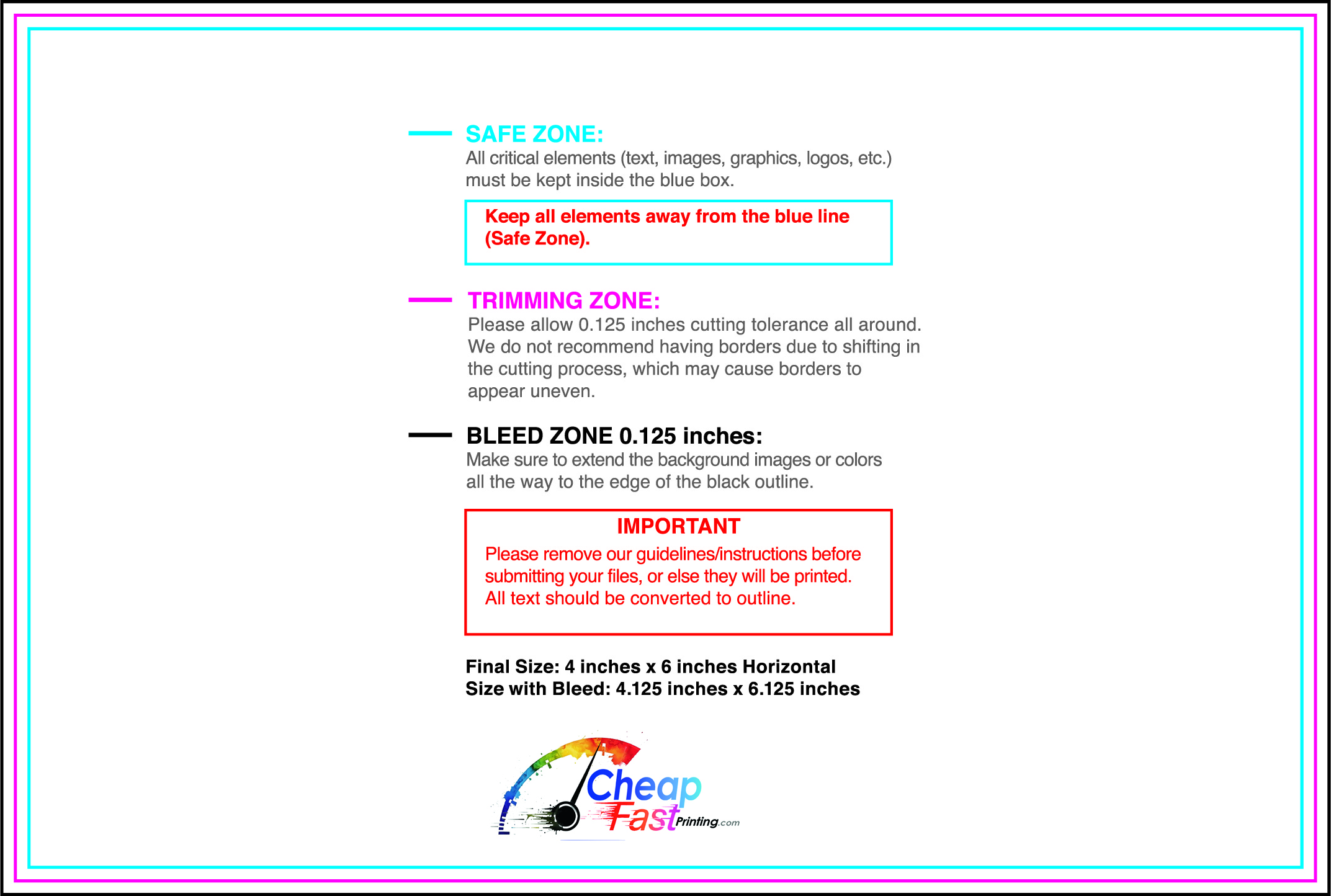
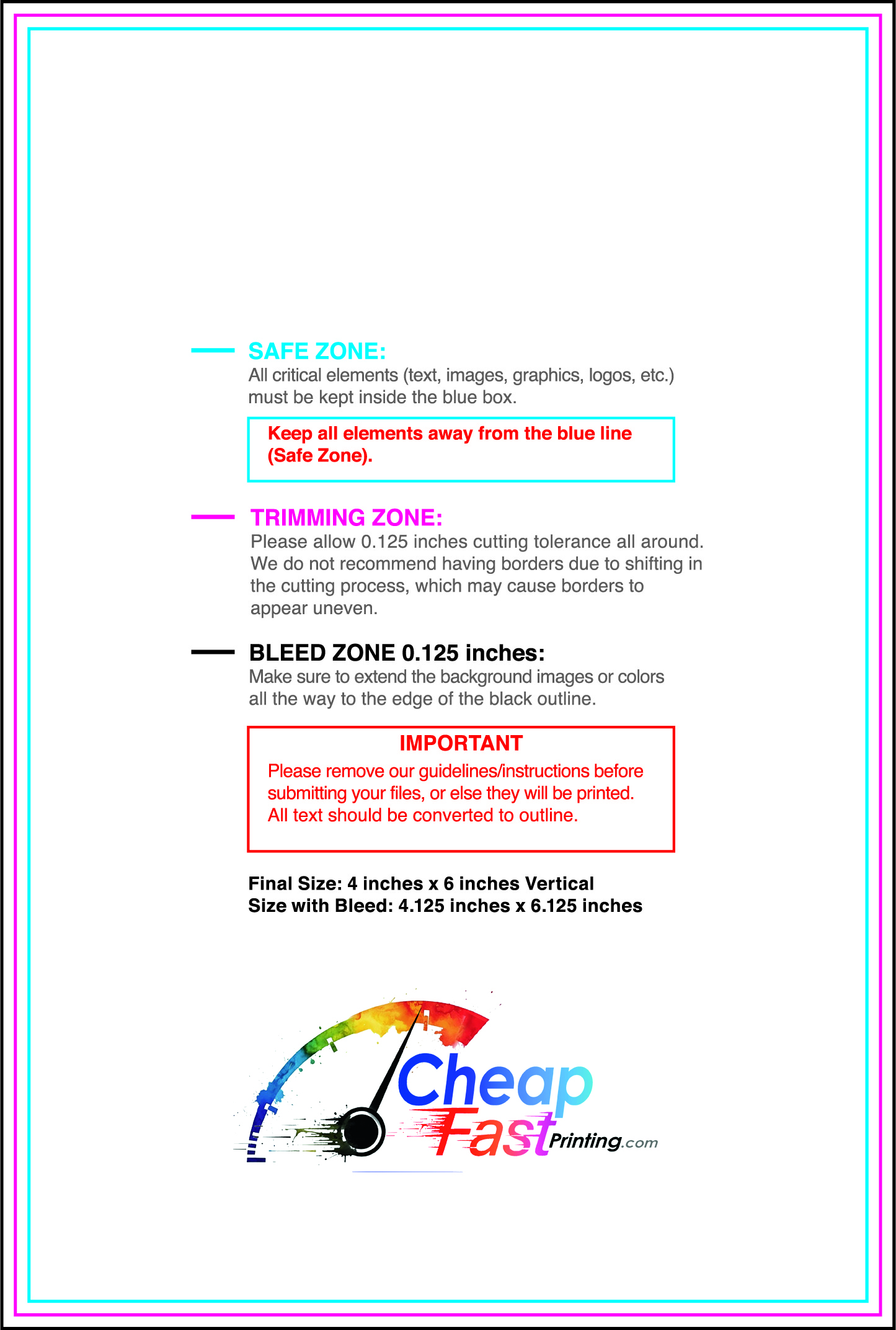
Submit a print-ready PDF (CMYK) at 300 DPI with 0.125" bleed and safe margins around important text. Keep thin lines above 0.5 pt and make QR codes at least ~0.8" square for reliable scanning.
Use vector logos when possible and limit your fonts to maintain a clean, professional look.
Request a proof so you can confirm spelling, margins, and QR/URL accuracy before production. Proofing is the easiest way to prevent expensive reprints.
Double-check phone numbers and offer terms first—those are the most common issues.
Match your flyer headline and offer to the landing page headline so visitors feel they’re in the right place. Keep the CTA consistent and make the page fast to load and easy to complete on mobile.
If you run ads, retarget QR visitors with the same offer to improve conversions.
Plan print runs around your occupancy goals and seasonality. Short runs work well when you need to refresh offers or change availability quickly.
Track which placements generate reservations and restock only the winners. A smaller, smarter run beats a large, unfocused run.
When a campaign wins, scale with consistent placement and repeated exposure so recognition builds in your highest-intent areas.

