Real estate is a trust business. Prospects do not only evaluate the property; they evaluate the agent who is showing up with the details. A well-printed flyer signals professionalism long before a call ever happens. It also creates something digital cannot: a physical reminder that sits on a refrigerator, a desk, or a kitchen counter after the person has already toured a listing page online.
This guide focuses on three real estate flyer jobs: (1) open house handouts that push attendance, (2) “just listed” and “just sold” pieces that build neighborhood momentum, and (3) longer-term farming campaigns that establish name recognition. We will also cover how to use QR codes responsibly (and effectively), how to choose paper and size so your photos look like photos, and how to avoid the most expensive flyer mistakes: wrong bleed, unreadable hierarchy, and distribution that misses the actual buyer window.
In many neighborhoods, the buyer journey is not linear. People search online, then forget details, then revisit later. A properly designed flyer becomes a “memory anchor.” The address, date/time, and QR link give them a fast way to return to the listing without re-searching from scratch.
- The 3 Real Flyer Goals (Open House, Listing, Farming)
- Design Rule #1: Let the Photography Lead
- What to Include: The Real Estate Information Stack
- Size and Stock Guide for Each Campaign Type
- Interactive: QR Scan to Lead Funnel Calculator
- Interactive: Campaign Layout Builder
- Distribution Strategy: Where Agents Actually Win
- Browse 6 Real Estate-Ready Flyer Formats
- Top 10 Real Estate Flyer Printing FAQs
The 3 Real Flyer Goals (Open House, Listing, Farming)
A single flyer template will not perform equally for every purpose. For real estate, think in campaign shapes.
1) Open house: attendance and showing intent
Open house flyers are urgent. The person has limited time to decide. Your flyer must communicate the basics instantly: date/day, time window, full address, and a QR code that leads to directions and full listing details. You can add beds/baths and 3-5 feature bullets, but keep it readable.
2) Just listed / just sold: credibility and momentum
These pieces are designed for neighborhood attention and reputation. They work best when they carry proof signals: the listing price, a clear photo selection, and a fast way to see the full story online. The goal is not immediate action. The goal is that when someone is ready later, they remember you had the relevant listing first.
3) Farming: consistency over time
Farming is long-horizon. If you only print flyers once, the neighborhood will never develop recognition. Instead, design for repeatability: keep brand voice consistent, vary property details when needed, and send on a recurring cadence. Your QR setup can be the same for the season with updated landing pages, so you can keep track without constantly re-building creatives.

Design Rule #1: Let the Photography Lead
Every other design element is secondary. Photography is the product. If your flyer feels “busy,” it is usually because photos are competing with too much text. The strongest real estate flyers compress copy and expand the image experience.
Practical layout patterns that repeatedly perform:
- Exterior first: the first image should establish the home immediately.
- Bold price block: show the listing price in a contrasting panel.
- Feature bullets: 3-5 bullets with short phrases, not long paragraphs.
- Agent contact at the end: name, phone, email, and website should be easy to find, not visually dominant.
What to Include: The Real Estate Information Stack
Use an “information stack” mindset: put the most decision-making facts at the top and keep everything else as supporting detail.
Core facts (non-negotiable)
- Property address
- Listing price (or offer range if that is your broker’s style)
- Event date/day and time window (for open house pieces)
- Bed/bath count and a short features list
- QR code and CTA text next to it
Optional but powerful
- Neighborhood context: 1 sentence describing why the area matters
- Map prompt: “Scan for directions” plus a “near X landmark” hint
- Schedule framing: “Open house both Saturday and Sunday” or “Appointment only”
- Social proof: awards, years of experience, or “top agent in area” if permitted
QR code placement checklist
QR codes need contrast and spacing. Keep them away from the edges, away from heavy shadows, and away from tiny background patterns. If your QR is scanning poorly in the real world, the fix is often design spacing and contrast—not the QR itself.
Use full bleed artwork and protect critical content with a safe zone. A standard production rule is 0.125 inch bleed on all sides and at least 0.125 inch of inner safe space for logos, phone numbers, and QR codes. This prevents the flyer from losing edges during finishing.

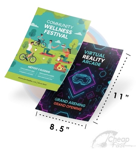
Size and Stock Guide for Each Campaign Type
Choosing the right size for the right stage avoids waste. A luxury listing should not look like an economy handbill, and an open house reminder must remain readable at a glance.
| Campaign Type | Recommended Size | Best Paper/Finish Approach |
|---|---|---|
| Open house door-drop | 5.5×8.5 (half sheet) | 100lb UV gloss for photo pop; ensure date/time block is high-contrast. |
| Open house brochure | 8.5×11 (full sheet) | Gloss or premium matte for “desk-ready” readability and multiple photo panels. |
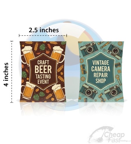
| Neighborhood “just listed” | 4×6 (pocket-friendly) | Postcard-style clarity; keep copy short and push QR to the full listing. |
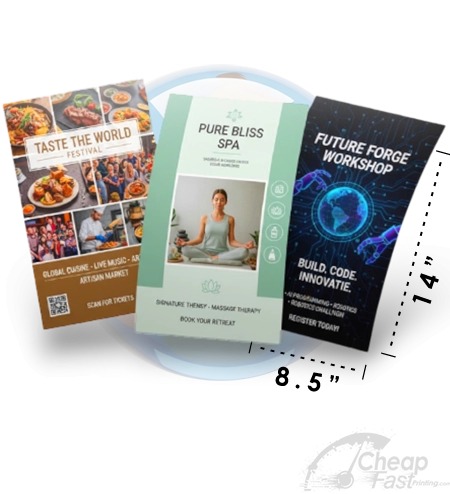
| Farming inserts / recurring drops | 4.25×5.5 or 5.5×8.5 | Economy-friendly but still premium enough to be kept. Consistency wins here. |
| Luxury property sheet | 8.5×11 on heavier stock | Premium cardstock or thick paper so the flyer feels aligned with the listing value. |
Interactive: QR Scan to Lead Funnel Calculator
Real estate flyers are easy to distribute and hard to measure unless you bridge the physical-to-digital path. This calculator models expected scans and leads from QR codes.
Interactive: Campaign Layout Builder
This widget outputs a recommended “section order” for common real estate campaign types. The idea is to keep your design consistent with real attention behavior: photos first, decision facts next, and contact/CTA last.
Distribution Strategy: Where Agents Actually Win
The flyer’s design matters, but real estate flyer performance is strongly tied to distribution timing and local placement. A “perfect flyer” placed in the wrong pocket of the neighborhood becomes invisible.
Placement winners
- Within the immediate farm radius: door drops 3-5 blocks around the open house and repeat drops for farming campaigns.
- Partner locations: local coffee shops, gyms, community boards, and complementary businesses where people wait and read.
- Office and service counters: tutoring centers, repair shops, and salons that have regular client traffic.
- Rack visibility: 4×9 rack cards and countertop placements for “next visit” reminders.
Retail chains and “print fast” behavior
In urgent situations, you may search how to print at big-box locations. It is common to consider print flyers at staples, print flyers at office depot, print flyers at walmart, and print flyers at walgreens. If you go this route, ask about thickness and finish options, and confirm they can handle full bleed properly.
For consistent quality at scale, many agents prefer online printing because it supports true full bleed, CMYK-ready file prep, and bulk runs without aggressive design fees. This is especially relevant when you plan flyers print bulk batches for neighborhood farming and recurring promotion.
Browse 6 Real Estate-Ready Flyer Formats
These are 6 format examples mapped to this post. Use the physical feel of each format to match your campaign stage: pocket reminders, door drop handbills, premium property sheets, and display-ready styles.