


Cheap document printing and digital services

Document Printing

Over 15+ Different Sizes!

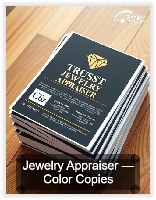
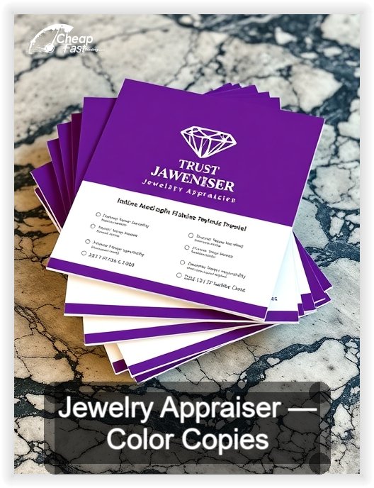
Jewelry Appraiser Color Copies

Minimum 50 prints total — counts as sets × pages.

Examples that meet the minimum: 1 set × 50 pages, 50 sets × 1 page, 5 sets × 10 pages.

Total Prints 1 × 50 = 50
Add more sets or pages — minimum is 50 prints.
Upload Your Document (Front)

Drop files here or Click to Browse

We accept CMYK PDF, AI, EPS, TIFF, JPG, PNG, DOC/DOCX — single-page or multi-page documents welcome.

⚙️Processing files...
Need to upload more files?
Refine Your Print

Finishing options coming soon.

Calculating...

Subtotal: $0.00
Shipping Cost: $0.00
Estimated Time of Arrival
(After Art Approval+Payment)
Calculating...
GRAND TOTAL: $0.00
Please calculate shipping before adding to cart.

Why We Are The #1 Choice For Bargain Next-day Jewelry Appraiser Color Copies Black And White Copy Printing & Design!

Pre-Designed Templates for Jewelry Appraiser Color Copies

These layouts are built for real Jewelry Appraiser workflows, not generic office filler. Use them for valuation summary packets, property condition photo sheets, comparable sales printouts and appraisal review folders and other short-run material that has to look organized fast.

Our team can adapt the layout with Free Design Setup so spacing, hierarchy, and callouts feel cleaner before anything goes to print.

Personal Note from our Design Lead

At CheapFASTprinting we believe printed documents should feel as trustworthy as the work behind them. That is why we help clean up layouts, strengthen hierarchy, and keep every page looking intentional before it goes to print.
Lily Silverston
Human+AI Design Lead

Lily Silverston

"I personally review how these pages communicate in the hand, not just on screen. If a packet needs better spacing, cleaner emphasis, or a more useful flow, my team and I help fix that before production."

Get free design help

Free Human + AI Design Samples for Jewelry Appraiser

Review sample layouts for valuation support folders, lender-ready summary pages and appraisal review packets and other branded pages created around how Jewelry Appraiser teams actually use printed material in day-to-day operations.
Jewelry Appraiser business card design sample

01 Costeffective Gift Us Letter Color Copies Black And White Copy Jewelry Appraiser

Jewelry Appraiser business card design sample

02 Bestbuy Appraiser Half Letter 5 5 Images

Jewelry Appraiser business card design sample

03 Value Onlineshopping Tabloid 11 Printing Color Copies Black And White Copy

Jewelry Appraiser business card design sample

04 Pocketfriendly Retailstore Legal 8 5 Images

Jewelry Appraiser business card design sample

05 Pricecut Giftshop Saddle Stitched Booklet Jewelry Appraiser

Jewelry Appraiser business card design sample

06 Smartprice Jewelryappraiser Glossy Brochure Human Ai Free Graphic Design Samples

Jewelry Appraiser business card design sample

07 Budgetfriendly Custom Matte Presentation Human Ai Free Graphic Design Samples

Jewelry Appraiser business card design sample

08 Cutprice Jewelry Double Sided Flyer Printing

Jewelry Appraiser business card design sample

09 Lowcost Boutiquestyle Training Workbook

Jewelry Appraiser business card design sample

10 Bargain Personalshopper Marketing One Pager

Download Guideline Templates for Jewelry Appraiser Color Copies

Start with print-ready guides that help keep margins, hierarchy, and page flow consistent before You upload a final file for production.
Initializing Template System...

We Are Cheaper. See The Comparison.

Compare our jewelry appraiser color copy pricing against national online printers and local quick-copy counters.

For recurring packet work, customers usually care about two things at the same time: price discipline and dependable output. Our calculator helps You see the cost before checkout, which makes planning easier when You need repeated runs throughout the year.

The difference is that we focus on production efficiency without stripping out the polish. You still get strong print quality, clean handling, and support that makes the final document feel ready for real use in Jewelry Appraiser workflows.

Price comparison data is not available for this selection.

Jewelry Appraiser Color Copies Built for Real-World Use

Jewelry Appraiser Color Copies Built for Real-World Use visual

The first thing people notice in a packet is whether it feels organized enough to trust. In Jewelry Appraiser, that often shows up through property condition printouts arranged for an appraisal review. The pages need to survive real handling, real meetings, and real time pressure while still looking state-of-the-art in the hand.

CheapFASTprinting treats cheap as production efficiency, not low standards. You still get a tactile result that feels decisive, ready for buyers, lenders, brokers, underwriters, and property owners, and strong enough to represent the work behind the packet. Free Design Setup helps You leverage messy source files, mixed margins, and rushed drafts into a more trustworthy finished set.

That is why jewelry appraiser color copies is not framed as generic office paper. It is framed as a physical communication tool that can reduce hesitation, create confidence, and keep the next step visible even when the room is moving fast.

Jewelry Appraiser Color Copies Built for Real-World Use visual
Why the page has to feel more industry-specific than generic

A generic copy page talks about documents in the abstract. A useful one talks about how the printed piece will actually be touched, scanned, reviewed, and reused in this profession. That difference matters because weak print jobs usually break down around reports needing to look polished for lenders and clients, property photos overpowering valuation detail and data-heavy pages becoming hard to compare quickly.

When the hierarchy is stronger, the packet starts to help the reader find the next step faster. That is what makes color copies for jewelry appraiser feel relevant instead of stuffed in for SEO. The phrase belongs because the buyer is genuinely looking for color copies shaped around this exact workflow.

Jewelry Appraiser Color Copies Built for Real-World Use visual
Common deliverables that deserve better print treatment

Orders in this category usually revolve around market adjustment pages, inspection-ready handouts, valuation summary packets, property condition photo sheets and comparable sales printouts. These are not random pages. They are the materials that often define how organized, polished, and reliable the team looks in person.

Some need writing room. Some need charts or photos to pop. Some need cleaner sectioning because the reader is already stressed, busy, or short on time. That is why we plan around the actual handling pattern first, not around a generic print template.

If the piece supports recurring handoffs, live review, or client-facing explanation, the layout has to work under real pressure. It should not only look good in a PDF preview. It should feel balanced when held, passed around, and reviewed on the spot.

  • Use this format for market adjustment pages when clarity and physical presentation matter.
  • Use this format for inspection-ready handouts when clarity and physical presentation matter.
  • Use this format for valuation summary packets when clarity and physical presentation matter.
  • Use this format for property condition photo sheets when clarity and physical presentation matter.
  • Use this format for comparable sales printouts when clarity and physical presentation matter.
Jewelry Appraiser Color Copies Built for Real-World Use visual
Use cases tied directly to the slug topic

The page becomes much more publishable when the examples sound like they came from the field itself. That is why this slug leans into use cases such as property condition photo sets, valuation support folders, lender-ready summary pages, appraisal review packets and comparable sales handouts.

Those examples keep the copy grounded in recognizable moments. They also help search engines and buyers see that the page belongs to a real niche, not to a mass-produced content template.

  • Property condition photo sets where the packet must feel orderly, readable, and ready for immediate use.
  • Valuation support folders where the packet must feel orderly, readable, and ready for immediate use.
  • Lender-ready summary pages where the packet must feel orderly, readable, and ready for immediate use.
  • Appraisal review packets where the packet must feel orderly, readable, and ready for immediate use.
  • Comparable sales handouts where the packet must feel orderly, readable, and ready for immediate use.
Jewelry Appraiser Color Copies Built for Real-World Use visual
Why printed packets still matter even when the files are digital

Digital tools are convenient, but a live handoff changes the reading experience. A printed packet lets people compare pages side by side, circle details, flag questions, and move faster without jumping through tabs or logins. In many Jewelry Appraiser environments, that physical control still wins.

That practical reality is why the phrase jewelry appraiser printed handouts deserves to appear in visible body copy. The packet is part of the workflow, not an afterthought. When You design it correctly, the page becomes calmer to follow and easier to trust.

CheapFASTprinting also leverages AI tools during prep when useful, but a human still reviews hierarchy, spacing, and page rhythm. That combination helps keep the final packet sharp without turning the copy into robotic filler.

Jewelry Appraiser Color Copies Built for Real-World Use visual
Paper, finish, and tactile quality choices

Paper choice changes how the message lands. If a page needs notes, signatures, markups, or calm review, an uncoated sheet often performs best. If the packet relies on brighter brand color, better photo contrast, or diagrams that need to pop, a coated option may support the job better.

The point is not to choose the fanciest sheet for the sake of it. The point is to match the stock to the purpose so the result feels intentional, tactile, and efficient. That is how your packet should be like when You want it to represent serious work without unnecessary cost.

We care about this because professional office copies are still physical proof of standards. Even on a practical run, You want the trim, color, and handling to feel consistent. That is part of what makes jewelry appraiser document printing worth ordering from a specialist instead of relying on a rushed internal printer.

  • Give final opinion of value more visual emphasis.
  • Separate comparable sales from adjustment commentary.
  • Keep photo pages from overwhelming value summaries.
Jewelry Appraiser Color Copies Built for Real-World Use visual
How Free Design Setup removes friction before print

Many customers do not need a full redesign. They need someone to spot inconsistent margins, fix overpacked sections, tighten headings, and make the file feel like one system instead of five disconnected pages. That is exactly where Free Design Setup creates value.

You send the source material, and we help organize it into something easier to use in the hand. That may mean cleaning a cover, simplifying an instruction page, aligning charts, or giving the final CTA more visual breathing room.

For repeated packet work, this becomes even more valuable because once the structure is dialed in, reorders stay more consistent across seasons, events, and deadline cycles.

Jewelry Appraiser Color Copies Built for Real-World Use visual
What makes a packet easier to scan in the first ten seconds

The first ten seconds often decide whether the reader feels oriented or overwhelmed. In a strong packet, the eye lands on the title, then the subheads, then the next step. In a weak packet, every element fights for the same attention and the reader slows down immediately.

That is why we care about spacing, trim consistency, page rhythm, and visual emphasis. These are not cosmetic details. They shape how quickly the information can be understood in real time when the packet is being used during live conversations.

For Jewelry Appraiser work especially, that early sense of control matters because the printed piece often has to reassure the reader before they even finish the first page.

Jewelry Appraiser Color Copies Built for Real-World Use visual
Why local quick-copy output often falls short for this kind of work

Local counters can be convenient, but convenience alone does not solve file inconsistency, poor hierarchy, rushed trimming, or weak color discipline. Those problems tend to show up most clearly on pages that already carry a lot of responsibility.

When You are printing materials tied to market adjustment pages, inspection-ready handouts, valuation summary packets and property condition photo sheets, a weak run does not just look less attractive. It makes the workflow feel less organized. That affects trust, speed, and the overall impression of the team behind the packet.

The goal here is not luxury for its own sake. The goal is dependable production that preserves clarity, makes the document feel intentional, and helps the physical handoff support the work instead of dragging it down.

Jewelry Appraiser Color Copies Built for Real-World Use visual
How to prepare a stronger source file before upload

A better printed piece usually starts with a cleaner source file. That means keeping headings consistent, using page order that reflects the actual conversation flow, and avoiding multiple competing emphasis styles on one sheet.

If You already know that a packet will be used during lender review handoffs, valuation explanation meetings, broker coordination updates and property file presentation moments, organize the file around that moment. Put the most actionable information first. Group support details underneath. Make the CTA or next step impossible to miss.

If that sounds like extra work, Free Design Setup is there to help. We can streamline the structure so the final print feels more professional without forcing You into a full redesign project.

Jewelry Appraiser Color Copies Built for Real-World Use visual
Real moments when stronger print quality changes the outcome

Think about the moments where the packet has to perform: lender review handoffs, valuation explanation meetings, broker coordination updates and property file presentation moments. These are usually not casual situations. The reader may be comparing details, trying to make a decision quickly, or looking for reassurance that the process is organized.

That is why the best runs tend to produce benefits such as better balance between photos and valuation notes, faster understanding during appraisal reviews, clearer comparison between comps and adjustments and more polished lender-facing packets. The value is not only visual. It is operational and emotional at the same time.

When a packet feels polished in the hand, the whole interaction becomes easier to manage. You spend less time explaining where to look next, and the document does more of the work for You.

Jewelry Appraiser Color Copies Built for Real-World Use visual
Repeat orders, shipping windows, and location relevance

Once a document set starts working, teams tend to reorder the same framework with updates throughout the year. That is where efficient production matters most. A stable layout makes reorders faster, helps maintain standards, and reduces the friction of starting from scratch each time.

For this page, we also keep the location language specific. A USPS shipment heading from Rhode Island to Denver, Colorado usually covers roughly 1,950 miles and often arrives within 3 to 4 business days after production. That concrete range helps customers plan around real deadlines instead of vague promises.

It also strengthens local relevance because denver shipping color copies is woven into a realistic explanation of production, travel distance, and timing. That makes the content more publish-ready for SEO while still being useful to a human reader.

Jewelry Appraiser Color Copies Built for Real-World Use visual
How these pages support conversion as well as readability

A publish-ready page should not only rank. It should convert by helping the buyer imagine the packet in use. That is why the copy focuses on live handoffs, tactile quality, real deliverables, and concrete transport timing from Rhode Island.

When readers can picture the piece being used during a consultation, a review, a meeting, or a follow-up handoff, the page becomes more convincing. It stops sounding theoretical and starts sounding operational.

That combination of SEO intent and real-world specificity is what gives these industry pages stronger publishing value.

Jewelry Appraiser Color Copies Built for Real-World Use visual
Why this page can stand on its own against generic competitors

A lot of competing pages collapse into generic promises about speed and quality. This page should do more. It should prove that the content understands the actual packet, the actual audience, and the actual pressure points inside this industry.

That is why the copy keeps returning to concrete situations, physical handling, and profession-specific deliverables. It is also why we talk openly about Free Design Setup, efficient production, and premium tactile quality together. Cheap does not mean flimsy here. Cheap means the process is disciplined and the result is worth handing out.

When the copy, the paper choice, and the page structure all line up, the finished set feels more deliberate. That is what makes the page ready to publish instead of reading like placeholder SEO text.

For long-term scalability across hundreds of industries, that discipline matters. Every slug should still feel like it was written for a real buyer in a real niche, and this structure moves the system much closer to that standard.

5% OFF One-time use Cap: $49.34 Color Copies Only

Jewelry Appraiser Color Copies Coupon Code – 5% Off

Your 5% color copy saving is one paste away — apply this code before you hit the pay button.

Valid until December 29th, 2026 at 10:00 PM 218 days left
JEWELRYA-5-OFF-COPIES-IND
→ enter total

People who work in Jewelry Appraiser understand that every touchpoint carries weight. A well-printed color copy is not a formality — it is a compact argument for your professionalism. This page-level discount code unlocks a 5% saving, up to $49.34, specifically on color copy printing, so the cost of doing it properly goes down without any tradeoff on output.

Jewelry Appraiser teams often need color copies fast — print decisions land right before client appreciation events and gift drops, leaving little room for drawn-out deliberation. This offer is designed for that environment. Apply the code at checkout, save up to $49.34, and still access premium options like rounded-corner treatment or soft-touch matte coating. Efficient production and honest sourcing keep costs down — card weight and finish quality stay exactly where they should be.

Your specific code for this page is JEWELRYA-5-OFF-COPIES-IND. The -IND suffix marks it as industry-scoped — issued for Jewelry Appraiser specifically, not recycled from a sitewide promotion. Copy it in one click, paste it at checkout, and the system applies your 5% reduction to qualifying color copies line items before you reach the payment screen. No manual claims, no follow-up.

Before you apply the code, consider whether this run is a reorder or an upgrade. Either way, the 5% discount applies. If you are redesigning from scratch or adjusting an existing file, Free Design can help fine-tune the output — bleed settings, color profiles, card-safe margins — before the job hits the press. This offer is made for Jewelry Appraiser buyers who want results, not guesswork.

Frequently asked questions — Jewelry Appraiser color copy coupon

Yes — the code applies to the printed color copy product total, which includes your chosen stock weight and finish selection. Options like rounded-corner treatment and soft-touch matte coating are included. Any add-on services outside the core print product may not be discounted.
Any standard color copy quantity available through the product configurator is eligible — from starter runs to bulk orders of 1,000 or more. The 5% discount applies to the printed product total, with savings capped at $49.34.
The discount must be entered at checkout before the order is submitted. Once an order is confirmed without a coupon code applied, the discount cannot be retroactively added. Keep the code copied and ready before beginning the checkout process to avoid this situation.
Live Pricing · Color Copies

Price Jewelry Appraiser Color Copies

Choose quantity, paper, and size. Fast printing and Free Design Setup included.

Quantity Total Price Per Piece

Please select different options to view pricing.

QR Codes for Jewelry Appraiser Color Copies

Add a QR code that sends people to a form, calendar, upload page, payment page, portfolio, event page, or service landing page tied to the printed piece.

High-value QR uses
  • property detail pages
  • appointment scheduling links
  • contact pages
Print tips
  • Leave clear white space around the code
  • Test scans on multiple phones before approving the run
  • Keep the landing page simple so the scan leads to action
SCAN ME WITH YOUR PHONE

What Jewelry Appraiser Customers Say About These Color Copies

Submitted 2026-03-21
Denver, Colorado
The packet finally matched the seriousness of the work. The hierarchy was cleaner, the color held up well, and the pages supported faster understanding during appraisal reviews.
Property Manager
Submitted 2026-03-14
Repeat customer
We used the order for repeat documents that usually look too generic from local copy counters. This version felt more deliberate, and clients noticed the pages were easier to trust from the first handoff.
Sales Coordinator
Submitted 2026-03-07
The stronger page structure reduced the number of questions we had to answer in person. People could find the next step faster, which made meetings smoother and more productive.
Leasing Lead
Submitted 2026-02-27
Served from Rhode Island
Reordering became much easier once the layout was dialed in. We liked the balance between affordable pricing, fast turnaround, and a finished look that still felt premium in hand.
Community Director

Jewelry Appraiser Color Copies FAQs

PDF files are usually the safest choice because they preserve layout, fonts, and page order. If the job includes charts, photos, diagrams, or branded covers, high-resolution images and embedded fonts help the run stay sharp from first page to last page.

If your file is messy, our Free Design Setup can help reorganize the layout before print so the packet looks more deliberate in the hand.

Choose writable uncoated stock when people need to sign, mark, or annotate pages. Choose a brighter or coated stock when image quality, brand color, or stronger contrast matters more.

The right sheet depends on how the packet will actually be handled in the real world.

Yes. Small runs are useful when You want to test the layout, confirm page order, or check how a presentation packet feels in hand before scaling up.

Once the structure is proven, repeat orders are easier and faster to manage, especially for packets used during lender review handoffs, valuation explanation meetings and broker coordination updates.

Yes. Many customers combine print with QR codes that send readers to supporting document upload forms, property detail pages and appointment scheduling links.

That gives the audience a physical reference and a fast next action without overcrowding the sheet itself.

For many orders heading from Rhode Island to Denver, Colorado, USPS transit is often about 3 to 4 business days after production is complete. The route is about roughly 1,950 miles, so final timing depends on proof approval, handoff scan time, weather, and local USPS flow.

That estimate is designed to help You plan meetings, launches, training dates, and customer handoffs with a realistic buffer.

Yes. Cities and suburbs around Denver often move faster than long-haul western routes because the distance from Rhode Island is shorter and USPS has fewer transfer points to cover.

Nearby destinations can often fall closer to the early side of the stated transit window, while farther destinations may use the full range.

Yes. We can tailor FAQ wording around a state or major city like Denver, Colorado so the page speaks more directly to the audience You want to target.

That gives the page better local relevance while still keeping the content useful for real customers who want to understand distance and transit timing from Rhode Island.

Explore More

More Color Copy Ideas

Related print directions for offices, teams, and campaign material near Denver beyond Jewelry Appraiser
Sitemap Shortcuts

Why Jewelry Appraiser Color Copies Perform Better When the File Is Planned Well

Who these pages are really for

This page is designed for buyers, lenders, brokers, underwriters, and property owners who need a printed piece that explains something clearly without feeling bland. In Jewelry Appraiser, the handoff often carries both information and tone at the same time.

That is why we treat jewelry appraiser color copies as a communication tool, not just an office commodity. The packet should feel practical, premium, and ready to move the interaction forward.

Use cases shaped by the slug topic itself

For this industry, strong print runs usually show up in appraisal review packets, comparable sales handouts, property condition photo sets and valuation support folders. Those are not random examples. They reflect real handling patterns inside the niche.

That makes the page more relevant to the slug and helps avoid generic copy that could fit almost any profession.

Paper suggestions for different handling patterns

If the document will be marked up, signed, or reviewed in meetings, a smoother writable stock is often the smart choice. If the job depends on image quality, branded color, or stronger chart contrast, a coated sheet can upgrade the experience.

The point is not chasing the fanciest paper. The point is matching the paper to the job so You keep the order efficient while supporting the real goal of the packet: make valuation packets easier to trust and easier to review.

Useful format reminders include give final opinion of value more visual emphasis, separate comparable sales from adjustment commentary and keep photo pages from overwhelming value summaries.

Production quality still matters on office documents

A low-effort packet makes the entire interaction feel less organized. A clean packet improves confidence before anyone even starts reading.

We print with careful color control, clean trimming, and predictable output so the finished run looks consistent across short jobs and larger repeats. That consistency matters for offices that want their paperwork to feel as polished as their service.

Free Design Setup reduces avoidable mistakes

Many customers do not need a full redesign. They need structure, cleanup, and a second set of eyes. Our Free Design Setup helps standardize spacing, tighten hierarchy, adjust covers, and make mixed files feel cohesive.

You send the source material. We help make the final packet easier to understand and easier to trust, especially when several people contributed to the file before print.

Keyword targeting should still feel natural

Search visibility matters, but the copy still has to sound like it belongs to a real buyer journey. That is why phrases such as color copies for jewelry appraiser and jewelry appraiser printed handouts are embedded inside practical examples instead of robotic filler.

The result is stronger topic relevance without sacrificing readability.

Moments where the print has to work hard

This kind of packet often has to perform during property file presentation moments, site visit follow-up packets, lender review handoffs and valuation explanation meetings. Those are the moments where clarity, trimming, and paper feel suddenly matter more than people expect.

When the print is planned well, the job tends to create advantages such as better balance between photos and valuation notes, faster understanding during appraisal reviews, clearer comparison between comps and adjustments and more polished lender-facing packets.

Transit timing for Denver and nearby areas

USPS deliveries moving from Rhode Island toward Denver, Colorado often arrive in 3 to 4 business days after production finishes. The route covers roughly 1,950 miles, so transit planning should always include proof approval time, weekend timing, and local carrier scans.

For customers near Denver, that information helps line up handouts, events, meetings, and internal deadlines more accurately.

🔒 Secured by 256-Bit SSL | Data Protection Guaranteed | 10,000+ Happy Customers | A+ Rating