


★
★
★
★
★
Submitted 2026-01-22
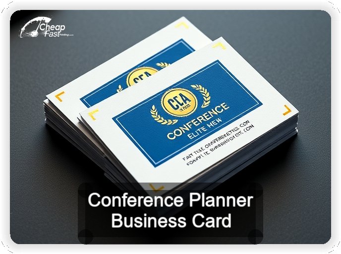
Used these for a 6,000 attendee healthcare summit. The half-circle shape stood out and the Trifecta Red core looked premium. Free design caught a spacing issue before print, and the cards survived four days of pockets an…
Alicia R.