


★
★
★
★
★
Submitted 2026-02-01
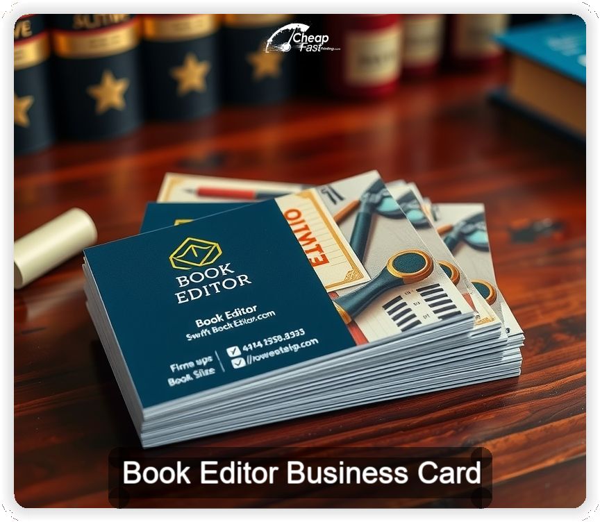
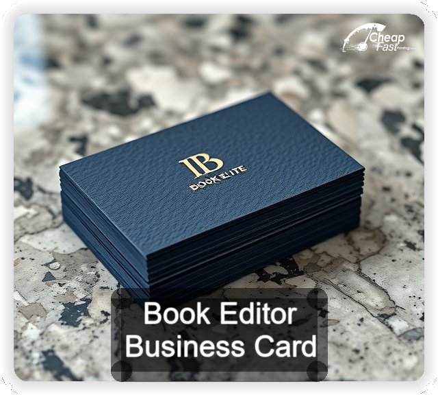
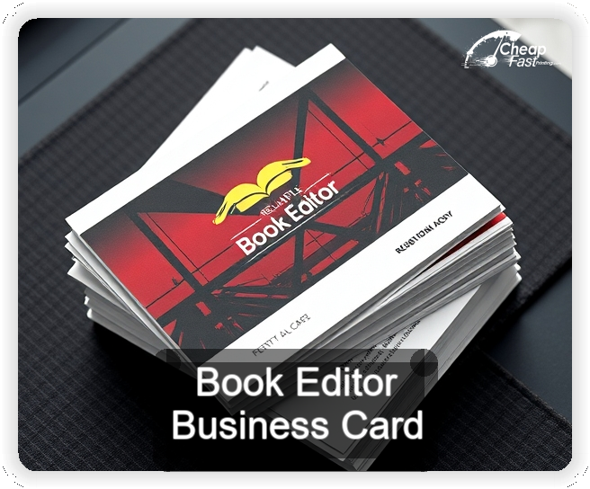
The arc stands out just enough on crowded tables. Gloss keeps small type sharp and the QR routes authors straight to my booking page.
Rene P., Freelance Editor