


★
★
★
★
★
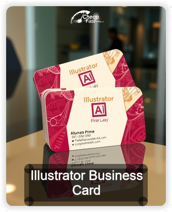
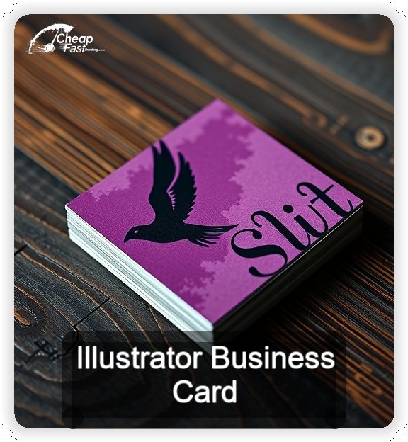
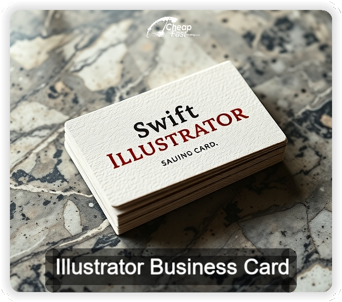
Submitted 2026-02-05
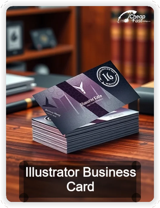
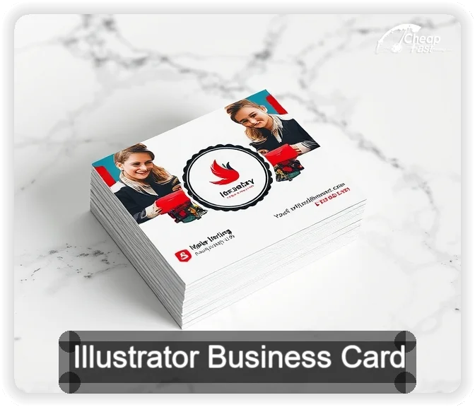
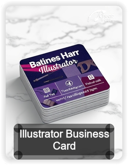
The kraft texture suits my linework, and the circle reads intentional. QR scans fast even in booth lighting. Reorders matched perfectly.
Rae M., Illustrator