Elevator Mechanic 4" x 4" Postcards printed on premium cardstock

4" x 4" Postcards

Modern square format perfect for Instagram-style prints and creative designs.

Elevator Mechanic Bulk Postcards

Calculating...

Front

Front Design | Click to Browse

⚙️Processing files...
Refine Your Postcards
Subtotal: $0.00
Shipping Cost: $0.00
Estimated Time of Arrival
(After Art Approval+Payment)
Calculating...
GRAND TOTAL: $0.00
Please calculate shipping before adding to cart.

Why Elevator Mechanic Teams Choose CheapFASTprinting for Bulk Postcards

Design Directions for Elevator Mechanic Postcards

The strongest Elevator Mechanic postcard designs usually lean on a short value-first headline, clean whitespace around the CTA, and easy redemption flow. The front should win attention quickly, and the back should translate that attention into a simple next step. Avoid decorative choices that interrupt the offer or make the piece look like a template reused without context.

As the layout evolves, keep a stable grid and repeatable hierarchy so future versions can refresh the story without breaking the mechanics that already work.

Personal Note from our Design Lead

At CheapFASTprinting, we believe every card should look professional. That is why I offer my personal guarantee on all design services. If you are not happy with your initial options, we will keep working until you love it.
Lily Silverston
Human+AI Design Lead

Lily Silverston

"Our workflow treats Elevator Mechanic bulk postcards as a niche-specific production system. The writing stays close to the topic, and the layout guidance stays practical enough to reuse on future drops."

Use Free Design Setup for your next postcard run

Elevator Mechanic postcard sample ideas

Use the sample gallery as a pattern library. The most useful examples show how to balance a niche-specific message with one easy response path. For this topic, pay special attention to how each sample handles easy contact paths, clear service promises, and trust-building contact details without crowding the design.

Pre-designed Elevator Mechanic postcard templates

Templates are most valuable when they act like infrastructure. Lock in a grid, CTA zone, and proof structure that fit Elevator Mechanic, then rotate imagery, timing, and offers as needed. That keeps the page topic aligned while making reorders faster.

Templates will load when this section comes into view.

This keeps the rest of the page responsive while the pre-designed gallery hydrates in the background.

Planning Elevator Mechanic mailers by volume

See how quantity and production choices can affect the economics of a repeatable postcard program.

The most useful pricing comparison is the one tied to response, not just volume. For Elevator Mechanic, postcard economics get clearer when you compare quantity tiers against the campaigns they support, such as launch announcements, new inventory mailers, and service reminders.

Use this module to judge when a stronger stock, faster turnaround, or repeatable template is worth the extra cost because it improves the chance of a real response.

Price comparison data is not available for this selection.

Elevator Mechanic Postcard Guide

Elevator Mechanic Postcard Guide visual

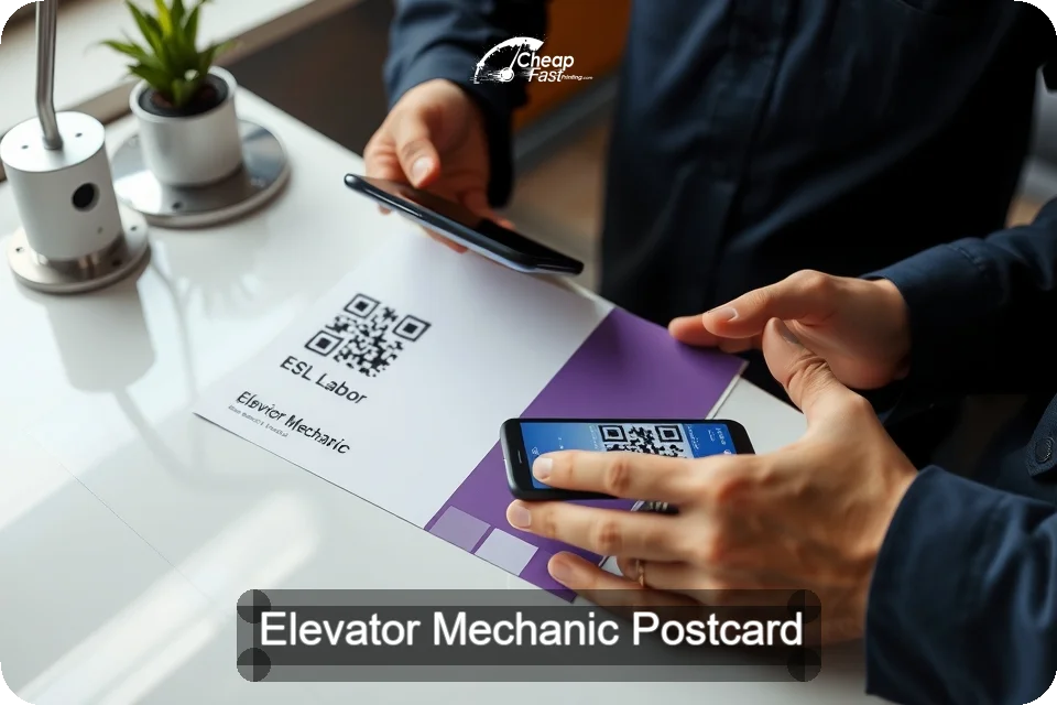
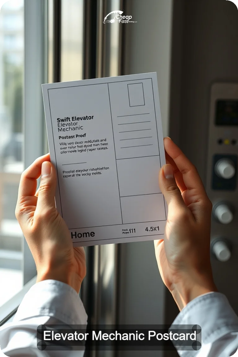
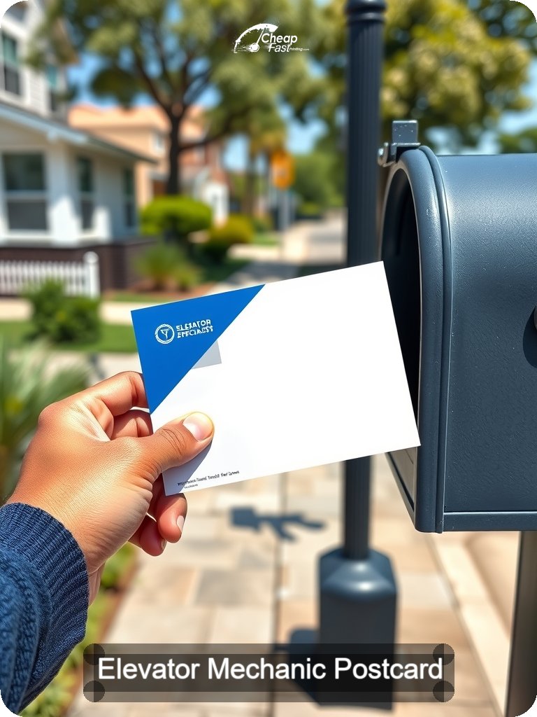
Postcards perform best when they support real business moments, not filler copy. In Elevator Mechanic, the strongest runs are usually tied to launch announcements, new inventory mailers, and service reminders. That gives the card a purpose the reader can feel immediately, and it gives the team ordering print a measurable reason to send it.

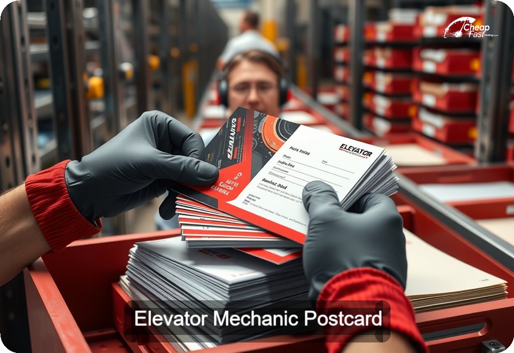
CheapFASTprinting approaches these jobs as production systems, not one-off mockups. We focus on practical design support, dependable print execution, and layouts that keep the next step obvious, whether the card is trying to help someone take action, for example claim an offer and request a quote.

Elevator Mechanic Postcard Guide visual

A page like this should sound like it understands the rhythm of Elevator Mechanic, not like a generic postcard paragraph with the slug swapped in. Readers notice the difference right away. So do search engines. Specificity comes from referencing the campaign windows, proof points, and decision triggers that belong to the niche itself, such as easy contact paths, clear service promises, and trust-building contact details.

When the language matches the actual job, the postcard stops feeling theoretical. It becomes a working tool that can be mailed, measured, reordered, and improved.

Elevator Mechanic Postcard Guide visual

Most successful postcard jobs in this topic fall into a handful of repeatable patterns. Teams order them to support launch announcements, new inventory mailers, service reminders, and repeat local mail drops. Those are stronger use cases than vague awareness mail because they anchor the creative to a real date, audience, or operational need.

The best layouts also stay disciplined about what the reader should do next. A postcard should not ask the audience to decode five messages at once. It should guide them toward a clear response path, such as claim an offer, request a quote, and visit a landing page.

  • Use one main offer or message per side so the card survives the two-second mailbox scan.
  • Keep the back focused on a single response path, with supporting details that make the action easier.
  • Reuse winning layouts seasonally so the team is improving a framework, not reinventing each drop.
  • Match photography, proof, and CTA style to the credibility expectations of the niche.
Elevator Mechanic Postcard Guide visual

Email and paid social are fast, but both disappear quickly into busy feeds and inboxes. A postcard creates a different kind of attention. It is handled, set down, shown to someone else, and often revisited later when the timing is right. That tactile pause is valuable on campaigns in this niche, especially when the next step needs more trust than a banner ad can create on its own.

That is why the strongest postcard pages describe real use, not abstract print specs. The card has to help the reader see what happens after delivery, and why this specific message deserves space in the mailbox.

Elevator Mechanic Postcard Guide visual

Material decisions affect more than appearance. A postcard has to survive sorting equipment, stacks, counters, and repeated handling without losing credibility. In this niche, the most useful combinations usually involve finishes that support bold color and automotive imagery, photo-friendly coatings, and writable backs.

The right choice depends on how the card is supposed to work after it lands. Some versions need photography to stay crisp. Others need enough writable space for notes, routing, or follow-up detail. The point is to match the finish to the actual job instead of selecting stock by buzzword alone.

Elevator Mechanic Postcard Guide visual

Many teams do not need a complete rebrand. They need a final production pass that protects the message they already know they want to send. Free Design Setup helps tighten hierarchy, improve spacing, and make sure the card keeps the next step obvious. That matters when the postcard has to support new inventory mailers, service reminders, and repeat local mail drops without turning into a cluttered flyer.

It also helps reduce avoidable problems around bleed, QR placement, image resolution, and front-back balance, so the piece feels intentional when it lands in someone’s hand.

Elevator Mechanic Postcard Guide visual

QR codes work best when they shorten one clear path, not when they decorate unused space. On postcards in this niche, the best destinations are usually lead capture pages, inventory pages, and store detail pages. That keeps the card connected to a mobile-first next step the recipient can finish quickly.

Every print run should also be treated like a measurable channel. Track which postcard version led to which response path, then preserve the framework that actually moved behavior. That is how postcard marketing gets stronger over time instead of staying anecdotal.

Elevator Mechanic Postcard Guide visual

A good postcard is not just a one-time creative success. It is an asset that can be versioned and re-used when the team needs to refresh timing, update an offer, or reach a related audience without starting from zero.

That repeatability is one of the main advantages of disciplined print systems. When teams in this niche lock in a winning format, they can spend more time improving the message and less time rebuilding the mechanics of the piece.

5% OFF One-time use Cap: $49.31 Postcards Only

5% off Elevator Mechanic postcard printing

Use this code at checkout on qualifying postcard orders from this page.

Valid until December 29th, 2026 at 5:00 PM 270 days left
ELEVATOR-5-OFF-POSTCARD-IND
→ enter total

Applies to qualifying postcard orders from this page before shipping and taxes. Checkout shows the final eligible discount in real time, so if a stronger sitewide promotion is active, use whichever offer gives the better value.

This is especially useful for teams reordering proven postcard layouts, because it reduces cost without forcing you to change the framework that already works.

Your code for this page is ELEVATOR-5-OFF-POSTCARD-IND. Copy it with the button or by selecting the code box, then paste it into the coupon field at checkout. The discount (about 5% off qualifying postcards, up to $49.31 max saving) should appear on your order summary before you pay.

Frequently asked questions , Elevator Mechanic postcard coupon

Use the coupon or promo field during checkout before payment is submitted. The order summary should update right away if the cart qualifies.
Eligibility depends on the live rules shown in checkout. If a product or finishing option is excluded, the cart will show that before you pay.
Yes, especially when you are reordering a postcard framework that already performs and you want to keep the same system in motion at a lower cost.
Bulk Postcards Pricing

Pricing guide for Elevator Mechanic postcards

Use the calculator to compare quantities, materials, and turnarounds against the real campaign timeline, not just the lowest per-piece number.

Quantity Total Price Per Piece

Please select different options to view pricing.

Connecting Elevator Mechanic postcards to digital actions

QR codes work when they remove friction instead of creating another design element to explain. For Elevator Mechanic, the strongest postcard links usually point to lead capture pages, inventory pages, and store detail pages.

Keep the code high contrast, protect its quiet zone, and make sure the destination matches the promise on the printed card.

QR options we support
  • High-contrast codes that stay readable after print and handling
  • Placement guidance so the QR supports the hierarchy instead of fighting it
  • Mobile-first destination planning tied to the offer on the card
  • Human review for spacing, safe zones, and front-back flow
Smart links for Elevator Mechanic teams
  • lead capture pages
  • inventory pages
  • store detail pages
  • appointment forms
SCAN ME WITH YOUR PHONE

What Elevator Mechanic buyers say about their postcard runs

Submitted Apr 2026
Austin, TX
Direct mail campaign
Free Design Setup helped turn rough assets into a postcard that felt niche-specific instead of generic. That saved time and gave us a cleaner piece to reorder later.
Marketing Coordinator
Submitted Jan 2026
Denver, CO
Direct mail campaign
We needed a repeatable format we could keep using without it sounding canned. The finished postcards looked disciplined, and the QR path made follow-up easier to track.
Operations Lead
Submitted Feb 2026
Charlotte, NC
Direct mail campaign
The postcard felt much more aligned with the real way our audience buys. The layout made the next step obvious and the print quality held up well once the mailers landed.
Service Manager

Elevator Mechanic postcard FAQs

The front should lead with the single strongest promise or visual hook, not with a crowded list of facts. In most campaigns in this niche, that means prioritizing one clear message tied to launch announcements and new inventory mailers.

The back should make response easier. Use it for supporting copy, contact detail, and one obvious next step, for example claim an offer and request a quote. If you need more explanation, route the reader to a QR code or short URL instead of shrinking the type until it is unreadable.

Reference the campaign moments and proof points that actually belong to the niche. For this topic, the page should feel grounded in things like launch announcements, new inventory mailers, and service reminders, not in vague language that could fit any business category.

In most cases, the strongest QR targets are lead capture pages, inventory pages, and store detail pages. The destination should match the promise on the printed card and load quickly on mobile.

Start with how the card will actually be handled and what it needs to prove visually. Common priorities here include finishes that support bold color and automotive imagery, photo-friendly coatings, and writable backs. If photography is carrying the message, protect it. If dense information matters more, favor readability and writability.

Yes. Shorter runs are useful for validating the offer, hierarchy, and landing page path before you expand the quantity. Once a structure works, preserve the layout and improve the variables that actually affect response.

Readers should not have to hunt for the point. Strong cards use a short value-first headline, clean whitespace around the CTA, and easy redemption flow, then support that with one clear CTA. The faster the meaning is understood, the better the chance the card survives past the first glance.

It helps tighten the final production details, such as hierarchy, spacing, bleed, and front-back balance, so the message you already want to send is easier to read and easier to act on. That is especially useful when the postcard needs to support a real deadline or campaign window.

The stronger option is usually direct action. Awareness improves when the card is tied to a clear next step, such as claim an offer, request a quote, and visit a landing page. Response-focused cards are easier to measure, refine, and repeat.

Refresh the message whenever the timing, audience, or offer changes, but try to keep the overall framework stable once it proves itself. That makes future drops faster, more consistent, and easier to compare.

It should immediately communicate credibility through easy contact paths, clear service promises, and trust-building contact details. If that proof is unclear, the recipient has less reason to keep reading.

Save the print-ready PDF and the editable source with clear naming. Once a postcard performs, treat it like infrastructure. Future campaigns can then update the offer, dates, and images without rebuilding the entire piece.

Bulk Postcards Explorer

Explore otherBulk PostcardsBulk Postcards niches besides Elevator Mechanic

Browse adjacent industries where topic-specific postcard systems help teams stay measurable and consistent. beyond Elevator Mechanic

Elevator Mechanic postcard planning guide

Who these postcards are built for

The buyers are typically small teams trying to stay visible locally, not casual one-off print shoppers.

This page is for small teams trying to stay visible locally who want a postcard to support something measurable. The piece should help create momentum around real work, such as launch announcements, new inventory mailers, and service reminders.

That is why the strongest orders are planned around timing, audience, and next-step clarity rather than around decoration alone.

Use cases that belong to the slug topic

The examples should sound native to the niche, not borrowed from another page.

Good topic alignment comes from naming the kinds of campaigns that actually happen in this field. In this niche, that usually means launch announcements, new inventory mailers, service reminders, and repeat local mail drops.

Those references make the page more useful to real buyers and much less likely to read like spun filler.

How layout should support response

The front wins attention, the back should remove hesitation.

The most effective postcards in this niche keep the front disciplined. One image or offer should lead, supported by a short value-first headline, clean whitespace around the CTA, and easy redemption flow.

The back should then make it easier to act, with a single response path built around claim an offer, request a quote, and visit a landing page.

Paper and finish recommendations

Material choices should match handling, photography, and readability.

Postcards are touched more than most digital-first teams expect. That makes material selection part of the strategy. In this category, common priorities include finishes that support bold color and automotive imagery, photo-friendly coatings, writable backs, and mail-friendly finishing choices.

The goal is not simply to make the stock feel expensive. The goal is to make the message survive the trip and still look credible on the second glance.

Production quality across repeat orders

A postcard program gets stronger when the framework is stable from run to run.

Teams that reorder frequently benefit from consistent output, because it lets them evaluate the message instead of wondering whether trim, color, or finishing changed the feel of the card. That is especially important when the same framework supports multiple offers or seasons.

Once a size and structure work, preserve them and improve the parts that actually affect response, such as offer language, imagery, and landing page alignment.

How QR codes should be used here

One direct mobile path usually beats several competing links.

QR performance improves when the destination matches the promise on the front of the card. For this topic, the smartest links are usually lead capture pages, inventory pages, and store detail pages.

Test the code after export and after proofing, and keep a readable URL nearby for recipients who prefer typing.

Offer structure and timing

Specific timing beats generic urgency.

Many campaigns improve when the offer reflects a real operational window instead of artificial hype. In this niche, practical postcards often support seasonal offers, inspection mailers, and limited-time scheduling pushes.

That kind of timing helps the mail piece feel relevant instead of evergreen in a forgettable way.

How to think about templates long term

Winning layouts should become infrastructure, not one-time experiments.

A strong postcard system gives the team a reusable skeleton. Update the story, image, and dates, while keeping the hierarchy that already proved it could convert. That is how print becomes easier to scale.

Teams that archive clean PDFs and source files usually move much faster on the second and third drop, because the production thinking is already done.

🔒 Secured by 256-Bit SSL | Data Protection Guaranteed | 10,000+ Happy Customers | A+ Rating