Professionally designed for 8.5" x 14" flyers. Fully editable & free!
Preparing Templates…
Use clear, guest‑friendly headings and one visible CTA to book or discover amenities. Hotel Flyers work best when they mirror front‑desk dialogue: service focus, availability, and one action.
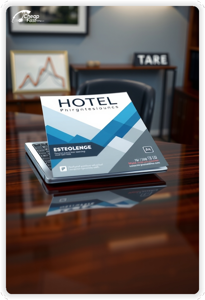
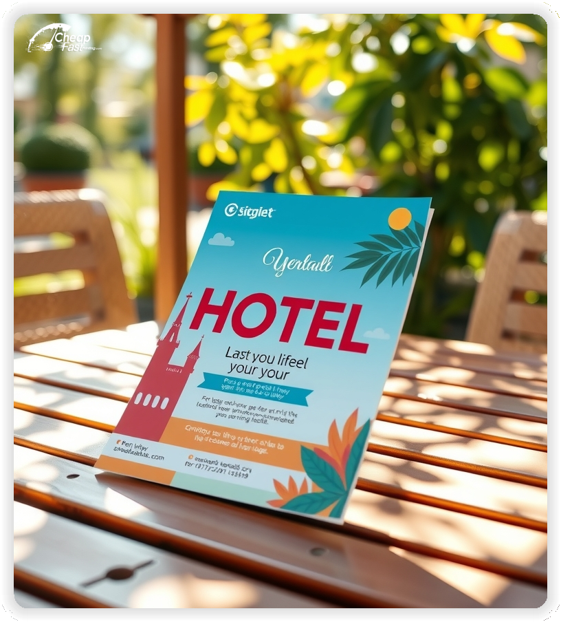
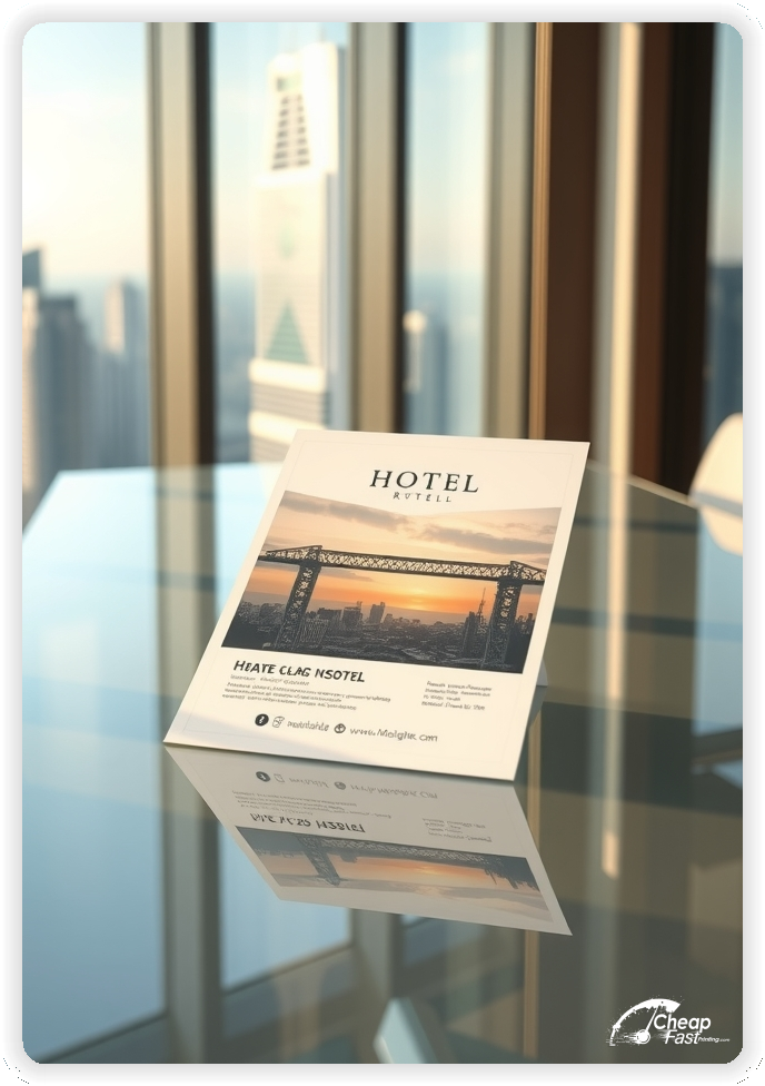
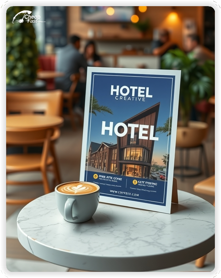
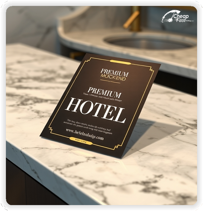
The 8.5x14 hotel flyers format provides room for offers, wayfinding, and concierge notes without crowding the layout.
Lead with guest‑useful details: reservations, amenities, and directions. Keep one CTA visible near hours or booking notes. Avoid hype; accuracy and clarity build confidence.

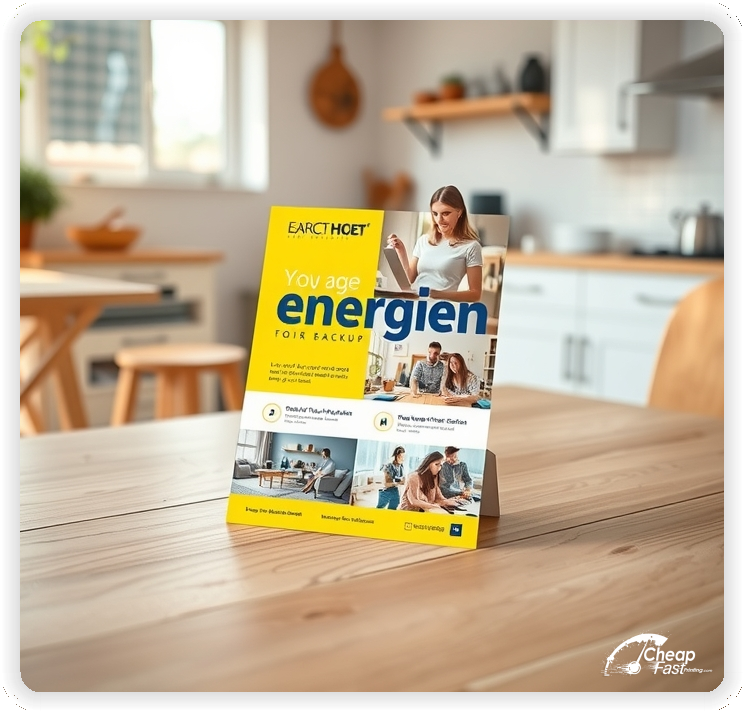
Keep copy helpful and direct. Guests respond to offers, directions, and one action.
8.5x14 hotel flyers provide space for packages, wayfinding, and concierge notes. The format stays readable at front desk and event tables.
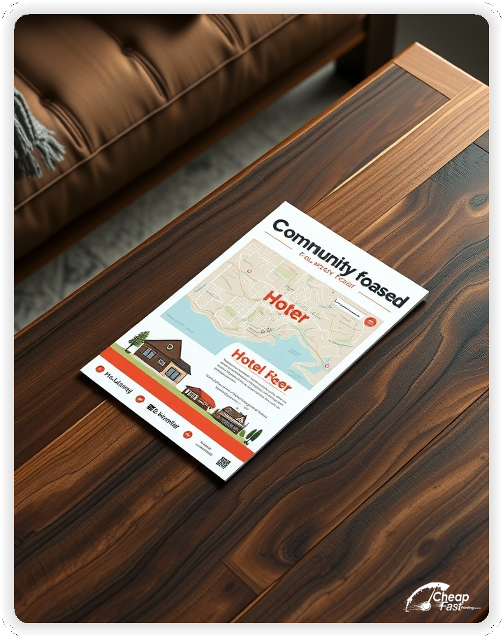
Use short headings and clean dividers so directions stand out.
Matte paper flyers prevent glare under lobby lighting and keep small type legible. The heavier stock holds up in guest areas.
Reserve color accents for CTA and map panels to guide action.
Use simple typography and brand icons. Hotel flyers printing benefits from consistent templates so updates are fast.
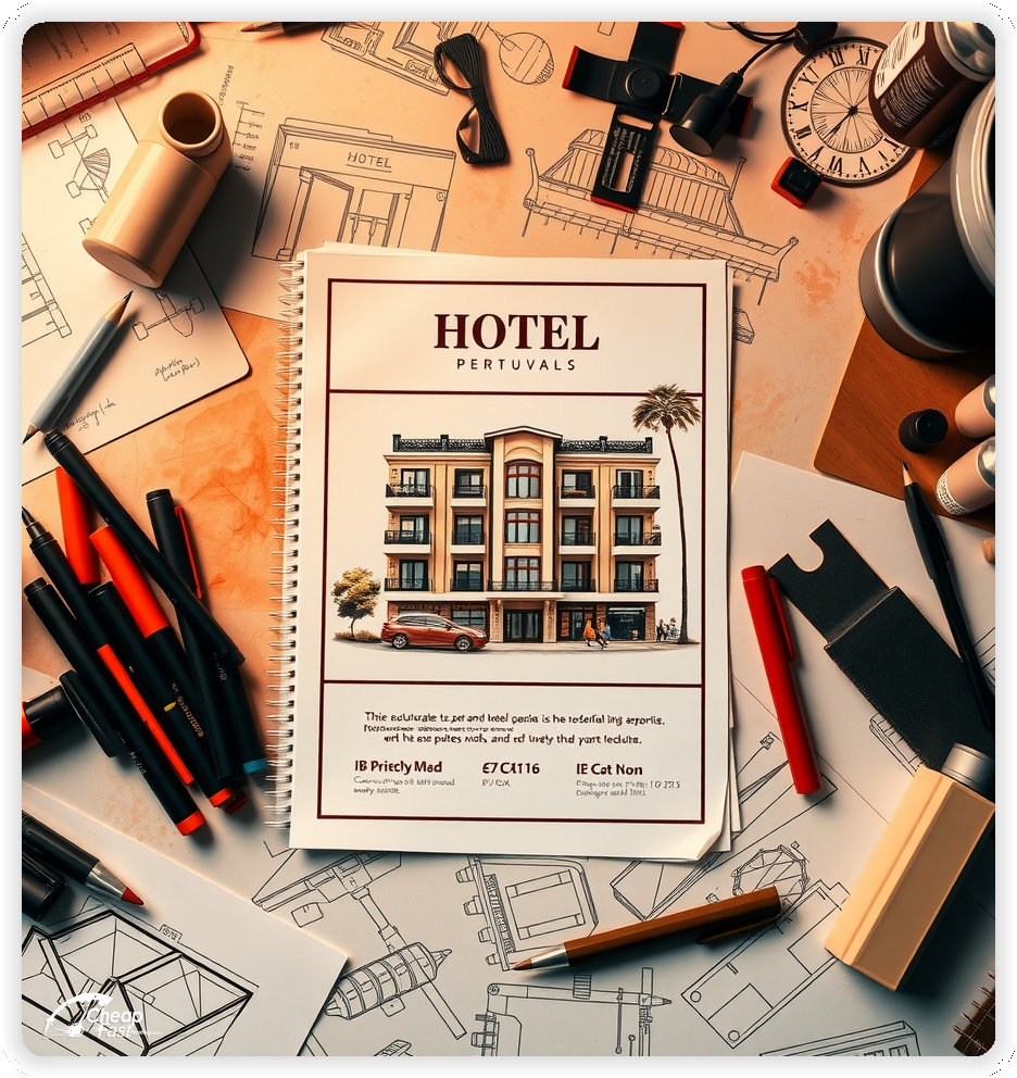
Upload artwork for custom hotel flyers that match your brand and seasonal offers.
Use front desk stacks, concierge, elevators, event tables, and partner venues. Refresh weekly where traffic is steady.
Start with 5000 hotel flyers for multi‑area coverage without overstock. Scale routes with bulk hotel flyers across properties sharing the same template.
Use the 8.5x14 template to preserve safe margins and consistent CTA placement. Keep logo and booking blocks in fixed positions for faster reorders.
Assign a unique QR or short URL per placement. Track calls and online bookings by area to refine the next print run.
Match flyer headings to the site so guests recognize the same offer names. Alignment across hotel marketing materials reduces confusion and improves conversion.
Keep three visible steps: offer, directions, and one CTA. Reduce copy; increase clarity.
Use unique QR per area with a short URL fallback to measure real response.
Upload artwork for custom hotel flyers. We keep one clear path to book.
We check contrast, trimming, and spacing so directions and the CTA remain visible.
Proof review verifies the QR destination and phone lines so the piece works without errors.
Use the 8.5x14 template to keep margins consistent and reserve space for offers, map, and CTA blocks.
Stable grids help staff update copy without redesigns and make reorders faster.
Loading Free Editable Designs...
Please wait while we prepare the template library.
Focused structure performs better because directions are easy to follow. Consistent templates reduce design time and keep copy aligned.
Track bookings, calls, and QR scans by placement rather than only print cost.
Use one clear headline, one offer, and one primary CTA (call, scan, or order). Add the essentials: phone, website/QR, service area, hours (if relevant), and a trust signal like years in business or a short review snippet.
Keep the layout scannable: one hero image or icon, short bullets, and high-contrast CTA text that’s readable at arm’s length.
Yes. 8.5" x 14" balances visibility and readability without feeling cramped. It gives enough space for a strong headline, a benefits list, and a CTA while staying easy to hand out or place on counters and boards.
Prioritize spacing and hierarchy over extra copy so the main message lands in 3–5 seconds.
100 lb. Matte Cover with Matte affects how the flyer feels and how colors read. Gloss tends to boost color and photos, matte reduces glare and feels more premium for text-heavy layouts, and uncoated is great for writing on.
If your design uses lots of fine text, choose clarity and contrast first; paper upgrades won’t fix a crowded layout.
5000 works well when you want consistent visibility across multiple placements (counters, boards, partner locations, events) over a few weeks. Bulk also lowers unit cost so you can test a message and keep the winner running.
Track performance, then reprint the best offer instead of changing everything at once.
If price is your main hook, feature one simple offer (“ off” or “Starting at ) and keep the fine print minimal. If you have variable pricing, use a short value statement and send details to a landing page.
A clean offer + simple CTA typically outperforms a long price list.
Use a QR code to a dedicated landing page and add UTM tags for each route or partner. Track scans, form fills, and calls to identify the placements that actually convert.
For non-QR audiences, include a short, memorable URL or a trackable phone extension.
Start where your customers already are: complementary businesses, community boards, local events, and targeted neighborhoods. Ask partners for the most visible spot and refresh before your flyer gets buried.
Use a consistent route and restock winners; small, repeated placements usually beat one big drop.
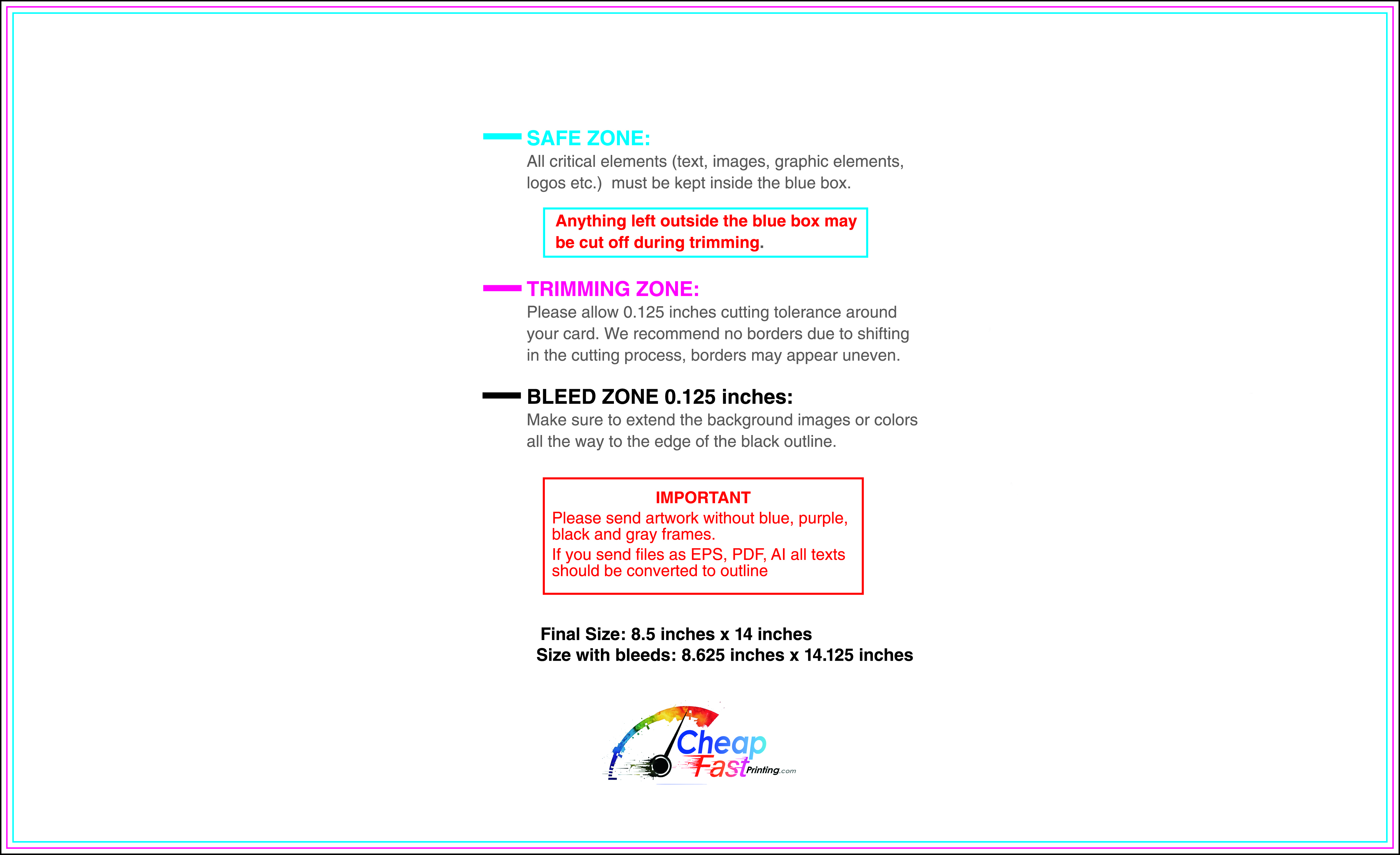
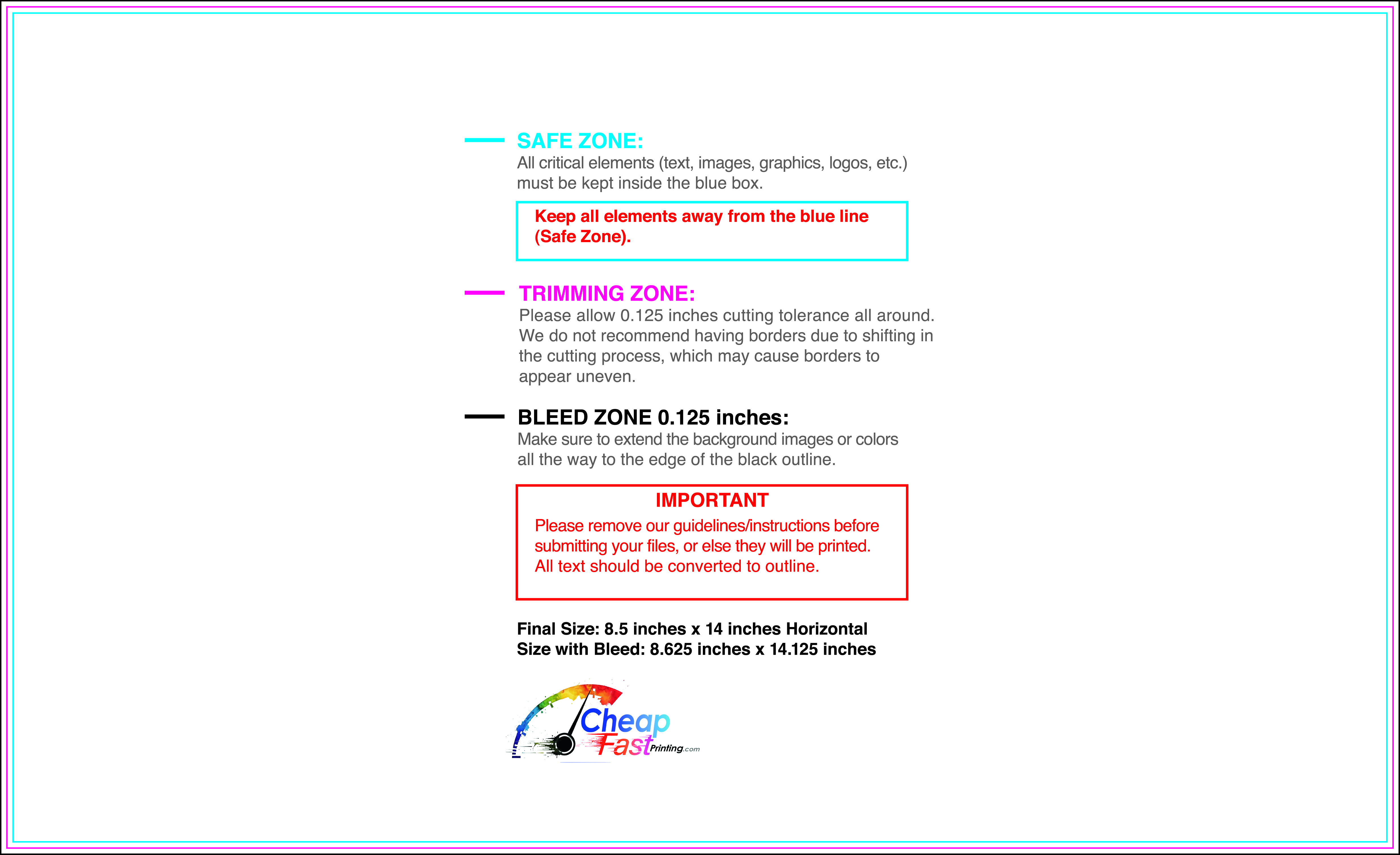
Submit a print-ready PDF (CMYK) at 300 DPI with 0.125" bleed and safe margins around important text. Keep thin lines above 0.5 pt and make QR codes at least ~0.8" square for reliable scanning.
Use vector logos when possible and limit your fonts to maintain a clean, professional look.
Request a proof so you can confirm spelling, margins, and QR/URL accuracy before production. Proofing is the easiest way to prevent expensive reprints.
Double-check phone numbers and offer terms first—those are the most common issues.
Match your flyer headline and offer to the landing page headline so visitors feel they’re in the right place. Keep the CTA consistent and make the page fast to load and easy to complete on mobile.
If you run ads, retarget QR visitors with the same offer to improve conversions.
Plan steady supply for front desk, concierge, elevators, and event tables. Use top‑up runs to match seasonal offers and area updates.
Scale coverage with bulk hotel flyers across properties; a run of 5000 hotel flyers supports multi‑area routes.

