Professionally designed for 5.5" x 8.5" flyers. Fully editable & free!
Preparing Templates…
Mental Health Flyers perform best when they feel calm, clear, and respectful. A good piece answers three questions fast: what support is offered, who it is for, and how to take the next step.
Use simple language, high contrast typography, and one primary CTA such as “Schedule a consult,” “Find a provider,” or “Join a support group.” Then let a QR code carry deeper information, office hours, and intake steps.
For community outreach, focus on clarity and accessibility. Keep details short, prioritize a phone number or short URL, and include the right resources for your audience.
Keep messaging supportive and specific. Lead with the service type (therapy, counseling, group sessions), then the audience (teens, adults, families), then the next step.
Avoid overcrowding the piece. One headline, one offer, and one CTA reads as more trustworthy than a long list.
Use calm colors and generous spacing so the flyer feels safe to keep and easy to share.


Effective outreach pieces reduce friction and feel safe to read. A strong flyer stays focused and makes the next step obvious.
This structure keeps mental health marketing materials clear and action-ready.
5.5x8.5 mental health flyers balance readability with easy distribution. The size fits front desks, clinic packets, community boards, and partner stacks without feeling bulky.
Use the top for the service and audience, the middle for key access details, and the bottom for the CTA plus QR code.
This layout helps people take information home and act later without needing to remember a long website.
Outreach pieces should feel clean and professional. Matte paper flyers reduce glare and keep text readable under office lighting, on community boards, and in waiting rooms.
The 100lb matte cover also holds up better in folders and handouts stacks, so the piece stays presentable after distribution.
People act when the next step feels easy. Use an invitation like “New clients welcome,” “Same-week appointments,” or “Support group sign-up.”
Keep the promise modest and clear. Put detailed policies and forms on the landing page so the flyer stays calm and readable.
List only what matters most: individual therapy, couples counseling, group support, or evaluation. Keep details short and use hierarchy so the most common service is obvious.
When the flyer is clear at a glance, it is more likely to be kept and shared.
Be specific about who you serve without sounding clinical. Examples include “support for stress and burnout,” “teen counseling,” or “family sessions available.”
This kind of clarity increases relevance while keeping tone supportive.
Small trust cues help people feel comfortable reaching out. Use one short credential line, a licensing note, or “telehealth available” if applicable.
Place full bios and detailed info on the landing page so the flyer stays simple.
Include address, cross streets, and the simplest contact method. If you offer evening hours, weekends, or bilingual support, add one short line.
Good access notes reduce barriers and support higher follow-through.
These pieces work well as front-desk inserts and referral leave-behinds. Keep one version for the general community and a second version for partner referrals if needed.
That approach makes mental health handouts easier to place in multiple settings.
If you run groups, keep it simple: group topic, day/time range, and how to join. Put registration steps behind the QR code.
This keeps the flyer readable while still supporting event-based outreach.
Choose placements where people feel safe picking up information: clinics, community centers, libraries, campuses, and partner offices.
Ask for discreet placement options and keep a small stack refreshed.
One flyer should lead to one action. A QR code to a short intake or scheduling page reduces friction and keeps the piece clean.
If you share resources, link to a curated page with the right contacts and next steps for your community.
Plan a consistent presence instead of a single burst. Repeated exposure in trusted locations helps people act when they are ready.
When you need fast turnaround, express mental health flyers support timely group start dates and clinic announcements.
Match the flyer headline to the landing page headline and keep the CTA identical. Consistency reduces confusion and increases follow-through.
Use the same service names and hours across every channel.
Test two CTAs with the same layout, like “Schedule a consult” versus “Join a support group.” Change only the CTA line and track QR scans by placement.
Once you know what works, keep the design stable and scale distribution.
For practices with multiple providers or locations, use one base template and localize only the contact info. That keeps the brand consistent and proofing fast.
When outreach expands, 5000 mental health flyers make it easier to stock multiple partner locations without reordering.
This is especially useful for referral packets, front desks, and community stacks.
Keep copy welcoming and straightforward. Use one line that tells people what happens next: call, schedule online, or scan to learn more.
Save detailed intake steps for the landing page.
Use supportive language and avoid sensational wording. Calm design, short sentences, and generous spacing help the flyer feel safe to keep.
This approach makes the piece more shareable in community settings.
If you offer ongoing support, keep it short: “weekly groups available” or “telehealth follow-ups offered.” Avoid long lists.
The flyer should still lead with the primary service and CTA.
If you include urgent resources, keep the line short and correct for your location. Avoid clutter and keep the primary CTA distinct.
Put full resource lists on the landing page so the piece stays readable.
Partner with physicians, schools, nonprofit programs, and community centers. Provide a small stack with a clear QR destination and updated contact info.
This placement pattern supports steady referrals without heavy ad spend.
In healthcare-adjacent outreach, print quality signals trust. Clean typography, correct margins, and a calm finish make the piece feel credible.
When the flyer looks intentional, more people keep it long enough to reach out.
People often discover local support through community spaces. Print creates repeated touchpoints where digital ads never reach.
Pair the flyer with a short scheduling page so awareness turns into action.
Use a supportive CTA like “Schedule a consult,” “Call for availability,” or “Scan for resources.” Keep it short and place it near the QR code.
Clarity matters for mental health flyers printing because the next step should be obvious even in a quick glance.
Use generous spacing and keep paragraphs short. A calm layout supports readability and makes the flyer easier to keep in a folder.
One clear image plus clean type usually outperforms a dense layout.
If you offer telehealth, mention it in one short line. If you offer in-person sessions, include the simplest location detail.
Keep scheduling steps behind the QR code.
For organizations, keep the message focused: one program name, one benefit, and one contact path. A separate landing page can collect referral details.
This keeps the public flyer clean while supporting partner outreach.
If you host groups or intake events, keep the details short and readable. One date range and one CTA is enough.
Use the landing page for eligibility notes and registration steps.
If you accept insurance or offer sliding scale options, add one short line. Keep it general and avoid long lists.
Full details belong on the landing page.
Keep one shared template for the practice, then add provider names on the back or a second version if needed. That prevents messy design changes.
Consistency improves trust and keeps printing predictable.
Awareness months and seasonal shifts can be good times to refresh messaging, but keep the template consistent. Swap the headline and update the QR destination as needed.
Consistency helps people recognize the resource quickly.
If you include “what to expect,” keep it short: appointment length, confidentiality note, and how to schedule. Avoid long explanations on the flyer.
Short guidance supports trust without crowding the design.
Use inclusive language and plain words. If you offer interpretation, wheelchair accessibility, or sensory-friendly options, add one short line.
Clarity helps more people feel comfortable reaching out.
Outreach works best when it creates one clear path from awareness to action. Keep the headline calm, keep details short, and put the QR code where it is easy to find.
This is how bulk mental health flyers stay helpful instead of overwhelming.
Your flyer has about 3 seconds to make an impression before it's tossed or kept. Don't bury the lead. Ensure your main headline and primary offer are visible from arm's length. Use high-contrast colors and bold typography to guide the eye exactly where you want it.
Target the Right Neighborhoods: Success isn't just about design; it's about distribution. Focus your efforts on neighborhoods that match your ideal customer profile. For local businesses, a tight radius around your location often yields the highest ROI.
People rarely act the moment they receive a flyer. They notice it, keep it, and return to it later when they feel ready. Plan distribution like a routine: choose a handful of trusted community locations and restock consistently.
Good placements include clinics, community centers, libraries, campuses, and partner offices. Use a QR destination that matches the flyer headline and track scans by location to learn what works.
Your flyer has about 3 seconds to make an impression before it's tossed or kept. Don't bury the lead. Ensure your main headline and primary offer are visible from arm's length. Use high-contrast colors and bold typography to guide the eye exactly where you want it.
Target the Right Neighborhoods: Success isn't just about design; it's about distribution. Focus your efforts on neighborhoods that match your ideal customer profile. For local businesses, a tight radius around your location often yields the highest ROI.
Upload artwork for custom mental health flyers and keep the message focused on one service and one clear next step.
Proofing checks trimming, contrast, and spacing so the flyer stays calm and readable. The most common errors are small, but costly.
Confirm the QR destination loads quickly and matches the flyer headline.
Use a consistent template so the headline, contact block, and QR placement stay in the same spot every run.
Templates speed up outreach refreshes and reduce proofing mistakes.
A stable grid makes it easy to update hours or service notes without redesigning.

Loading Free Editable Designs...
Please wait while we prepare the template library.
Simple pieces outperform crowded pieces because contact info and next steps are obvious. Track response by QR scans, calls, and scheduled intakes from each placement.
When the headline stays consistent, recognition improves and response becomes more predictable.
Use one clear headline, one offer, and one primary CTA (call, scan, or order). Add the essentials: phone, website/QR, service area, hours (if relevant), and a trust signal like years in business or a short review snippet.
Keep the layout scannable: one hero image or icon, short bullets, and high-contrast CTA text that’s readable at arm’s length.
Yes. 5.5" x 8.5" balances visibility and readability without feeling cramped. It gives enough space for a strong headline, a benefits list, and a CTA while staying easy to hand out or place on counters and boards.
Prioritize spacing and hierarchy over extra copy so the main message lands in 3–5 seconds.
100 lb. Matte Cover with Matte affects how the flyer feels and how colors read. Gloss tends to boost color and photos, matte reduces glare and feels more premium for text-heavy layouts, and uncoated is great for writing on.
If your design uses lots of fine text, choose clarity and contrast first; paper upgrades won’t fix a crowded layout.
5000 works well when you want consistent visibility across multiple placements (counters, boards, partner locations, events) over a few weeks. Bulk also lowers unit cost so you can test a message and keep the winner running.
Track performance, then reprint the best offer instead of changing everything at once.
If price is your main hook, feature one simple offer (“ off” or “Starting at ) and keep the fine print minimal. If you have variable pricing, use a short value statement and send details to a landing page.
A clean offer + simple CTA typically outperforms a long price list.
Use a QR code to a dedicated landing page and add UTM tags for each route or partner. Track scans, form fills, and calls to identify the placements that actually convert.
For non-QR audiences, include a short, memorable URL or a trackable phone extension.
Start where your customers already are: complementary businesses, community boards, local events, and targeted neighborhoods. Ask partners for the most visible spot and refresh before your flyer gets buried.
Use a consistent route and restock winners; small, repeated placements usually beat one big drop.
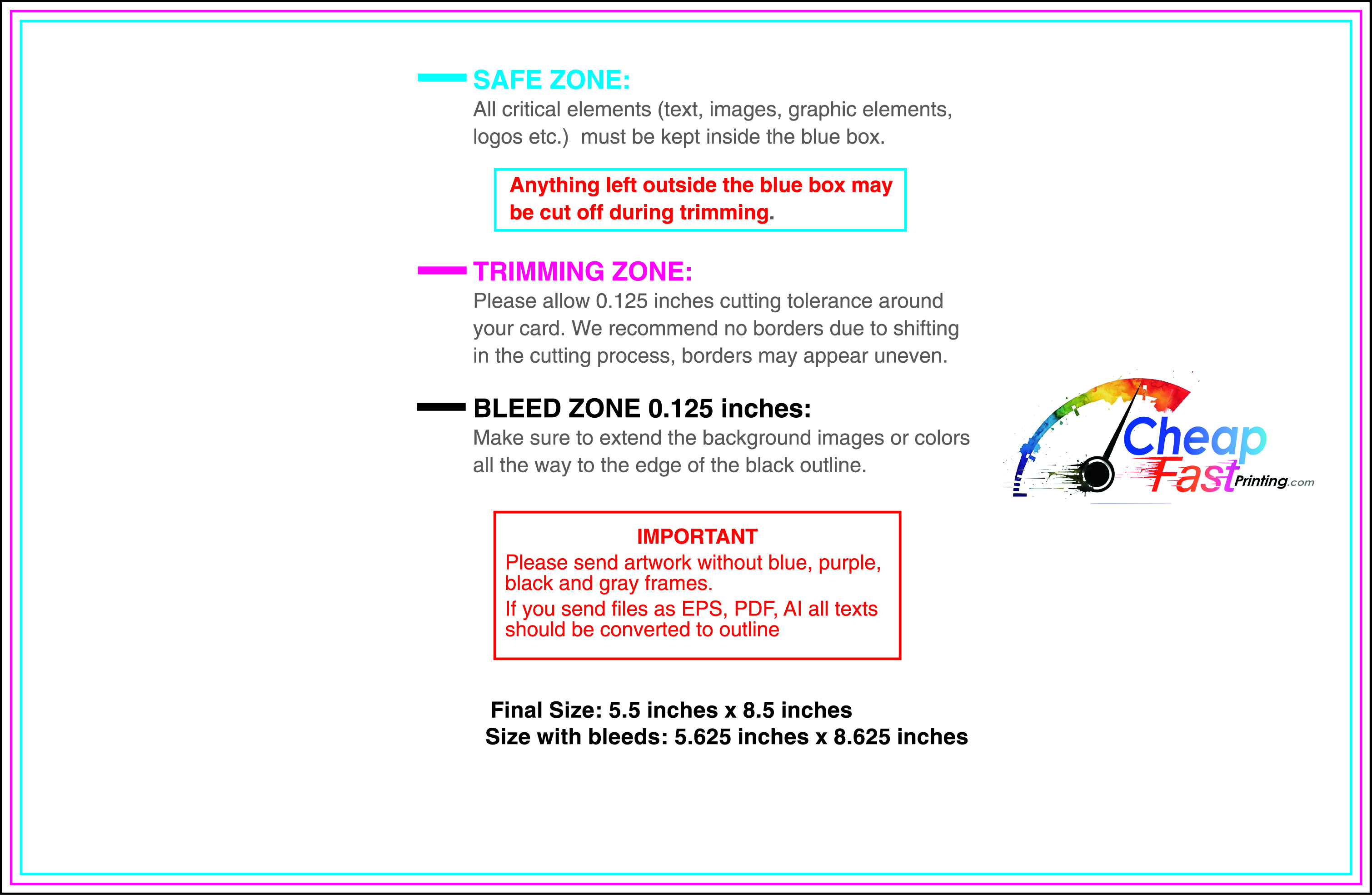
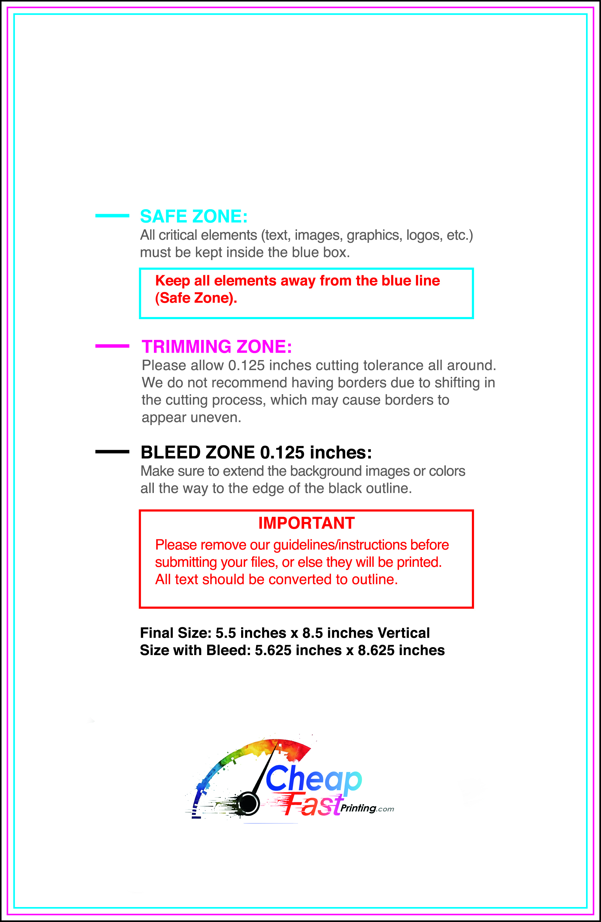
Submit a print-ready PDF (CMYK) at 300 DPI with 0.125" bleed and safe margins around important text. Keep thin lines above 0.5 pt and make QR codes at least ~0.8" square for reliable scanning.
Use vector logos when possible and limit your fonts to maintain a clean, professional look.
Request a proof so you can confirm spelling, margins, and QR/URL accuracy before production. Proofing is the easiest way to prevent expensive reprints.
Double-check phone numbers and offer terms first—those are the most common issues.
Match your flyer headline and offer to the landing page headline so visitors feel they’re in the right place. Keep the CTA consistent and make the page fast to load and easy to complete on mobile.
If you run ads, retarget QR visitors with the same offer to improve conversions.
Bulk works best when distribution is scheduled. Start with a repeatable restock loop across a few trusted locations, then expand after you know what converts.
Use bulk mental health flyers for clinic stacks, referral packets, and community placements so information stays available when people need it.
For broader outreach, 5000 mental health flyers keep multiple partners stocked while the design stays consistent.

