
Professionally designed for 6" x 9" flyers. Fully editable & free!
Preparing Templates…
In wealth management, trust is the currency. A flimsy flyer suggests risky business, while a premium, professional piece signals stability and expertise. Whether you are promoting a retirement seminar or introducing a new firm, print marketing remains a powerful tool for reaching demographic-specific leads.
Ordering 500 financial planning flyers in the versatile 6x9 format gives you the perfect size for direct mail campaigns or seminar seat drops. It stands out in the mail pile without being oversized.
Effective financial planning marketing materials simplify complex concepts into clear benefits: security, growth, and legacy. The flyer should guide prospects to a consultation or event registration.
When the design is clean and the paper feels substantial, you establish theauthority needed to manage someone's life savings.
Lead with a question. 'Will You Outlive Your Savings?' or 'Are Your Taxes Too High?' engages the brain instantly.
Use authoritative colors. Navy blue, forest green, and slate grey convey stability and money.
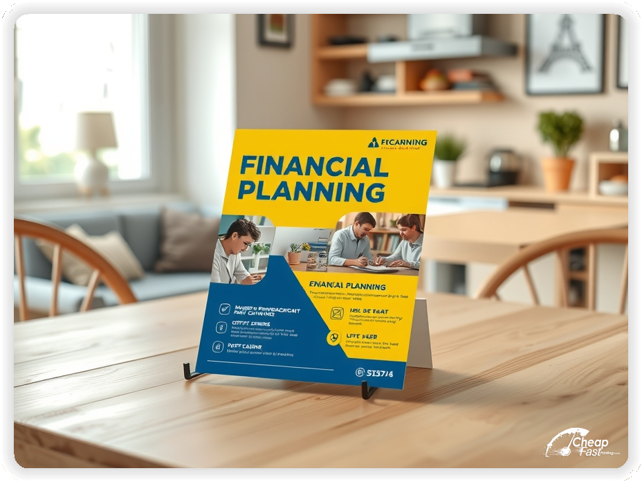
Include a photo of the advisor. People buy people; showing your face builds familiarity before the first meeting.


These pieces must prove competence. High-net-worth individuals are skeptical; your flyer must reassure them.
This structure builds a bridge from skepticism to inquiry.
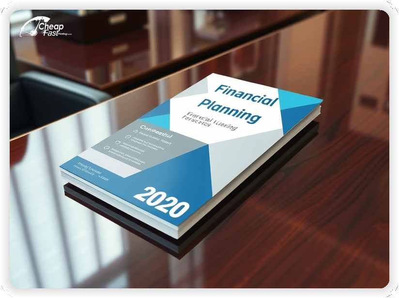
The 6x9 financial planning flyers format provides more real estate than a standard postcard, allowing you to explain your 'process' or 'philosophy' in detail.
This size is also EDDM (Every Door Direct Mail) friendly, allowing you to target specific wealthy zip codes.
It fits nimbly into presentation folders alongside quarterly reports.
Financial documents should feel crisp. The 80lb Gloss Book paper offers a professional sheen that makes charts and graphs look sharp.
Text remains highly readable on this stock, which is crucial for older demographics.
Standard copy paper feels cheap; glossy paper flyers feel like a corporate brochure.
Fill the room. Use the flyer as a formal invitation to a dinner seminar.
Include the menu or restaurant name to increase perceived value.
Physical invites have a higher open rate than email blasts for these events.
Offer value upfront. '5 Steps to a Secure Retirement'.
Use the back of the flyer as a checklist.
This positions you as an educator, not just a salesperson.
Time it right. 'Reduce Your Tax Liability Before Year-End'.
Send these in October or November.
Focus on actionable strategies like Roth conversions.
Leave financial planning handouts at local golf clubs, luxury car dealerships, and estate attorney offices.
Partner with CPAs for cross-referrals.
Direct mail to neighborhoods with high home values is the gold standard.
Grow your footprint. 'Now Serving the Westside'.
Invite the community to an open house.
Reduce friction. 'Scan to Book a 15-Minute Intro Call'.
Link directly to your Calendly or scheduling tool.
Target the legacy mindset. 'Protect Your Family's Future'.
This appeals to older clients concerned about their heirs.
Be the voice of reason. 'How to Stay Calm When Markets Drop'.
Send these during corrections to show leadership.
A universal concern. 'Maximize Your Social Security Benefits'.
This topic consistently drives high seminar attendance.
Target dissatisfied investors. 'Is Your Portfolio Working as Hard as You Do?'.
Offer a no-obligation review of their current holdings.
Leverage your base. 'We Grow Through Introduction'.
Include these in your new client welcome kits.
Ordering bulk financial planning flyers lowers your cost per lead significantly.
A run of 500 financial planning flyers is perfect for testing a new seminar topic or zip code.
Consistent mailing builds brand recognition in your target farming area.
Create a series. 'Financial Literacy Month' tips.
Mail a new tip every week for a month.
Target transitions. 'Just Retired?', 'Selling a Business?', 'New Grandchild?'.
These events create immediate need for advice.
Use serif fonts (like Garamond or Times) for body text; they are easier to read and convey tradition.
Avoid trendy or overly stylized fonts.
You manage money. Your marketing cannot look cheap. High-quality financial planning flyers printing is a direct reflection of your firm's attention to detail.
Smudged ink or thin paper raises red flags.
Be specific. 'Financial Planning for Doctors' or 'Teacher Retirement Options'.
Specialization builds instant credibility with that group.
Use a low-risk CTA such as 'Download Our Whitepaper' or 'Register for Dinner'.
Avoid high-pressure sales language.
Education sells better than pitching.
Use charts sparingly. One clear graph showing 'Compound Interest' is better than a spreadsheet.
Use white space to keep the layout from feeling overwhelming.
Differentiate yourself. 'We Act in Your Best Interest'.
Explain what being a fiduciary means.
Flyers work best when they offer clarity in a confusing world. A clear path to financial security is a powerful hook.
When the design communicates stability, the flyer opens doors to kitchen table conversations.
Pair print with LinkedIn content for a professional omni-channel presence.
Your flyer has about 3 seconds to catch a prospect's attention among the bills. Don't use generic handshake photos. Ensure your main headline ('Retire Tax-Free') addresses a major desire. Use calming, corporate colors (Blue/Grey) to evoke stability.
Target the Right Mailboxes: Success isn't just about design; it's about data. Purchase a mailing list filtered by income, age (55+), and home value. wasting postage on unqualified leads is the most expensive mistake advisors make.
Upload your event details and logo to create custom financial planning flyers that drive registration.
Proofing checks contrast, trimming, and font logic so your disclosures are legible.
Proof review also confirms the QR destination and phone numbers so the flyer works without errors.
Confirm that the event dates are correct.
Verify that office addresses are accurate.
Check that the layout aligns evenly after trimming.
Confirm that all required compliance language is present.
Use the 6x9 template to keep margins consistent and reserve space for postal indicia.
Templates also protect the layout so regulatory updates do not break alignment.
Consistent spacing keeps contact details visible after trimming.
A stable grid helps marketing teams update seminar dates without redesigns.
Consistent templates also support multi-advisor teams with minimal editing.
They also preserve alignment for QR placement and headshot sizing.
It also keeps headers aligned across tax and retirement campaigns.

Loading Free Editable Designs...
Please wait while we prepare the template library.
Focused layouts outperform crowded pieces because the message is clearer.
Consistent templates reduce design time and keep the firm branding strong.
Compare response by AUM (Assets Under Management) gathered rather than only print cost.
When the brand stays consistent, prospects trust the firm easier.
Tracking seminar ROI helps refine the next campaign spend.
Review appointment set rates to understand which flyers perform best.
Use one clear headline, one offer, and one primary CTA (call, scan, or order). Add the essentials: phone, website/QR, service area, hours (if relevant), and a trust signal like years in business or a short review snippet.
Keep the layout scannable: one hero image or icon, short bullets, and high-contrast CTA text that’s readable at arm’s length.
Yes. 6" x 9" balances visibility and readability without feeling cramped. It gives enough space for a strong headline, a benefits list, and a CTA while staying easy to hand out or place on counters and boards.
Prioritize spacing and hierarchy over extra copy so the main message lands in 3–5 seconds.
80 lb. Gloss Book with Gloss affects how the flyer feels and how colors read. Gloss tends to boost color and photos, matte reduces glare and feels more premium for text-heavy layouts, and uncoated is great for writing on.
If your design uses lots of fine text, choose clarity and contrast first; paper upgrades won’t fix a crowded layout.
500 works well when you want consistent visibility across multiple placements (counters, boards, partner locations, events) over a few weeks. Bulk also lowers unit cost so you can test a message and keep the winner running.
Track performance, then reprint the best offer instead of changing everything at once.
If price is your main hook, feature one simple offer (“ off” or “Starting at ) and keep the fine print minimal. If you have variable pricing, use a short value statement and send details to a landing page.
A clean offer + simple CTA typically outperforms a long price list.
Use a QR code to a dedicated landing page and add UTM tags for each route or partner. Track scans, form fills, and calls to identify the placements that actually convert.
For non-QR audiences, include a short, memorable URL or a trackable phone extension.
Start where your customers already are: complementary businesses, community boards, local events, and targeted neighborhoods. Ask partners for the most visible spot and refresh before your flyer gets buried.
Use a consistent route and restock winners; small, repeated placements usually beat one big drop.
Submit a print-ready PDF (CMYK) at 300 DPI with 0.125" bleed and safe margins around important text. Keep thin lines above 0.5 pt and make QR codes at least ~0.8" square for reliable scanning.
Use vector logos when possible and limit your fonts to maintain a clean, professional look.
Request a proof so you can confirm spelling, margins, and QR/URL accuracy before production. Proofing is the easiest way to prevent expensive reprints.
Double-check phone numbers and offer terms first—those are the most common issues.
Match your flyer headline and offer to the landing page headline so visitors feel they’re in the right place. Keep the CTA consistent and make the page fast to load and easy to complete on mobile.
If you run ads, retarget QR visitors with the same offer to improve conversions.
Plan a steady supply for seminars and prospecting mailers. Short runs allow topic updates without waste.
Predictable inventory supports consistent lead generation.
Track which zip codes drive the most calls and double down there.
Use premium financial planning flyers for high-end events.
Balance broad awareness and targeted seminar distributions.
Use thank-you cards for client retention.
For annual reviews, bulk financial planning flyers can serve as a year-end checklist for all clients.

