
Professionally designed for 11" x 17" flyers. Fully editable & free!
Preparing Templates…
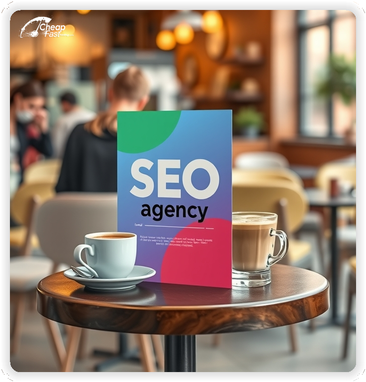
Digital agencies need tangible touchpoints to build trust in a crowded market. High‑impact seo agency flyers bridge the gap between online promises and offline credibility. A well‑executed leave‑behind showcases case studies, audit processes, and growth metrics in a format prospects can hold.
The 11x17 format offers ample canvas space for detailed infographics, service tier comparisons, and performance charts. When printed on premium 14pt gloss paper, the piece feels authoritative and substantial during pitch meetings or networking events.
Use this large‑format print at business expos, partner offices, and local networking sessions where decision makers evaluate your proof quickly.
Focus on evidence. Use the large 11x17 layout to display before‑and‑after traffic graphs or ROI calculations. A data‑driven design converts better than generic promises, especially when the CTA is a single audit request.
Use glossy paper flyers when you need charts and icon blocks to pop at a busy event table. High‑contrast data visualizations on quality stock signal precision and expertise.

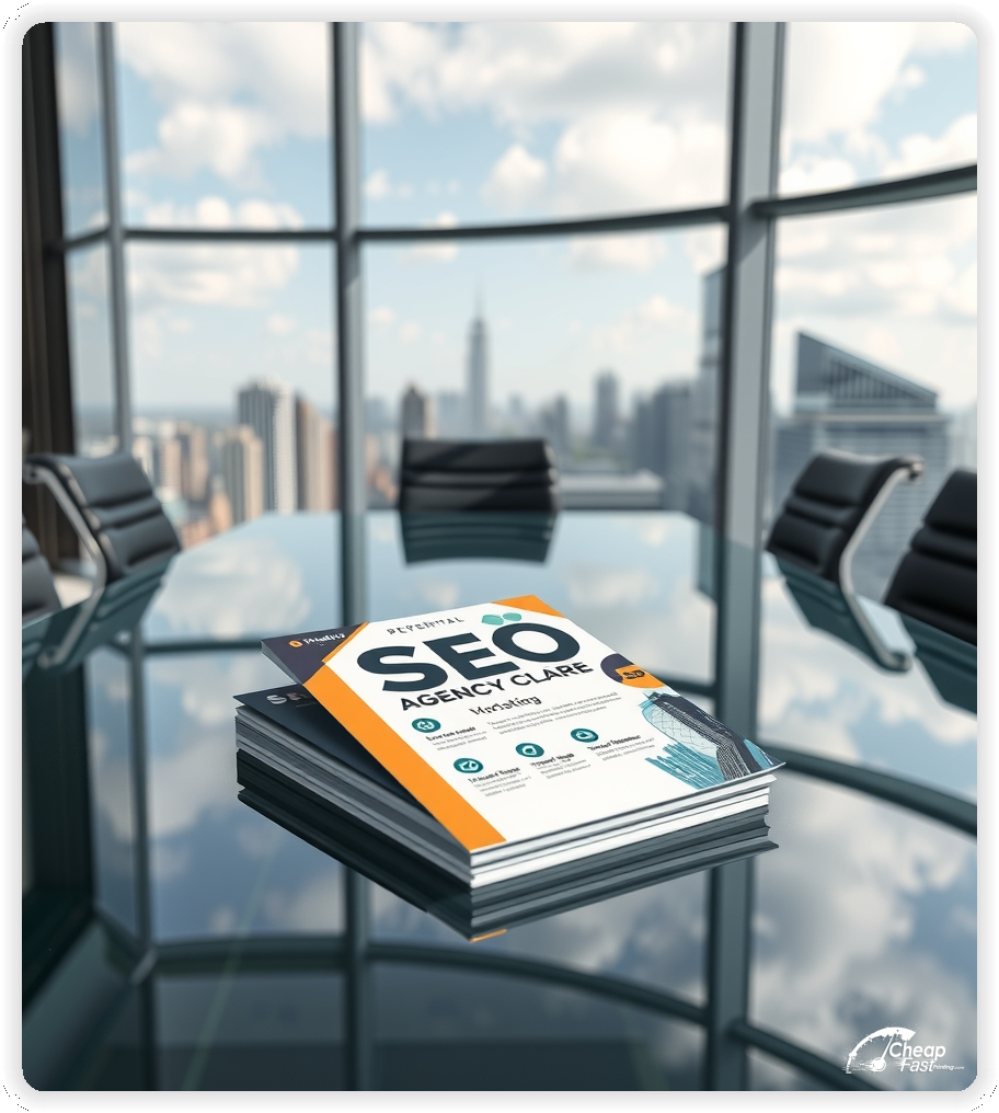
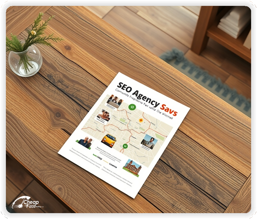

Selling intangible services requires tangible proof. seo agency marketing materials on 11x17 paper allow you to present full‑page case studies and detailed service roadmaps that standard letter‑sized print cannot accommodate.
This structure keeps the proof block large enough to be read across a meeting table.
The 11x17 size functions as a mini‑poster or a folded brochure, perfect for walking a prospect through your strategy during a consultation.
For boardroom demos, 11x17 seo agency flyers keep charts readable from a few feet away without forcing tiny type.
Data needs to look sharp. Gloss enhances color vibrancy, making traffic graphs and revenue charts stand out. The 14pt stock is rigid enough to stand in a presentation folder without dog‑earing.
Use larger legend labels and keep grid lines subtle so the reader focuses on the upward trend, not the chart frame.
Your brand is your reputation. custom seo agency flyers allow you to align print pieces with your website’s aesthetic and messaging hierarchy.
Consistent branding across digital and physical channels reinforces authority and reduces perceived risk for prospects.
Use a simple color system: one primary brand color, one accent for the CTA, and a neutral background for data blocks.
Growth requires volume. Printing bulk seo agency flyers prepares you for large‑scale direct mail drops to local business owners. A targeted physical piece often bypasses the crowded email inbox of decision‑makers.
Whether you are targeting dentists, lawyers, or retailers, a physical audit offer in their hands gets read more often than a cold email.
Prospects evaluate agencies by evidence, not promises. Build a compact proof stack that shows baseline, action, and result in one visual line.
Use one short case with the starting metric, the change, and the impact window. Add a single quote or a client logo row to reinforce legitimacy without adding heavy text.
Keep the proof block near the headline so the reader sees the outcome before the service list.
Decision makers say yes to clear steps. Present a three‑tier path that starts with a low‑risk audit, then a roadmap, then an execution sprint.
This framing positions the next step as structured and easy to approve.
A single case study block should fit in one column so it can be read without zooming or re‑reading. The goal is instant clarity, not a full report.
Use a four‑part structure that mirrors how a decision maker thinks: baseline, action, outcome, and timeframe. Keep each line short and measurable.
This format builds trust because it shows a clear cause‑and‑effect chain without over‑explaining the tactics.
Prospects worry about unpredictable timelines and volatile rankings. Address this concern directly by clarifying what is measured and what is not guaranteed.
Use short language like “measured improvements in qualified traffic” and “repeatable process with reporting cadence.” This frames your work as a system, not a promise.
Include a small line that highlights dependencies such as site access or content approvals. This signals professionalism and prevents later friction.
The objective is to reduce uncertainty while keeping the message confident and concise.
Large‑format print works best when it supports multiple channels. Use direct mail for targeted local businesses, and use event distribution for fast, high‑quality conversations.
For partner offices, place the piece in a clean stand and rotate the proof block each quarter so the material looks current. This keeps your brand present without a full redesign.
Pair the primary 11x17 piece with a smaller follow‑up leave‑behind that includes a shorter CTA. The combination builds recall and shortens the decision cycle.
Local businesses respond to localized results. When the target audience is a regional brand, show map pack visibility, phone call lift, and localized content wins.
National brands care about scale, so lead with enterprise‑level reporting, multi‑location rollouts, and larger traffic wins. Keep the copy short and focused on outcomes.
Matching the proof to the buyer’s world improves trust and keeps the conversation centered on value instead of skepticism.
Print pieces should connect directly to a simple dashboard or report preview. Use a QR link that opens a short page with a visual summary and a single scheduling button.
After a scan, send a brief follow‑up that repeats the same proof metric from the print piece. Consistency turns curiosity into a meeting.
Log scans and meetings by source so your team can evaluate which placements produce the highest quality leads.
At events, seo agency handouts should lead to one action: scan for an audit slot or book a consult. Place the QR above the fold and label it with a single action verb.
Pair the print piece with a one‑sentence staff script so every team member explains the same offer. Consistency improves scan‑to‑meeting conversion.
Store one version per event so follow‑up emails match the same headline and proof block.
Local businesses respond best when examples match their category. Create a short set of variations for medical, legal, home services, and e‑commerce.
Swap the proof block and one callout sentence while keeping the layout stable. This keeps production efficient while making the message feel specific.
When a prospect sees metrics tied to their industry, the credibility hurdle drops fast.
Use unique short URLs or QR codes for each placement so you can compare performance by event and partner location.
Name scans by source in your analytics and report back to the sales team weekly. This closes the loop between print and pipeline.
When the data shows a high‑performing channel, repeat it and scale the same design.
B2B decisions take time, so the print piece should survive multiple handoffs. Include a short summary line, a proof block, and one consistent contact path.
Give account managers a second version with a deeper service checklist for later‑stage conversations.
These two versions keep the initial outreach light while supporting longer discussions.
Large layouts still need a clear reading path. Guide the eye in three steps so the audience understands the offer in seconds.
This hierarchy reduces overwhelm and improves scan behavior at busy events.
Print works best when it triggers a consistent follow‑up flow. Use the same headline from the piece in your email and calendar invite so the lead recognizes the offer.
Send a short recap with one proof metric and one scheduling link. The continuity between print and digital increases response without extra copy.
Send a high‑value physical mailer to your top 100 local prospects. A generic letter gets tossed, but a large, proof‑heavy one‑sheet with a “Free Competitor Analysis” offer gets noticed.
Event domination: At trade shows, everyone hands out business cards. Hand out a substantial 11x17 infographic so your team looks like the authority in the room.
Lead with the result, then explain the path. A single metric and a short timeline line build trust quickly.
Once the reader believes the outcome is possible, the process steps feel like a safe, structured plan rather than a pitch.
Upload your designs and start your print run. Fast turnaround helps you hit your next event deadline.
We know you inspect every pixel of a website; we do the same for print. Our proofing process checks chart contrast, label size, and trim safety so the results read clean at arm’s length.
We also verify QR placement, font pairing, and color balance to protect the message from blurring or glare.
Consistent seo agency flyers printing keeps metrics readable across every batch.
Download our 11x17 guide to set up your file correctly. Precise templates keep margins consistent and protect chart spacing.
Use a grid so your headline, proof block, and CTA align every time. This makes it easy to swap metrics without rebuilding the layout.
Correct file setup speeds up production and reduces revision cycles.

Loading Free Editable Designs...
Please wait while we prepare the template library.
Our cheap seo agency flyers pricing allows you to acquire high‑value B2B clients at a fraction of the cost of PPC clicks.
Evaluate cost per qualified meeting, not just cost per piece. One retained client often covers multiple distribution cycles.
Track response by event and channel so you can reinvest only where results are proven.
Use one clear headline, one offer, and one primary CTA (call, scan, or order). Add the essentials: phone, website/QR, service area, hours (if relevant), and a trust signal like years in business or a short review snippet.
Keep the layout scannable: one hero image or icon, short bullets, and high-contrast CTA text that’s readable at arm’s length.
Yes. 11" x 17" balances visibility and readability without feeling cramped. It gives enough space for a strong headline, a benefits list, and a CTA while staying easy to hand out or place on counters and boards.
Prioritize spacing and hierarchy over extra copy so the main message lands in 3–5 seconds.
14 pt. Gloss with Gloss affects how the flyer feels and how colors read. Gloss tends to boost color and photos, matte reduces glare and feels more premium for text-heavy layouts, and uncoated is great for writing on.
If your design uses lots of fine text, choose clarity and contrast first; paper upgrades won’t fix a crowded layout.
500 works well when you want consistent visibility across multiple placements (counters, boards, partner locations, events) over a few weeks. Bulk also lowers unit cost so you can test a message and keep the winner running.
Track performance, then reprint the best offer instead of changing everything at once.
If price is your main hook, feature one simple offer (“ off” or “Starting at ) and keep the fine print minimal. If you have variable pricing, use a short value statement and send details to a landing page.
A clean offer + simple CTA typically outperforms a long price list.
Use a QR code to a dedicated landing page and add UTM tags for each route or partner. Track scans, form fills, and calls to identify the placements that actually convert.
For non-QR audiences, include a short, memorable URL or a trackable phone extension.
Start where your customers already are: complementary businesses, community boards, local events, and targeted neighborhoods. Ask partners for the most visible spot and refresh before your flyer gets buried.
Use a consistent route and restock winners; small, repeated placements usually beat one big drop.
Submit a print-ready PDF (CMYK) at 300 DPI with 0.125" bleed and safe margins around important text. Keep thin lines above 0.5 pt and make QR codes at least ~0.8" square for reliable scanning.
Use vector logos when possible and limit your fonts to maintain a clean, professional look.
Request a proof so you can confirm spelling, margins, and QR/URL accuracy before production. Proofing is the easiest way to prevent expensive reprints.
Double-check phone numbers and offer terms first—those are the most common issues.
Match your flyer headline and offer to the landing page headline so visitors feel they’re in the right place. Keep the CTA consistent and make the page fast to load and easy to complete on mobile.
If you run ads, retarget QR visitors with the same offer to improve conversions.
Scale your campaigns efficiently. Split batches by event and partner location so performance is easy to compare.
A run of 500 seo agency flyers is enough for a focused quarter of conferences and local meetups when each event has a distinct QR.
Use reorders to maintain the same layout while refreshing only the proof metric and headline.

