
Professionally designed for 11" x 17" flyers. Fully editable & free!
Preparing Templates…
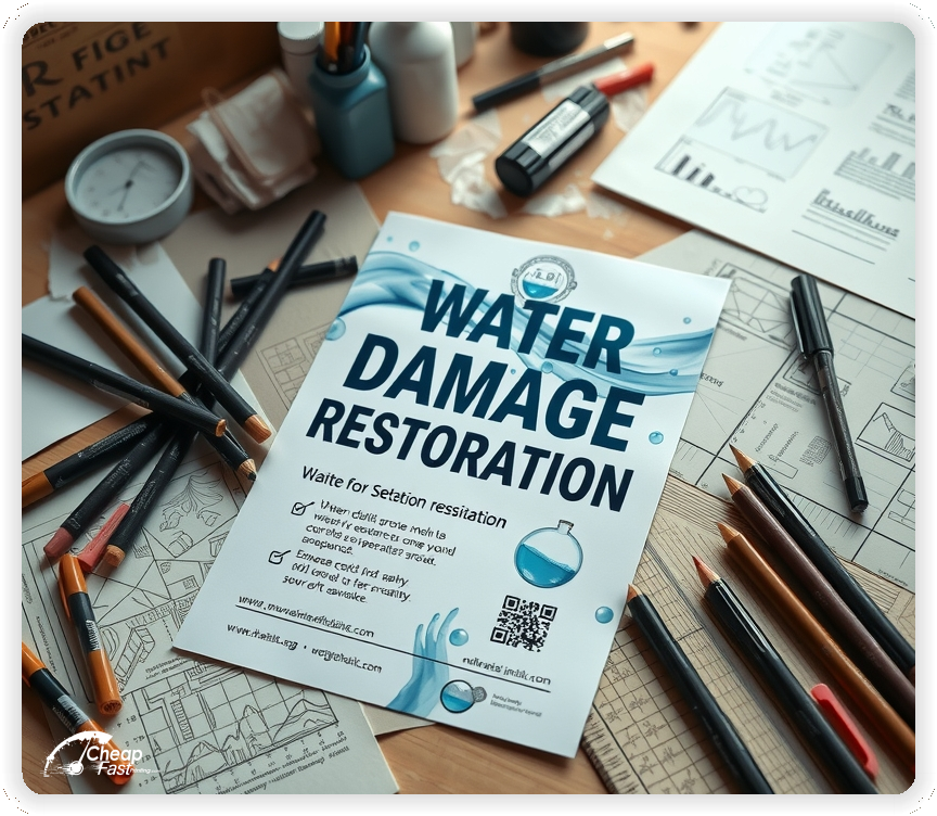
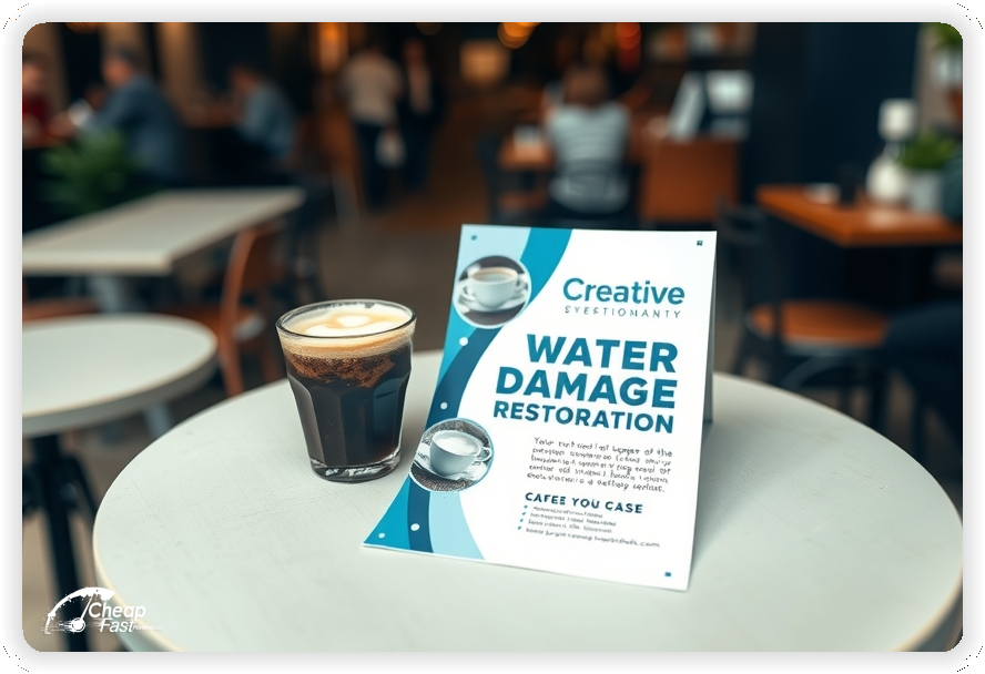
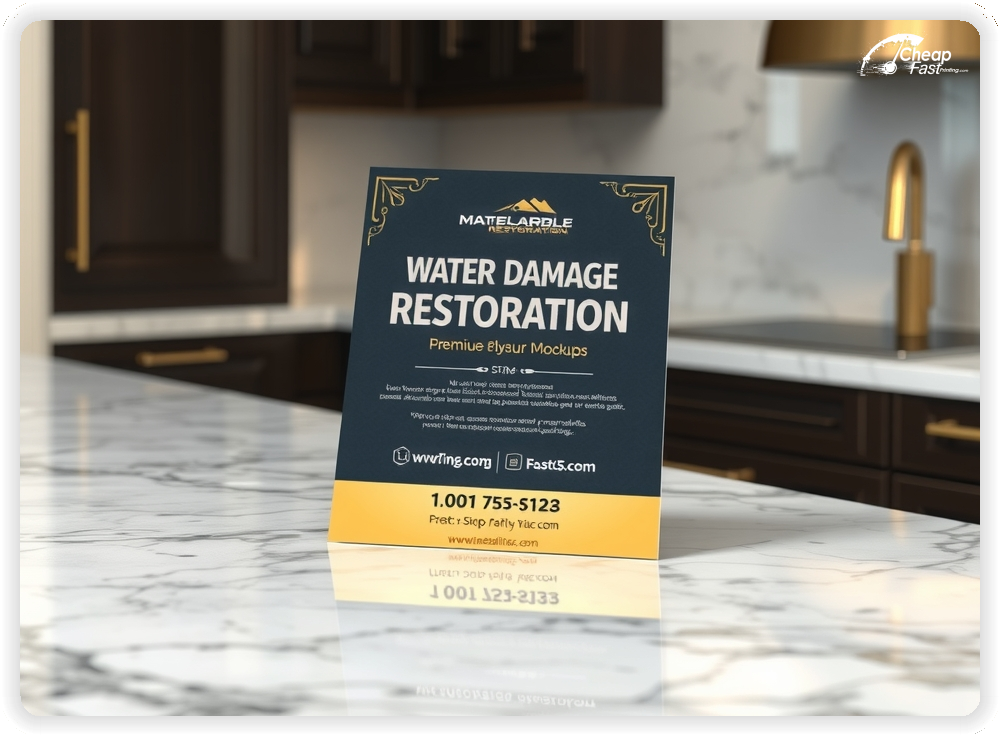
Water Damage Restoration Flyers for emergency cleanup pros: advertise rapid response, insurance coordination, and mold remediation services. This 11x17, 14pt gloss format creates a bold, trustworthy message that reads at a glance.
Use clear contact lines and one CTA—call now or scan to book a same-day assessment. These water damage restoration handouts work as door-hanger alternatives and counter displays to capture urgent leads.
Front-load urgency and trust: lead with response time and a clear phone or QR CTA. Mention certifications, insurance experience, and a concise list of services (water extraction, drying, mold remediation).
Keep the copy short, use high-contrast panels for the phone number, and place a small checklist of core services to reduce friction for callers.

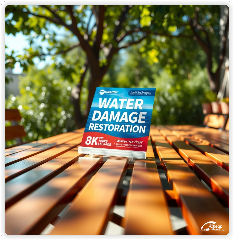


These flyers must communicate speed, competency, and contact clarity. Homeowners respond best when they immediately see '24/7 response' and a prominent phone number or QR code.
Keep the layout bold and legible—avoid thin scripts on glossy stock.
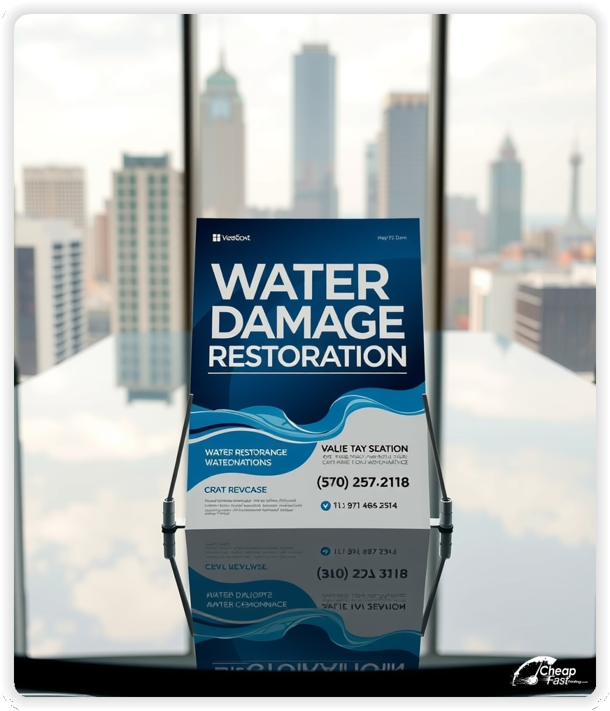
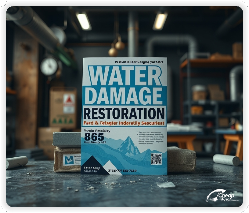
11x17, 14pt gloss flyers stand out in windows, counters, and handouts because they feel substantial and reflect professionalism. The larger size allows a bold phone line and a short checklist without small text.
Use the top area for your urgent promise (e.g., 'Same-Day Water Extraction') and the bottom for contact details and licensing badges.
Offer a clear, time-bound call to action: free emergency assessment, reduced inspection fee if booked within 24 hours, or guaranteed response windows.
A short bulleted list of immediate benefits reduces hesitation: fast arrival, insurance liaison, moisture monitoring, odor control.
Use one strong image or before/after thumbnail to demonstrate cleanup professionalism. Add license badges, association logos, and a short testimonial line.
Icons for '24/7', 'Licensed', 'Insured', and 'Free Estimates' help scanability on glossy paper flyers.
Make the phone number the largest element after the headline. Use high-contrast blocks for the number and QR placement so it reads under glare.
QR codes should link to a short mobile landing page that pre-fills 'water damage' as the service so callers land on a focused booking flow.
Lines like 'We assist with insurance claims' reassure property owners. Use short phrases—provide a QR link to a downloadable claims checklist to keep the flyer uncluttered.
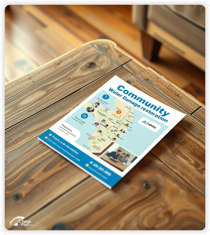
Distribute to property management offices, restoration partners, plumbers, and lobby counters for higher intent placements. Door-to-door handouts near flood-prone neighborhoods perform well after storms.
Use distinct QR URLs per channel to track which placements generate calls.
When offering mold remediation, use factual language: 'mold inspection available' and 'mold remediation specialists'. Stress safety protocols and remediation guarantees when applicable.
For crews and partners, plan bulk runs with staggered restocks so you can refresh contact numbers or seasonal offers without waste. Use wholesale printing services for multi-location campaigns.
Use trackable phone numbers or QR landing pages to measure lead-to-booking ratios. Report metrics weekly during campaigns to optimize placements and creative variants.
Use large headlines, short bullet lists, and a single primary CTA. Avoid long paragraphs; glossy stock can increase glare—test contrast and font weights for readability.
Provide editable templates so local teams can update phone numbers, QR codes, or offers without a full redesign. Templates speed up emergency restocks and keep branding consistent.
Use tasteful before/after imagery for credibility when available. Use icons for service lists to preserve clarity on small printed panels.
Include a short note about discounts for returning customers or priority scheduling for previous clients to encourage repeat business.
Mention proper disposal of contaminated materials if relevant; keep the language short and practical for homeowners asking about safety and cleanup.
Consider one-line FAQ callouts such as 'Do you work with insurance?' and 'Can you respond same day?'. Link to fuller answers on the landing page.
Maintain standby creatives for seasonal storms. Fast shipping and small-batch glossy paper flyers let you react quickly during demand spikes.
Your flyer has about 3 seconds to make an impression before it's tossed or kept. Don't bury the lead. Ensure your main headline and primary contact are visible from arm's length. Use high-contrast colors and bold typography to guide the eye exactly where you want it.
Target the Right Neighborhoods: Success isn't just about design; it's about distribution. Focus your efforts on neighborhoods that are at higher risk for water events or near recent storm paths. A tight radius around affected areas often yields the highest ROI.
Upload artwork or use our editable 11x17, 14pt gloss template to create water damage restoration flyers focused on rapid response and insurance-friendly messaging.
Proofing checks contrast, trimming, and spacing so the phone number and QR remain clear on glossy stock.
Proof review confirms QR destinations, test-phones, and claim-link accuracy so the flyer drives calls without errors.
Verify that phone lines are prominent at arm's length and that badge images remain sharp after trimming.
Use the 11x17 template to keep margins consistent and reserve space for a prominent phone line, QR code, and service checklist.
Templates protect phone placement and QR alignment so updates do not break contact clarity.
Consistent spacing keeps contact details visible after trimming and supports quick approvals during emergency restocks.
A stable grid helps field teams update numbers and offers without redesigns.
Templates preserve alignment for license badges and photo thumbnails across every run.

Loading Free Editable Designs...
Please wait while we prepare the template library.
Focused, contact-first layouts outperform crowded pieces because homeowners can call immediately. Measure campaigns by booked assessments and insurance referrals, not only print price.
Consistent templates reduce setup time and keep messages aligned across placements.
Compare response by calls, booked inspections, and completed claims to refine future restocks.
Use QR scan-to-book ratios and trackable numbers to identify the highest-performing placements.
Use one clear headline, one offer, and one primary CTA (call, scan, or order). Add the essentials: phone, website/QR, service area, hours (if relevant), and a trust signal like years in business or a short review snippet.
Keep the layout scannable: one hero image or icon, short bullets, and high-contrast CTA text that’s readable at arm’s length.
Yes. 11" x 17" balances visibility and readability without feeling cramped. It gives enough space for a strong headline, a benefits list, and a CTA while staying easy to hand out or place on counters and boards.
Prioritize spacing and hierarchy over extra copy so the main message lands in 3–5 seconds.
14 pt. Gloss with Gloss affects how the flyer feels and how colors read. Gloss tends to boost color and photos, matte reduces glare and feels more premium for text-heavy layouts, and uncoated is great for writing on.
If your design uses lots of fine text, choose clarity and contrast first; paper upgrades won’t fix a crowded layout.
500 works well when you want consistent visibility across multiple placements (counters, boards, partner locations, events) over a few weeks. Bulk also lowers unit cost so you can test a message and keep the winner running.
Track performance, then reprint the best offer instead of changing everything at once.
If price is your main hook, feature one simple offer (“ off” or “Starting at ) and keep the fine print minimal. If you have variable pricing, use a short value statement and send details to a landing page.
A clean offer + simple CTA typically outperforms a long price list.
Use a QR code to a dedicated landing page and add UTM tags for each route or partner. Track scans, form fills, and calls to identify the placements that actually convert.
For non-QR audiences, include a short, memorable URL or a trackable phone extension.
Start where your customers already are: complementary businesses, community boards, local events, and targeted neighborhoods. Ask partners for the most visible spot and refresh before your flyer gets buried.
Use a consistent route and restock winners; small, repeated placements usually beat one big drop.
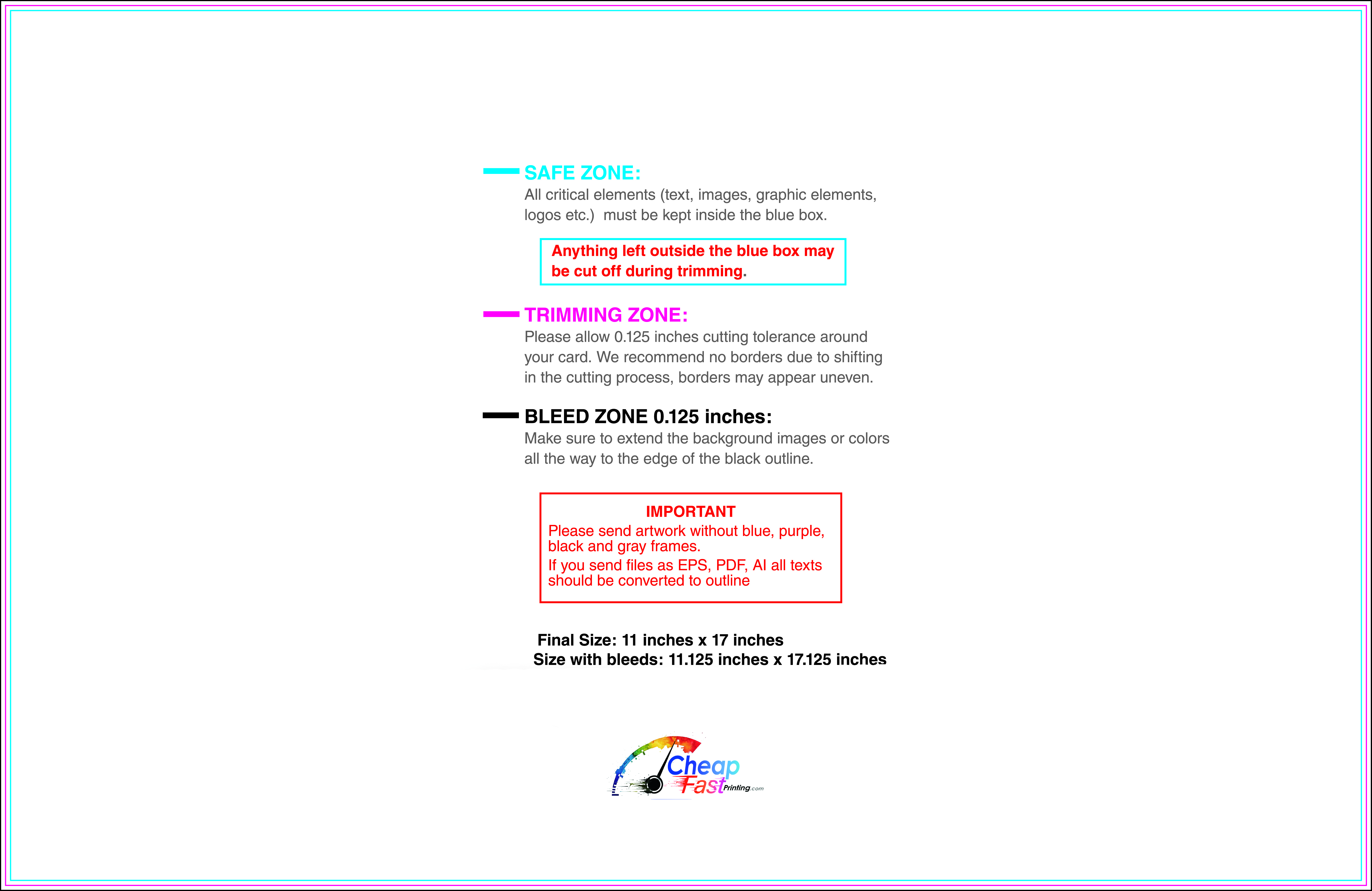
Submit a print-ready PDF (CMYK) at 300 DPI with 0.125" bleed and safe margins around important text. Keep thin lines above 0.5 pt and make QR codes at least ~0.8" square for reliable scanning.
Use vector logos when possible and limit your fonts to maintain a clean, professional look.
Request a proof so you can confirm spelling, margins, and QR/URL accuracy before production. Proofing is the easiest way to prevent expensive reprints.
Double-check phone numbers and offer terms first—those are the most common issues.
Match your flyer headline and offer to the landing page headline so visitors feel they’re in the right place. Keep the CTA consistent and make the page fast to load and easy to complete on mobile.
If you run ads, retarget QR visitors with the same offer to improve conversions.
Plan a steady supply for property managers, contractor counters, and partner locations. Small runs allow message tweaks without waste.
Predictable timing supports stronger booking response and keeps the offer current.
Track which placements drive the most QR scans and prioritize restocks there.
Use smaller top-up runs to match seasonal storms without redesigning the layout.
Balance immediate restocks with weekly top-ups to keep coverage consistent.
Use distribution logs to identify high-performing boards and retire low-response locations.
For emergency pushes, cheap glossy paper flyers in short runs let you scale quickly while maintaining clarity.

