
Professionally designed for 4.25" x 5.5" flyers. Fully editable & free!
Preparing Templates…
Grocery decisions happen fast and close to home. A strong flyer makes the next trip feel urgent with a short list of weekly specials and a clear savings hook.
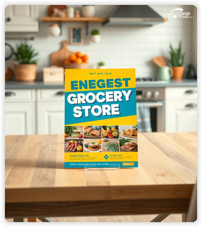
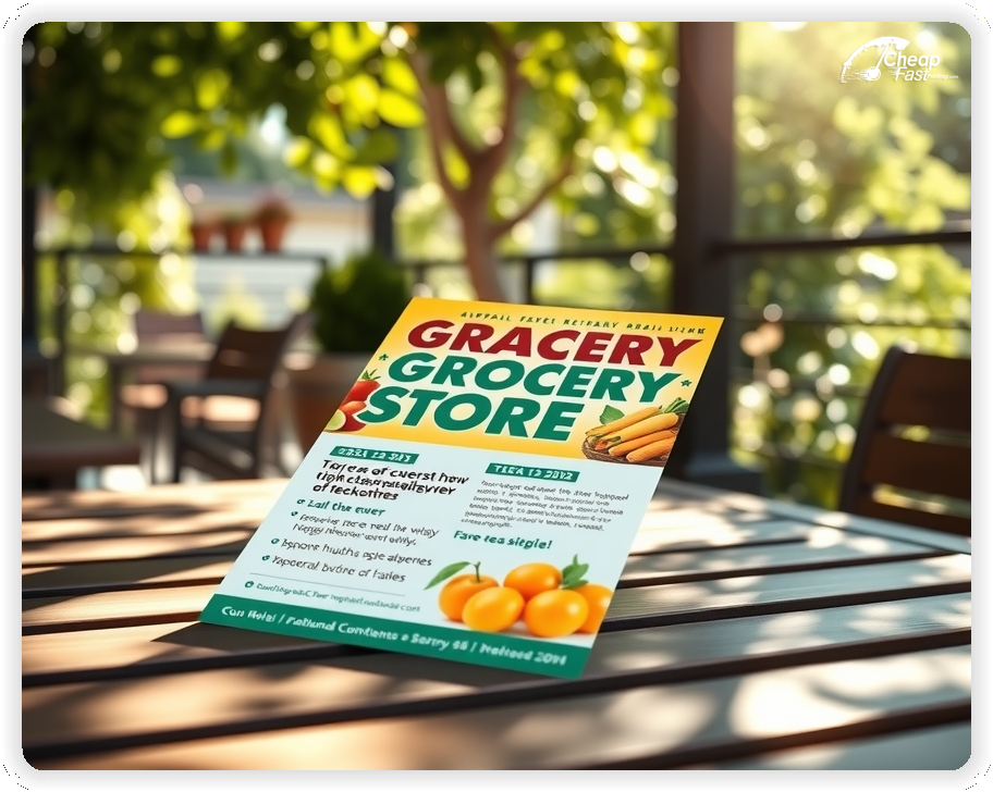
For neighborhood drops and counter stacks, 4.25x5.5 grocery store flyers are easy to hand out, slip into bags, and post on local boards.
Uncoated paper flyers are a practical choice for coupons because shoppers can circle deals, jot notes, and keep the piece on the fridge.
Use one simple coupon and keep the contact details tight so the handout stays readable at a glance.
When you need speed, rapid grocery store flyers help you launch a weekend promo or restock displays without delaying the sale.
Add a QR code to your digital circular or promo page to connect print with trackable grocery store marketing materials, then measure results by placement.
Lead with 5–8 high-margin weekly specials and one “hero deal” that makes the trip feel worth it.
Keep pricing simple and readable, then place the coupon, QR, and CTA together so shoppers know exactly how to redeem.
Use high-contrast design, clear category headers (produce, meat, deli, bakery), and a short time window to create urgency without clutter.
These flyers win when they make the next trip feel easy and worth it. Shoppers want a quick list of deals, a short time window, and a clear way to redeem.
This format keeps grocery store handouts simple, readable, and effective.
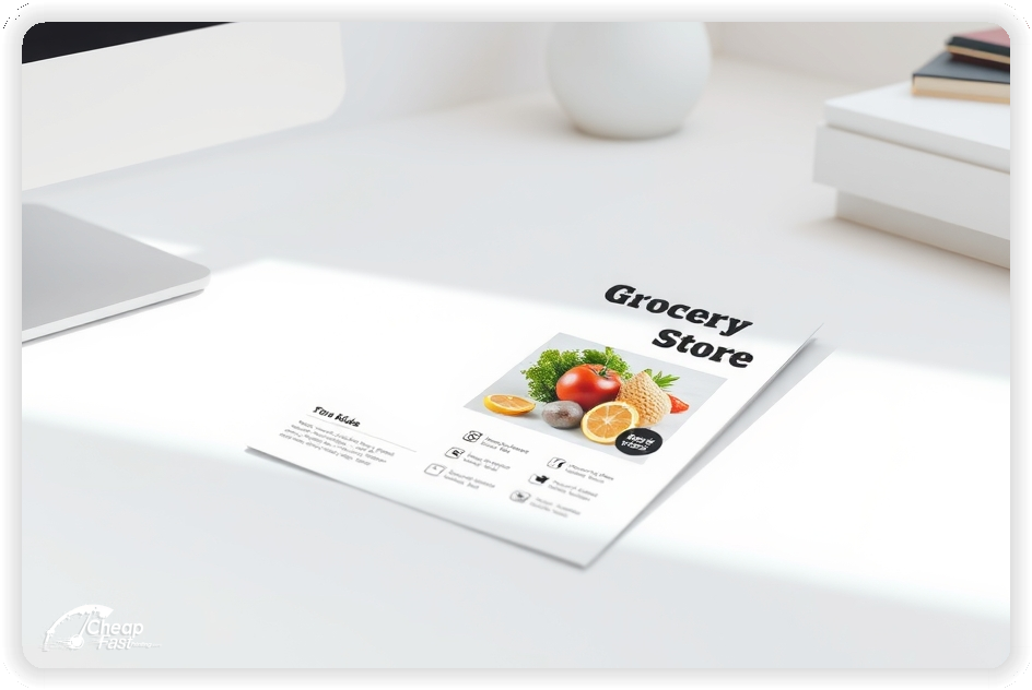
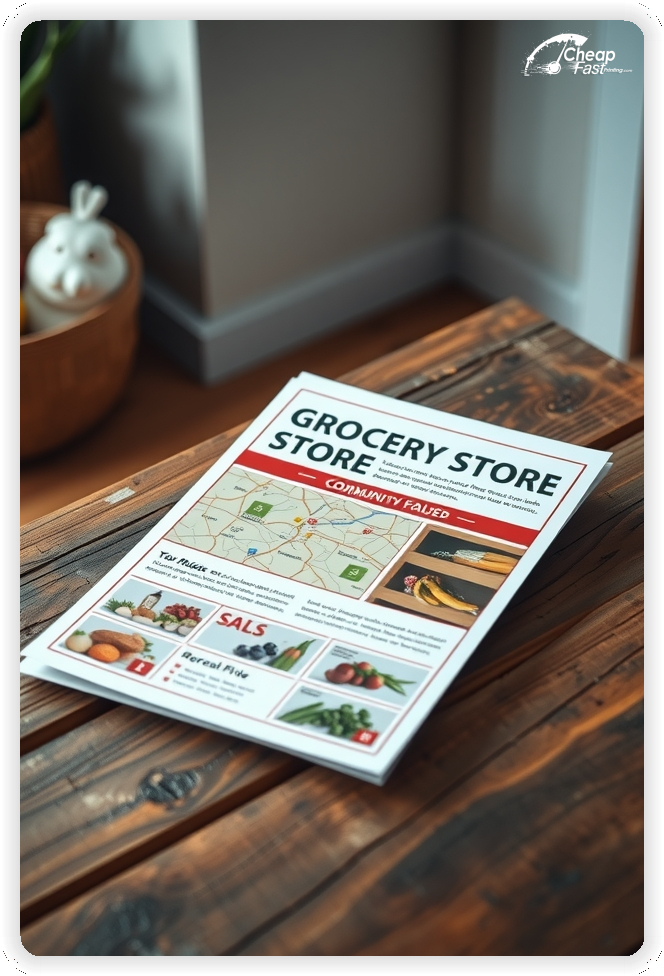
4.25x5.5 grocery store flyers are a practical size for checkout counters, take-home bags, and local racks. They scan quickly and feel like a helpful reminder rather than a long circular.
Use the top third for the hero deal and date range, the middle for the specials list, and the bottom for the coupon/QR plus hours.
When your goal is fast response, compact grocery store marketing materials tend to outperform crowded layouts.
Uncoated paper flyers are great for grocery promotions because they are easy to write on. Shoppers can circle deals, jot a list, or keep a stamped coupon card without smearing.
Uncoated surfaces also reduce glare under store lighting, keeping prices and dates readable at a glance.
For custom grocery store flyers, uncoated stock helps the coupon area feel practical and easy to use.
Choose offers that build a full trip: buy-one deals, bundle pricing, and category discounts like “$5 off $50” or “3 for $10.”
Keep the rules short on the flyer and move full terms to a landing page. This keeps grocery store flyers clean while still reducing checkout friction.
If you run a loyalty program, add one line that explains how to earn or redeem.
Use a simple list: category header, product name, price, and a short qualifier like “with card” if needed.
Keep typography consistent so prices align visually. Highlight only 1–2 items so the flyer doesn’t look noisy.
Clear formatting improves response because shoppers can decide quickly and keep the flyer for the next trip.
Pick one core message for each campaign: freshest produce, fastest pickup, local specialties, or best value.
Consistency matters. When the same promise shows up on every run, shoppers recognize your store before they compare prices.
Use a matching headline on your website or digital circular to keep the message aligned.
Use a short proof point: locally owned, fresh-cut daily, in-house bakery, or “USDA Choice” for key departments.
Keep it to one line near the CTA so the flyer stays focused on deals.
A single trust line helps your grocery store marketing materials feel credible without adding clutter.
Add one quick access note: “easy parking,” “curbside pickup,” or “same-day delivery available.”
These details reduce hesitation and help shoppers choose your store for the next trip.
Keep the note short and place it near the hours and address.
Use one line: “Join rewards for member-only pricing” or “Earn points on every trip.”
Keep details on a landing page so the flyer remains easy to scan.
This helps grocery store handouts stay focused while still signaling long-term value.
Holiday meals, grilling season, back-to-school, and game-day snacks are reliable themes.
Use a short callout like “Weekend BBQ Deals” or “Holiday Dinner Essentials” and keep the date range visible.
Seasonal urgency pairs well with rapid grocery store flyers when you need a quick refresh.
Place stacks where grocery decisions happen: apartment lobbies, laundromats, coffee shops, community centers, and school bulletin boards.
Ask for the best visible spot and restock weekly. Track which placements produce the most scans or coupon redemptions.
Consistent placement makes bulk grocery store flyers worth the investment over time.
Give every flyer one action: view the digital circular, clip a coupon, or join rewards.
Use a QR code that links to a short page with the same headline and the same top deal for continuity.
Track scans by placement to learn which neighborhoods respond best to your grocery store flyers.
Mid-week drops work well for weekend shopping. Keep the promo window short so the flyer feels current.
Plan a main run and a smaller restock run to keep counters full without overprinting.
When you need to move inventory quickly, 10000 grocery store flyers can cover multiple routes with one consistent message.
Match your flyer headline to your homepage banner or circular headline to avoid confusion.
Use the same item names and price formatting so shoppers recognize the offer instantly.
Consistency makes your grocery store marketing materials feel reliable and easier to redeem.
Test two flyers with the same layout: change only the hero deal and keep everything else constant.
Track results using unique QR links or coupon codes per version.
Once you know what pulls best, scale with bulk grocery store flyers to keep distribution consistent.
Chains and multi-location stores perform best with one master template and localized address blocks.
Keep the weekly specials consistent, then adjust store hours, pickup options, and the nearest location list.
That approach keeps grocery store flyers printing simple while still making each flyer feel local.
New shoppers need simple guidance. Use one line that explains how to redeem deals and whether a loyalty card is required.
Keep details short and link to a landing page for full terms.
This reduces checkout friction and increases coupon use.
Choose a tone that matches your audience: value-forward, fresh-focused, or premium specialty.
Keep language consistent across pricing blocks, departments, and your CTA.
Aligned tone helps your custom grocery store flyers feel intentional and trustworthy.
Add one retention line: “New weekly deals every Wednesday” or “Clip next week’s coupon in-store.”
Keep it short so it doesn’t compete with this week’s hero deal.
Repeat messaging supports steady trips without forcing deeper discounts.
If it’s relevant, include a short quality note such as “fresh-cut daily” or “hand-selected produce.”
Keep the note brief and place it near your trust line.
One clear quality signal can reduce price shopping and improve conversion.
If you’re locally owned, say it in one line. Community matters in grocery choice.
Keep it short and let your website tell the deeper story.
Local credibility helps your grocery store handouts feel more personal.
Grocery flyers live and die by readability. Crisp print keeps prices, dates, and coupon rules legible.
A clean print finish makes the flyer feel trustworthy and reduces misreads at checkout.
When the piece looks professional, the store feels more reliable.
Many shoppers discover new stores through neighborhood boards, community racks, and shared local spaces.
For steady local outreach, bulk grocery store flyers help you keep distribution consistent across weeks.
This supports awareness while the QR and coupon capture action.
Use simple CTAs: “Shop this weekend,” “Clip this coupon,” or “Scan for the full circular.”
Place the CTA near the coupon and date range so the next step is obvious.
Clear CTAs help shoppers decide quickly and keep the flyer for the next trip.
Spacing matters in price-heavy layouts. Use generous margins and clear category dividers.
Keep text blocks short so the price list stays readable.
A balanced layout keeps attention on the hero deal and the coupon.
Use one short add-on line: deli platters, bakery cakes, or catering trays.
Keep details on a landing page so the flyer stays focused on weekly specials.
This supports higher basket value without crowding the layout.
Community giveaways, school partnerships, and local event sponsorships can expand reach.
Use one brief callout and send details to a dedicated page.
This adds depth to your grocery store marketing materials without cluttering the deals list.
Rotate featured categories: local produce, seafood weekends, bulk pantry deals, or ready-to-eat meals.
Keep the feature block consistent so shoppers learn where to look.
That structure makes repeat runs easier and keeps grocery store handouts predictable.
If inventory is tight, add one short note like “while supplies last” and keep it near the hero deal.
This sets expectations and reduces complaints.
Short notes preserve readability and keep the flyer actionable.
If you offer services like a butcher counter, fresh seafood, or made-to-order sandwiches, add one short line.
Keep it secondary to the specials list.
Service callouts can differentiate your store without taking over the flyer.
Themed weekends make promotion simple: “Taco Night,” “Pasta Week,” or “Family Dinner Deals.”
Keep dates on the flyer and move full item lists online.
Themed series create repeat visits without requiring constant redesign.
Use one clear line: “Show this flyer at checkout” or “Scan to clip the coupon.”
Keep rules brief and consistent across promotions.
Simple redemption guidance increases coupon usage and reduces staff questions.
If it matters, include one short note like “EBT accepted,” “wheelchair accessible,” or “senior discount days.”
Keep it short and avoid long explanations on the flyer.
Small details improve trust and help shoppers choose your store confidently.
Flyers work best when they create one clear path from interest to checkout. A strong headline, a visible hero deal, and a simple coupon are enough.
When the layout stays focused, grocery store flyers can drive real foot traffic without heavy copy.
Pair print with a short promo page so shoppers can quickly confirm availability, hours, and additional specials.
Your flyer has about 3 seconds to make an impression before it's tossed or kept. Don't bury the lead. Ensure your main headline and primary offer are visible from arm's length. Use high-contrast colors and bold typography to guide the eye exactly where you want it.
Target the Right Neighborhoods: Success isn't just about design; it's about distribution. Focus your efforts on neighborhoods that match your ideal customer profile. For local businesses, a tight radius around your location often yields the highest ROI.
Most shoppers do not decide the moment they touch a flyer. They notice, they remember, and they act later when it is time to restock. For grocery promotions, plan distribution like a routine instead of a single drop. Pick two to four tight neighborhoods, repeat every one to two weeks, and keep the hero deal consistent so recognition builds.
Pair one primary route with two supporting placements. A counter stack at a related business, an apartment lobby, or a community board creates extra touches. Use the same offer across all placements and track the channel with a distinct QR destination or coupon code. When you know where redemptions come from, you can scale the winning route and stop printing pieces that do not produce trips.
Your flyer has about 3 seconds to make an impression before it's tossed or kept. Don't bury the lead. Ensure your main headline and primary offer are visible from arm's length. Use high-contrast colors and bold typography to guide the eye exactly where you want it.
Target the Right Neighborhoods: Success isn't just about design; it's about distribution. Focus your efforts on neighborhoods that match your ideal customer profile. For local businesses, a tight radius around your location often yields the highest ROI.
Upload artwork and keep the focus on one hero deal, a short specials list, and one coupon for custom grocery store flyers.
Proofing checks contrast, trimming, and spacing so prices, dates, and coupon rules remain clear.
Proof review also confirms the QR destination, promo code, and contact lines so your grocery store marketing materials work without errors.
Confirm that the promo page loads quickly on mobile so shoppers can redeem instantly.
Verify that coupon rules are short and readable at arm’s length.
Check that the specials list aligns cleanly so prices are easy to compare.
Confirm that the store hours and address are correct and clearly visible.
Use the 4.25x5.5 template to keep margins consistent and reserve space for your hero deal, date range, and coupon/QR blocks.
Templates protect price alignment so weekly updates do not break the layout.
Consistent spacing keeps item names, prices, and fine print readable after trimming and supports faster approvals.
A stable grid helps staff refresh weekly specials without redesigning from scratch.
Consistent templates also support multi-location updates with minimal editing.
They preserve alignment for QR placement, promo codes, and phone lines across every run.
This keeps seasonal updates clean and easy to manage.

Loading Free Editable Designs...
Please wait while we prepare the template library.
Focused layouts outperform crowded pieces because shoppers can scan deals quickly.
Consistent templates reduce design time and keep the message aligned week to week.
Compare response by coupon redemptions, basket size, and repeat visits rather than only print cost.
When the hero deal stays consistent, shoppers recognize your store faster and shop with less hesitation.
Track redemption by offer type to refine the next print cycle.
Review scan-to-landing-page ratios to understand which placements generate the best conversions.
Use one clear headline, one offer, and one primary CTA (call, scan, or order). Add the essentials: phone, website/QR, service area, hours (if relevant), and a trust signal like years in business or a short review snippet.
Keep the layout scannable: one hero image or icon, short bullets, and high-contrast CTA text that’s readable at arm’s length.
Yes. 4.25" x 5.5" balances visibility and readability without feeling cramped. It gives enough space for a strong headline, a benefits list, and a CTA while staying easy to hand out or place on counters and boards.
Prioritize spacing and hierarchy over extra copy so the main message lands in 3–5 seconds.
14 pt. Uncoated with Uncoated affects how the flyer feels and how colors read. Gloss tends to boost color and photos, matte reduces glare and feels more premium for text-heavy layouts, and uncoated is great for writing on.
If your design uses lots of fine text, choose clarity and contrast first; paper upgrades won’t fix a crowded layout.
10000 works well when you want consistent visibility across multiple placements (counters, boards, partner locations, events) over a few weeks. Bulk also lowers unit cost so you can test a message and keep the winner running.
Track performance, then reprint the best offer instead of changing everything at once.
If price is your main hook, feature one simple offer (“ off” or “Starting at ) and keep the fine print minimal. If you have variable pricing, use a short value statement and send details to a landing page.
A clean offer + simple CTA typically outperforms a long price list.
Use a QR code to a dedicated landing page and add UTM tags for each route or partner. Track scans, form fills, and calls to identify the placements that actually convert.
For non-QR audiences, include a short, memorable URL or a trackable phone extension.
Start where your customers already are: complementary businesses, community boards, local events, and targeted neighborhoods. Ask partners for the most visible spot and refresh before your flyer gets buried.
Use a consistent route and restock winners; small, repeated placements usually beat one big drop.
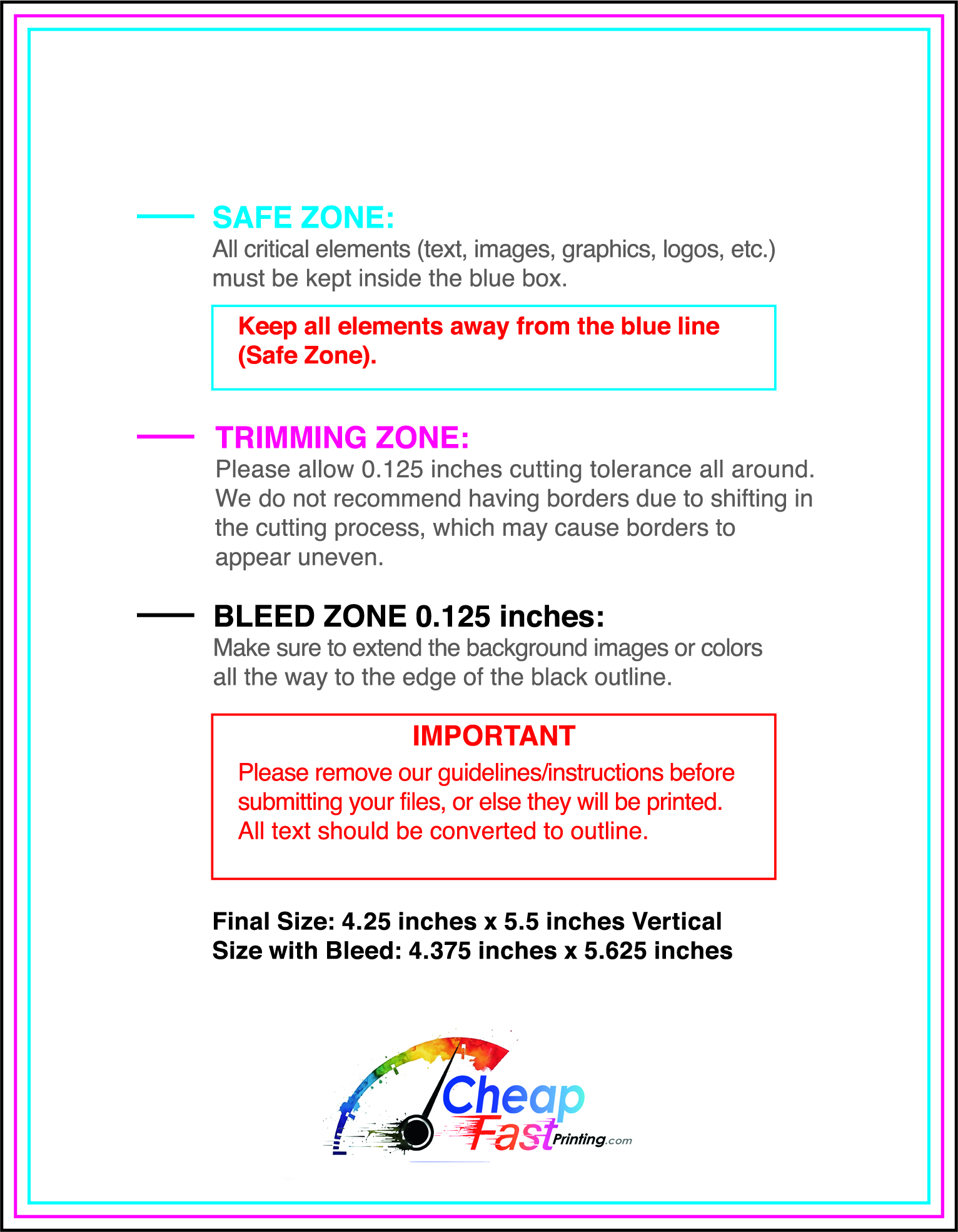
Submit a print-ready PDF (CMYK) at 300 DPI with 0.125" bleed and safe margins around important text. Keep thin lines above 0.5 pt and make QR codes at least ~0.8" square for reliable scanning.
Use vector logos when possible and limit your fonts to maintain a clean, professional look.
Request a proof so you can confirm spelling, margins, and QR/URL accuracy before production. Proofing is the easiest way to prevent expensive reprints.
Double-check phone numbers and offer terms first—those are the most common issues.
Match your flyer headline and offer to the landing page headline so visitors feel they’re in the right place. Keep the CTA consistent and make the page fast to load and easy to complete on mobile.
If you run ads, retarget QR visitors with the same offer to improve conversions.
Plan a steady supply for counter stacks, bag inserts, and partner locations. Short runs allow weekly changes without waste.
Predictable timing supports stronger redemption and keeps the message current.
Track which locations drive the most QR scans or coupon redemptions and prioritize restocks there.
Use smaller top-up runs to match seasonal changes without redesigning the layout.
Balance weekly and monthly distributions to keep coverage consistent.
Use distribution logs to identify placements that perform well and retire low-response locations.
For bigger coverage, 10000 grocery store flyers and other bulk grocery store flyers help keep budgets stable while you scale.

