Professionally designed for 4.25" x 5.5" flyers. Fully editable & free!
Preparing Templates…
Showcase a portfolio with a compact piece that feels like a gallery card, not a standard ad. Lead with one hero image and a clean offer so the work stays center stage.
14pt uncoated cover keeps tones natural and avoids glare in mixed lighting. Add a QR to book and keep copy minimal so the images carry the message.
Pick one signature style and repeat it across every drop. Consistent image treatment, spacing, and typography builds recognition faster than rotating looks.
Keep the offer short, keep contact info obvious, and let the portfolio do the selling.


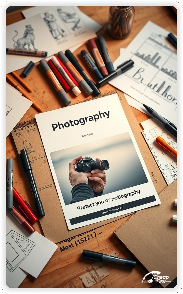
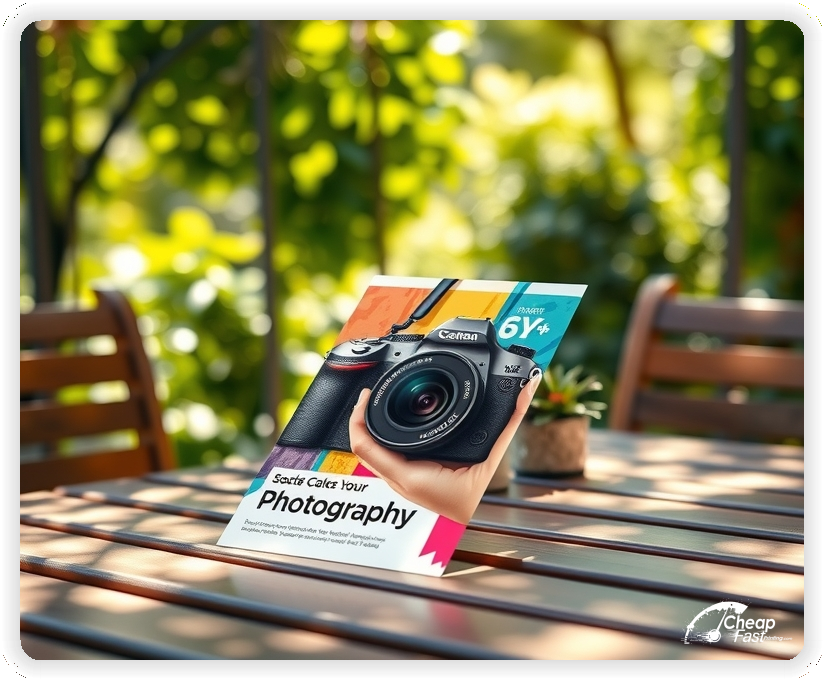

A strong piece needs one clear visual story and one clear next step. Use a single hero image, a short offer, and a booking path that fits on mobile.
This keeps the message clean while letting the portfolio build trust.
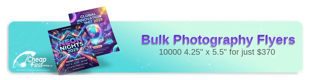
4.25x5.5 custom flyers feel like a premium promo card: easy to hand out, easy to keep, and quick to scan.
This size is ideal for front desks, partner counters, and event tables where space is limited. It also prints beautifully when you let the image dominate and keep copy light.
Use the top half for the hero image, and reserve the bottom half for your offer and booking CTA.
Uncoated cover stock gives images a natural, tactile look without strong reflections. It works well for portrait tones, black-and-white work, and editorial styles.
Because uncoated paper is less glossy, keep midtones clean and avoid overly dark backgrounds. Strong contrast and careful sharpening help details stay crisp.
This pairing is a solid choice for uncoated paper flyers that aim for a premium brand impression.
People book photographers based on style. Point to proof quickly: “View full galleries” beats a long pitch every time.
Use a QR code that lands on a short page with 6–12 images, your niche, and one inquiry form. If you shoot multiple niches, run separate versions so the imagery matches the offer.
Keep the CTA specific and action-driven: “Book mini sessions” or “Get headshot pricing” works better than generic “Contact us”.
Add one deadline or limit to create urgency, such as “Limited weekends” or “Only 12 spots”. Make sure the QR destination matches the same headline and offer.
Bulk runs work when the piece feels like a keepsake, not a coupon. Let the imagery lead, keep the offer short, and use clean typography.
For local outreach, bulk photography flyers keep your work in circulation at partner locations without relying only on ads.
Place flyers where your ideal clients already are: salons, boutiques, gyms, cafés, wedding vendors, real estate offices, or coworking spaces.
Rotate fresh stacks every few weeks and keep the hero image consistent long enough for recognition to build.
Handing out photography handouts at local events also works well when the offer is simple and the QR is easy to scan.
Use one QR code per campaign so you can measure which placement performs best. Keep the landing page fast: portfolio images, the offer, and a simple form.
If you run multiple offers, use separate QR destinations. That keeps tracking clean and prevents visitors from getting lost.
Seasonal promos make decisions easy: spring family sessions, summer graduations, fall minis, and holiday portraits.
Keep dates tight and lead with the benefit. If demand shifts quickly, short turnaround helps you keep messaging current.
Match the flyer headline to the booking page headline, and use the same lead image on social posts. Consistency reduces friction and improves response.
Aligned photography marketing materials build recognition faster than constantly changing styles.
Test one variable at a time: the offer line, the CTA, or the hero image. Keep the layout consistent so results are comparable.
Once a winner is clear, scale with photography flyers printing that fits your distribution plan.
If you work with multiple associates or cover multiple service areas, keep one core design and localize only the contact block or QR destination.
That makes it easier to restock and keeps brand recognition consistent across neighborhoods.
One flyer should speak to one buyer. A wedding client, a corporate headshot buyer, and a family session client look for different proof and different language.
Build a version for each niche, keep the same visual style, and swap only the hero image and offer. That keeps your brand consistent while making the message feel personal.
If you shoot multiple niches, run separate versions for each and track which one drives the best inquiries.
Mini sessions work because they are simple to say yes to. Lead with a short benefit, a clear date window, and a limited number of spots.
Use one line for the offer, then send details to the QR landing page so the print piece stays clean. A tight timeframe and a clear next step turn interest into bookings.
This approach is ideal for seasonal pushes and quick fills when you need response from local foot traffic.
Headshot buyers want predictability. Highlight fast scheduling, consistent lighting, and an easy selection process.
Use a small set of thumbnails on the landing page to show variety, then include a simple form that captures company name, team size, and preferred dates.
For team outreach, place 4.25x5.5 photography flyers at coworking spaces and professional service offices where decision makers already visit.
Wedding and event buyers trust referrals. Place flyers with planners, venues, florists, bridal shops, DJs, and dress boutiques, then keep the offer aligned with what those partners hear most often.
Use a QR destination that starts with your best wedding work and ends with one simple inquiry form. Keep your availability statement honest and time-bound so expectations stay clear.
Vendor placement works best when the flyer looks premium and feels like a small portfolio sample.
Portrait marketing works when you sell outcomes, not gear. Use benefits like “confident LinkedIn presence” or “family portraits you’ll print” instead of listing camera specs.
Keep the session description short and use the landing page for package options, wardrobe guidance, and delivery timelines.
When the story is clear, custom promo pieces feel like a curated invite rather than a discount ad.
Set clean expectations so inquiries stay qualified. Avoid heavy editing claims on the flyer and keep retouching language simple: natural cleanup, color correction, and light skin smoothing when requested.
Use the QR landing page to clarify what is included and what is optional. This reduces back-and-forth and improves conversion because the buyer understands the process.
Clear policies protect your time while keeping the message focused on the work.
People care about when they get results. Add one short timeline statement like “proof gallery in 48 hours” or “edits delivered in 7 days” only if you can consistently hit it.
If you offer rush delivery, mention it as an option rather than a promise. Keep the exact terms on the landing page so the flyer remains uncluttered.
Simple timelines reduce friction and help buyers choose you over slower options.
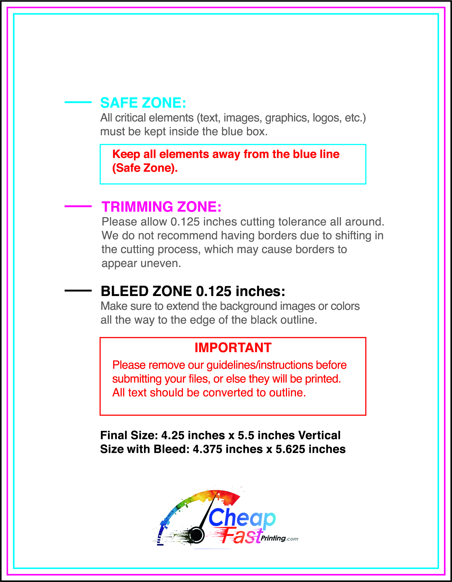
Uncoated stock can look premium, but it benefits from clean files. Use high-resolution images, avoid heavy compression, and crop intentionally so key details stay away from the trim edge.
Keep fine text large enough to read at arm’s length, especially URLs and email addresses. If the image is dark, lift shadows slightly so detail does not get lost on uncoated cover.
This keeps uncoated paper flyers looking crisp and professional in real-world lighting.
Uncoated paper absorbs ink more than glossy finishes, so deep blacks and heavy saturation can soften. Aim for clean midtones, strong but not crushed shadows, and simple backgrounds behind text.
If you want a dramatic look, use contrast in the image itself and keep the typography minimal. A subtle border around a QR code can also improve scan reliability.
The goal is a natural, fine-art impression that supports your brand.
One short testimonial can do more than a paragraph of claims. Use a single sentence that matches your niche, such as a bride mentioning organization or a business owner mentioning speed.
Avoid stacking multiple reviews on the flyer. Put deeper proof on the landing page, and keep the print piece clean so the hero image remains the focus.
Trust works best when it supports the visuals instead of competing with them.
Referral offers work when they feel simple and fair. Use a small benefit like a print credit or a free upgrade rather than a big discount that devalues your work.
Give partners a QR destination that is unique to them so you can track results and pay commissions or credits accurately.
These photography marketing materials perform best when the incentive is subtle and the portfolio is front-and-center.
Flyer traffic is impatient. Keep the landing page short: 6–12 images, your niche statement, the offer, and one form.
Make the form easy: name, email, date preference, and a short note. Add optional fields only if they help qualify leads, such as location or team size.
A fast page improves conversion for photography handouts because the next step is obvious on mobile.
Cost-effective printing can still feel premium if the design is restrained. Use one hero image, one font family, and generous white space.
Avoid coupon-style clutter. Keep discounts small or switch to a value offer like “free consultation” or “complimentary style guide”.
When the piece looks intentional, cheap photography flyers can still support a high-end brand perception.
Your flyer has about 3 seconds to earn attention. Lead with your best image, then place the offer and QR where the eye naturally lands.
Target the Right Neighborhoods: Distribution matters as much as design. Put your flyers where your ideal clients already spend time, refresh consistently, and keep the hero image stable long enough for recognition to build.
Most buyers do not book the moment they see a flyer. They notice your style, remember it, and act later when timing is right. Plan distribution as a repeatable loop, not a one-time drop. Choose two to four tight neighborhoods or partner routes, then refresh every two to three weeks so familiarity grows.
Pair one primary route with two supporting placements. A counter stack at a vendor, a community board, and an event table creates multiple touches. Use the same offer across placements and track each channel with a distinct QR destination so you can scale what works.
When you know which placement wins, bulk runs become a predictable lead source instead of a guessing game.
Reduce unqualified inquiries by being clear about where you work. If you travel, keep it simple on the flyer with one short line like “Serving [city] + nearby areas”.
Use the landing page to explain travel fees, venue requirements, and whether you have a studio space. This protects your time and helps the right clients move forward confidently.
Clear coverage notes also help partner placements perform because people know you are available in their area.
A short preparation tip can increase satisfaction without adding clutter. Instead of long guidance on the flyer, use the QR destination to share what to wear, how to coordinate colors, and how to arrive camera-ready.
This reduces reschedules and improves results, especially for family sessions and headshots where timing matters.
When your process feels organized, it reinforces trust and makes the booking decision easier.
Your flyer has about 3 seconds to earn attention. Lead with your best image, then put the offer and QR where the eye naturally lands.
Target the Right Neighborhoods: Distribution matters as much as design. Place your flyers where your ideal clients already spend time, and refresh consistently so recognition builds.
Upload artwork and keep the focus on one hero image and one offer for custom photography flyers.
Proofing checks trimming, safe zones, and how your images reproduce on uncoated stock.
Confirm contact lines, URLs, and the offer headline so the piece works without friction.
Use the 4.25x5.5 template to keep margins consistent and protect your hero image from trimming.
Reserve a clean lower block for the offer, QR, and contact line so updates stay simple.
Templates also keep typography aligned across seasonal promos and new session types.

Loading Free Editable Designs...
Please wait while we prepare the template library.
Portfolio-first layouts outperform crowded pieces because the image earns trust quickly.
Compare response by inquiries, booking rate, and average job value rather than only print cost.
Track scan-to-inquiry ratios per placement and scale the locations that perform.
Use one clear headline, one offer, and one primary CTA (call, scan, or order). Add the essentials: phone, website/QR, service area, hours (if relevant), and a trust signal like years in business or a short review snippet.
Keep the layout scannable: one hero image or icon, short bullets, and high-contrast CTA text that’s readable at arm’s length.
Yes. 4.25" x 5.5" balances visibility and readability without feeling cramped. It gives enough space for a strong headline, a benefits list, and a CTA while staying easy to hand out or place on counters and boards.
Prioritize spacing and hierarchy over extra copy so the main message lands in 3–5 seconds.
14 pt. Uncoated with Uncoated affects how the flyer feels and how colors read. Gloss tends to boost color and photos, matte reduces glare and feels more premium for text-heavy layouts, and uncoated is great for writing on.
If your design uses lots of fine text, choose clarity and contrast first; paper upgrades won’t fix a crowded layout.
10000 works well when you want consistent visibility across multiple placements (counters, boards, partner locations, events) over a few weeks. Bulk also lowers unit cost so you can test a message and keep the winner running.
Track performance, then reprint the best offer instead of changing everything at once.
If price is your main hook, feature one simple offer (“ off” or “Starting at ) and keep the fine print minimal. If you have variable pricing, use a short value statement and send details to a landing page.
A clean offer + simple CTA typically outperforms a long price list.
Use a QR code to a dedicated landing page and add UTM tags for each route or partner. Track scans, form fills, and calls to identify the placements that actually convert.
For non-QR audiences, include a short, memorable URL or a trackable phone extension.
Start where your customers already are: complementary businesses, community boards, local events, and targeted neighborhoods. Ask partners for the most visible spot and refresh before your flyer gets buried.
Use a consistent route and restock winners; small, repeated placements usually beat one big drop.
Submit a print-ready PDF (CMYK) at 300 DPI with 0.125" bleed and safe margins around important text. Keep thin lines above 0.5 pt and make QR codes at least ~0.8" square for reliable scanning.
Use vector logos when possible and limit your fonts to maintain a clean, professional look.
Request a proof so you can confirm spelling, margins, and QR/URL accuracy before production. Proofing is the easiest way to prevent expensive reprints.
Double-check phone numbers and offer terms first—those are the most common issues.
Match your flyer headline and offer to the landing page headline so visitors feel they’re in the right place. Keep the CTA consistent and make the page fast to load and easy to complete on mobile.
If you run ads, retarget QR visitors with the same offer to improve conversions.
Plan a steady supply for partner counters and local events. Smaller top-up runs let you refresh seasonal offers without waste.
Track which placements drive the most QR scans and restock those first.
For larger pushes, 10000 photography flyers keep distribution consistent while you refine the winning offer.

