
Professionally designed for 4.25" x 11" flyers. Fully editable & free!
Preparing Templates…
Choosing a physical therapist is a decision driven by pain, trust, and convenience. A professional flyer bridges the gap between a doctor's referral and the first appointment.
Ordering 1000 physical therapy flyers in the unique 4.25x11 physical therapy flyers format gives you a slim, rack-ready piece that fits perfectly in medical office displays and gym counters.
Effective physical therapy marketing materials focus on outcomes: mobility, pain reduction, and recovery. When your flyer clearly communicates these benefits along with insurance acceptance, it becomes a powerful patient acquisition tool.
High-quality printing on kraft paper flyers adds a tactile element of warmth and natural health, reinforcing your clinic's welcoming atmosphere.
Focus on specific conditions. 'Back Pain Relief' or 'Sports Injury Recovery' catches more attention than general 'Physical Therapy'.
Include a clear 'Insurance Accepted' section. This is often the first question a new patient has.
Use the vertical layout to list conditions treated in a clean, scannable checklist.


Your flyer serves as a bridge to care. It must answer three core questions: Can you help me? Do you take my insurance? How do I start?
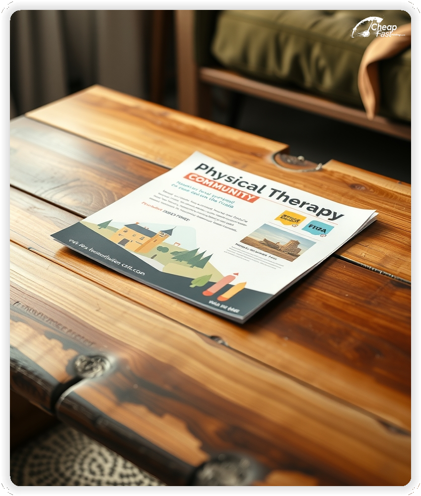
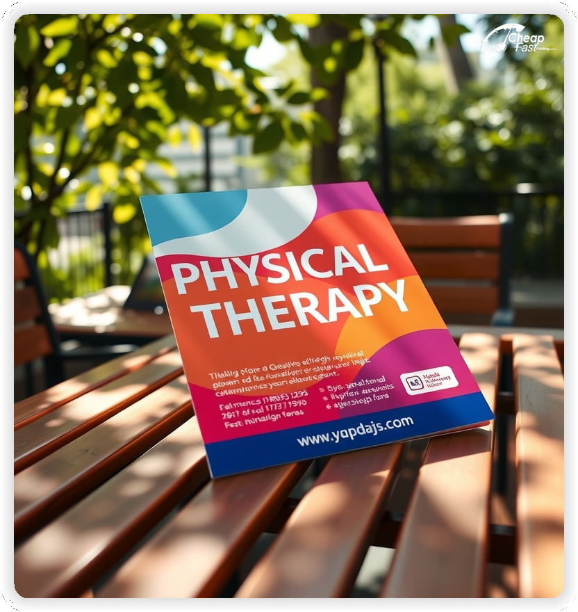
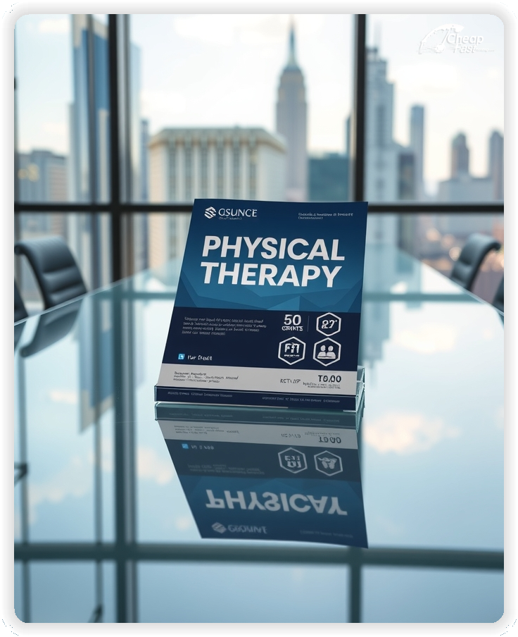
The 4.25x11 physical therapy flyers are the standard size for rack cards found in waiting rooms. They stand tall in holders without flopping over.
For clinics requesting custom physical therapy flyers, this slim format is easy for patients to grab and tuck into a bag or paperwork folder.
Use the top third for your main headline and emotional hook, the middle for the condition list, and the bottom for contact info.
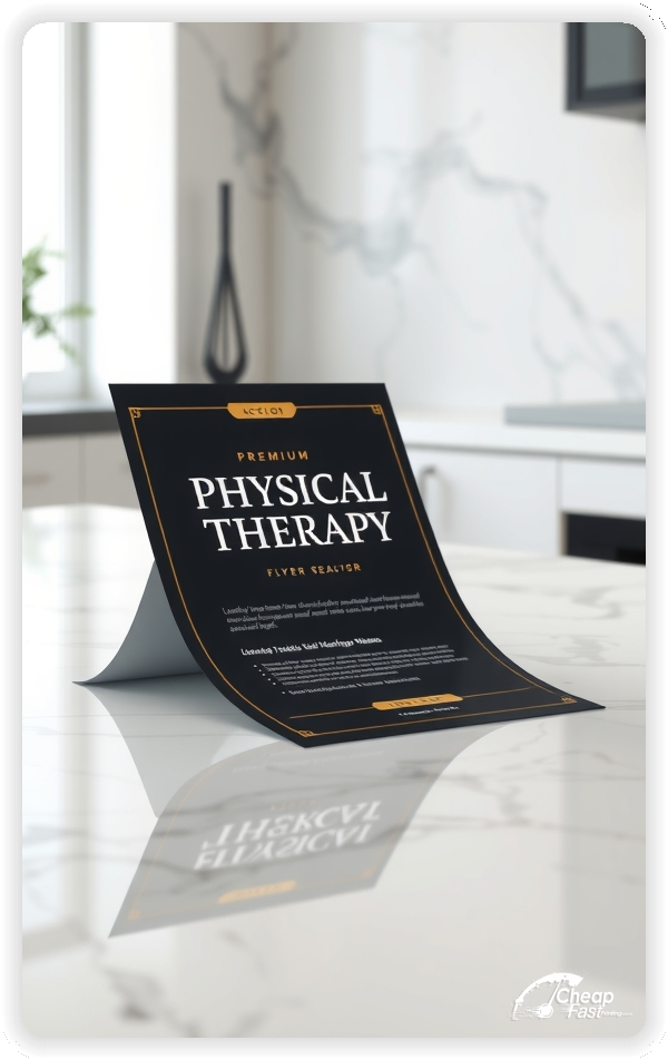
Kraft paper flyers offer a distinct, natural look that aligns well with holistic, hands-on care. It stands out in a sea of glossy medical brochures.
18pt Premium Kraft is thick and durable, signaling a high-quality practice.
Avoid high gloss if you want to convey a more clinical, serious tone; matte or uncoated textures often feel more trustworthy in healthcare.
Many patients don't know they can see a PT without a doctor's prescription (in direct access states). Highlight 'No Referral Needed' to remove a major barrier to entry.
This simple educational point can significantly increase self-referred appointments. Use a graphic icon like a prescription pad with a 'check' mark.
Do you offer dry needling, pelvic floor therapy, or vestibular rehab? Use the flyer to spotlight these niche services.
Specialized service flyers can be distributed to specific referral sources, like OBGYNs for pelvic floor or ENT doctors for vestibular issues.
Social proof is vital. Include a short, relatable quote from a patient who recovered mobility.
Ensure testimonials comply with HIPAA guidelines (no full names or identifying details without consent).
Create a version of your flyer specifically for local physicians. Focus on your reporting speed and patient outcomes.
Drop physical therapy handouts at orthopedic surgeons and pain management clinics to keep your clinic top-of-mind for referrals.
Align your marketing with seasonal activities. Spring: 'Garden without Back Pain'. Fall: 'Prep for Ski Season'.
Timely messages make chronic issues feel like urgent, solvable problems.
Insurance confusion stops many patients. Use a clear section to list 'In-Network With:' and major logos.
Also mention 'HSA/FSA Accepted' or 'Affordable Cash Pay Options' to capture a wider audience.
Reduce phone tag. Add a QR code that links directly to your 'Request an Appointment' form.
Label it 'Scan to Request an Evaluation' for a clear call to action.
Partner with local gyms and senior centers. A 'Free Injury Screen' coupon on your flyer can drive foot traffic.
Sponsor local 5K races and include your flyer in the swag bag.
Target patients preparing for surgery. A flyer titled 'Pre-Hab: Prepare for Your Surgery' positions you as a partner in their full recovery journey.
Distribute these through surgical coordinators.
Ordering bulk physical therapy flyers reduces your cost per patient acquisition.
For new location announcements, a run of 1000 physical therapy flyers allows you to saturate the local neighborhood.
Consistent monthly distribution keeps your schedule full.
Falls are a major concern for seniors. A 'Fall Prevention Program' flyer works well in senior living communities.
Focus on independence and confidence: 'Stay in Your Home Longer'.
Target local businesses with 'Ergonomic Assessment' flyers.
Offer to come in for a lunch-and-learn.
A 'Free 15-Minute Screen' is a low-risk way for patients to meet you.
Make this offer prominent on the flyer to lower the barrier for skeptical patients.
Your flyer should drive traffic to your website. Ensure your URL is short and easy to type.
Consider a custom landing page for flyer traffic.
Your flyer, business card, and clinic signage should look like a family. Use consistent fonts and colors.
Professional consistency builds trust, which is the currency of healthcare.
For clinic openings, bulk physical therapy flyers allow you to saturate a zip code via Every Door Direct Mail (EDDM).
Large runs reduce the cost per unit, making mass distribution viable.
Blurry text or cheap paper reflects poorly on medical quality. Physical therapy flyers printing must signal attention to detail.
Don't just say 'Physical Therapy'. Use headers that speak to the patient's internal dialogue: 'Waking Up With Back Pain?'
Question-based headers stop the scroll and invite the reader to find a solution.
Many patients wait until after surgery to think about PT. Educate them on 'Pre-Hab'.
The Message: 'Prepare your body for joint replacement.'
Move beyond injury treatment. Target golfers and runners.
The Offer: 'Golf Swing Analysis' or 'Running Gait Video Assessment'.
Pelvic floor therapy is a rapidly growing niche.
The Tone: Discreet, professional, and empowering.
Position PT as the safe alternative to pain meds.
The Statistic: 'CDC recommends PT as a first-line treatment.'
Remind patients about deductibles in October.
The Hook: 'You've met your deductible—your PT might be free!'
Flyers work best when they solve a specific problem. 'Back Pain' is a problem; 'Physical Therapy' is a solution.
When the design is clean and professional, the flyer builds the clinical trust needed to book the eval.
Turn your flyer into a referral tool. Include a section on the back: 'Refer a Friend or Family Member'. Patients who have had success with you are your best advocates.
Turn your flyer into a referral tool. Include a section on the back: 'Refer a Friend or Family Member'. Patients who have had success with you are your best advocates. Give them a tool to share your story easily.
Your flyer has about 3 seconds to catch a patient's eye. Don't use generic medical stock photos. Ensure your main headline ('Back Pain Relief') is visible instantly. Use calming, trusted colors (Blue/Green/Natural) to evoke healing.
Target the Right Racks: Success isn't just about design; it's about placement. Ensure your rack cards are in high-traffic areas where people in pain visit. Orthopedic waiting rooms and pharmacies are gold mines.
Upload your design to create professional physical therapy flyers that drive appointments.
Medical marketing requires precision. Our proofing team ensures your text is sharp so older patients can read it.
Proof review also confirms the QR destination and phone numbers so the flyer works without errors.
Confirm that the map is accurate.
Verify that office hours are correct.
Check that the layout aligns evenly after trimming.
Confirm that direct access language is compliant.
Use the 4.25x11 template to keep margins consistent and reserve space for rack display visibility.
Templates also protect the layout so service updates do not break alignment.
Consistent spacing keeps contact details visible after trimming.
A stable grid helps marketing teams update insurance lists without redesigns.
Consistent templates also support multi-clinic updates with minimal editing.
They also preserve alignment for QR placement and logo sizing.
It also keeps headers aligned across seasonal campaigns.

Loading Free Editable Designs...
Please wait while we prepare the template library.
Focused layouts outperform crowded pieces because the path to care is clearer.
Consistent templates reduce design time and keep the clinic identity strong.
Compare response by evaluations booked rather than only print cost.
When the brand stays consistent, patients trust the providers easier.
Tracking referral sources helps refine the next campaign spend.
Review arrival rates to understand which flyers perform best.
Use one clear headline, one offer, and one primary CTA (call, scan, or order). Add the essentials: phone, website/QR, service area, hours (if relevant), and a trust signal like years in business or a short review snippet.
Keep the layout scannable: one hero image or icon, short bullets, and high-contrast CTA text that’s readable at arm’s length.
Yes. 4.25" x 11" balances visibility and readability without feeling cramped. It gives enough space for a strong headline, a benefits list, and a CTA while staying easy to hand out or place on counters and boards.
Prioritize spacing and hierarchy over extra copy so the main message lands in 3–5 seconds.
18 pt. Premium Kraft with Gloss affects how the flyer feels and how colors read. Gloss tends to boost color and photos, matte reduces glare and feels more premium for text-heavy layouts, and uncoated is great for writing on.
If your design uses lots of fine text, choose clarity and contrast first; paper upgrades won’t fix a crowded layout.
1000 works well when you want consistent visibility across multiple placements (counters, boards, partner locations, events) over a few weeks. Bulk also lowers unit cost so you can test a message and keep the winner running.
Track performance, then reprint the best offer instead of changing everything at once.
If price is your main hook, feature one simple offer (“ off” or “Starting at ) and keep the fine print minimal. If you have variable pricing, use a short value statement and send details to a landing page.
A clean offer + simple CTA typically outperforms a long price list.
Use a QR code to a dedicated landing page and add UTM tags for each route or partner. Track scans, form fills, and calls to identify the placements that actually convert.
For non-QR audiences, include a short, memorable URL or a trackable phone extension.
Start where your customers already are: complementary businesses, community boards, local events, and targeted neighborhoods. Ask partners for the most visible spot and refresh before your flyer gets buried.
Use a consistent route and restock winners; small, repeated placements usually beat one big drop.
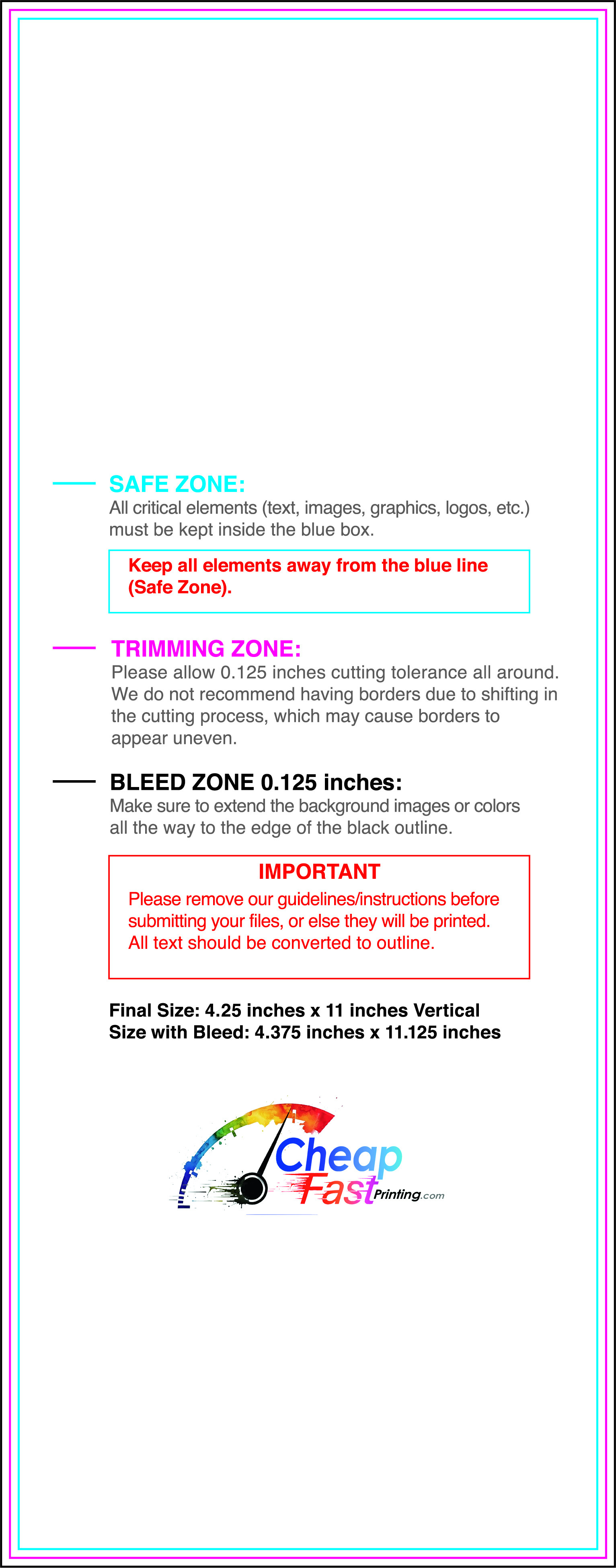
Submit a print-ready PDF (CMYK) at 300 DPI with 0.125" bleed and safe margins around important text. Keep thin lines above 0.5 pt and make QR codes at least ~0.8" square for reliable scanning.
Use vector logos when possible and limit your fonts to maintain a clean, professional look.
Request a proof so you can confirm spelling, margins, and QR/URL accuracy before production. Proofing is the easiest way to prevent expensive reprints.
Double-check phone numbers and offer terms first—those are the most common issues.
Match your flyer headline and offer to the landing page headline so visitors feel they’re in the right place. Keep the CTA consistent and make the page fast to load and easy to complete on mobile.
If you run ads, retarget QR visitors with the same offer to improve conversions.
Plan a steady supply for doctor offices and community centers. Short runs allow topic updates without waste.
Predictable inventory supports consistent physician marketing.
Track which referral sources drive the most patients and replenish those stocks.
Use online physical therapy flyers ordering for quick restocks.
Balance broad awareness and targeted condition distributions.
Use rack cards for waiting rooms.
For health fairs, bulk physical therapy flyers provide the volume needed to reach everyone.

