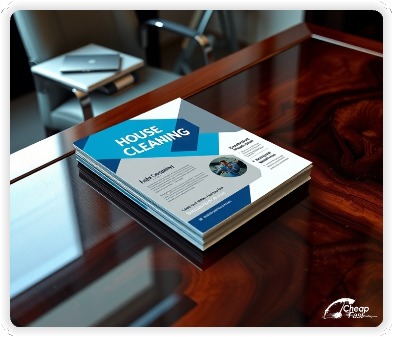
Professionally designed for 2.5" x 4" flyers. Fully editable & free!
Preparing Templates…
When homes need reliable help, your house cleaning flyers make the first impression. Lead with the service promise, the service area, and the next step for a quote.
The 2.5x4 size is easy to hand to homeowners, leave with property managers, or pin to community boards. Printed on bright gloss stock, the design stays crisp even with bold offers.
If you need 1000 house cleaning flyers for a neighborhood route, we can turn them fast. For broader coverage, bulk house cleaning flyers keep the unit cost low while the message stays consistent.
Use custom house cleaning flyers to highlight your checklist, response time, and easy contact path so prospects can book without friction.
Lead with one core service and one clear offer. A focused message, such as recurring cleanings, move-out resets, or deep cleans, converts better than a long list.
Keep the offer short and place the CTA near the phone or QR so the path is clear.
Use bold contrast so the checklist and price range stay readable on quick house cleaning handouts.
These pieces must make the service feel reliable and easy to book. New clients respond best to a clear scope and a low-friction next step.
This structure keeps house cleaning marketing materials focused while supporting fast decisions.
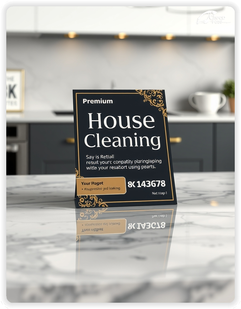
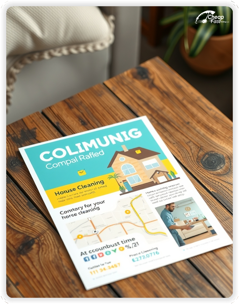
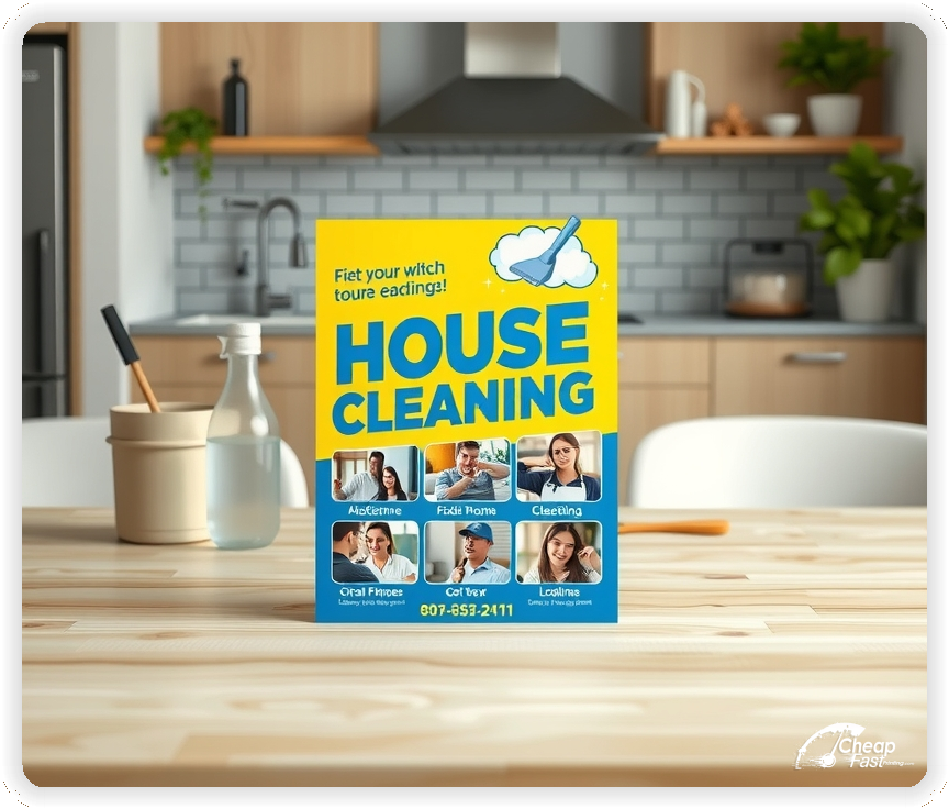
2.5x4 house cleaning flyers are slightly larger than a business card, giving you space for a checklist without feeling bulky.
The compact size fits wallets and front-desk trays, keeping your contact details within reach when a home needs help.
Use the top third for the offer, the middle for a short checklist, and the bottom for the CTA and service area.
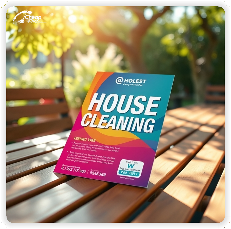
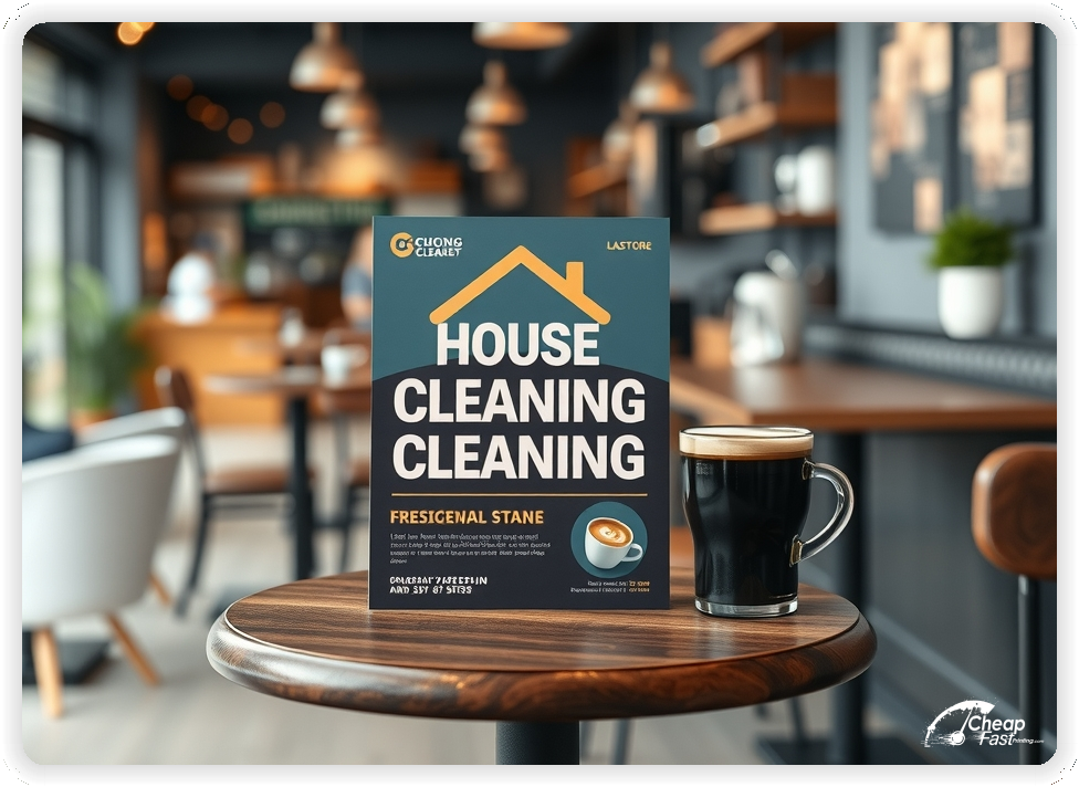
Bright surfaces keep before-and-after photos and bold offers easy to scan. Glossy paper flyers help the design look clean, fresh, and professional.
Use high-contrast panels so the checklist and contact details remain readable at a glance.
Gloss stock also resists smudges and keeps colors vivid during distribution.
A focused intro offer removes hesitation. Examples include a first-clean discount or a bundled hours package.
Keep the offer line short and move details to the quote page so the print piece remains clean.
Clear offers improve conversion because homeowners understand the next step.
Checklists must be easy to scan. Use short lines such as “kitchen, baths, floors, dusting.”
Keep the list to five to seven items and use a small icon set for quick recognition.
Readable lists are essential for house cleaning outreach because scope is the top decision factor.
Choose one primary service for each print run, such as recurring maintenance, move-out resets, or deep cleans.
This keeps the message specific and helps homeowners self-select more quickly.
Focused positioning improves inquiries and supports higher booking conversion.
Homeowners want confidence in who enters their space. A short line about bonding, insurance, and years in business builds trust.
Keep credentials brief and avoid long bios. The landing page can provide full team details.
A short trust line near the CTA supports decision confidence without adding clutter.
Clarity improves response. Add a short line about neighborhoods served or a simple service radius.
Keep the note brief so the offer remains the main focus.
Clear service area notes reduce last-minute questions and support higher booking rates.
Recurring plans can be summarized in one line, such as “weekly and biweekly plans available.”
Keep detailed pricing on the quote page so the piece remains easy to scan.
This approach keeps the message welcoming while still signaling value.
Seasonal cleans are strong for demand spikes. Use a short callout for spring resets or holiday prep.
Keep dates short and direct readers to a quote page for full details.
Event callouts add urgency while keeping the core service offer visible.
Place materials at real estate offices, apartment lobbies, and neighborhood boards with permission.
Ask front desks for the most visible spots and refresh placements when boards rotate.
Consistent placement supports awareness and brings steady inquiries for cleaning trials.
Each piece should lead to one action. A QR code to a short quote page reduces friction.
Keep the landing page focused on service options, offer, and a simple request form.
This flow converts better than long pages because it keeps the decision path clear.
Interest rises during spring refreshes, pre-holiday prep, and move-in season.
Plan a primary run for each peak season and a smaller follow-up run to keep momentum.
When changes happen quickly, fast house cleaning flyers support a timely campaign refresh.
Match the headline and offer to the quote page to reduce confusion.
Use the same service names and add-ons so the experience feels consistent.
Alignment across print and digital improves conversion because the message stays consistent.
Test two offers with the same layout to identify the best response.
Change only the offer line and track QR scans or calls by placement.
Once a winner is clear, scale the distribution while keeping the layout consistent.
For high-demand months, bulk runs help keep the offer consistent across all routes.
Cleaning teams with multiple crews benefit from consistent templates and localized service areas.
Use consistent branding while adjusting the phone line or service zones by route.
Larger campaigns support consistent reach without production delays.
Consistent visuals help neighbors recognize the brand quickly.
New clients need clear guidance. Use one line that explains how to prepare the home and what to expect.
Keep the text short, and link to a full FAQ on the quote page.
This reduces anxiety and supports smoother first visits.
Use language that reflects your brand voice, such as meticulous, friendly, or efficient.
Keep tone consistent across the checklist and offer blocks so the piece feels cohesive.
Aligned tone helps the message feel authentic and builds a stronger brand impression.
Use a short reminder line such as “loyalty discounts available” or “recurring plans available.”
Do not add a full list of pricing tiers. The goal is to encourage ongoing visits.
Retention messaging supports steady bookings without overshadowing the intro offer.
Cleanliness and safety remain important for many households. A short line about supplies, sanitizing steps, or pet-safe options improves confidence.
Keep the note brief and place it near the trust line.
Short safety notes support decisions without requiring a long policy list.
Local teams often stand out through community roots. A short line about serving nearby neighborhoods builds connection.
Keep it to one line and allow the about page to tell the deeper story.
This creates a sense of trust without adding heavy copy to the piece.
Cleaning brands rely on crisp, tidy visuals. High-quality printing keeps lines sharp and colors clean.
When the piece looks polished, the service feels more professional and trustworthy.
Quality print also helps a simple design look intentional rather than sparse.
Many homeowners discover services through neighborhood boards or partner businesses. A clear, practical print piece supports discovery when digital ads miss local foot traffic.
For local outreach, consistent distribution keeps response steady across weeks.
This supports awareness while the quote page captures the action.
Use a friendly CTA such as “Book your first clean” or “Request a quote.”
Keep the CTA short and place it near the offer so the next step is visible.
Clear CTAs help readers decide quickly and support higher booking rates.
Spacing matters in home services. Use generous margins around the checklist and offer block.
Keep text blocks short and separate them with simple dividers.
A balanced layout keeps attention on the offer and makes the piece feel refined.
Add-ons attract clients who want tailored service. A short line such as “fridge cleanouts available” adds value without overwhelming the main offer.
Keep details on the quote page so the piece remains focused on the core service.
This message supports premium offerings while keeping the intro offer clear.
Property managers and small offices can be a growth channel. A short line about move-in resets or office upkeep signals flexibility.
Use a brief callout and direct inquiries to a dedicated contact form.
This adds a business-friendly option without crowding the primary offer.
Teams that highlight training can include a short line about checklists, inspections, or quality standards.
Keep the details on a separate landing page and let the piece serve as an introduction.
This adds depth to the brand profile and builds credibility among new clients.
If slots fill quickly, mention limited availability and recommend booking ahead.
Use a short line such as “limited weekend appointments.”
This sets expectations and helps reduce scheduling friction.
Some teams offer add-on supplies like filters or light organization. A short line about these options can improve average job value.
Keep the focus on cleaning and use the add-on note as a secondary detail.
This supports revenue without shifting the primary message away from service.
Bundles and multi-visit plans build retention. Use a short line such as “save with monthly plans.”
Keep details on the quote page to preserve layout clarity.
Plan messaging can improve repeat visits and long-term retention.
New clients often want to know what to expect. A short line about pets, entry, or supplies can reduce anxiety.
Keep guidance brief and place it near the CTA so it reads as part of the visit flow.
This small detail supports higher first-visit completion and fewer last-minute cancellations.
Inclusive language makes a service feel welcoming to a wider audience. A short note such as “all home types welcome” helps prospects feel comfortable.
Keep the note short and avoid long explanations on the piece.
Clear inclusivity messaging supports community growth and encourages first-time bookings.
Print pieces work best when they create one clear path from interest to booking. A clear headline, a visible checklist, and a short offer line are enough.
When the layout stays focused, the piece can build demand without heavy copy.
Pair print with a short quote page and keep the message aligned for a consistent experience.
Your print piece has about 3 seconds to make an impression before it's tossed or kept. Don't bury the lead. Ensure your main headline and primary offer are visible from arm's length. Use high-contrast colors and bold typography to guide the eye exactly where you want it.
Target the Right Neighborhoods: Success isn't just about design; it's about distribution. Focus your efforts on neighborhoods that match your ideal customer profile. For local businesses, a tight radius around your location often yields the highest ROI.
Most prospects do not decide the moment they touch a piece. They notice, they remember, and they act later when the need becomes urgent. For local cleaning outreach, plan distribution like a routine instead of a single drop. Pick two to four tight neighborhoods, repeat every two to three weeks, and keep the headline consistent so recognition builds. Consistency increases response without forcing you into bigger discounts.
Pair one primary route with two supporting placements. A counter stack at a related business, a community board, or a partner location creates extra touches. Use the same offer across all placements and track the channel with a distinct QR destination. When you know where leads come from, you can scale the winning route and stop printing pieces that are not producing calls.
Your print piece has about 3 seconds to make an impression before it's tossed or kept. Don't bury the lead. Ensure your main headline and primary offer are visible from arm's length. Use high-contrast colors and bold typography to guide the eye exactly where you want it.
Target the Right Neighborhoods: Success isn't just about design; it's about distribution. Focus your efforts on neighborhoods that match your ideal customer profile. For local businesses, a tight radius around your location often yields the highest ROI.
Upload artwork and keep the focus on one core service and one intro offer for custom house cleaning flyers. Start your house cleaning flyers printing order in minutes.
Proofing checks contrast, trimming, and spacing so the checklist and CTA remain clear.
Proof review also confirms the QR destination and contact lines so the piece works without errors.
Confirm that the quote page loads quickly on mobile so new clients can request a visit.
Verify that service items and prices remain clear at arm’s length.
Check that the checklist aligns evenly after trimming so rows remain consistent.
Confirm that offer lines remain aligned and do not wrap on narrow displays.
Use the 2.5x4 template to keep margins consistent and reserve space for checklist and CTA blocks.
Templates also protect the checklist grid so updates do not break alignment.
Consistent spacing keeps contact details visible after trimming and supports quick approvals.
A stable grid helps staff update offers without redesigns.
Consistent templates also support multi-route updates with minimal editing.
They also preserve alignment for QR placement and phone lines across every run.
It also keeps headers aligned across seasonal updates cleanly.
Loading Free Editable Designs...
Please wait while we prepare the template library.
Focused layouts outperform crowded pieces because the scope stays visible.
Consistent templates reduce design time and keep the message aligned across seasons.
Compare response by quote requests, scheduled visits, and recurring plans rather than only print cost.
When the offer stays consistent, homeowners recognize the brand faster and book with less hesitation.
Tracking response by offer type helps refine the next print cycle.
Review scan-to-quote ratios to understand which placements generate the best conversions.
Use one clear headline, one offer, and one primary CTA (call, scan, or order). Add the essentials: phone, website/QR, service area, hours (if relevant), and a trust signal like years in business or a short review snippet.
Keep the layout scannable: one hero image or icon, short bullets, and high-contrast CTA text that’s readable at arm’s length.
Yes. 2.5" x 4" balances visibility and readability without feeling cramped. It gives enough space for a strong headline, a benefits list, and a CTA while staying easy to hand out or place on counters and boards.
Prioritize spacing and hierarchy over extra copy so the main message lands in 3–5 seconds.
100 lb. Gloss Book with Gloss affects how the flyer feels and how colors read. Gloss tends to boost color and photos, matte reduces glare and feels more premium for text-heavy layouts, and uncoated is great for writing on.
If your design uses lots of fine text, choose clarity and contrast first; paper upgrades won’t fix a crowded layout.
1000 works well when you want consistent visibility across multiple placements (counters, boards, partner locations, events) over a few weeks. Bulk also lowers unit cost so you can test a message and keep the winner running.
Track performance, then reprint the best offer instead of changing everything at once.
If price is your main hook, feature one simple offer (“ off” or “Starting at ) and keep the fine print minimal. If you have variable pricing, use a short value statement and send details to a landing page.
A clean offer + simple CTA typically outperforms a long price list.
Use a QR code to a dedicated landing page and add UTM tags for each route or partner. Track scans, form fills, and calls to identify the placements that actually convert.
For non-QR audiences, include a short, memorable URL or a trackable phone extension.
Start where your customers already are: complementary businesses, community boards, local events, and targeted neighborhoods. Ask partners for the most visible spot and refresh before your flyer gets buried.
Use a consistent route and restock winners; small, repeated placements usually beat one big drop.
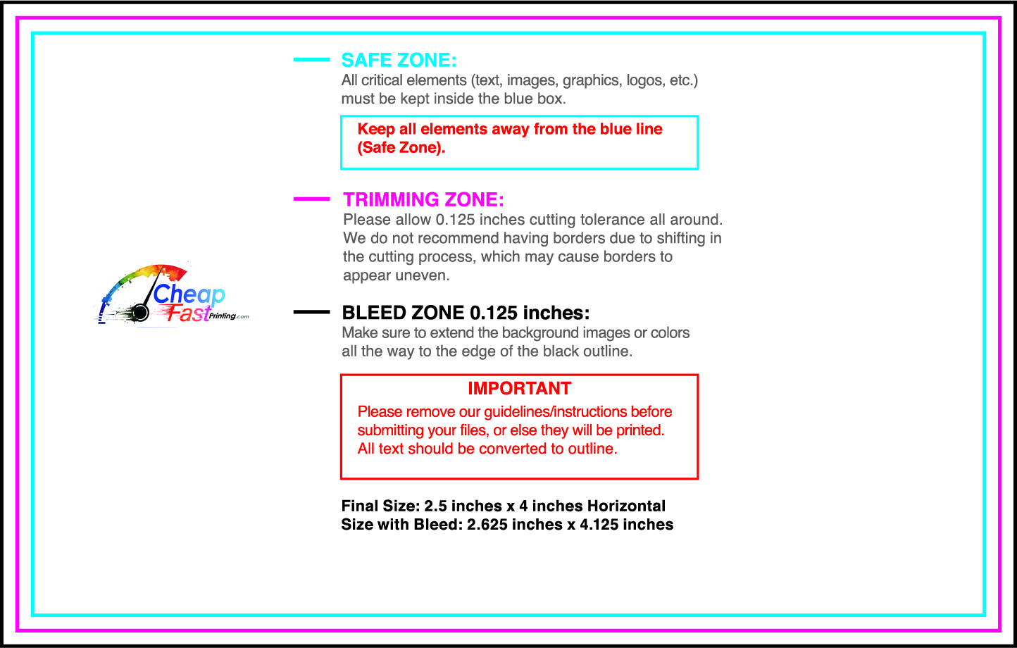
Submit a print-ready PDF (CMYK) at 300 DPI with 0.125" bleed and safe margins around important text. Keep thin lines above 0.5 pt and make QR codes at least ~0.8" square for reliable scanning.
Use vector logos when possible and limit your fonts to maintain a clean, professional look.
Request a proof so you can confirm spelling, margins, and QR/URL accuracy before production. Proofing is the easiest way to prevent expensive reprints.
Double-check phone numbers and offer terms first—those are the most common issues.
Match your flyer headline and offer to the landing page headline so visitors feel they’re in the right place. Keep the CTA consistent and make the page fast to load and easy to complete on mobile.
If you run ads, retarget QR visitors with the same offer to improve conversions.
Plan a steady supply for community boards and partner locations. Short runs allow offer updates without waste.
Predictable timing supports stronger response and keeps the message current.
Track which locations drive the most QR scans and prioritize restocks there.
Use smaller top-up runs to match seasonal changes without redesigning the layout.
Balance weekly and monthly distributions to keep coverage consistent.
Use distribution logs to identify boards that perform well and retire low-response locations.
For seasonal pushes, bulk house cleaning flyers keep budgets stable while you scale.

