Professionally designed for 9" x 12" flyers. Fully editable & free!
Preparing Templates…
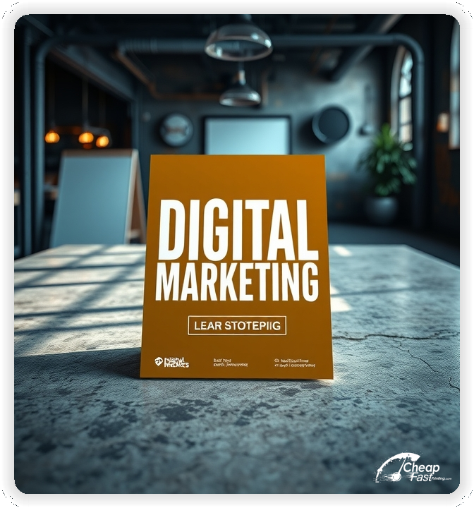
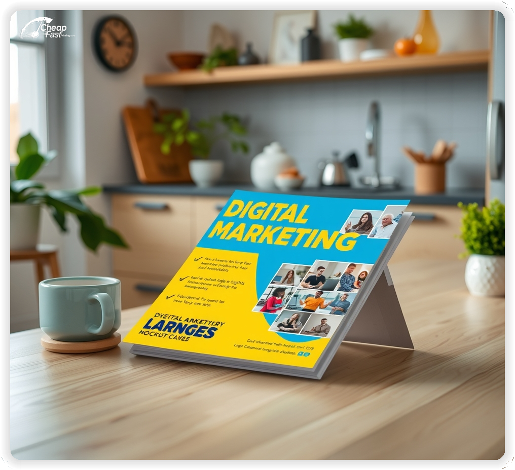
Digital marketing decisions are trust-based and timing-driven. Digital marketing flyers should explain core services, proof points, and the next step for a discovery call.
For agency outreach, keep the tone confident and the CTA direct so prospects know how to request an audit.
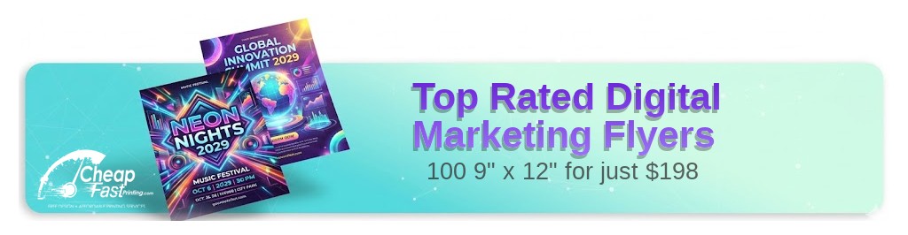
The 9x12 format provides room for service highlights, key results, and a clear contact path without crowding the layout. Use 9x12 digital marketing flyers on linen paper flyers stock for a premium first impression.
Effective outreach pairs print with a short landing page. Custom digital marketing flyers work best when the offer matches your online funnel, keeping digital marketing marketing materials aligned. Digital marketing flyers printing remains a steady channel when local awareness is the goal.
For targeted neighborhoods and partner referrals, start with 100 digital marketing flyers to test response, then scale to bulk digital marketing flyers as placement proves out. Digital marketing handouts at business centers help keep awareness steady.
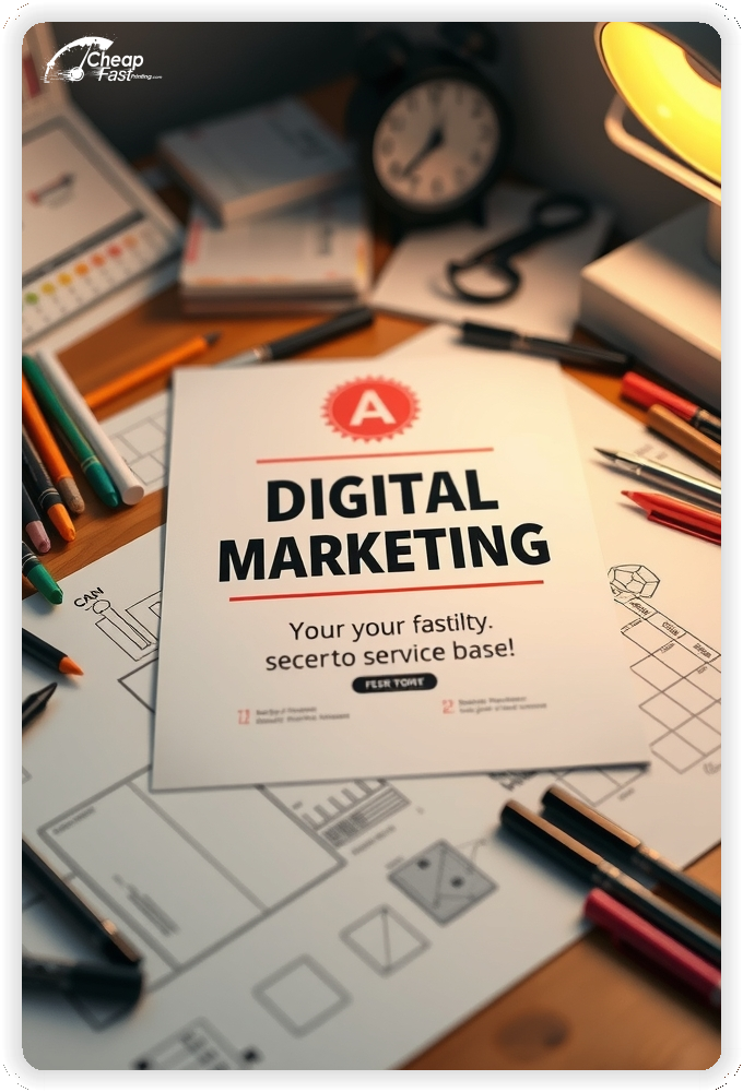
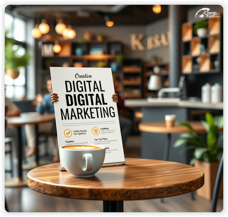
Lead with one primary offer and a short results block. A single focus, such as PPC audit, SEO roadmap, or paid social cleanup, converts better than a long list.
Keep the first-step offer short and place the CTA near the proof so the path is clear.
Use a clean layout with high contrast so metrics and contact details remain readable at a glance.

These flyers must make the agency feel credible and easy to contact. Prospects respond best to a clear offer and a low-friction next step.
This structure keeps digital marketing flyers focused while supporting fast decisions.
9x12 digital marketing flyers create room for service highlights and proof points without tiny text.
The size keeps phone numbers readable from a distance and leaves space for a short results callout.
Use the top third for the service focus and offer, the middle for proof, and the bottom for the CTA and contact details.
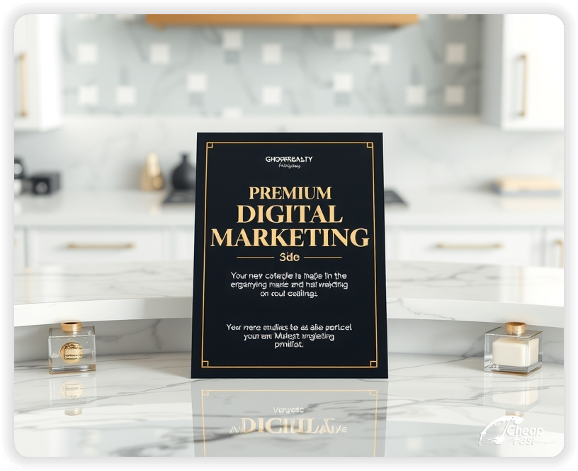
Linen paper flyers add a premium feel that supports agency credibility.
Clean typography and strong hierarchy perform best for marketing services. Premium quality prints preserve gradients and keep metrics legible.
Use gloss when brand photography is central to the message. High contrast panels protect readability.
For office racks and partner desks, thicker stock holds up better and stays crisp on boards.
When the design uses minimal text, the finish elevates the visual impact without extra copy.
A focused intro offer removes hesitation. Examples include a free audit or a short strategy call.
Keep the offer line short and move terms to the landing page so the flyer remains clean.
Clear offers improve conversion because prospects understand the next step.
Offers must be easy to scan. Use a simple stack with a headline, two proof points, and one CTA.
Keep metrics short and add a one-line service scope.
Readable offers are essential for digital marketing marketing materials because time is the top decision factor.
Choose one primary service for each flyer, such as SEO recovery, paid search management, or social ads.
This keeps the message specific and helps prospects self-select more quickly.
Focused positioning improves inquiries and supports higher audit-to-contract conversion.
Students want confidence in instruction quality. A short line about certification, experience, or continuing education builds trust.
Keep credentials brief and avoid a long bio. The landing page can provide full instructor details.
A short trust line near the CTA supports decision confidence without adding clutter.
Accessibility improves response. Add a short line about parking availability, nearby transit, or meeting options.
Keep the note brief so the offer remains the main focus.
Clear access notes reduce last-minute questions and support higher first-call show rates.
Retainer options can be summarized in one line, such as “monthly growth retainers available.”
Keep detailed pricing on the landing page so the flyer remains easy to scan.
This approach keeps the agency message clear while still signaling value.
Webinars and audit events are strong for seasonal demand. Use a short callout for a workshop or a quarterly review offer.
Keep dates short and direct readers to a registration page for full details.
Event callouts add urgency while keeping the core offer visible.
Place flyers at coworking spaces, partner agencies, business centers, and local chambers with permission.
Ask front desks for the most visible spots and refresh placements when boards rotate.
Consistent placement supports awareness and brings steady inquiries for audits.
Each flyer should lead to one action. A QR code to a short audit page reduces friction.
Keep the landing page focused on proof, the intro offer, and a simple request form.
This flow converts better than long pages because it keeps the decision path clear.
Interest rises during new year resets, pre-summer wellness goals, and fall routine shifts.
Plan a primary run for each peak season and a smaller follow-up run to keep momentum.
When changes happen quickly, fast shipping flyers support a timely campaign refresh.
Match the flyer headline and offer to the landing page to reduce confusion.
Use the same service names and proof points so the experience feels consistent.
Alignment across digital marketing marketing materials and print improves conversion because the message stays consistent.
Test two offers with the same layout to identify the best response.
Change only the offer line and track QR scans or calls by placement.
Once a winner is clear, scale with affordable custom printing to keep cost controlled.
For high-demand months, bulk digital marketing flyers help keep the offer consistent across all locations.
Multi-location agencies benefit from consistent templates and localized service blocks.
Use wholesale printing services to keep branding aligned across locations while adjusting local details.
For large campaigns, bulk digital marketing flyers support consistent reach without production delays.
Consistent visuals help business owners recognize the agency quickly.
New prospects need clear guidance. Use one line that explains what to bring and how quickly you respond.
Keep the text short, and link to a full FAQ on the landing page.
This reduces hesitation and supports smoother first calls.
Use language that reflects the agency vibe, such as analytical, growth-focused, or creative.
Keep tone consistent across the proof and offer blocks so the piece feels cohesive.
Aligned tone helps the flyer feel authentic and builds a stronger brand impression.
Use a short reminder line such as “retainer plans available” or “quarterly optimization.”
Do not add a full list of pricing tiers. The goal is to encourage ongoing engagements.
Retention messaging supports steady growth without overshadowing the intro offer.
Data privacy and security remain important for many clients. A short line about secure access and compliant tracking improves confidence.
Keep the note brief and place it near the trust line.
Short safety notes support decisions without requiring a long policy list.
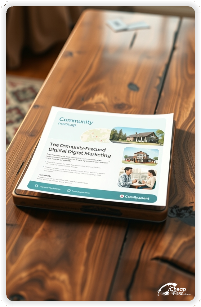
Agencies often stand out through community. A short line about local roots or business partnerships builds connection.
Keep it to one line and allow the team page to tell the deeper story.
This creates a sense of belonging without adding heavy copy to the flyer.
Agencies rely on clean, premium visuals. Premium quality prints reinforce that perception by keeping lines crisp and colors clean.
When the piece looks polished, the agency feels more professional and trustworthy.
High-quality print also helps a simple design look intentional rather than sparse.
Many business owners discover agencies through neighborhood boards or partner businesses. A clear flyer supports discovery when digital ads miss local foot traffic.
For local outreach, digital marketing flyers printing keeps distribution consistent across weeks.
This supports awareness while the landing page captures the action.
Use a direct CTA such as “Request an audit” or “Book a strategy call.”
Keep the CTA short and place it near the offer so the next step is visible.
Clear CTAs help readers decide quickly and support higher response rates.
Spacing matters in professional branding. Use generous margins around the proof and offer block.
Keep text blocks short and separate them with simple dividers.
A balanced layout keeps attention on the offer and makes the piece feel refined.
Strategy sessions attract clients who want personalized guidance. A short line such as “private strategy sessions available” adds value without overwhelming the main offer.
Keep details on the landing page so the flyer remains focused on the core offer.
This message supports premium services while keeping the introduction offer clear.
Corporate and SMB outreach can be a growth channel. A short line about B2B campaigns or partner referrals signals flexibility.
Use a brief callout and direct inquiries to a dedicated contact form.
This adds a business-friendly option without crowding the primary offer.
Agencies that offer team training can include a short line about analytics or ad platform workshops.
Keep the training details on a separate landing page and let the flyer serve as an introduction.
This adds depth to the agency profile and builds credibility among serious marketers.
If audits fill quickly, mention limited capacity and recommend reserving ahead.
Use a short line such as “limited audit slots each month.”
This sets expectations and helps reduce waitlist frustration.
Some agencies offer add-on services like CRO, email, or creative.
Keep the focus on the core offer and use the add-on note as a secondary detail.
This supports growth without shifting the primary message away from the audit.
Short sprints and multi-week programs build momentum. Use a short line such as “4-week growth sprint” or “30-day pipeline reset.”
Keep dates and details on the landing page to preserve flyer clarity.
Program messaging can improve repeat engagements and longer retainers.
New clients often want to know what to expect. A short line about response time or required access can reduce anxiety.
Keep guidance brief and place it near the CTA so it reads as part of the request flow.
This small detail supports higher show rates and fewer last-minute cancellations.
Inclusive language makes an agency feel welcoming to a wider audience. A short note such as “all industries welcome” or “flexible budgets” helps prospects feel comfortable.
Keep the note short and avoid long explanations on the flyer.
Clear inclusivity messaging supports community growth and encourages first-time requests.
Flyers work best when they create one clear path from interest to contact. A bold headline, a proof callout, and a short offer line are enough.
When the layout stays focused, the flyer supports digital marketing flyers without heavy copy.
Pair print with a short landing page and keep the message aligned for a consistent experience.
Your flyer has about 3 seconds to make an impression before it's tossed or kept. Don't bury the lead. Ensure your main headline and primary offer are visible from arm's length. Use high-contrast colors and bold typography to guide the eye exactly where you want it.
Target the Right Neighborhoods: Success isn't just about design; it's about distribution. Focus your efforts on neighborhoods that match your ideal customer profile. For local businesses, a tight radius around your location often yields the highest ROI.
Most prospects do not decide the moment they touch a flyer. They notice, they remember, and they act later when the need becomes urgent. For local agency outreach, plan distribution like a routine instead of a single drop. Pick two to four tight business districts, repeat every two to three weeks, and keep the headline consistent so recognition builds. Consistency increases response without forcing you into bigger discounts.
Pair one primary route with two supporting placements. A counter stack at a related business, a community board, or a partner location creates extra touches. Use the same offer across all placements and track the channel with a distinct QR destination. When you know where leads come from, you can scale the winning route and stop printing flyers that are not producing calls.
Your flyer has about 3 seconds to make an impression before it's tossed or kept. Don't bury the lead. Ensure your main headline and primary offer are visible from arm's length. Use high-contrast colors and bold typography to guide the eye exactly where you want it.
Target the Right Neighborhoods: Success isn't just about design; it's about distribution. Focus your efforts on neighborhoods that match your ideal customer profile. For local businesses, a tight radius around your location often yields the highest ROI.
Upload artwork and keep the focus on one service line and one intro offer for custom digital marketing flyers.
Proofing checks contrast, trimming, and spacing so the offer and CTA remain clear.
Proof review also confirms the QR destination and contact lines so the flyer works without errors.
Confirm that the landing page loads quickly on mobile so prospects can request an audit.
Verify that proof points remain clear at arm’s length.
Check that the proof block aligns evenly after trimming so rows remain consistent.
Confirm that offer lines remain aligned and do not wrap on narrow displays.
Use the 9x12 template to keep margins consistent and reserve space for proof and CTA blocks.
Templates also protect the proof grid so updates do not break alignment.
Consistent spacing keeps contact details visible after trimming and supports quick approvals.
A stable grid helps staff update offers without redesigns.
Consistent templates also support multi-location updates with minimal editing.
They also preserve alignment for QR placement and phone lines across every run.
It also keeps headers aligned across seasonal updates cleanly.
Loading Free Editable Designs...
Please wait while we prepare the template library.
Focused layouts outperform crowded pieces because the proof stays visible.
Consistent templates reduce design time and keep the message aligned across seasons.
Compare response by audit requests and qualified calls rather than only print cost.
When the offer stays consistent, prospects recognize the agency faster and reach out with less hesitation.
Tracking requests by offer type helps refine the next print cycle.
Review scan-to-call ratios to understand which placements generate the best conversions.
Use one clear headline, one offer, and one primary CTA (call, scan, or order). Add the essentials: phone, website/QR, service area, hours (if relevant), and a trust signal like years in business or a short review snippet.
Keep the layout scannable: one hero image or icon, short bullets, and high-contrast CTA text that’s readable at arm’s length.
Yes. 9" x 12" balances visibility and readability without feeling cramped. It gives enough space for a strong headline, a benefits list, and a CTA while staying easy to hand out or place on counters and boards.
Prioritize spacing and hierarchy over extra copy so the main message lands in 3–5 seconds.
13 pt. Premium Linen with Uncoated affects how the flyer feels and how colors read. Gloss tends to boost color and photos, matte reduces glare and feels more premium for text-heavy layouts, and uncoated is great for writing on.
If your design uses lots of fine text, choose clarity and contrast first; paper upgrades won’t fix a crowded layout.
100 works well when you want consistent visibility across multiple placements (counters, boards, partner locations, events) over a few weeks. Bulk also lowers unit cost so you can test a message and keep the winner running.
Track performance, then reprint the best offer instead of changing everything at once.
If price is your main hook, feature one simple offer (“ off” or “Starting at ) and keep the fine print minimal. If you have variable pricing, use a short value statement and send details to a landing page.
A clean offer + simple CTA typically outperforms a long price list.
Use a QR code to a dedicated landing page and add UTM tags for each route or partner. Track scans, form fills, and calls to identify the placements that actually convert.
For non-QR audiences, include a short, memorable URL or a trackable phone extension.
Start where your customers already are: complementary businesses, community boards, local events, and targeted neighborhoods. Ask partners for the most visible spot and refresh before your flyer gets buried.
Use a consistent route and restock winners; small, repeated placements usually beat one big drop.
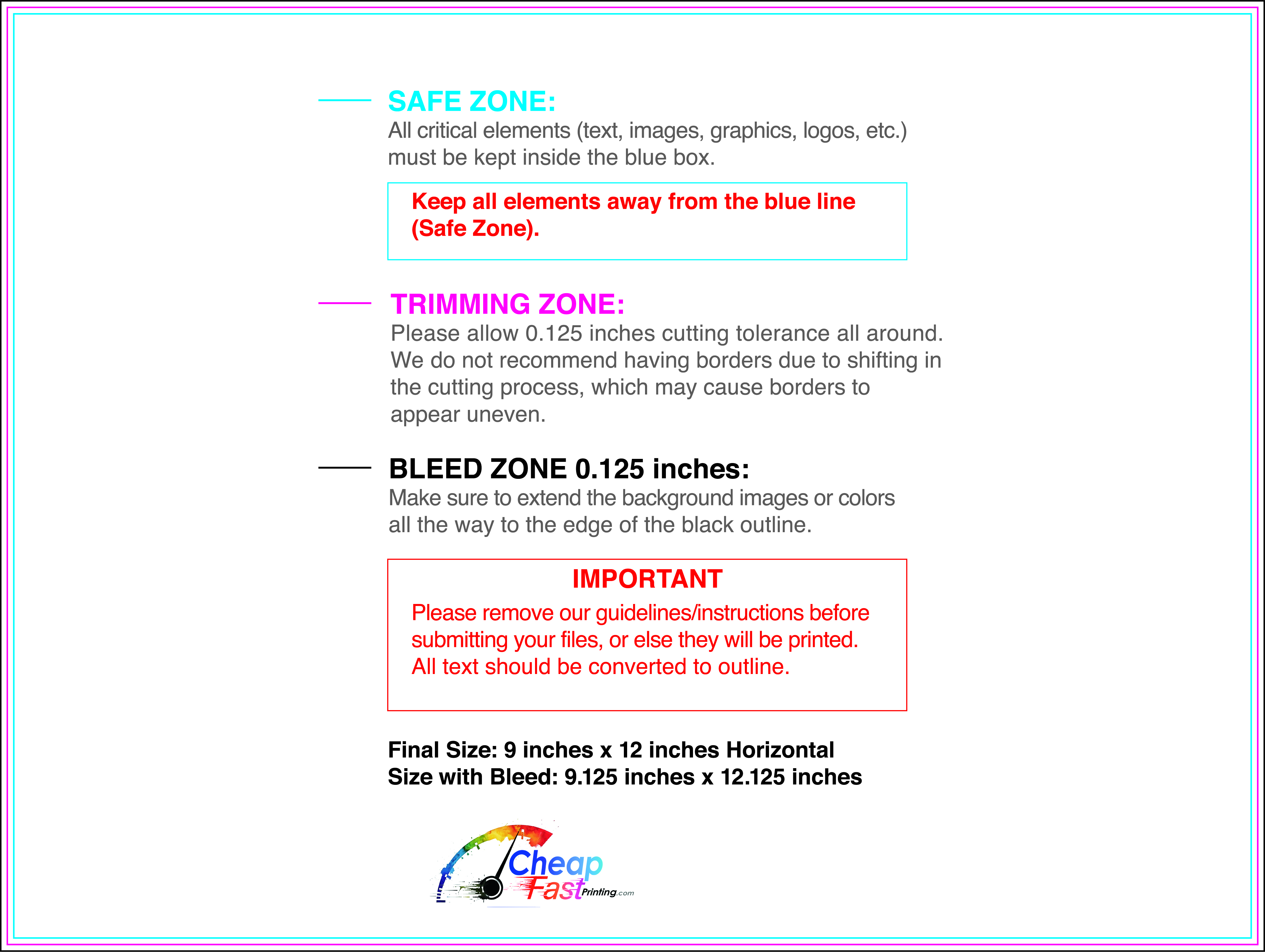
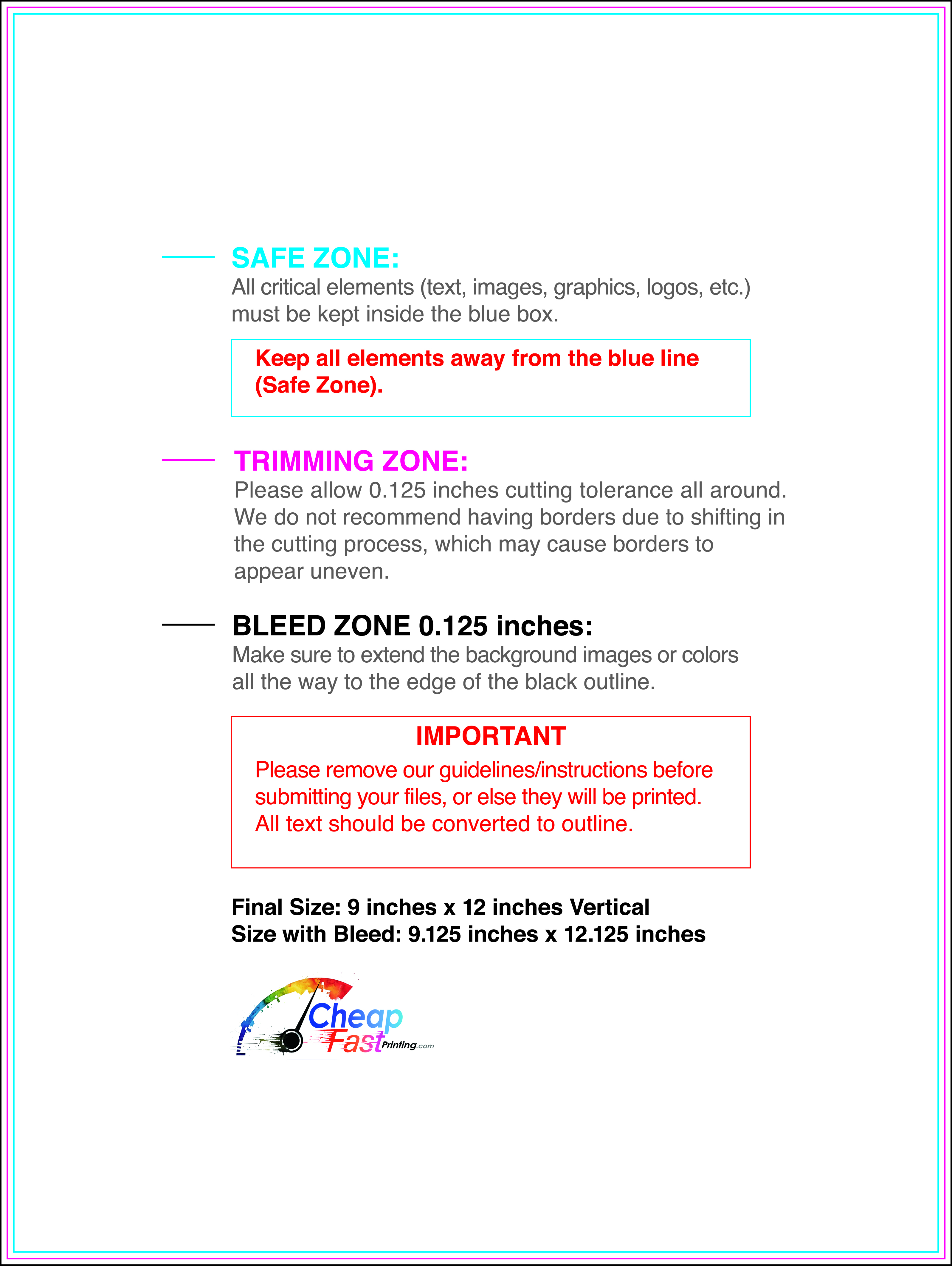
Submit a print-ready PDF (CMYK) at 300 DPI with 0.125" bleed and safe margins around important text. Keep thin lines above 0.5 pt and make QR codes at least ~0.8" square for reliable scanning.
Use vector logos when possible and limit your fonts to maintain a clean, professional look.
Request a proof so you can confirm spelling, margins, and QR/URL accuracy before production. Proofing is the easiest way to prevent expensive reprints.
Double-check phone numbers and offer terms first—those are the most common issues.
Match your flyer headline and offer to the landing page headline so visitors feel they’re in the right place. Keep the CTA consistent and make the page fast to load and easy to complete on mobile.
If you run ads, retarget QR visitors with the same offer to improve conversions.
Plan a steady supply for community boards and partner locations. Short runs allow offer updates without waste.
Predictable timing supports stronger response and keeps the message current.
Track which locations drive the most QR scans and prioritize restocks there.
Use smaller top-up runs to match seasonal changes without redesigning the layout.
Balance weekly and monthly distributions to keep coverage consistent.
Use distribution logs to identify boards that perform well and retire low-response locations.
For seasonal pushes, cheap digital marketing flyers keep budgets stable while you scale.

