
Professionally designed for 9" x 12" flyers. Fully editable & free!
Preparing Templates…
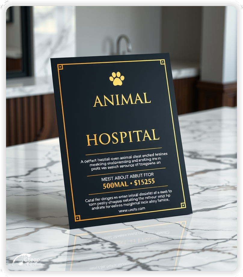
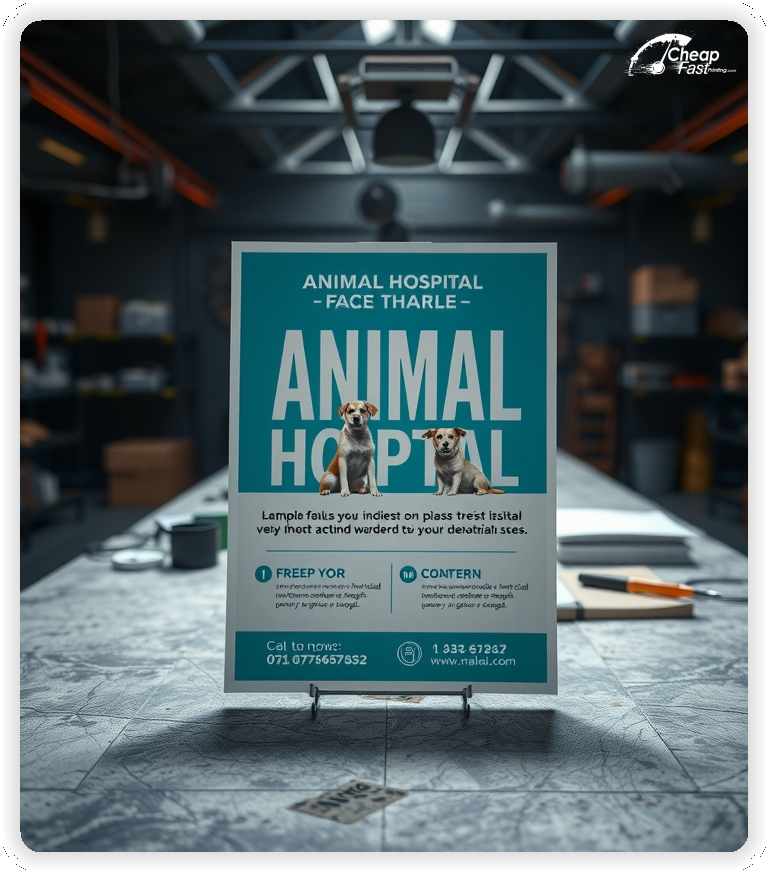
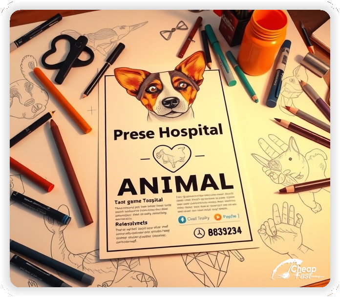
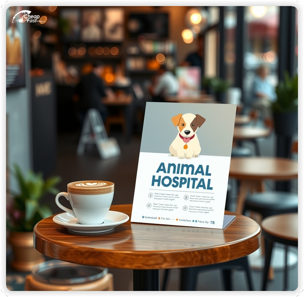
Pet owners respond to clear care options and an easy next step. Animal Hospital Flyers highlight wellness plans, vaccine reminders, and contact details for quick booking.
Use calm headings and short service lists so readers can scan from arm’s length. Keep the CTA simple: call, book online, or scan a QR code.
The 9x12 layout gives room for hours, services, and a first‑visit offer without tiny text.
Place handouts at partner clinics, pet stores, and groomers to build local visibility.
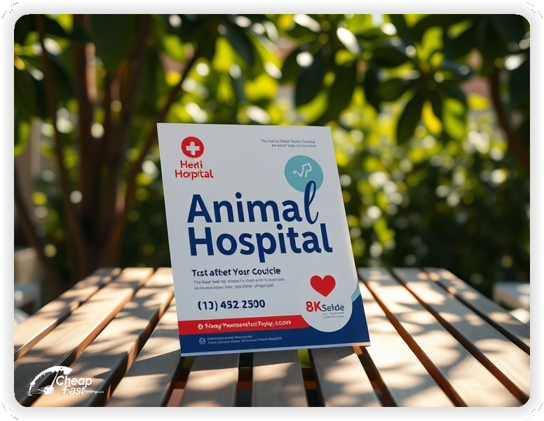
Lead with one primary service focus, such as wellness exams, vaccinations, or dental care, and keep the offer tight.
For local outreach, start with 100 animal hospital flyers and scale after you confirm the best neighborhoods.
Keep the CTA near the service list so pet owners can book quickly.
Keep care options clear and decision paths simple. Pet owners choose faster when the message is focused.
Keep the message consistent across all placements.
9x12 provides room for services, hours, and an intro offer without tiny text.
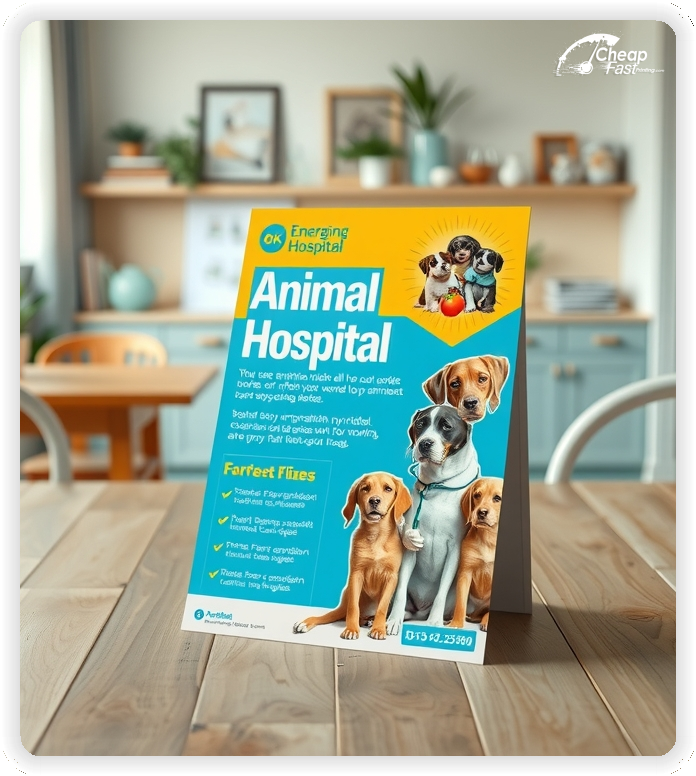
Use the top third for your care focus, the middle for service highlights, and the bottom for the CTA and contact details.
Warm imagery and clean typography perform well for pet care. Premium quality prints preserve subtle color gradients and keep service lists legible.
Use gloss when photos and brand color blocks are central to the message; high‑contrast panels protect readability.
For lobby racks, paper flyers and handouts in a thicker stock hold up better and remain crisp on boards.
A focused intro offer removes hesitation. Examples: first‑visit discount or a short wellness package.
Keep the offer line short and move terms to the booking page so the flyer stays clean.
Lead to one action. A QR code to a short booking page reduces friction.
Keep the landing page focused on hours, services, the intro offer, and a simple appointment form.
Accessibility improves attendance. Add a short line about parking availability, curbside drop‑off, or transit proximity.
Keep the note brief so the core message remains the focus.
Confidence matters. A short line about veterinarian credentials, experience, and reviews builds trust.
Keep credentials brief and link to a full team page for details.
Make the difference clear. Use one line that notes urgent care availability and typical hours for routine visits.
Clarity reduces calls and helps owners choose the right path.
Place flyers at partner clinics, pet stores, groomers, and community boards with permission.
Ask front desks for the most visible spots and refresh placements when boards rotate.
Match the flyer headline and offer to the booking page to reduce confusion.
Use the same service names so the experience feels consistent.
Alignment across marketing materials online and print improves conversion because the message stays consistent.
Your flyer has about 3 seconds to make an impression before it's tossed or kept. Don't bury the lead. Ensure your main headline and primary offer are visible from arm's length. Use high-contrast colors and bold typography to guide the eye exactly where you want it.
Target the Right Neighborhoods: Success isn't just about design; it's about distribution. Focus your efforts on neighborhoods that match your ideal customer profile. For local businesses, a tight radius around your location often yields the highest ROI.
Upload artwork and keep the focus on one care message and a clear CTA for custom animal hospital flyers.
Proofing checks contrast, trimming, and spacing so services, phone lines, and QR remain clear.
Confirm that the booking page loads quickly on mobile so new clients can book without errors.
Verify that phone and hours remain clear at arm’s length.
Use the 9x12 template to keep margins consistent and reserve space for services and the CTA block.
Templates protect alignment so updates do not break readability.
Consistent spacing keeps contact details visible after trimming and supports quick approvals.
Loading Free Editable Designs...
Please wait while we prepare the template library.
Focused layouts outperform crowded pieces because care options stay visible.
Consistent templates reduce design time and keep the message aligned across seasons.
Compare response by appointments, calls, and repeat visits rather than only print cost.
Tracking scan‑to‑book ratios helps refine the next print cycle.
Use one clear headline, one offer, and one primary CTA (call, scan, or order). Add the essentials: phone, website/QR, service area, hours (if relevant), and a trust signal like years in business or a short review snippet.
Keep the layout scannable: one hero image or icon, short bullets, and high-contrast CTA text that’s readable at arm’s length.
Yes. 9" x 12" balances visibility and readability without feeling cramped. It gives enough space for a strong headline, a benefits list, and a CTA while staying easy to hand out or place on counters and boards.
Prioritize spacing and hierarchy over extra copy so the main message lands in 3–5 seconds.
70 lb. Opaque Smooth White with Uncoated affects how the flyer feels and how colors read. Gloss tends to boost color and photos, matte reduces glare and feels more premium for text-heavy layouts, and uncoated is great for writing on.
If your design uses lots of fine text, choose clarity and contrast first; paper upgrades won’t fix a crowded layout.
100 works well when you want consistent visibility across multiple placements (counters, boards, partner locations, events) over a few weeks. Bulk also lowers unit cost so you can test a message and keep the winner running.
Track performance, then reprint the best offer instead of changing everything at once.
If price is your main hook, feature one simple offer (“ off” or “Starting at ) and keep the fine print minimal. If you have variable pricing, use a short value statement and send details to a landing page.
A clean offer + simple CTA typically outperforms a long price list.
Use a QR code to a dedicated landing page and add UTM tags for each route or partner. Track scans, form fills, and calls to identify the placements that actually convert.
For non-QR audiences, include a short, memorable URL or a trackable phone extension.
Start where your customers already are: complementary businesses, community boards, local events, and targeted neighborhoods. Ask partners for the most visible spot and refresh before your flyer gets buried.
Use a consistent route and restock winners; small, repeated placements usually beat one big drop.
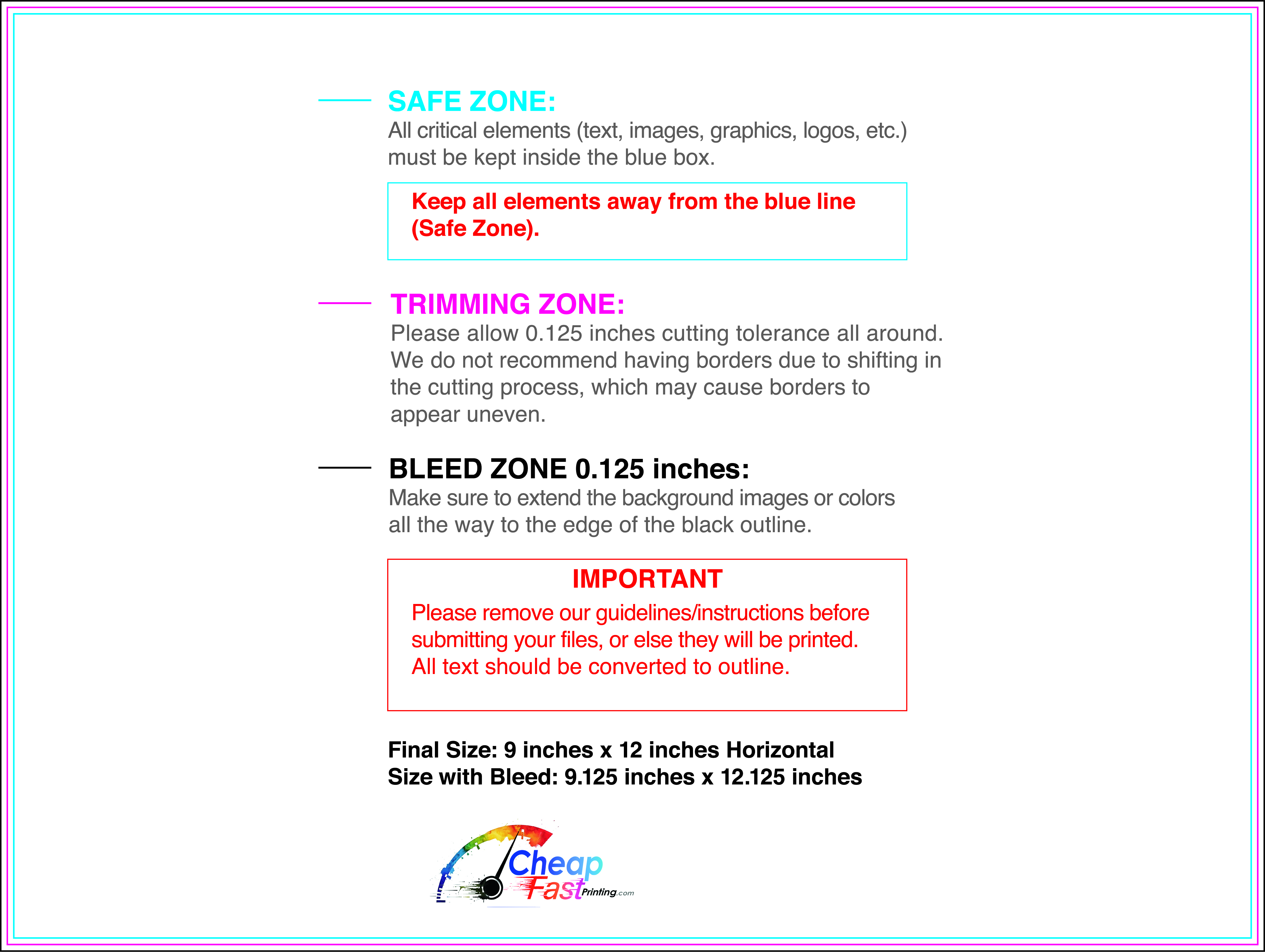
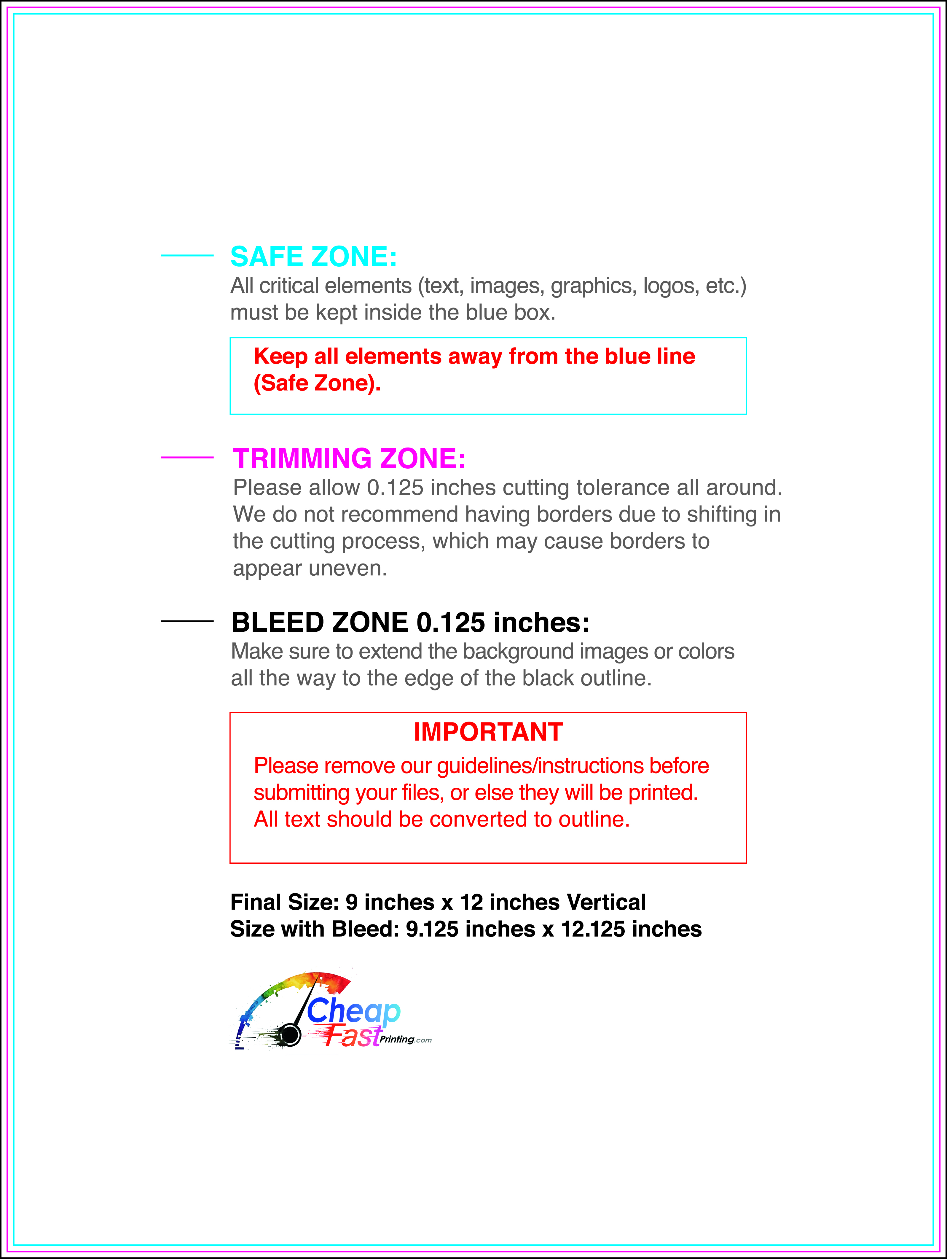
Submit a print-ready PDF (CMYK) at 300 DPI with 0.125" bleed and safe margins around important text. Keep thin lines above 0.5 pt and make QR codes at least ~0.8" square for reliable scanning.
Use vector logos when possible and limit your fonts to maintain a clean, professional look.
Request a proof so you can confirm spelling, margins, and QR/URL accuracy before production. Proofing is the easiest way to prevent expensive reprints.
Double-check phone numbers and offer terms first—those are the most common issues.
Match your flyer headline and offer to the landing page headline so visitors feel they’re in the right place. Keep the CTA consistent and make the page fast to load and easy to complete on mobile.
If you run ads, retarget QR visitors with the same offer to improve conversions.
Plan a steady supply for community boards and partner locations. Short runs allow updates without waste.
Predictable timing supports stronger appointment response and keeps the message current.
Track which locations drive the most QR scans and prioritize restocks there.
Use smaller top‑up runs to match seasonal changes without redesigning the layout.

