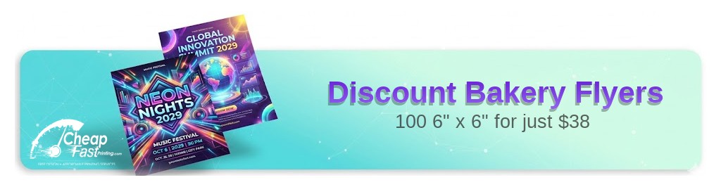
Professionally designed for 6" x 6" flyers. Fully editable & free!
Preparing Templates…
Baked goods are an impulse buy driven by craving. A high-quality flyer with a stunning photo of a fresh croissant or a custom cake triggers that craving instantly.
The 4x6 and 5x7 formats are perfect for handouts, bag stuffers, or counter displays that highlight your best sellers and daily specials.
Effective bakery marketing combines appetite appeal with a 'sweet' offer—like a free coffee with purchase or a discount on a dozen—to turn neighbors into regulars.
When your flyer looks delicious, your customers know your food will be too.
Food photography must be sharp and well-lit. Use gloss paper to make glazes shine and textures look crisp.
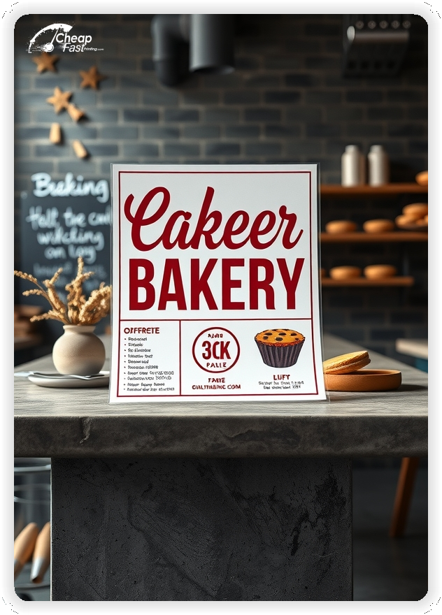
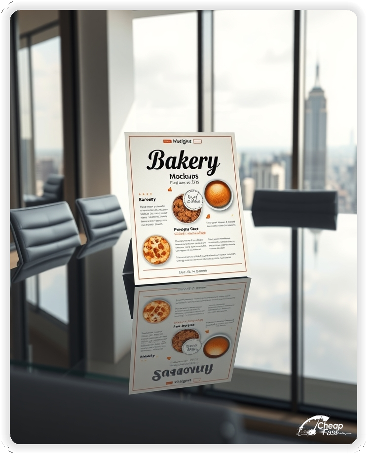
Keep the menu short. Highlight 3-5 signature items rather than listing every cookie you bake.
Include a 'Best Before' coupon to drive immediate foot traffic (e.g., 'Valid this week only').

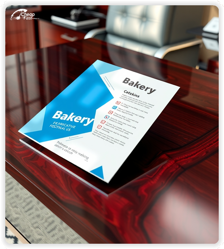
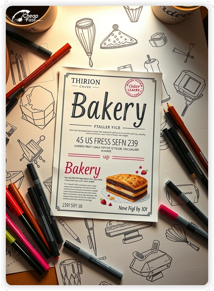

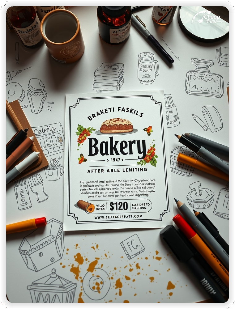
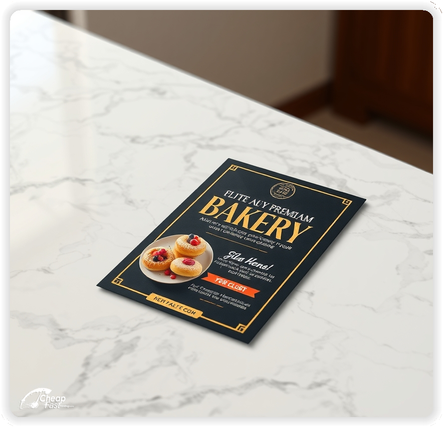
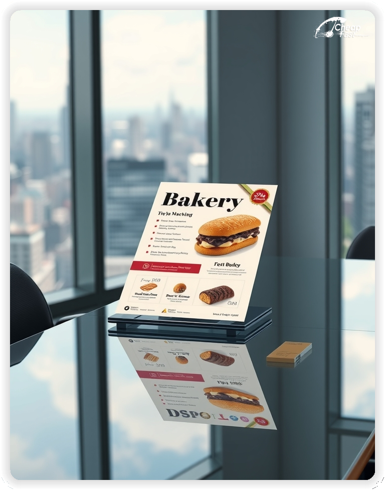


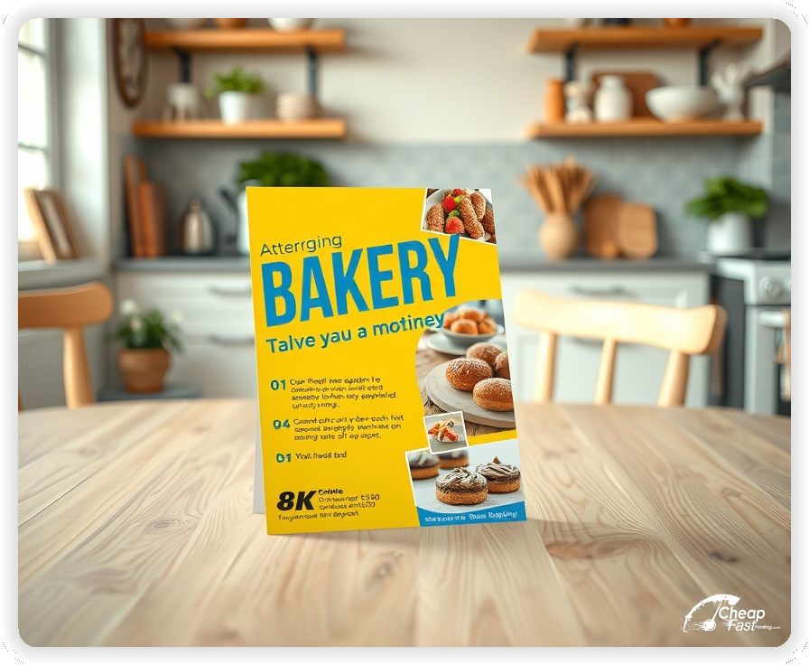


The single most important element of a bakery flyer is the hero image. It must look fresh, flaky, and moist.
Our high-resolution printing ensures your photos look as good as the real thing.
4x6 flyers are the industry standard for bakeries. They are affordable enough to hand out by the hundreds at local events or farmers markets.
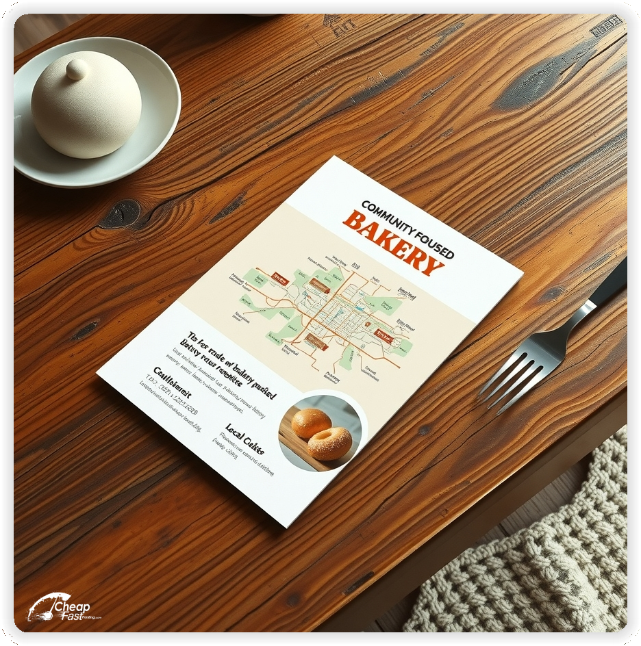
For bakery menu flyers, a slightly larger 5x7 or 6x9 works well to list catering options or wedding cake pricing.
Small formats fit easily into takeout bags, turning every customer into a repeat buyer.
Don't clutter the flyer with 50 items. Feature your 'Hero Products'—the ones people travel for.
Use descriptive words like 'House-Made', 'Slow-Fermented', or 'Locally Sourced' to build value.
Clear, bold pricing on key items (e.g., '$2 Coffee') acts as a strong anchor for value.
Bakeries live and die by the morning rush. Use offers that build habits.
Examples: 'Free Coffee with any Pastry', 'Buy 6 Get 1 Free', or '50% Off After 3 PM' (to clear inventory).
Punch cards printed on the back of a flyer are a classic retention tool.
Drop flyers at local offices to drive catering orders and morning coffee runs.
Target residential mailboxes for weekend brunch crowds and birthday cake orders.
Tailor the message: 'Office Hero' for businesses, 'Sunday Treat' for families.
Glossy Paper is best for photos of pastries, cakes, and shiny glazes.
Uncoated/Matte Paper gives a rustic, artisanal feel, perfect for sourdough bakeries or organic cafes.
Choose the finish that matches your brand personality.
Bakeries have a calendar full of opportunities: Valentine's Day, Mother's Day, Thanksgiving, Christmas.
Plan your bulk flyer printing to promote pre-orders 3-4 weeks in advance.
Seasonal flyers create urgency and help you manage production capacity by securing orders early.
Use a dedicated flyer for high-ticket items like wedding cakes or corporate catering trays.
These should be on higher quality stock (e.g., 14pt Cardstock) to convey luxury and stability.
Leave these at bridal shops, florists, and event venues.
Local bakeries are community hubs. Mention your local ingredients or family history.
'Baking for [City Name] since 1995' builds instant loyalty.
Sponsor a local school event with a flyer donation to get your brand in front of parents.
Link a QR code to your online ordering system or full catering menu.
This allows you to keep the flyer simple while giving customers access to every flavor and option.
Update the digital menu daily without re-printing the flyer.
Don't just hand out paper. Hand out a small sample (cookie bite, mini muffin) WITH the flyer. The taste creates reciprocity, and the flyer gives them the instruction on how to get more. This tactic can double your conversion rate at street fairs and local events.
Ensure your files are print-ready with our correct bleed, safety, and trim lines.
Loading Free Editable Designs...
Please wait while we prepare the template library.
Compare our cheap flyer printing rates against giants like GotPrint, UPrinting, CatPrint.
Use one clear headline, one offer, and one primary CTA (call, scan, or order). Add the essentials: phone, website/QR, service area, hours (if relevant), and a trust signal like years in business or a short review snippet.
Keep the layout scannable: one hero image or icon, short bullets, and high-contrast CTA text that’s readable at arm’s length.
Yes. 6" x 6" balances visibility and readability without feeling cramped. It gives enough space for a strong headline, a benefits list, and a CTA while staying easy to hand out or place on counters and boards.
Prioritize spacing and hierarchy over extra copy so the main message lands in 3–5 seconds.
14 pt. Uncoated with Uncoated affects how the flyer feels and how colors read. Gloss tends to boost color and photos, matte reduces glare and feels more premium for text-heavy layouts, and uncoated is great for writing on.
If your design uses lots of fine text, choose clarity and contrast first; paper upgrades won’t fix a crowded layout.
100 works well when you want consistent visibility across multiple placements (counters, boards, partner locations, events) over a few weeks. Bulk also lowers unit cost so you can test a message and keep the winner running.
Track performance, then reprint the best offer instead of changing everything at once.
If price is your main hook, feature one simple offer (“ off” or “Starting at ) and keep the fine print minimal. If you have variable pricing, use a short value statement and send details to a landing page.
A clean offer + simple CTA typically outperforms a long price list.
Use a QR code to a dedicated landing page and add UTM tags for each route or partner. Track scans, form fills, and calls to identify the placements that actually convert.
For non-QR audiences, include a short, memorable URL or a trackable phone extension.
Start where your customers already are: complementary businesses, community boards, local events, and targeted neighborhoods. Ask partners for the most visible spot and refresh before your flyer gets buried.
Use a consistent route and restock winners; small, repeated placements usually beat one big drop.
Submit a print-ready PDF (CMYK) at 300 DPI with 0.125" bleed and safe margins around important text. Keep thin lines above 0.5 pt and make QR codes at least ~0.8" square for reliable scanning.
Use vector logos when possible and limit your fonts to maintain a clean, professional look.
Request a proof so you can confirm spelling, margins, and QR/URL accuracy before production. Proofing is the easiest way to prevent expensive reprints.
Double-check phone numbers and offer terms first—those are the most common issues.
Match your flyer headline and offer to the landing page headline so visitors feel they’re in the right place. Keep the CTA consistent and make the page fast to load and easy to complete on mobile.
If you run ads, retarget QR visitors with the same offer to improve conversions.

