
Professionally designed for 9" x 12" flyers. Fully editable & free!
Preparing Templates…
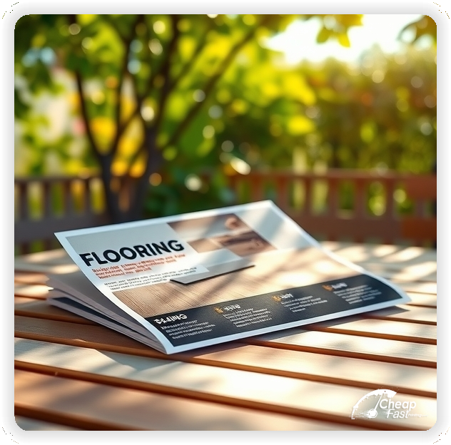
Flooring is a high-ticket home improvement where trust and visual appeal are paramount. A professional flyer puts your best materials in front of homeowners before they even visit a store.
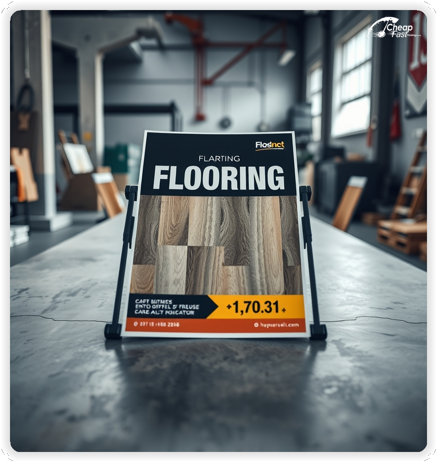
The 9x12 and 8.5x11 formats offer ample space to showcase hardwood textures, tile patterns, and carpet swatches with high-resolution clarity.
Effective flooring marketing combines beautiful imagery with a compelling offer—like free installation estimates or seasonal financing—to trigger the renovation decision.
When your flyer feels premium, your craftsmanship feels premium.
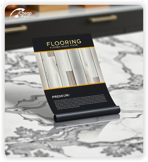
Use high-gloss paper to make wood grains and tile textures pop. A dull image suggests dull floors.
Include a clear 'Before & After' element if space permits, as visual proof builds immediate confidence.
Keep the Call to Action focused on a 'Free In-Home Estimate' rather than just a store visit, as this lowers the barrier to entry for busy homeowners.


Flooring is bought with the eyes. Your flyer must act as a mini-showroom.
Visual fidelity reduces hesitation and inspires homeowners to start their project.
9x12 custom flyers and large postcards stand out in the mail and provide the canvas needed for detailed photos.
For flooring contractor flyers, cramped layouts kill the premium vibe. You need whitespace to let the images breathe.
Use the extra space to list your services (Hardwood, LVP, Carpet, Tile) without cluttering the main visual.
Homeowners are wary of contractors. Your flyer must bridge the trust gap immediately.
Include badges for 'Licensed & Insured', local chamber of commerce memberships, or manufacturer certifications (e.g., 'Certified Shaw Installer').
A short testimonial or a '5-Star Rated on Google' badge can be the deciding factor for a callback.
Flooring is expensive. A strategic offer can push a homeowner off the fence.
Effective hooks include: 'Free Underlayment Upgrade', 'No Interest Financing for 12 Months', or '$500 Off Whole Home Installation'.
Make the expiration date clear to create urgency without sounding desperate.
New homeowners often replace floors immediately. Targeting 'Just Sold' lists with a 'New Neighbor Discount' is highly effective.
For established neighborhoods, focus on 'Modernize Your Home' messaging to target owners with outdated carpets or worn hardwoods.
For flooring, 100lb Gloss Cover or 14pt Gloss Coated is almost always the right choice.
The gloss finish enhances color saturation and contrast, making wood tones rich and tile surfaces shine.
Matte finishes can flatten the look of polished surfaces, making them look less premium.
The goal of the flyer is not to sell the floor, but to sell the appointment.
Your CTA should be big and bold: 'Call Now for Your Free In-Home Measure & Estimate'.
Remove friction by emphasizing that the estimate is 'No Obligation' and 'Fast'.
Spring (tax refunds) and Fall (pre-holiday prep) are peak flooring seasons.
Plan your bulk flyer printing campaigns to hit mailboxes 2-3 weeks before these peaks begin.
Off-season campaigns (Winter) can focus on 'Inventory Clearance' or 'New Year, New Floors' to keep crews busy.
If targeting businesses, focus on durability, overnight installation (no downtime), and safety ratings.
If targeting homeowners, focus on aesthetics, comfort, and property value increases.
Don't mix the messages too heavily; use separate flyers for B2B and B2C campaigns.
You can't fit every sample on a flyer. Use a QR code linked to your digital gallery or Instagram feed.
Caption it: 'Scan to See Our Recent Transformations' or 'View Our 2025 Catalog'.
This bridges the gap between the physical ad and your full range of products.
When you finish a job, the best leads are the neighbors. Distribute your flyers to the 50 homes surrounding your current project. Use a sticker or headline that says 'We're working in your neighborhood!' This social proof significantly increases trust and conversion rates.
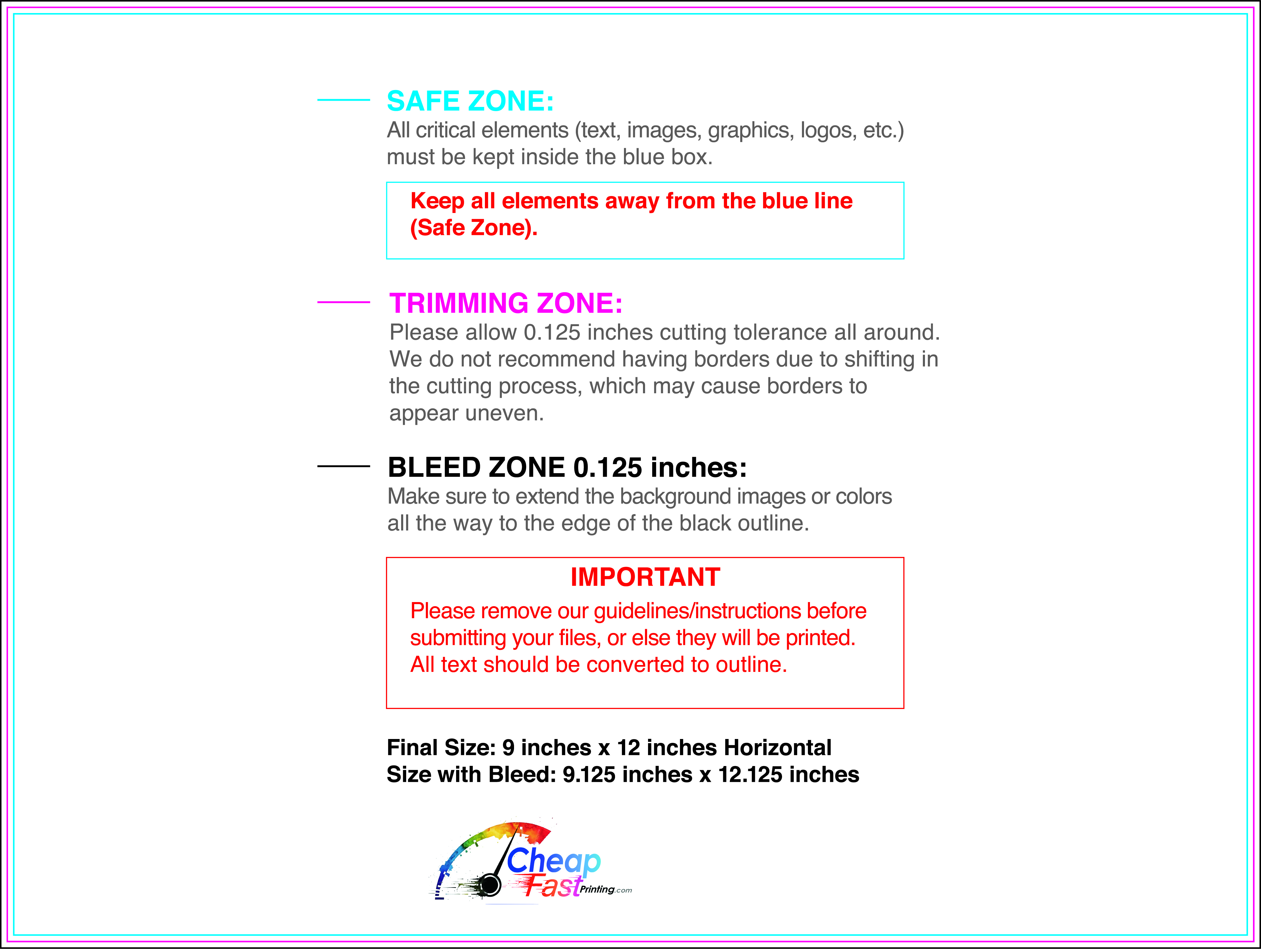
Ensure your files are print-ready with our correct bleed, safety, and trim lines.
Loading Free Editable Designs...
Please wait while we prepare the template library.
Compare our cheap flyer printing rates against giants like PsPrint, PrintPlace, DocuCopies.
Use one clear headline, one offer, and one primary CTA (call, scan, or order). Add the essentials: phone, website/QR, service area, hours (if relevant), and a trust signal like years in business or a short review snippet.
Keep the layout scannable: one hero image or icon, short bullets, and high-contrast CTA text that’s readable at arm’s length.
Yes. 9" x 12" balances visibility and readability without feeling cramped. It gives enough space for a strong headline, a benefits list, and a CTA while staying easy to hand out or place on counters and boards.
Prioritize spacing and hierarchy over extra copy so the main message lands in 3–5 seconds.
70 lb. Opaque Smooth White with Uncoated affects how the flyer feels and how colors read. Gloss tends to boost color and photos, matte reduces glare and feels more premium for text-heavy layouts, and uncoated is great for writing on.
If your design uses lots of fine text, choose clarity and contrast first; paper upgrades won’t fix a crowded layout.
100 works well when you want consistent visibility across multiple placements (counters, boards, partner locations, events) over a few weeks. Bulk also lowers unit cost so you can test a message and keep the winner running.
Track performance, then reprint the best offer instead of changing everything at once.
If price is your main hook, feature one simple offer (“ off” or “Starting at ) and keep the fine print minimal. If you have variable pricing, use a short value statement and send details to a landing page.
A clean offer + simple CTA typically outperforms a long price list.
Use a QR code to a dedicated landing page and add UTM tags for each route or partner. Track scans, form fills, and calls to identify the placements that actually convert.
For non-QR audiences, include a short, memorable URL or a trackable phone extension.
Start where your customers already are: complementary businesses, community boards, local events, and targeted neighborhoods. Ask partners for the most visible spot and refresh before your flyer gets buried.
Use a consistent route and restock winners; small, repeated placements usually beat one big drop.
Submit a print-ready PDF (CMYK) at 300 DPI with 0.125" bleed and safe margins around important text. Keep thin lines above 0.5 pt and make QR codes at least ~0.8" square for reliable scanning.
Use vector logos when possible and limit your fonts to maintain a clean, professional look.
Request a proof so you can confirm spelling, margins, and QR/URL accuracy before production. Proofing is the easiest way to prevent expensive reprints.
Double-check phone numbers and offer terms first—those are the most common issues.
Match your flyer headline and offer to the landing page headline so visitors feel they’re in the right place. Keep the CTA consistent and make the page fast to load and easy to complete on mobile.
If you run ads, retarget QR visitors with the same offer to improve conversions.

