

In the world of Retail Price Hang Tags Printing, those small hanging labels attached to your products do way more than just show the price. They are your silent salespeople, whispering quality, story, and value directly into your customer’s hands.
We understand how easy it is to overlook these details when you’re busy running a business, but don’t worry, we’ve got you covered. Imagine holding a tag that feels premium, with colors that pop and textures that invite touch – that’s the tactile magic we’re talking about, contrasting sharply against the fleeting digital ads. At CheapFASTprinting, we leverage from years of experience to help you avoid common pitfalls that make even great products look amateurish.
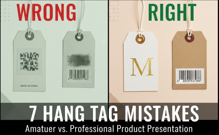
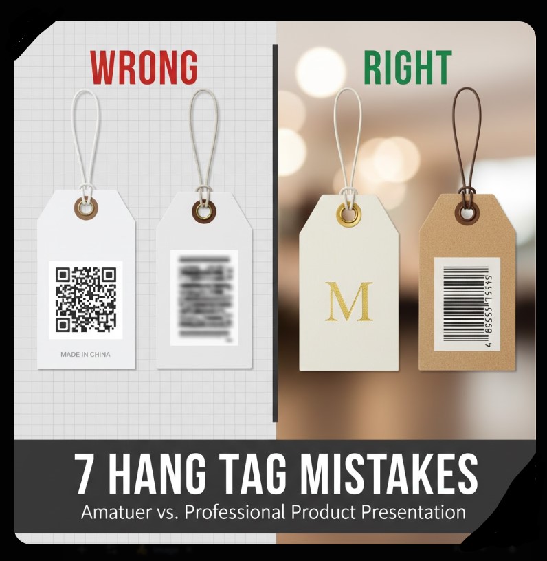
Mistake #1: Using Low-Resolution Images in Retail Price Tags Printing
One of the biggest errors we see in retail price tags printing is slapping on images that are pulled straight from the internet at 72dpi. Why does this happen? Often, it’s because folks think any picture will do, but when printed, those low-res files turn into blurry messes that scream “cheap effort.” We’ve handled countless orders where customers send us pixelated logos, and trust us, it doesn’t hold up under the scrutiny of a real, physical tag. Remember, your hang tag is something people touch and examine up close – a fuzzy image undermines that professional feel we’re all aiming for.
To illustrate, picture a clothing tag with a logo that’s supposed to be crisp and inviting. On the left (in our featured image common-hang-tag-mistakes-examples-right-vs-wrong.webp), the wrong way: a 72dpi web grab that looks grainy and unprofessional, like it was rushed. On the right, the correct approach: a 300dpi vector file that prints sharp, making colors pop off the page. We hardly recommend starting with high-res files from the get-go; it leverages from our state-of-the-art Heidelberg Offset presses to deliver that world-class clarity.
How to Fix Low-Res Issues in Your Designs
First, always check your file’s resolution before uploading. We offer free image enhancement where our AI tools upscale and sharpen things up, completely free of charge. If you’re worried about the “cheap” part of our name, don’t be – it refers to our efficient production, not cutting corners on quality. This way, your Retail Price Hang Tags Printing comes out looking premium every time.
Mistake #2: Poor Hole Placement That Ruins the User Experience
Misaligned holes are a sneaky mistake in retail price tags printing that can turn a beautiful design into a frustrating mess. We’ve seen tags where the hole punches right through the logo or text, making it look like an afterthought. Why? Because without proper templates, it’s easy to guess the positioning, but that leads to uneven hangs or obscured branding. Our team has fixed this for so many customers – it’s that simple oversight that separates pro from amateur.
Take a generic example: a jewelry tag (details removed for privacy) with the hole too close to the edge, causing it to tear easily when attached. Compared to a well-placed center hole that allows smooth stringing without damage. We provide pre-designed templates showing exact positions – top center, left, or right – so you can visualize and avoid this. Leverage from our free graphic design setup; we position everything perfectly, ensuring your tags hang straight and look intentional.
But if you want something custom, like offset holes for folded tags, contact us. We got you covered with options that maintain balance and durability, keeping that tactile strength intact.
Mistake #3: Choosing the Wrong Paper Stock for Durability
Selecting flimsy paper is a classic blunder in retail price tags printing. Thin stocks like 10pt might save pennies upfront, but they crease, tear, and feel cheap in hand – exactly the opposite of what you want for branding. We are positive to say that thickness equals perceived value; our 16pt cardstock feels stiff and substantial, like a credit card, elevating your product’s image.
Real-world wrong: A boutique used uncoated thin paper for clothing tags, which absorbed oils from hands and looked worn after minimal handling. Right way: Our Trifecta Velvet Series, with its soft luxury feel and recycled fibers for eco-brands. It’s specially good for nature lovers, providing that raw flake texture without compromising strength. Don’t worry about prices – our bulk printing keeps it cheap and fast, but quality to the top.
We hardly recommend starting with our free sample kits to feel the difference. This hands-on approach contrasts the digital world, where you can’t touch before buying.
Mistake #4: Overlooking UV Coating and Its Impact on Functionality
Applying UV coating on both sides without thinking ahead is a common error, especially when you need writable surfaces. In retail price tags printing, glossy UV makes colors pop massively, but it prevents ink from sticking – no more handwritten notes or prices. We’ve seen restaurants and events struggle with this, where tags need quick customizations.
Example gone wrong: A promotional tag with full UV that looked shiny but couldn’t be marked with a pen, frustrating staff. Correct: Spot UV on one side for accents, leaving the other matte for writing. Our aqueous coating adds protection without the full gloss lockdown. Leverage from our variable data printing for personalized touches, keeping things functional and beautiful.
If you’re unsure, our designers advise based on use – for bottles or apparel, we balance shine with practicality. It’s that simple to avoid this pitfall.
Mistake #5: Ignoring Bleed and Safe Zones in Layouts
Forgetting bleed – that extra 0.125 inches around edges – leads to white borders or cut-off designs in retail price tags printing. It’s a technical term, but simply, it means extending your artwork beyond the cut line so printing goes all the way to the edge. Without it, tags look unfinished and cheap.
Bad example: A die-cut sticker tag with text too close to the edge, getting sliced during production. Good: Using our templates with marked safe zones, ensuring logos and info stay intact. We offer free file conversion and setup, handling RGB to CMYK shifts to avoid color surprises. This proactive step maintains quality to the top, no matter the shape.
Best Practices for Bleed in Custom Shapes
For custom die-cuts, like star or oval tags, bleed is crucial. Our team vectors paths precisely, so contours hug your design without gaps. Remember, we never think we will compromise on this – it’s part of our free proofing process.
Mistake #6: Skipping Professional Proofing Before Production
Rushing without a digital proof is risky in retail price tags printing. Typos, color mismatches, or layout flaws slip through, making final products embarrassing. We’ve caught so many errors in our manual human review – it’s why we insist on emailing proofs for approval.
Wrong: A batch of event tags with misspelled brand names, wasting time and money. Right: Our free proof system lets you double-check everything. We build designs from scratch if needed, completely free, ensuring pixel-perfect results. This empathetic approach solves fears of “what if it looks bad?” – we got you covered.
Plus, for complex projects, our paid graphic design services handle sophisticated elements like foil or embossing, but start with free for basics.
Mistake #7: Not Considering Eco-Friendly Options for Modern Branding
Ignoring recycled materials makes tags look outdated in today’s market. In retail price tags printing, eco-conscious choices like 100% recycled fibers signal care for the planet, appealing to green-minded customers. Thin, non-sustainable stocks feel disposable and cheap.
Example error: Using virgin paper for adventure brands, missing the natural appeal. Success: Our Kraft stock with soy-based inks, perfect for hiking gear or organic products. It has that rustic texture that transports you to the outdoors. We encourage this for massive impact, specially as sustainability trends rise.
Don’t be shy – request our free QR-code generation to link tags to your eco-story. It’s a complete way to leverage from print’s permanence over digital ephemera.
Conclusion: Elevate Your Brand with Smart Hang Tag Choices
Avoiding these seven mistakes in retail price tags printing transforms your products from ordinary to outstanding. We’ve shared real insights from our experience, showing how small tweaks like proper resolution, hole placement, and paper selection create that tactile wow factor. At CheapFASTprinting, we’re your partners in this – offering free design setup, fast production, and quality that withstands comparison. Why settle for less? Contact us today to feel the difference in your hands. Remember, great tags aren’t just printed; they’re crafted to build lasting connections.
Last Modified: January 13, 2026
Why do low-res images ruin hang tags?
Low-res (72dpi) images print blurry, making tags look unprofessional. Use 300dpi for sharp results.
What’s the best hole placement for tags?
Top center for balance, or left/right for asymmetry. Use templates to avoid punching through designs.
Should I use UV coating on tags?
Yes for shine, but spot UV if you need writable areas. Full coating prevents pen marks.
Author: Lily Silverston, Free Graphic Design and Marketing Manager at CheapFASTprinting. With over a decade in printing, Lily helps brands create tactile masterpieces that stand out.