Most people do not struggle with flyer design because they do not like design. They struggle because the flyer they picked does not match the moment it is delivered in.
A flyer encountered in motion must be understandable in a glance. A flyer encountered in pause-friendly environments can carry more structure. Flyer size affects both the speed and the depth of what can be communicated.
If your message can be summarized in headline + essentials + one CTA, choose a smaller standard format like 4×6 or 5×7. If you need multiple sections, pick 8.5×11. For strong display impact, consider 11×17.
- How to Pick the Right Flyer Size
- Most Common US Flyer Sizes (Quick Table)
- Size-by-Use Guide: When Each Size Wins
- Bleed + Safe Zone: The Production Safety Rule
- Interactive: Size Recommendation Selector
- Interactive: Bleed + Safe Zone Calculator
- Browse 6 Flyer Format Example Picks
- Top 10 Flyer Size FAQs
How to Pick the Right Flyer Size
Picking a flyer size is a two-variable problem: content depth and reader time. You solve it by asking these questions:
- How many decision facts must fit on the flyer (date/time, address, proof points, schedule blocks)?
- Where will people encounter it (street handoff, waiting room, desk stack, community board)?
- Will people keep it or will it be discarded quickly?
When you align those answers with common standard sizes, your flyer becomes easier to read and easier to convert.

Most Common US Flyer Sizes (Quick Table)
| Size | Best For | Reader Behavior |
|---|---|---|
| 4×6 | Compact handouts | Quick scan, pocket/desk keeping |
| 5×7 | Headline + photo + CTA | Fast scan with slightly deeper detail |
| 8.5×11 | Structured brochures | More reading; easier to include sections |
| 9×12 | Premium display | Desk visibility and “keep for later” |
| 11×17 | Lobby and event display | Distance readability; often an information poster |
Extended reference: other common US flyer sizes
Most US campaigns start with the core sizes, but real distribution often uses additional “workhorse” formats. These are still standard in flyer workflows because they match common production setups and produce consistent trimming.
| Size | When to use | What to emphasize |
|---|---|---|
| 4.25×5.5 | Quarter-sheet reminders | Headline + one QR CTA + minimal bullets |
| 3.5×8.5 | Counter and desk visibility | Readable date/time + contact information |
| 5.5×8.5 | Half-sheet handouts | Balanced details: headline, when/where, QR CTA |
| 4×9 | Street promos and rack display variants | Bold headline + high-contrast QR area |
| 6×6 | Distinct premium compact shape | Visual hook + short message, easy to pocket |
| 8.5×14 | Extended layout and “mini brochure” | Structured info blocks and stronger hierarchy |
| 9×12 | Premium brochure feel | Proof points, testimonials, and clear next steps |
| 12×12 | Square premium display | Branding consistency and creative visuals |
| 11×17 | Distance readability | Large headline panels and QR CTA near the headline |
Layout-density guidance (how much text is too much?)
Flyer size does not directly set readability; layout density does. The same font size can be readable on one format and unreadable on another because the physical distance and viewing angle are different. A reliable planning habit is to design with “content tiers.”
Use three content tiers:
- Tier 1 (must be understood instantly): headline promise, date/time (if relevant), location, and a single CTA.
- Tier 2 (should be scanned next): 3-5 bullets of what to expect, who it is for, or what is included.
- Tier 3 (can live on the landing page): details, policy text, deeper FAQs, and extended proof.
When your Tier 2 grows too large for the chosen size, conversion drops because the reader cannot find the CTA quickly. At that point, you usually need either a larger size (like 8.5×11) or a structured format (like a tri-fold flyer) rather than simply adding more text.
QR placement and contrast by size
QR codes are small by nature, so their success is mostly about placement and contrast. Smaller sizes require especially strict safe-zone behavior because trimming variation represents a larger proportion of the flyer area.
- 4×6 / 4.25×5.5: keep QR near the CTA and avoid placing it near corners. Use a clean background panel behind the QR.
- 5×7 / 5.5×8.5: you can add a short “scan to” instruction line next to the QR so the reader understands the action.
- 8.5×11 / 9×12: you can add QR near the primary CTA and also include a second QR on the bottom section for alternate actions (if you have two action types).
- 11×17: make QR big enough to scan at distance and keep headline and QR in the same “attention zone” for fewer reader moves.
Rack and tall-format behavior
Some flyers are designed for counter stacks or rack displays rather than pocket/door drop distribution. In those contexts, vertical readability matters more than creative complexity. The headline should be near the top edge, and the CTA should be visible without requiring the flyer to be rotated.
If your distribution includes waiting rooms or counters, prioritize designs with:
- One strong headline block
- A QR CTA inside safe zone
- Minimal competing text near the top
- Consistent brand header/footer so your flyer still “looks like you” when stacked
Orientation tip: Most 4×6 and 5×7 flyers work best in portrait because the reader can scan top-to-bottom while the flyer sits in a pocket or face-up counter stack. For tall-format display and rack visibility, vertical orientation also reduces the need to rotate the flyer. Landscape can work for image-heavy promos, but it tends to be harder to scan quickly when flyers are stacked or handed to someone who wants to read immediately.
Size-by-Use Guide: When Each Size Wins
4×6: the two-second flyer
4×6 is the classic compact format. It works when the message must be understood immediately. Think: event headlines, short service promotions, “open now” reminders, and simple QR CTAs.
- Design rule: keep to headline + essentials + 1 CTA instruction.
- Best distribution: hand-to-hand, counter stacks, pocket reminders.
- Best stock: thicker paper if you want retention; matte for readability.
5×7: the premium compact compromise
5×7 gives you room for a strong hero photo plus a few supporting bullets. It is often the most balanced choice when you want a premium feel without turning your flyer into a brochure.
- Design rule: use a 3-block hierarchy (hero, essentials, CTA).
- Best distribution: door handouts, event check-ins, office counter stacks.
- Great for: QR-driven lead capture with readable CTA text.
8.5×11: structured details and credibility
8.5×11 is for flyers that must carry organized content. It supports multiple sections, schedules, FAQs, partner logos, and clearer “next step” instructions.
- Design rule: treat the top half as “what/why” and the bottom as “how/CTA.”
- Best distribution: office desks, community board stacks, longer door drops.
- Best for: campaigns that need more than a glance.
9×12: premium desk and display feel
9×12 tends to feel substantial. It is often chosen for premium positioning because it looks like it belongs in a brochure stack. When you want to build credibility quickly, 9×12 can help.
11×17: distance readability and lobby impact
11×17 is designed for visibility. People can read it from farther away in lobbies and waiting areas. It works well for event display, announcements with multiple blocks, and “information poster” moments.

Bleed + Safe Zone: The Production Safety Rule
Standard size does not matter if your production safety is wrong. Flyers need two protection layers:
- Full bleed: keeps backgrounds consistent to the edge so trim does not reveal gaps.
- Safe zone: keeps critical content at least 0.125 inch inside trim so cutting variation does not clip it.
QR codes are sensitive. If your QR sits near edges, cutting variation reduces scan reliability. Always keep the QR inside the safe zone and give it enough quiet space around the code.
Interactive: Size Recommendation Selector
Choose your use case and your reader time assumption. The widget recommends a standard size direction and what your flyer should emphasize.

Interactive: Bleed + Safe Zone Calculator
This calculator helps you compute the recommended full canvas size given a standard 0.125 inch bleed on all sides and a 0.125 inch safe zone for critical content inside trim.
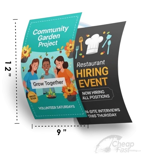
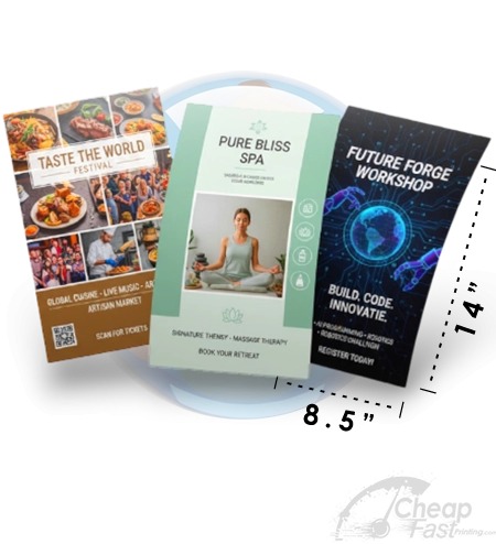
Browse 6 Flyer Format Example Picks
These six allocated cards are examples for this post. Use them to see how different sizes feel in real campaign use cases.