There is a particular satisfaction in handing someone a flyer you designed and printed yourself — watching them engage with something you built from scratch, from a blank digital canvas to a physical object that communicates your vision on premium paper. Designing a flyer from scratch sounds intimidating, but the process follows a repeatable, learnable framework that even complete non-designers can master with the right guidance.
This guide covers every phase of the from-scratch flyer creation process: define the goal, establish the design architecture, apply color and typography correctly, prepare the file for professional printing, and order at wholesale quality. By the end, you will have a press-ready file that looks like it was produced by a professional studio — at a fraction of studio costs.
Select your industry to get a research-backed color palette recommendation for your flyer design.
- Step 1 — Writing Your Design Brief (5 Minutes)
- Step 2 — Flyer Layout Architecture
- Step 3 — Color, Typography, and the Hierarchy Rule
- Step 4 — Image Selection and Resolution Requirements
- Step 5 — File Preparation for Professional Printing
- Browse 6 From-Scratch Design-Ready Formats
- Top 10 Design-From-Scratch FAQs
Step 1 — Write Your Design Brief First (5 Minutes)
The single biggest mistake made by non-designers creating their first flyer is opening the design software before answering three questions: Who is this for? What do I want them to do? What is the single most important thing they need to know?
A design brief does not need to be elaborate. It can be three bullet points written on a notepad. But answering these questions before touching a design tool prevents the most common failure mode in from-scratch flyer design: cluttered, unfocused layouts that try to say too much and end up saying nothing clearly.
Your brief should specify: your primary audience (age, income, interest), the single action you want them to take (call, scan QR, visit, attend), and the one benefit that is most likely to motivate them. Every design decision that follows is evaluated against these three answers.

Step 2 — Flyer Layout Architecture
Professional flyer layouts follow a Z-pattern or F-pattern reading flow based on how Western eyes naturally scan a page. The most effective single-page flyer structure is:
- Top third: Logo + Headline (1 powerful sentence maximum). This is what is seen first and from the greatest distance.
- Middle third: Primary visual (photo or graphic) + Supporting subheadline. The visual communicates the essence of your offer faster than text can.
- Bottom third: Body copy (3–5 bullet points of benefits), Contact information, QR code, and Call-to-Action button or urgency element.
Sketch this architecture on paper before opening Canva. A 2-minute sketch on a notepad saves 30 minutes of digital rearrangement. Identify where each of your content elements lands in this framework and confirm every element serves the single call-to-action you defined in Step 1.
Step 3 — Color, Typography, and the Hierarchy Rule
Color communicates emotion before the brain processes language. For marketing flyers, your color choices must simultaneously reflect your brand identity and trigger the emotional state that primes action. Use the Industry Color Advisor above to identify your correct palette.
Typography hierarchy is the most critical and most violated layout principle in non-professional flyer design. The rule is absolute: you should be able to tell the order of importance of every text element on your flyer by size alone, without reading the words. If your business name is the same size as your headline, you have violated hierarchy.

Step 4 — Image Selection and Resolution Requirements
Images must be 300 DPI at the intended print size. This is non-negotiable. Stock-photo websites (Unsplash, Pexels, Adobe Stock, Shutterstock) all provide high-resolution files suitable for print. Social media images, screenshots, and thumbnails are typically 72 DPI and will print blurry at any size above 2×2 inches.
For food businesses: use real photography of your actual dishes, not stock images of generic food. Authenticity converts better at every price point. For service businesses: a high-quality professional headshot or team photo communicates trust better than any stock image of shaking hands. For events: the event graphic/artwork is the anchor — if it is weak, spend money on the design before spending on print.
Step 5 — File Preparation for Professional Printing
After completing your design, prepare the print-ready file with these specifications:
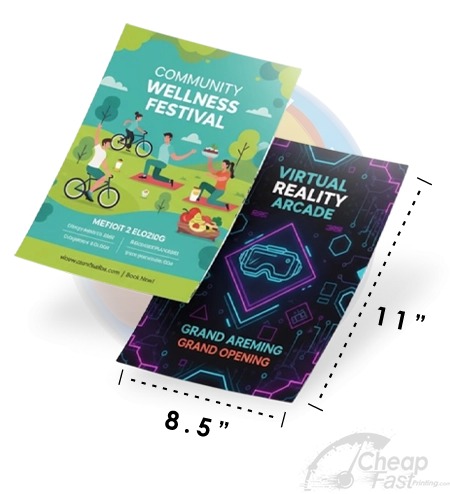
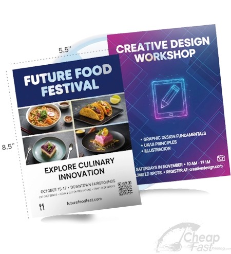
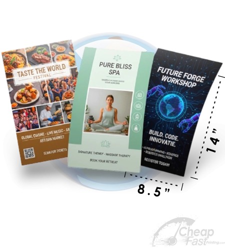
- Canvas size: Final print size + 0.125″ bleed on all four sides (e.g., 8.75×11.25 for an 8.5×11 flyer)
- Resolution: 300 DPI for all raster elements
- Color mode: CMYK (or request free conversion from CheapFastPrinting)
- File format: PDF with crop marks, bleed marks, and flattened/embedded fonts
- Safe zone: All critical content 0.125″–0.25″ inside the trim line
Upload your PDF to CheapFastPrinting. Our Free Graphic Design Review checks every specification above and corrects any issues before your order enters production — at zero additional cost.
Browse 6 Design-Ready Print Formats