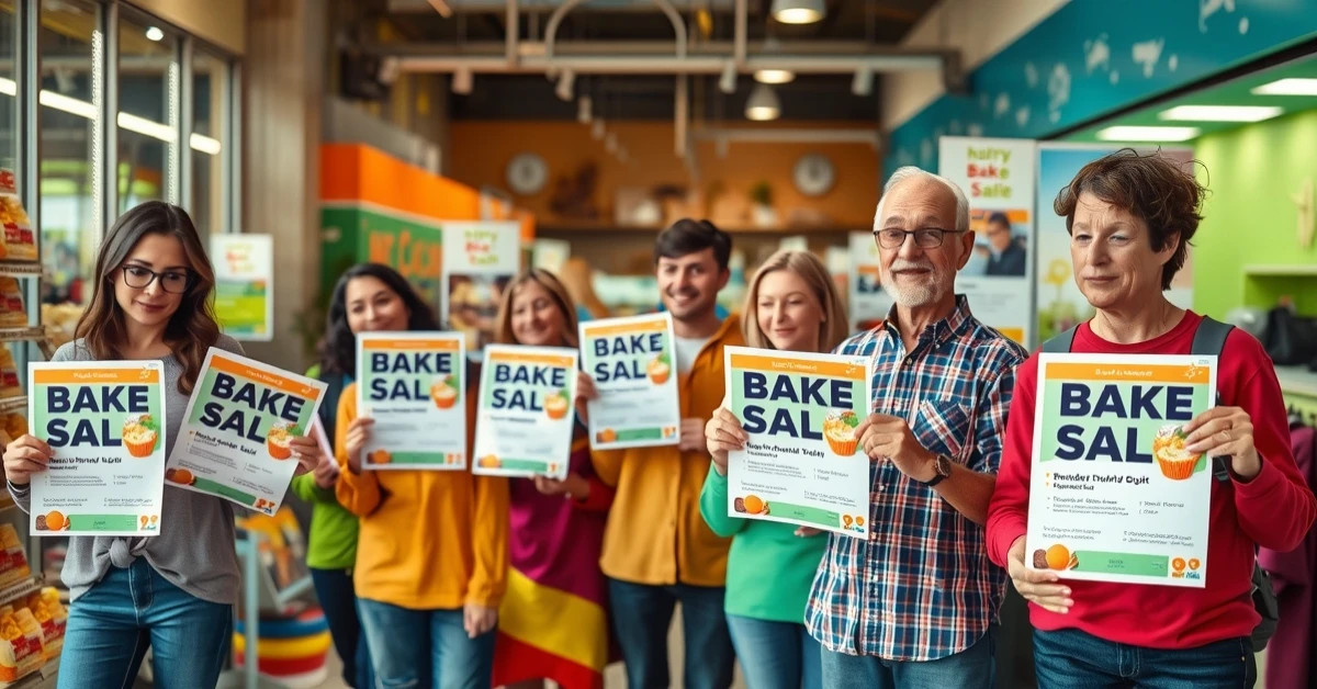
Nonprofits and churches often operate with two constraints: limited budgets and high expectations. Your flyer must do real work. It needs to raise donations, recruit volunteers, communicate service times, and share event information clearly enough that someone can act immediately without needing additional explanation.
In practice, the most common flyer failure for nonprofits is not that the message is “wrong.” It is that the flyer is hard to read at the moment it is encountered. Bulletin boards are chaotic. People are busy. Flyers are placed under glass or taped to textured surfaces. Bright daylight and fluorescent glare can reduce readability. If your design and print choices do not respect those physical realities, your conversion suffers.
This post optimizes for three outcomes: fast reading (legible at a glance), trusted action (clear QR/CTA), and repeatable distribution (formats that work week after week).
- Nonprofit Flyer Goals (Donations, Volunteers, Notices)
- Design for Trust and Fast Decisions
- Size and Stock Recommendations for Community Flyers
- Interactive: Donation ROI Calculator
- Interactive: Outreach Message Planner
- Where Nonprofits Should Distribute Flyers
- Browse 6 Nonprofit-Friendly Flyer Formats
- Top 10 Church & Nonprofit Flyer FAQs
Nonprofit Flyer Goals (Donations, Volunteers, Notices)
Nonprofit flyers are not just “announcements.” They are requests for action, and the action can be different types:
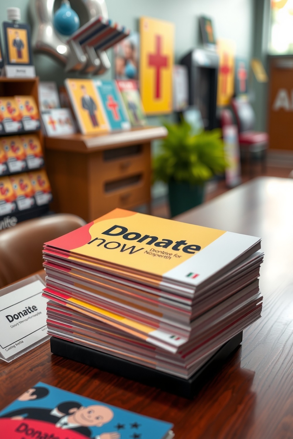
- Donation requests: you need a clear goal, a deadline (or urgency), and a simple donation method.
- Volunteer recruitment: readers must understand what they would do, when training happens, and how to apply.
- Service and community notices: you need clarity over persuasion. The flyer is a schedule tool with a brand signal.
Because each goal is different, the flyer hierarchy should change. Donation flyers should prioritize the emotional hook and the donation CTA. Volunteer flyers should prioritize roles, schedule windows, and an easy sign-up path. Service notices should prioritize time, location, and contact.
Design for Trust and Fast Decisions
People hesitate when they feel uncertain. Nonprofit flyers can reduce hesitation by being visually disciplined.
Use a “read at 2 feet” rule
Imagine your flyer is seen by someone standing next to a bulletin board. If they cannot read your event essentials quickly, your conversion drops.
- Keep the event essentials in one visual block.
- Use short sentences and consistent line breaks.
- Choose a contrast combination that does not blur under glare.
- Use one QR code with one landing page for each campaign.
Trust signals you can add without clutter
- Organization name and location
- A simple description of “where funds go” if you can share
- Contact method (phone or website)
- Simple, specific deadlines for urgency (for example, “Donate by Friday”)
QR codes that actually scan
QR codes fail more often from poor contrast, too-small sizing, or being placed too close to edges. Place the QR inside the safe zone (protect the edges), and include a text prompt that explains what happens after scanning.
Use full bleed and keep critical content (QR, logos, donation links) at least 0.125 inch inside the trim edge. Flyers are trimmed and finished with slight variability; the safe zone protects your CTA.
Size and Stock Recommendations for Community Flyers
When your goal is community readability, choose sizes that match how people interact with physical flyers.
| Flyer Use Case | Best Size Direction | Recommended Finish Behavior |
|---|---|---|
| Donation and RSVP | 5.5×8.5 or 4×6 | Readable text, clear QR prompt. Matte often reduces glare issues. |
| Volunteer signups | 5.5×8.5 | Use a mid-size to explain roles and include one CTA path. |
| Multi-day posters | 11×17 | Strong for community bulletin placements and lobby displays; heavier stock resists curling. |
| Recurring weekly notices | 4.25×5.5 or 5.5×8.5 | Economical but still credible. Build a template that is easy to update. |
Donation and Volunteer Flyer Design Checklist
Before you export your final file and place a print order, run this checklist. These items are the difference between a “good looking” nonprofit flyer and a “designed to convert” flyer.
Clarity checklist (for bulletin board reality)
- One headline only: avoid multiple font sizes competing for attention.
- One primary action: scanning, calling, or signing up. Do not split the CTA into two competing paths.
- Date/day and time first: for events, the “when” must appear before the “about.”
- Location in plain language: street address plus a short landmark cue if parking is confusing.
- QR code contrast: ensure the QR has strong contrast against the background so it still scans when the flyer is slightly smudged.
Trust checklist (for donation hesitation)
- Organization name is unmistakable: include it in the top or middle area, not buried in the footer.
- Explain where impact happens: one sentence describing what donations support is enough for credibility.
- Contact method included: phone number, website, or a simple “reply to email” option.
- Keep the message disciplined: if the layout becomes crowded, readability drops and hesitation increases.
Use full bleed and the safe zone rule so your QR CTA does not get clipped during finishing. If your flyer relies on tight spacing, verify your export has at least 300 DPI at final size and uses CMYK for professional printing workflows. These are not technical niceties; they are the reason your flyer still reads clearly when it arrives.
Interactive: Donation ROI Calculator
This model helps nonprofits set realistic expectations. It estimates QR-driven donation conversions and outputs cost per donation and modeled donation total.
Interactive: Outreach Message Planner
Nonprofit messaging must feel kind, clear, and specific. Use this planner to generate a disciplined message structure you can adapt for each campaign.
Where Nonprofits Should Distribute Flyers
For church and nonprofit campaigns, your distribution strategy should prioritize dwell time and shared trust environments. The “best placement” is rarely random foot traffic; it is the places where someone is already waiting, already reading local information, or already has a relationship with your partner community hub.
High dwell time placements
- Libraries and community centers
- Community cafés and local restaurants with bulletin areas
- Hair salons and barber shops
- Laundromats and neighborhood service centers
- Gyms, yoga studios, and training spaces
- Childcare and tutoring centers
Retail chain printing for emergencies
Sometimes you need flyers fast for an immediate community need. It is normal to look at options like print flyers at staples, print flyers at office depot, print flyers at walmart, and print flyers at walgreens. Those can be useful for a last-minute batch, but always verify stock thickness and whether the service can support your file specs (especially bleed and safe zone correctness).
When you need bulk quantities for recurring events, organizers often choose online production to keep costs predictable and specs consistent, which matters when you are coordinating campaigns across multiple weeks. Search for flyers print bulk solutions with trackable QR-ready output so your campaigns remain measurable.
Browse 6 Nonprofit-Friendly Flyer Formats
These product formats are mapped to this post. Think of them as physical “tool types” you can use for different nonprofit moments: posters for multi-day presence, half sheets for handouts, and compact cards for pocket-friendly reminders.