Most flyer printing mistakes happen at the last step: sending a file that is almost right. “Almost right” is expensive because trimming can clip edge-close content and QR quiet zone loss can make scanning fail.
This page is your final-mile system. Use the checklist score widget to sanity-check your setup, then use the deadline planner to keep your proof/test steps aligned with your distribution date.
Before you send: validate the QR/CTA safe zone and export print-ready PDF workflow. Everything else supports those two conversion assets.
Interactive: Checklist Score
Answer the questions. The widget estimates your “production readiness” score and lists what to fix next.

Interactive: Deadline Step Planner
Plan your steps relative to a distribution deadline. The widget suggests a safe schedule so you do not rush proofs and safe-zone checks.
Pre-flight checklist (the real list)
Use this list to validate the highest-risk flyer elements: trim safety, QR scan reliability, and file correctness. If you follow this checklist, you eliminate the majority of common reprint causes.
1) Geometry and safety (trim survival)
- Bleed: full-bleed artwork extends to the bleed boundary so trimming does not reveal gaps.
- Safe zone: keep logos, QR codes, phone numbers, and CTA text at least 0.125 inch inside trim.
- Avoid edge-close design: do not place thin borders, small icons, or long numbers directly on edges.
2) File sharpness (QR and text crispness)
- DPI: images are at least 300 DPI at final print size.
- QR size: QR is sized so it scans reliably when printed at the flyer’s final dimensions.
- Font embedding: ensure text uses fonts that preserve shapes in the PDF workflow.
3) Color workflow (CMYK expectations)
- CMYK: if your design tool exports RGB, request CMYK conversion when submitting.
- Photo/grads: request proof when gradients are critical or brand colors must match.
- Finish match: choose matte/gloss based on lighting conditions; glare can reduce QR/text readability.
4) Export file correctness
- Use print-ready PDF workflow: prefer PDF Print.
- Disable scaling: ensure 100% output and no “fit to page” behaviors.
- Verify page size: flyer dimensions match exactly, with correct orientation.
5) Typography and font safety (avoid thin/fragile text)
Typography is where “almost right” designs get caught. A flyer is printed and trimmed, so thin strokes, tiny font sizes, and low-contrast text can lose clarity quickly. If your CTA is difficult to read, QR scanning may still occur but conversions drop because the reader cannot confidently interpret the next step.
- Check font weight: keep CTA and important headings in a heavier weight so readability survives print and trimming.
- Avoid hairline rules: thin borders can disappear on paper or become unpredictable after trimming.
- Validate line breaks: your CTA sentence should stay on the intended lines so it does not wrap into awkward, unreadable blocks.
- Confirm font embedding: in PDF workflows, make sure fonts do not get substituted with unexpected shapes.
- Use consistent hierarchy: the reader should see “headline -> offer -> CTA/QR” without searching.
6) Finish matching (glare can reduce QR/text clarity)
Even if your file is perfect, finish can change the reader experience. Gloss increases contrast but also increases reflection. Matte reduces glare but can feel less vivid if your design uses low-contrast colors. Your goal is not “matte always” or “gloss always.” Your goal is: CTA and QR must remain readable under the lighting where your flyers are placed.
- Outdoor/sunlight: prioritize glare reduction (matte) and keep CTA text bold.
- Office light / indoor: gloss can work when contrast is protected and QR is placed on a clean panel.
- Counter stacks: choose stock that resists curling so stacking does not hide the CTA.
7) CMYK and color sanity (proof-first when it matters)
Color failures often feel subtle: everything is “readable,” but the flyer does not feel trustworthy because brand colors are off, photos look muddy, or dark backgrounds become uneven. This is why CMYK workflows and proofing exist.
When you request proofing, look for these checkpoints rather than judging the entire artwork:
- Brand colors: confirm your key brand tones look directionally correct on your chosen paper finish.
- Dark background stability: does the CTA and QR remain high contrast on the darkest areas?
- Gradient smoothness: do gradients look banded or clean and smooth?
- Sharpness around QR: does the QR edge stay crisp and not soften?
8) Common last-minute mistakes (the ones that cause reprints)
These mistakes are common because they happen right before sending files.
- Using “fit to page” in export: it changes geometry and shifts the QR/CTA relative to safe-zone placement.
- Resizing the flyer after design: this can reduce effective DPI and soften QR modules.
- Forgetting to update QR URLs: scans route to the wrong landing page or old campaign.
- Placing QR on a textured/complex background: contrast becomes inconsistent on paper.
- Assuming screen clarity equals print clarity: reflections and paper texture can change readability.
9) Repeatable test steps (so your next run is faster)
After you send one successful job, build a repeatable internal workflow. For teams, this saves time because reorders often need only content swaps, not redesign.
- Keep a “known good” PDF Print export template in your project folder.
- Record which safe-zone layout you used and where the QR CTA sits.
- Document your proof notes: any gradient or contrast adjustments you approved.
- Use the same QR size and placement in every variant so scanning remains consistent.

QR and CTA verification checklist
Before you send, treat QR/CTA like a single system. Your CTA sentence tells the reader what scanning does; QR provides the mechanics. Fixing QR without fixing CTA still reduces conversion.
Scan reliability test (how to prove your QR will work)
Your “QR works on screen” assumption is not enough. On paper, QR modules can soften due to printer behavior, paper coating, and trimming. Use a test that checks reliability, not just whether it scans once.
- Scan from the same distance your audience will use (door drops are usually closer than lobby displays).
- Test at least two phones if possible. Different cameras have different autofocus and exposure behavior.
- Check contrast under glare. Move the flyer slightly (or cover part of the light source) and confirm scanning still works.
- Confirm the landing page experience: load speed, clear next action, and mobile-friendly layout.
- Scan test on paper: scan with a phone immediately after you receive proof or after you print your sample.
- Check CTA readability in real lighting: office light, sunlight, and counter glare differ.
- Keep QR and CTA close: avoid situations where the reader must search for where scanning happens.
- Use contrast: keep QR dark-on-light or light-on-dark with minimal background interference.
- Track results: use unique QR URLs per campaign/placement so you can improve your next run.
When to order a proof
Proofing is a budget protection step. Order a proof if your flyer has any of these risk factors:
- Full-bleed backgrounds and edge-close elements.
- Photos and gradients that must reproduce smoothly.
- Brand colors you must match exactly (or where “off” reduces trust).
- QR scanning requirements where failure would be costly.
When you review your proof, you are not looking for perfection. You are checking that the QR safe-zone rules survived trimming, that the CTA remains readable next to your chosen backgrounds, and that gradients do not introduce banding that makes scanning harder.
If your job is simple and text-heavy, proofing might not be necessary. But if QR and full bleed are involved, a proof helps prevent expensive reprints.
Reorders and version control (keep your results consistent)
Flyers are rarely one-and-done. When you reorder, you want the new batch to match the last “successful” batch so your tracking and results remain comparable. Treat reorders like versioned production releases.
- Keep the same QR placement and size. Only change the QR destination URL if needed.
- Preserve the same safe-zone layout. Do not move QR/CTA closer to edges “for aesthetics.”
- Document your export workflow (PDF Print, no scaling, correct page size/orientation).
- If you change stock/finish tier, do a small test first because paper behavior can change readability.
- Track QR per placement so you can improve based on data, not guesswork.
Whenever you change anything, rerun the checklist in order and scan a test proof before approving the full production run.
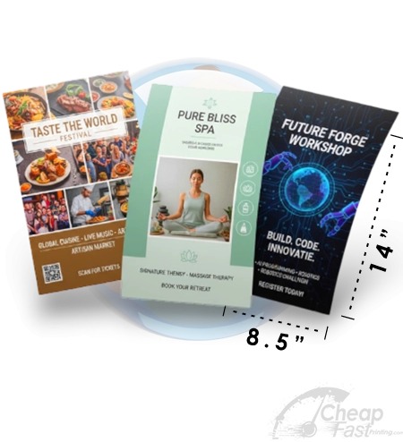
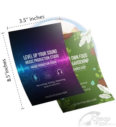
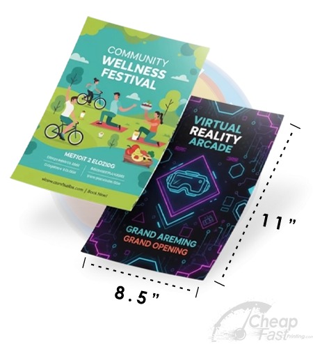
Browse 6 Checklist-Friendly Stock Picks
These allocated examples are good references for what “final output success” feels like: clear hierarchy, safe-zone discipline, and readable CTA/QR areas.