If flyer printing feels intimidating, you are not alone. Most confusion comes from trying to learn every production detail at once. The better approach is to understand the handful of decisions that actually control results.
This article covers the essentials: what flyers are for, what bleed and safe zones do, how paper/finish affects readability, why QR codes need quiet space, and how to avoid the most common beginner mistakes.
Design for scanning first. Your flyer is a conversion tool, not a decoration. If your reader can read the CTA and scan the QR reliably, you did it right.
- The 5 decisions that matter most
- Choosing flyer size
- Paper and finish basics (matte vs gloss)
- Bleed and safe zone (0.125 inch)
- QR readability basics
- Interactive: Beginner Starter Plan
- Interactive: Paper/Finish Chooser
- Test print and proof workflow
- Browse 6 beginner-friendly product picks
- Top 10 Flyer Printing FAQs
The 5 decisions that matter most
Beginner flyers usually succeed when five choices are made deliberately:
- Size: matches reader behavior and content depth.
- Paper and finish: supports readability under lighting and reduces glare/curl risk.
- Bleed and safe zone: protects QR and essential content from trim variation.
- File sharpness: at least 300 DPI at final size so QR modules and text edges stay crisp.
- CTA clarity: one obvious next step next to the QR so scanning converts.

Choosing flyer size
Size controls how fast someone understands your message. Smaller formats work best for headline + essentials + one CTA. Larger formats support schedules, multiple sections, and credibility blocks.
Quick beginner mapping
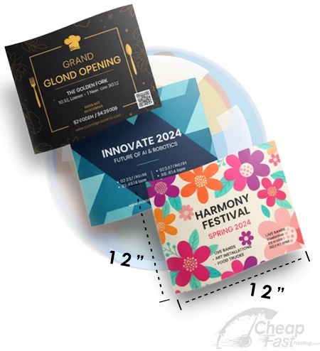
- 4×6: fast reminders, compact promos, single action.
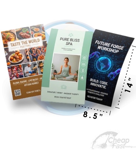
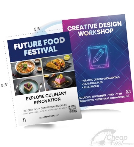
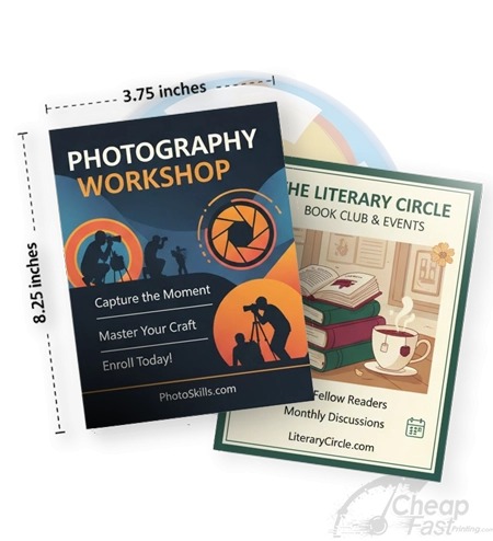
- 5×7: premium compact flyer with photo + 2-5 bullets.
- 8.5×11: structured details, schedule blocks, longer explanations.
- 9×12: premium desk display and “keep for later” feel.
- 11×17: lobby and distance readability (often poster-style).
Paper and finish basics (matte vs gloss)
Paper affects how ink looks and how the flyer feels. Finish affects glare and perceived contrast.
Matte: your readability default
Matte finishes reduce glare and make small text more stable under varied lighting. If you are unsure, matte is usually the safest default for flyers used in offices, waiting rooms, or mixed environments.
Gloss: photo impact and contrast
Gloss increases color pop and photo contrast. The trade-off is glare: if your CTA is too thin or your QR is placed too close to edges, scanning reliability can decrease.
Thicker stock increases “kept” behavior
When paper feels premium and stays flat, recipients are more likely to keep it. That increases exposure time and improves your chance to convert later.
Bleed and safe zone (0.125 inch)
Bleed and safe zones are production safety rules. Without them, designs can fail even when they look perfect on a screen.
- Bleed: extend backgrounds and artwork to the edge so trimming does not create thin white gaps.
- Safe zone: keep logos, QR codes, phone numbers, and CTA text at least 0.125 inch inside the trim edge.
If your QR sits near the edge, trimming variation can remove quiet zone padding. That is a common beginner mistake that leads to “my QR doesn’t scan.”
QR readability basics
QR codes fail for predictable reasons:
- Placed too close to edges (trim removes quiet zone).
- Too small for the flyer size.
- Low contrast between QR and background.
- Printed on top of busy gradients or patterns.
- Landing page is slow or confusing.
To avoid these problems, treat QR as a production element: choose a safe placement, use high contrast, and validate with a test print.

Paper weight and finish: beginner guide
Beginners often assume “better paper” is only about looking premium. In flyer printing, paper affects handling, glare, curling, and how confidently a QR can be scanned after distribution stress (stacking, light angles, and quick phone camera shots).
Common paper tiers you will see
- 14pt / 13pt cover classes: typically feel lighter but still look clean for small reminders and simple promos.
- 18pt classes: usually feel more substantial and can reduce curling so flyers stay flatter in hands.
- 70lb / 80lb classes: coated/covered flyer stocks that are popular for readable, professional handouts.
- 100lb classes: thicker premium feel. Great when you want people to keep the flyer longer.
Matte vs gloss for beginners
Matte is a safe default for most flyer distributions because it reduces glare and keeps small text more stable across lighting. Gloss can increase color contrast and photo impact, which helps “first glance” performance. The trade-off is that gloss can create reflections that reduce scan confidence if your CTA text or QR zone is too close to edges.
- Choose matte for mixed lighting, indoor offices, and readability-first campaigns.
- Choose gloss for photo-heavy flyers where contrast and color pop drive attention.
- If unsure, start with matte and keep your CTA area high contrast.
Finish decisions that reduce reprints
The easiest way to avoid reprints is to pick a finish that supports your design. If you have small text and a QR CTA, matte often makes readability more forgiving. If your flyer is mainly visuals with bold headlines, gloss can be an advantage. Either way, safe-zone rules still apply; finish does not protect clipped content.
File/export basics for beginners
Printing is reliable when your file communicates clear intent. Use the same principles every time so your QR remains consistent and your layout survives trimming.
- Export print-ready PDF: use PDF Print (or the vendor’s recommended print workflow).
- CMYK for professional output: if you can, design for CMYK so colors convert predictably.
- 300 DPI at final size: ensures photos and QR edges remain crisp after trimming.
- Full bleed: backgrounds should extend to the bleed boundary so you do not get visible trim gaps.
- Safe zone: keep QR/CTA and phone digits at least 0.125 inch inside trim.
- No “fit to page” scaling: scaling breaks QR placement and safe-zone survival.
Common beginner mistakes (and the fix)
Most beginner flyer failures come from a small set of issues. If you spot one of these during a test print, fix the file/setup before you scale.
- QR too close to edges: trimming removes quiet zone. Fix by moving QR/CTA into safe zone.
- CTA text too thin: reflections and printing limitations reduce readability. Fix by increasing font weight.
- Wrong export type: JPG/PNG exports can reduce text sharpness. Fix by exporting PDF Print.
- Low-resolution images: photos look soft and gradients band. Fix by using high-res assets.
- Skipping proof: full bleed and QR safety may fail. Fix by proofing for complex designs.
When you avoid these mistakes, beginners can produce professional flyer results quickly and confidently.
During your test print, scan the QR immediately with your phone and then check readability in the lighting your flyer will face (office light, sunlight, or a counter stack). If anything feels uncertain, adjust safe-zone placement and CTA contrast before scaling.
Keep notes so your next run matches your successful settings.
Interactive: Beginner Starter Plan
This widget turns your flyer goal into a beginner-friendly step order: what to decide first, what to check in your file, and what to validate in a test print.
Interactive: Paper/Finish Chooser
Choose where the flyer will be read and whether it is photo-heavy. The tool recommends a finish direction and a QR readability strategy.
Test print and proof workflow
Beginners often jump straight to full quantity. A better workflow is test-then-scale.
The test print purpose
Your goal is to validate your two conversion assets: the QR code and the CTA sentence. Also validate trimming behavior for safe-zone protection.
What to do with the test print
- Scan the QR and confirm the landing page loads fast on a phone.
- Check CTA readability at arm\\’s length (and in the lighting you expect).
- Look for glare (gloss) and glare-free readability (matte).
- Confirm trim does not clip logos, phone digits, or QR quiet zones.
When to ask for a proof
Ask for proof when your flyer uses full bleed, includes photos/gradients, or needs brand color accuracy. Proof reduces expensive reprints and helps ensure your safe-zone plan survives production.
Browse 6 Beginner-Friendly Flyer Format Picks
These allocated examples align with beginner-friendly flyer outcomes: readability, consistent CTA zones, and paper/media behavior that supports scanning.