

If you have ever held a flyer that felt flimsy, or a photo print that looked dull under indoor light, you already understand the quiet power of paper choice. Color copies on cardstock can make a basic design feel intentional, more durable, and instantly more professional, without changing your artwork at all.This guide breaks down what to print on thick stock, when colored sheets help your design.
How to compare full color copies with photo style output, and what to ask a print shop so you get the finish you imagined, not a surprise at pickup.Editor note: The fastest way to upgrade print results is to stop treating paper like an afterthought. Ink sits on paper, light reflects off it, and people judge your brand in a single touch.
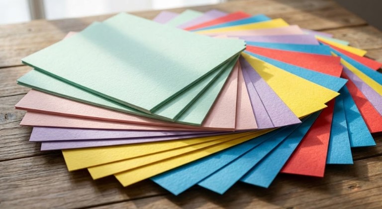
Quick paper glossary, in plain terms
- Text weight vs cover weight: Text weight is lighter and bends easier, cover weight is thicker and stiffer. Cardstock is usually a cover style weight.
- Coated vs uncoated: Coated papers feel smoother and make colors pop. Uncoated papers feel natural and write on easily.
- Finish: Matte looks softer and resists glare, glossy looks vibrant and reflective.
When to Use Color Copies on Cardstock
Choosing color copies on cardstock is not only about thickness, it is about confidence. When someone picks up a piece and it holds its shape, you communicate care, and that feeling carries into how they value the offer, the event, or the brand.Here are the most common, best use cases where color copies on cardstock make immediate sense.
Best use cases, at a glance
- Business handouts: Price lists, service menus, mini lookbooks, one page sell sheets
- Event pieces: Invitations, programs, table numbers, schedules, VIP passes
- Retail and product: Product cards, care instructions, packaging inserts, thank you cards
- Signage light duty: Counter cards, small posters, directional signs for indoor use
- Education and training: Quick reference sheets, checklists, onboarding guides
Table, common projects and recommended stock
| Project type | What you want it to do | Good paper choice | Why it works |
|---|---|---|---|
| Flyers for street handouts | Stay crisp in a bag or pocket | Light cardstock or heavy text | Feels premium, less corner curl |
| Event invitations | Feel special, survive handling | Cardstock | Stiffness signals quality |
| Presentation handouts | Look sharp under office lighting | Smooth cardstock, matte or satin | Clean color, readable charts |
| Product inserts | Protect brand look in shipping | Cardstock | Resists scuffs better |
| Photo heavy promos | Make images pop | Coated cardstock | Better contrast and saturation |
Durability and Professionalism with Color Copies on Cardstock
Durability is the obvious win. Color copies on cardstock resist corner bending, finger creasing, and that tired look that shows up after one day in a backpack.Professionalism is the deeper win. Thicker stock changes how people behave with the piece. They keep it longer, they scan it slower, and they are more likely to place it on a desk instead of tossing it, because it feels like it cost something to make.
A simple durability checklist before you print
- Handling: Will people hold it for more than 30 seconds, carry it, or pin it up
- Environment: Indoors, outdoors, humid, near food or drinks
- Time: One day use, one week use, or ongoing
- Budget reality: Better paper can reduce the need for reprints
Thoughts note: The best paper choice is the one that matches the moment. A luxury finish for a throwaway coupon is wasted, but a thin sheet for a premium offer quietly undercuts you.
Using Staples Colored Printer Paper to Save Ink
Colored sheets can do more than look fun. They can make your design clearer, cheaper to run, and easier to skim, especially when you do not need heavy ink coverage.Many people start with what they can easily buy locally, like Staples colored printer paper. It is convenient for quick internal docs, school projects, simple signage, and drafts that still need to look organized.
When colored paper helps most
- Low ink designs: Black text, simple icons, light line art
- Color coding: Forms by department, class handouts, event staff packets
- Readable contrast: Soft yellow or light blue can feel easier on the eyes than bright white
- Quick differentiation: Same layout, different sheet color, less confusion
Staples colored copy paper, what to watch for
If you are using Staples colored copy paper or any similar colored stock, the key is consistency. The same “blue” can vary by batch, and some bright colors shift how your ink appears. Black text may look softer on dark sheets, and color graphics may pick up a tint.Editor note: Colored paper is not a replacement for good design. It is a background choice, and backgrounds should support the message, not compete with it.
Table, smart ink saving strategies using colored paper
| Goal | Best approach | Why it saves ink | What can go wrong |
|---|---|---|---|
| Make headings stand out | Use a light colored sheet, keep text mostly black | Less need for large color blocks | Too dark a sheet lowers readability |
| Differentiate versions | Same file, different paper colors | No redesign, no extra ink | Colors may not match your brand |
| Add “premium” feel cheaply | Warm off white or subtle pastel | Looks intentional with minimal coverage | Cheap paper can still feel cheap |
| Improve scanning workflow | Color code sets by paper | Fewer print errors | Mixed batches cause mistakes |
Green Copy: Eco Friendly Paper Options
“Green copy” can mean a few things, recycled content, FSC certified sourcing, or papers made with responsible processes. If you want green copy choices without sacrificing print quality, ask for specifics, not vague labels.What to ask your printer:
- Recycled content percentage: Post consumer content is often the meaningful metric
- Certification: FSC certification is a common trust signal
- Brightness: Recycled sheets can be slightly warmer, which may soften some colors
- Coating: Coated eco options exist, but not all shops stock them
If you want to explore premium paper options and finishes, Neenah is a well known source for paper education and product specs, see Neenah Paper.
Full Color Copies vs. Color Photo Copies
People use these terms interchangeably, but they can point to different expectations.
- Full color copies typically mean standard color output for documents, flyers, presentations, and marketing sheets. The goal is accurate, pleasing color, readable text, clean gradients.
- Color photo copies usually mean photo focused output where skin tones, shadow detail, and smooth transitions matter more. The goal is photographic realism and consistent color management.
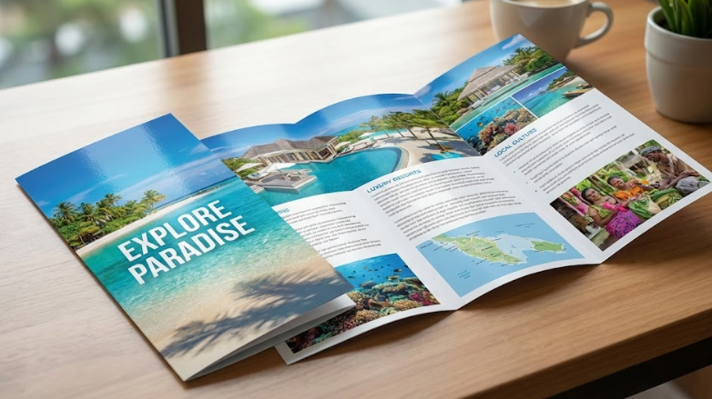
In practice, your best result comes from matching the print process to the content. A flyer with photos can still be done as full color copies, but if the piece lives or dies by image quality, you may want a photo oriented setup.
How to choose based on what you are printing
Ask yourself:
- Is text the hero, or is the image the hero
- Will it be viewed under bright light, or framed behind glass
- Do you need exact brand colors, or natural skin tones
- Do you need it to be writable, or wipeable
Choosing the Right Finish: Matte vs. Glossy
Finish is not just “look,” it is usability.
- Matte: Softer, easier to read under overhead lights, better for writing, hides fingerprints
- Glossy: More pop and contrast, strong for photos, but glare can be an issue and fingerprints show more
For color copies on cardstock, matte is often the safe choice for handouts, menus, and business materials that get handled. Glossy can shine for photo heavy promos and high impact pieces, especially when you want that vibrant, polished look.Thoughts note: If the piece will be read while someone stands, matte often wins because glare quietly steals attention.
Table, finish selection cheat sheet
| Use case | Pick this finish | Why |
|---|---|---|
| Handouts and menus | Matte | Easy reading, less glare, more practical |
| Photo promos and brochures | Glossy or satin | Strong color, deeper blacks, more punch |
| Training sheets and checklists | Matte | Writable, less smudge visibility |
| Display on counters | Satin | Balanced, looks premium without harsh glare |
Where to Find the Best Specialty Paper Services for Color Copies on Cardstock
The best shop is not the one with the fanciest claims, it is the one that asks the right questions and can show you samples.
What a good print shop will ask you
- Final size: Letter, half sheet, custom trim
- Quantity: Small run vs bulk, because pricing changes fast
- Purpose: Handout, mailer, display, keepsake
- Paper preference: Smooth vs textured, coated vs uncoated, recycled option
- Color expectations: Brand color matching, photo realism, or general accuracy
- Finishing: Trimming, folding, scoring, drilling, corner rounding
A quick ordering checklist, so you get what you pictured
- Bring one real reference: A previous print you liked, or a sample from a store
- Request a paper sample: Especially if you are choosing between two cardstocks
- Ask for a small proof run: Even a few sheets can prevent a full reprint
- Confirm the finish: Matte, satin, glossy, and whether it is coated
- Confirm turnaround and pickup: Rush jobs change what is realistic
Table, questions that prevent the most common disappointments
| Common disappointment | Question to ask | What you are really protecting |
|---|---|---|
| Colors look dull | Is this coated, and what finish is it | Vibrancy and contrast |
| Paper feels thin | What cardstock weight is this | Perceived quality |
| Cracks on folds | Will you score before folding | Clean folds on thick stock |
| Text looks soft | Is the file high resolution, and is sharpening applied | Crispness and readability |
| Dark images print too dark | Can you adjust shadows or run a proof | Photo detail |
Editor note: A five minute conversation at the start saves you hours later. Specialty paper is forgiving in feel, but unforgiving in expectations.
Summary: Picking the Right Paper for the Job
If you remember one thing, remember this, the paper is part of the design. Color copies on cardstock are a smart upgrade when the piece needs to feel substantial, last longer than a quick glance, or represent your brand with confidence.Use colored sheets when they simplify the message, reduce ink coverage, or help people stay organized, and choose photo oriented output when image realism matters more than anything else. When you pair the right stock, finish, and expectation, your prints stop looking like “copies” and start looking like products people want to keep.
Final quick picks
- For durability and a premium feel: color copies on cardstock, matte finish for most handouts
- For easy, low ink documents: Staples colored printer paper, with simple black text and clean spacing
- For image first marketing: full color copies on coated stock, satin or glossy depending on glare
- For photo keepsakes: color photo copies, with a finish chosen for the display environment
- For eco minded projects: green copy options with clear recycled content and certification details
FAQ
What cardstock should I choose for color copies on cardstock?
Start with a mid weight cardstock for general handouts, then go thicker for invitations, product cards, and anything you want to feel premium. If it will be folded, confirm scoring, thick stock can crack without it.
Can I print full color copies on colored paper?
Yes, but the sheet color shifts the look of the ink. Light tints work best. For brand critical color, white coated paper is usually more predictable.
Is Staples colored copy paper good for business use?
It can be, especially for internal packets, quick forms, and drafts. For client facing pieces, paper quality and consistency matter more, so test a sample and avoid very dark colors for text heavy pages.
What is the difference between full color copies and color photo copies?
Full color copies focus on balanced color for mixed documents, text plus graphics. Color photo copies focus on smooth photo detail and natural tones, and they often benefit from photo specific settings and papers.
Should I choose matte or glossy for brochure style printing?
If the brochure will be read under bright lights, matte or satin keeps it readable. If the brochure is photo heavy and used in controlled lighting, glossy can deliver extra punch.
What does “green copy” usually mean at a print shop?
It usually refers to recycled content paper, FSC certified sourcing, or both. Ask what the recycled percentage is and whether certification applies to the exact stock you are choosing.
I searched “colour photocopy printer”, what should I ask for at the counter?
Ask for color printing on your chosen paper type, and mention whether it is a document style job or photo quality. Then confirm paper weight, finish, and whether you want single sided or double sided output.