Here is something most people never think about when they order business cards: the paper stock you choose says as much about your brand as the design on the card itself. Before anyone reads your name or looks at your logo, they feel your card. The thickness of it. The texture. The way light plays on the surface. The way it moves between fingers. All of this happens in milliseconds and creates an instant impression that is very difficult to override with words or design alone.
We are going to walk through every major paper type for business cards, explain what each one feels and looks like, and help you figure out which one is right for your brand. This is one of those decisions that seems minor but actually has massive impact on how your card is received and remembered. Our experience at CheapFastPrinting.com tells us that paper choice is the single most underestimated variable in the entire business card equation.
One of the smartest things you can do is browse templates and paper ideas together. We have 7,000+ free editable business card templates, which makes it much easier to picture how a slim card, square card, kraft card, or glossy card should actually look in real life. Start at the business card template hub, then use the industry gallery to compare niches like real estate agent business cards, graphic designer business cards, and plumber business cards. The same design can feel totally different depending on whether you print it on 14pt gloss, 18pt kraft, or premium matte.
Paper decisions are much easier when you can see a real business-card direction first. A template makes the stock conversation more concrete. You stop asking only “Which paper is best?” and start asking “Which paper is best for this style, this shape, and this kind of customer handoff?” That is a much better question.
Warm and tactile stocks can make the same layout feel more grounded, artisan, or boutique.
If the template relies on photography, contrast, or bold color, a glossy surface may support that visual energy better.
When you combine the template direction with Free Design Setup and a digital proof, it gets much easier to choose a stock confidently.
Why Paper Choice Is a Branding Decision, Not Just a Print Decision
Think about the brands you admire. The premium ones. The ones that feel expensive before you even look at their price. Now think about every physical thing they produce: the packaging, the bags, the receipts, the business cards. There is a consistency to the material quality that reinforces the brand experience at every touch point.
Your business card is a brand touch point. A thin, floppy, generic card signals one thing about your brand. A thick, thoughtfully finished card signals something else entirely. The paper stock you choose is part of your brand statement, even if the person holding your card never consciously thinks about it. They just feel it, form an impression, and that impression influences how they feel about reaching out to you.
This is not theoretical. We have seen customers switch from 14pt standard to 16pt Soft Touch and immediately notice that people’s reactions to their cards change. People hold them longer. They comment on them. They keep them. The right paper stock transforms a functional card into an object worth keeping.
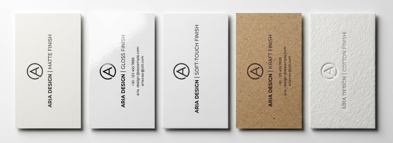
Standard Paper Types for Business Cards Explained
| Finish Type | Look & Feel | Brand Personality Match | Writable? | Best For | Avoid For |
|---|---|---|---|---|---|
| Matte Uncoated | Flat, no shine, natural texture | Sophisticated, authentic, writable | YES | Law, finance, consulting, wellness | Bold color photography cards |
| Gloss Aqueous | Shiny, reflective, vibrant colors | Bold, energetic, photographic | No | Photography, retail, real estate | Minimalist, understated luxury brands |
| Silk / Satin | Semi-gloss, smooth, refined | Elegant, professional, balanced | No | Corporate, fashion, medical | Artisan, craft, eco brands |
| Soft Touch / Velvet | Velvety suede texture, luxury feel | Premium, creative, memorable | No | Luxury, creative professionals, consulting | Budget-sensitive orders (adds cost) |
| Kraft / Natural | Brown/warm toned, organic texture | Artisan, sustainable, authentic | YES | Eco, food, wellness, craft | Corporate, medical, formal industries |
| Cotton / Linen | Distinctive weave texture, premium | Artisan, heritage, high-end | YES | Law, finance, heritage brands, weddings | Modern, digital, tech brands |
Matte Finish: Clean, Sophisticated, and Easy to Write On
Matte finish is exactly what it sounds like: no shine, no reflection, just a clean, flat surface. On 14pt or 16pt paper stock, matte finish feels surprisingly substantial and premium. Colors on matte cards tend to look more subdued and sophisticated compared to gloss, which is ideal for certain brand personalities.
One practical advantage of matte finish is that it is writable. You can jot a quick note on a matte card before handing it to someone (“Call me Tuesday!” or “Here’s that discount code”). You cannot do that on a gloss or UV-coated card. This makes matte cards particularly useful if you frequently personalize cards when networking, which is a genuinely powerful networking technique.
Matte also does not show fingerprints the way gloss does, which keeps your cards looking clean and professional longer when they are handled frequently. For industries where professionalism, restraint, and sophistication are the signal you want to send, matte is almost always the right choice.
Gloss Finish: Vibrant Colors and Photo-Ready Results
Gloss is the most popular finish for standard business cards, and for good reason. The shiny, reflective surface makes colors pop with incredible vibrancy. Photographs, gradients, and bold color backgrounds all look their absolute best on gloss stock. If your card has a colorful design or strong visual elements, gloss finish amplifies everything and makes the design feel alive.
Gloss cards are coated with a thin aqueous or UV layer that also protects the card from moisture and light handling. They are slightly more durable than uncoated stock in everyday handling. The trade-off is that glossy cards can look less premium in certain professional contexts, particularly law, finance, and high-end consulting, where the gloss can feel slightly commercial rather than refined.
Soft Touch (Velvet) Laminate: The Premium Tactile Experience
This is the finish that makes people say “what is this material?” when they pick up your card. It is a velvety, almost suede-like surface that is unlike any standard paper finish. Soft Touch (also called Velvet Laminate) is applied as a film over the printed card, creating that tactile luxury experience that is impossible to ignore and very difficult to forget.
Colors on Soft Touch cards look rich and slightly muted, with a depth that is hard to describe and very easy to feel. This is the premium tier for most branding purposes. We are seeing it become increasingly popular among consultants, creative professionals, luxury service providers, and anyone who wants their card to create a genuine physical reaction when someone picks it up.
- vs. Standard Matte: Same flat look, but dramatically different feel. Soft Touch is velvety; standard matte is just flat.
- vs. Gloss: Soft Touch absorbs light rather than reflecting it. More sophisticated, less commercial.
- vs. Uncoated: Soft Touch has a consistent, luxurious texture. Uncoated has a natural, slightly rough feel.
- Cost: Typically 25-40% more than standard finishes. Worth it for client-facing professionals.
- Durability: Very durable. Resistant to fingerprints, minor scratches, and light moisture.
Kraft and Natural Stock: Earthy and Authentic
Kraft paper stock gives your cards that warm, natural, artisan feel that is completely distinctive in a world of white business cards. It is slightly rough to the touch, has a brown or warm gray tone, and immediately communicates sustainability and authenticity. Kraft cards are excellent for businesses in the food and beverage, wellness, craft, cannabis, and sustainability space.
Design considerations for kraft stock are different from white paper. Since the base stock is not white, light colors will not appear as bright. Deep, saturated colors work beautifully. Earth tones are completely at home. White or light ink when printed on kraft creates a striking, elegant contrast that looks genuinely distinctive and is increasingly being used in premium branding contexts well beyond the traditional artisan market.
Paper Weight: What Does 14pt, 16pt, and 32pt Mean?
| Weight | Thickness | Hand Feel | Best Application | Price vs. Standard |
|---|---|---|---|---|
| 10pt | 0.010″ | Thin, borderline flimsy | NOT recommended for business cards | Cheapest, not worth it |
| 14pt | 0.014″ | Firm, professional, standard | General business use, bulk distribution | Standard baseline |
| 16pt | 0.016″ | Noticeably heavier, quality impression | Client-facing, premium positioning | +15-25% |
| 24pt | 0.024″ | Heavy, impressive, unmistakably quality | Luxury service providers, high-end brands | +40-60% |
| 32pt (Trifecta) | 0.032″ | Credit card thickness, extraordinary impact | Maximum impact situations, memorable gifts | +80-120% |
Specialty Finishes That Create Massive Impact
| Finish | Effect | Best Paired With | Impression Level | Cost Premium |
|---|---|---|---|---|
| Full Aqueous Coating | Thin protective sheen, clean look | 14pt or 16pt standard matte | Professional | Minimal (~5%) |
| Full UV Coating | High-gloss, hard protective finish | 14pt gloss | Polished Premium | ~10-15% |
| Spot UV | Gloss varnish on logo/text only, rest stays matte | 16pt matte | Luxury | |
| Soft Touch Laminate | Velvety matte film, full card coverage | 16pt matte | Luxury | |
| Gold/Silver Foil Stamp | Metallic foil on specific elements | 16pt matte | Ultra Premium | |
| Letterpress | Design pressed into card surface | 32pt cotton or natural | Artisan Ultra Premium | Highest |
| Embossing/Debossing | Raised or recessed elements without ink | 32pt or thick natural stock | Artisan Premium | Very High |
Matching Paper Type to Brand Personality: Quick Reference Guide
Here is the straightforward guide we give our customers when they are not sure which direction to go:
- Stock: 16pt Matte or Soft Touch
- Palette: Restrained, 1-2 brand colors
- Finish: Matte or Soft Touch, no gloss
- Message: Authority, trust, established
- Stock: 16pt Soft Touch or Gloss
- Design: Bold, uses full visual range
- Finish: Soft Touch or Gloss + possible Spot UV
- Message: Taste, craft, creativity
- Stock: 14pt or 16pt Gloss
- Design: Vibrant colors, photos encouraged
- Finish: Gloss for photo vibrancy
- Message: Energy, approachability, value
- Stock: Kraft or Recycled Natural
- Palette: Earthy, warm, nature-inspired
- Finish: Uncoated or Aqueous Matte only
- Message: Authenticity, sustainability
- Stock: 16pt or 32pt Soft Touch
- Finish: Soft Touch + Spot UV or Gold Foil
- Palette: Dark, restrained, metallic accents
- Message: Exclusivity, premium positioning
If you are between two paper stocks or finishes and cannot decide, order sample cards before committing to a full run. Feeling the actual materials in your hands resolves every debate instantly. What reads as ‘premium’ in a description becomes immediately obvious when you hold the card. CheapFastPrinting.com can produce test prints so you can make this decision with full confidence.
Frequently Asked Questions