

This is a question we get a lot, and it is a good one. Because the answer has genuinely changed over the past few years. The business card that worked in 2015 is not necessarily the right card for 2025. Some information that used to be essential is now outdated. Some contact details that were optional before are now expected. And some things that people still put on cards? They are actively hurting the impression they make.
So let’s settle this once and for all. Here is exactly what belongs on a modern business card, what to skip, and how to present everything in a clean, professional way that works in today’s world. We have helped thousands of customers think through this decision at CheapFastPrinting.com, and there are patterns that consistently produce the best results.
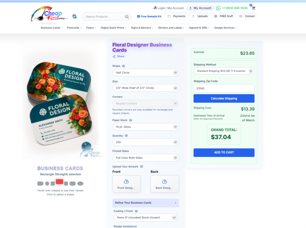
Different professions need very different card content, and that is exactly why our 7,000+ free editable business card templates are useful. You can browse the industry gallery to see how a realtor card differs from a plumber card or a photographer card, then pull files from the main template hub when you are ready to design. Good examples to study are real estate agent business cards, plumber business cards, and product photographer business cards. This makes the article much more practical because you can compare real layouts while deciding what belongs on your own card.
This is exactly where free design templates become useful in a practical way. A realtor usually needs headshot logic, broker identity, and mobile-first contact flow. A plumber often needs direct phone, service promise, and QR or emergency emphasis. A photographer may need portfolio direction and visual branding space. When you can compare live examples, the decision about what to include gets much easier.
Templates show what people in your field usually lead with, so you stop overloading the card with everything at once.
Once you see real examples, it becomes clearer which details belong on the front and which should move to the back or a QR destination.
If your template is close but your wording or hierarchy still feels crowded, we can restructure the card and send a digital proof before printing.
The Core Information Every Business Card Must Include
Let’s start with the non-negotiables. These are the pieces of information that every card, in every industry, at every level, needs to have. Skip any of these and you are making someone’s life harder, which is the opposite of what a business card should do.
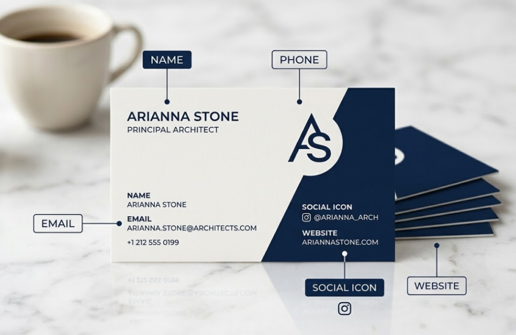
- Full Name: Prominent, clearly readable, the biggest element on the card. This is not about ego, it is about function.
- Professional Title or Role: What you do, stated simply and clearly. Not a paragraph, just your role.
- Company or Brand Name: Context for who you represent. For freelancers, this might be your personal brand name.
- Primary Phone Number: One number, the one you actually answer. Not two, not three.
- Professional Email Address: Branded domain preferred. A generic Gmail signals that you are not fully established.
- Website URL: Your central hub. Keep it short and clean. Remove “www” if it makes it shorter.
That is the foundation. Everything else is additional, and the key word there is “additional,” not “mandatory.” Adding to this list should only happen when there is a clear reason the information belongs, not just because you have space to fill.
No more than seven pieces of information on a standard business card. Name, title, company, phone, email, website, and one social handle or QR code. That is seven. If you cannot fit everything at readable size with proper white space, something needs to come off. Simplicity always wins.
Name, Title and Company: Getting the Hierarchy Right
Your name should be the biggest, boldest element on the card. This is not about ego, it is about function. When someone picks up your card later, the first thing they need to quickly identify is who you are. Title and company name follow in a slightly smaller size. The visual hierarchy should be name first, role second, company third.
One thing to think about: are you more recognizable by your name or your company? A freelancer or solo professional should lead with their name. A corporate employee might reasonably lead with the company logo, since that brand recognition might carry more weight in their professional context. Think about how your contacts actually think about you, and structure your card around that reality rather than abstract preference.
Which Phone Number to Include (and Which to Skip)
The simple answer: one phone number, the one you actually answer. Including both a work line and a cell phone, especially if they go to voicemail boxes you rarely check, just adds clutter and creates confusion about which number to actually call. Pick the number where someone can reliably reach you during business hours. If you have a business line that is properly managed, use that. If you are a solo professional and your cell is the real point of contact, use that. One number, clearly labeled, no ambiguity.
Digital Contact Details: Email, Website and Social Handles
Email is still essential. It is the primary professional communication channel in 2025, and leaving it off a business card is a real oversight that surprises people. Use a professional email address meaning your own domain or a company domain. A branded email address (yourname@yourcompany.com) signals professionalism in a way that genericname247@gmail.com simply does not, even if you run a one-person operation.
Your website URL belongs on the card if you have one. Keep it short. If your full URL is very long or complex, use a clean landing page or use a redirect domain and put that cleaner URL on the card. And yes, your website should be mobile-friendly and fast-loading, because the first thing someone does after meeting you is pull out their phone and look you up right then and there.
| Contact Info | Include in 2025? | Format Recommendation | Notes |
|---|---|---|---|
| Full Name | Always | Largest element, bold | Primary hierarchy element |
| Job Title | Always | 11pt, clear and simple | Keep it concise, one line max |
| Company/Brand Name | Always | Paired with logo if possible | Consistent with brand guidelines |
| Primary Phone | Always, one number only | (555) 123-4567 format | Label if it is a direct cell vs. office line |
| Professional Email | Always | name@domain.com | Branded domain strongly preferred |
| Website URL | Always if you have one | domain.com (no www needed) | Link to portfolio if creative professional |
| LinkedIn Handle | Yes for B2B professionals | @yourhandle or linkedin.com/in/yourname | Skip if not actively maintained |
| Instagram Handle | If visually relevant | @yourhandle with icon | Photographers, designers, artists, restaurants |
| QR Code | Highly recommended | Back of card, 0.75″+ square | Link to website, portfolio, or digital vCard |
| Fax Number | Skip entirely | N/A | Dates your card. Remove unless legally required. |
| Full Street Address | Usually skip | Only if foot traffic is key | Waste of space for most modern businesses |
| Multiple emails | Skip | N/A | Choose one. Two emails creates confusion. |
How to Display Your LinkedIn or Instagram Professionally
Social media on business cards is now expected for most industries, but the key is being selective. Only include the platforms that are genuinely professional or relevant to your work. LinkedIn is almost universally appropriate for B2B professionals. Instagram is relevant for creative professionals, photographers, artists, and brands where visual content is central to the business relationship.
Do not list every platform you use. Pick one or two maximum. And instead of writing out the full URL, use just the handle (@yourusername) with the platform icon beside it. Cleaner, faster to read, and more modern. If someone wants to find you on another platform, they will search for you once they have your name and primary contact info.
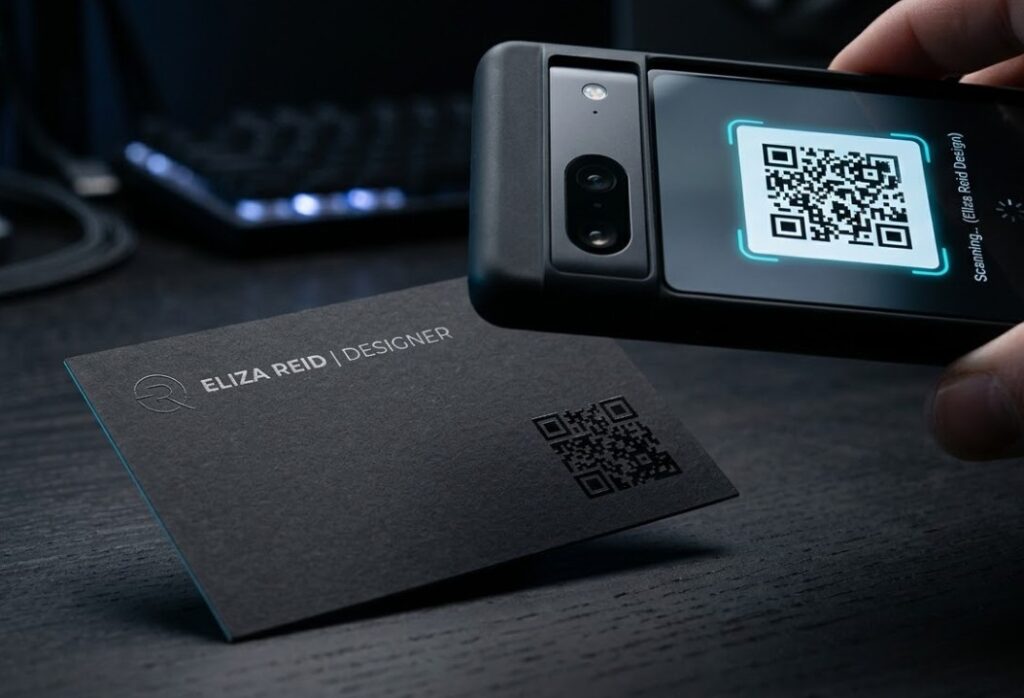
QR Codes: Should You Add One and Where?
Yes, we are strong fans of QR codes on modern business cards, and here is why. A QR code lets you put more information on a card without cluttering the design. Link it to your website, your LinkedIn profile, a digital vCard with your full contact information that drops right into someone’s phone, or even a short video introduction. The physical card gets scanned once and suddenly all that digital information is transferred instantly.
- Size: Minimum 0.75″ x 0.75″ square for reliable smartphone scanning in any light
- Placement: Back of card, lower corner or center, away from other design elements
- Link destination: Website homepage, LinkedIn profile, or digital vCard (most useful)
- Testing: Always scan with multiple devices before approving for print
- Free at CheapFastPrinting.com: QR code generation is included with every design order
- Dynamic QR codes: Consider a redirect URL so you can update the destination without reprinting
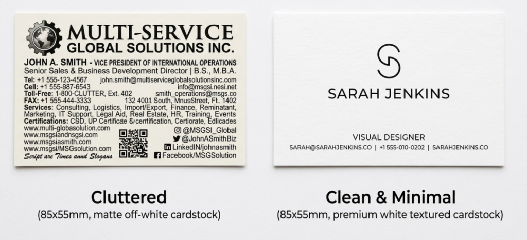
What NOT to Put on Your Business Card Anymore
This section is just as important as the previous one. Here is what to leave off your modern business card, and why each item is actively working against you when it is still on there.
| Remove This | Why It Hurts You | Exception |
|---|---|---|
| Fax number | Immediately dates your card to the pre-smartphone era. Makes you look behind the times. | Very specific legal or medical contexts only |
| Multiple email addresses | Confuses people about which channel to use. Creates decision paralysis. | None. Choose one. |
| Full home address | Privacy issue, takes up space, and most modern professionals do not meet clients at home. | If your home is a client-facing business location |
| Every social platform you use | Creates visual noise and signals you are not selective about what matters professionally. | Never. Max two platforms, always. |
| Outdated job title | If you were promoted or changed roles, old title damages credibility immediately. | None. Always keep current. |
| Discontinued products or services | References something that no longer exists. Confusing and unprofessional. | None. Reprint when offerings change. |
| Long taglines over 8 words | Competes with contact info for space and attention. Taglines belong on websites. | Keep to 5 words max if you use one. |
Outdated Information That Hurts Your Brand
A card that lists a discontinued product line, an old job title, or a website that no longer exists does real damage to your professional image. Keep your cards current. When you get a new title, change roles, launch a new website, or change your phone number, reprint. Cards are inexpensive enough, specially in bulk at CheapFastPrinting.com, that there is no reason to be handing out outdated information to potential clients and partners.
Think about it from the other person’s perspective. They meet you, feel good about the interaction, file your card away. Three months later they want to reach out and they pull out your card. The phone number is dead. The website is gone. The title is wrong. That entire positive first impression just evaporated. Reprinting is cheap. A missed opportunity is not.
Industry-Specific Variations: What Changes by Profession
Different industries have different norms, and that is worth acknowledging and planning for. Here is what varies by profession:
- License number (often legally required in your state)
- Brokerage name and logo (per brokerage policy)
- Optional: Featured property photo on back
- DRE or similar local licensing notation
- Credentials (MD, DO, RN, NP, etc.)
- Specialty or practice area
- Clinic or hospital name
- Appointments phone separate from general info
- Portfolio website URL (often more important than company name)
- Relevant social handle (Instagram for visual work)
- One work sample on the card back
- Specialty: photographer, illustrator, designer, etc.
- State bar number (often required)
- Practice areas (2-3, not a full list)
- Law firm name prominently
- Separate direct line if applicable
- Clear value statement tagline (5 words max)
- Credentials or certifications relevant to practice
- Specific specialty, not just ‘consultant’
- Professional headshot on back (personal brand)
- Physical address (foot traffic matters)
- Hours if they fit
- Loyalty program QR code on back
- Social handle for community engagement
The Front/Back Strategy: Making Every Inch Work
One of the biggest missed opportunities in business card design is treating the back of the card as an afterthought. The back of your card is valuable real estate that you have already paid for. Use it.
The most effective approach is to divide information intentionally. Put your identity information on the front (name, title, logo). Put your contact and connection information on the back (phone, email, website, QR code). This creates a natural two-step interaction: people see who you are first, then flip the card to find out how to reach you. It makes both sides of the card purposeful and worth looking at.
After finishing your card design, hand it to someone who has never seen it before and give them exactly 3 seconds to look at it. Then take it away and ask: ‘Who is this person and what do they do?’ If they cannot answer both questions clearly, your hierarchy or information presentation needs work. This is the real test of whether your card communicates what it needs to.
How Often Should You Reprint Your Business Cards?
More often than most people do. A good rule: reprint whenever any piece of information changes, whenever your brand identity updates, or at least once a year as a practice check. Annual reprinting also gives you the opportunity to review whether your card design still represents where your business is now versus where it was when you first designed it.
With bulk printing economics, the cost difference between reprinting and not reprinting is small. 500 cards at CheapFastPrinting.com is very affordable, and handing out current, accurate cards is worth far more than whatever you save by holding onto outdated ones. Our Free Design service makes it easy to update your card at any time without paying for design work.