

Let’s talk about something that fits in a wallet but carries massive weight. Your business card is often the very first physical impression someone has of you and your brand. Think about that for a second. In a world full of websites and apps and social feeds, a Real, physically printed card in someone’s hand can be more memorable than anything on a screen.
But here is the problem. Most people don’t design business cards properly. They cram too much information, pick the wrong fonts, choose colors that don’t print well, and end up with something that looks fine on screen but terrible in print. Don’t worry, we got you covered. This guide walks through everything, from the technical specs printers need to the design decisions that actually make an impression. Let’s do it right from the start.
And if all these setup details feel like too much, we are offering Free Design Setup, free file format conversion, free image enhancement, free QR code generation, free design edits, and a digital email proof before we print. You can leverage from our team instead of guessing on every little technical detail.
- The anatomy of a well-designed business card
- Standard dimensions and safe zones
- Choosing fonts and typography
- Color strategy for print
- Layout principles and hierarchy
- Common design mistakes to avoid
- The production process after submission
- Frequently asked questions
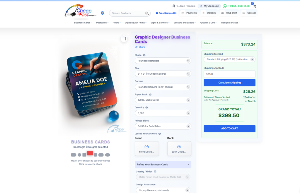
You do not always need to start from a blank canvas. We already have more than 7,000 free editable business card templates for different industries, sizes, and shapes, which makes this design process much easier to leverage from. You can start with the downloadable template section, browse professional niches in the business card industry gallery, or study pages like product photographer business cards, web designer business cards, and real estate agent business cards to see how information hierarchy changes by industry.
A strong template is not just about beauty. It is about helping you place the right information in the right order for the kind of business you actually run. These live public examples make that easier to understand, because you can compare how different industries handle hierarchy, spacing, logo presence, and contact details.
Instead of guessing where your name, title, company, phone, and QR code should go, you can start from a layout already proven in similar industries.
A slim card, square card, or standard rectangle does not only look different, it changes how much room you have and how the brand feels in hand.
If the template gets close but not perfect, we can tighten the alignment, adjust the wording, add QR code logic, and send a digital proof before print.
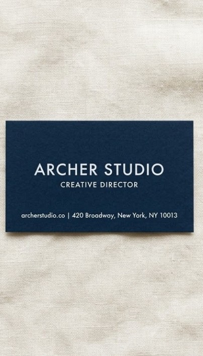
The Anatomy of a Well-Designed Business Card
Every great business card has a clear visual hierarchy. That means your most important information stands out first, followed by supporting details. Think of it like this: name first, then title, then company, then contact info. Simple, clean, intentional.
A well-designed card uses white space wisely. White space is not wasted space. It is breathing room that makes everything else easier to read and more professional-looking. Cards that are crammed edge to edge feel overwhelming and amateur. Cards with balanced white space feel confident and established. Most first-time card designers use about 70% of the available space. Experienced designers often leave 40-50% as breathing room and the result looks and feels dramatically more premium.
There is also the question of front versus back. Too many people think about the front and treat the back as an afterthought. The back is prime real estate. A bold color field, a clean pattern, a key piece of information, or a QR code on the back makes your card a two-sided experience that people interact with longer.
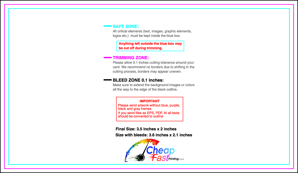
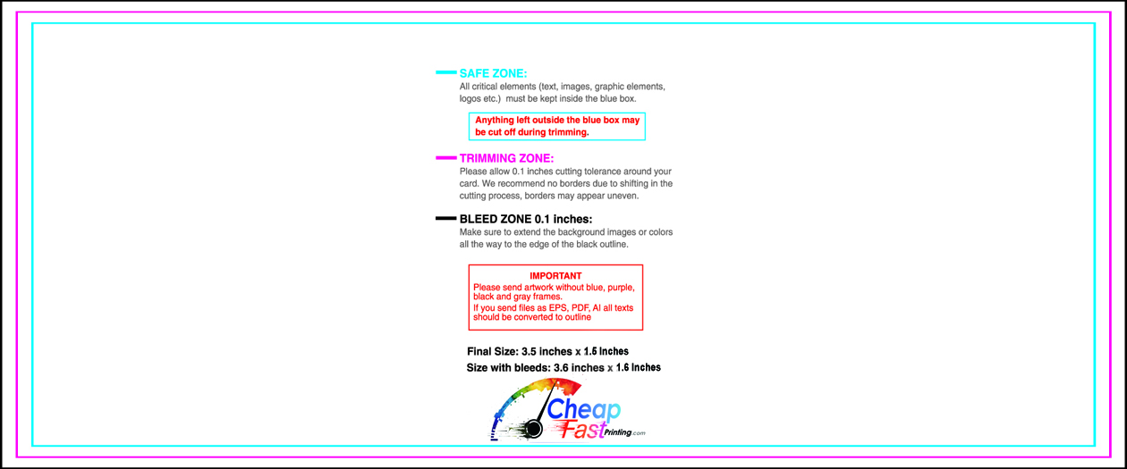
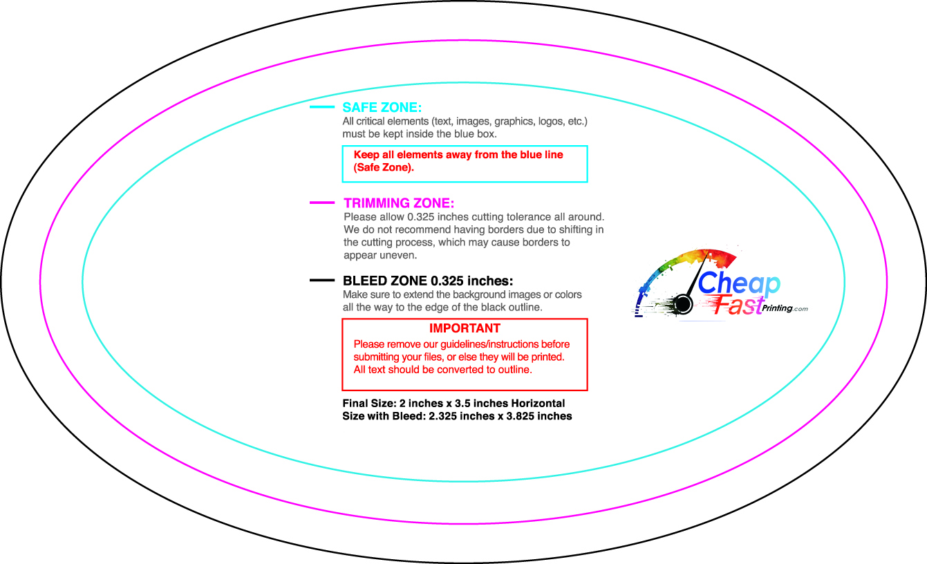
- Bleed Area: 3.75″ x 2.25″ (extends 0.125″ beyond each edge). Background must fill this zone completely.
- Trim Line: 3.5″ x 2.0″, this is where the cutter trims the card. The actual final size.
- Safe Zone: 3.25″ x 1.75″, all text and logos must live inside here to avoid getting cut.
Standard Dimensions and Safe Zones You Must Know
| Zone | Dimension | Purpose | What Happens if Ignored |
|---|---|---|---|
| Full canvas with bleed | 3.75″ x 2.25″ | Includes bleed on all 4 sides | Background stops before edge, creates ugly white borders |
| Final trim size | 3.5″ x 2.0″ | Industry Standard card size | N/A, this is the output target |
| Safe zone (text/logo) | 3.25″ x 1.75″ | Critical content zone | Text or logo may get partially trimmed off |
| Bleed area | 0.125″ per side | Background extension | White edge lines appear after trimming |
| Minimum font size | 8pt body text | Readability in print | Text becomes squinting-required at smaller sizes |
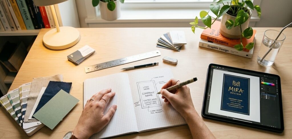
Choosing the Right Fonts and Typography
Typography is where most DIY card designs fall apart. The font you choose communicates personality before anyone reads a single word. Serif fonts feel traditional and established. Sans-serif fonts feel modern and clean. Script fonts add personality but must be used sparingly because they sacrifice readability for style.
For business cards, less is more. Two fonts maximum is the professional standard: one for your name or headline, one for the body information. More than two fonts on a small card creates visual noise and reads as unprofessional. Many of the best-designed cards use a single font family at different weights.
| Font Style | Brand Personality | Best Industries | Avoid When |
|---|---|---|---|
| Serif (Times, Garamond) | Traditional, Established, Trustworthy | Law, Finance, Insurance, Heritage | Modern, tech-forward, startup brands |
| Sans-Serif (Helvetica, Montserrat) | Modern, Clean, Direct, Approachable | Almost any industry | When you need warmth or artisan feel |
| Script / Handwritten | Personal, Creative, Elegant | Wedding, Beauty, Personal brands | Corporate, Medical, Legal, Tech |
| Geometric (Futura, Circular) | Minimal, Premium, Forward-thinking | Design, Architecture, Luxury | Casual, rustic, heritage brands |
| Slab Serif (Rockwell, Archer) | Bold, Confident, Editorial | Publishing, Construction, Craft | Delicate, elegant, minimalist brands |
Font Pairing Rules That Work Every Time
Great font pairing is simpler than most people think. Here are the rules that consistently produce professional results:
- Two fonts maximum. One for headline/name, one for body information. More creates visual chaos on a small card.
- Pair contrasting styles. Serif + sans-serif almost always works. Two serifs or two scripts usually fights.
- Weight contrast matters. Bold for your name, regular or light for contact details. Hierarchy created through weight, not font changes.
- Never use two script fonts together. Readability suffers immediately and the card looks like a wedding invitation regardless of your industry.
- Test at actual print size. A font that looks great on a 27-inch monitor may be unreadable at 8pt on a physical card.
Minimum Font Size for Readability in Print
| Text Element | Recommended Size | Minimum Size | Notes |
|---|---|---|---|
| Name (Primary) | 12–16pt | 11pt | Biggest element on the card. Bold weight recommended. |
| Title / Company Name | 9–11pt | 8pt | Clear, professional weight. No light or thin fonts here. |
| Contact Details | 8–9pt | 7pt | Phone, email, website. Regular weight, not light. |
| Tagline / Social handles | 7–9pt | 7pt | Secondary information. Should not compete with name. |
| Legal / Fine print | 6–7pt | 6pt | Almost never needed. If required, use sparingly. |
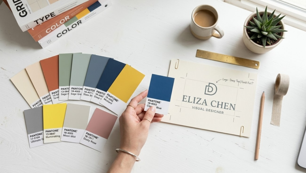
Color Strategy: How to Use Color Without Overwhelming
Color is one of the most powerful tools in your card design, and one of the most misused. The goal is not to use all your brand colors everywhere. The goal is to use color intentionally to create hierarchy, emotion, and recognition.
For most professional cards, a two to three color palette is plenty. Your brand’s primary color plus a neutral (white, black, or gray) is often all you need. If you have a secondary brand color, use it as an accent, not a main field. The most common mistake is using four or more colors on a card and wondering why it looks busy and unprofessional.
- Blue: Trust, professionalism, reliability. Finance, corporate, healthcare.
- Black: Luxury, authority, sophistication. High-end services, fashion, premium brands.
- Green: Growth, wellness, sustainability. Health, eco, finance.
- Red: Energy, urgency, passion. Food, retail, entertainment.
- Gold / Amber: Premium, achievement, warmth. Luxury, consulting, professional services.
Using Brand Colors vs. Complementary Palettes
If you have established brand colors, use them consistently on your card. Consistency builds recognition. But what if your brand colors don’t print well? Some very bright digital colors, like certain neons or ultra-saturated hues, are hard to reproduce accurately in CMYK print. In those cases, your designer should help you find the nearest CMYK equivalent that still feels on-brand.
One critical design rule: never design in RGB and send the file to print expecting perfect color match. RGB is for screens. CMYK is for print. The color gamuts overlap but are not identical, and some colors shift significantly in conversion. Our team at CheapFastPrinting.com handles CMYK optimization for every file as part of our Free Design Setup, completely free of costs. We will flag any colors that are likely to shift and suggest approved CMYK alternatives before you see the proof.
Layout Principles: White Space, Hierarchy and Balance
Your name is almost always the primary focal point. Make it the largest, boldest element. Everything else supports it.
Name biggest. Title and company next. Contact details smallest. Every element should be obviously more or less important than the elements around it.
Even if the grid is invisible, everything should feel like it belongs to an intentional structure. Random placement reads as amateur even to people who can’t articulate why.
Padding around text, margins from card edges, breathing room between sections. White space is not empty. It is a design element.
Design tools often default to large preview sizes. Always check your design at 100% zoom (actual 3.5″ x 2″ size) before sending to print.
Front vs. Back: What Goes Where
The front of your card is prime real estate. This is where your name, title, and logo should live. Keep it clean. The back is where you can get creative or expand, placing contact details, a tagline, a QR code, or a visual element that reinforces your brand. Double-sided cards give you twice the canvas for nearly the same price per card, so leverage from both sides.
A common and effective layout approach: front carries your name, title, company name, and logo. The back carries phone, email, website, and a QR code. This divides the functional information naturally and keeps each side focused. Alternatively, many creative professionals use the back for a sample of their work: a photograph, an illustration, a bold graphic treatment. This turns the back of your card into a mini-portfolio piece.
Common Design Mistakes to Avoid
We have reviewed thousands of card files over the years, and the same mistakes come up again and again. Here is what to avoid:
| Mistake | What Goes Wrong | How Bad | The Fix |
|---|---|---|---|
| Too much information | Card looks cluttered, nothing stands out | Very Common | Limit to 7 key pieces of info max |
| No bleed area | White edges appear after trimming | Extremely Common | Extend background 0.125″ beyond card edge |
| RGB instead of CMYK | Colors shift at the printer, specially blues and greens | Common | Design in CMYK or let us convert free |
| Low resolution (under 300dpi) | Blurry, pixelated print result | Common | All images and logos at 300dpi minimum |
| Font too small (under 7pt) | Contact info becomes unreadable | Very Common | Minimum 8pt for all contact details |
| Low contrast text on background | Text blends into background | Common | Test contrast before sending to print |
| Stretched or distorted logo | Logo looks warped and unprofessional | Less Common | Always scale proportionally, lock aspect ratio |
| Using web-optimized images | Pixelation in print even if it looked fine on screen | Very Common | Use original high-res files, never screenshots |
Monitors are calibrated for light (RGB). Printers use ink (CMYK). What looks perfect on your screen can shift at the printer, especially with very bright blues, neons, and vivid greens. Always request a digital proof and review it carefully before approving for print. At CheapFastPrinting.com, our digital email proof is always included, completely free.
The Production Process: What Happens After You Submit
Understanding the printing process helps you understand why certain specifications matter. After you submit your file, here is what actually happens:
- File Verification: Our team checks resolution, bleed, color mode, and font embedding. Issues are flagged and fixed.
- Color Calibration: Your file is color-profiled for our specific press and paper stock combination.
- Digital Proof Generation: A soft proof is created and emailed to you for approval. This is your last chance to catch anything before printing.
- Plating / Press Setup: For offset runs, plates are made. For digital, the file goes to print-ready status.
- Printing: Cards are printed on large sheets containing multiple card layouts for efficiency.
- Cutting and Finishing: Sheets are trimmed to final size, coatings applied, and cards bundled.
- Quality Check: A final visual inspection before packaging. We never think we will compromise on quality at this stage.